I don't have much experience with the higher/luxury end of the spectrum. But I have had some, and honestly? I was disappointed. When it comes to certain things like blush, bronzer, etc., unless the item is reputable and precious and I don't really have anything else, why not? But for me, the drugstore and affordable brands offer enough options.
There was a time, however, when I really did buy up samples or discounted higher end, thinking it would somehow make a difference in my life. Short story- it didn't. I thought I would break down the products that I did try, and why they were not worth it.
1. Kevyn Aucoin Powder Highlighter in Candlelight. I had a sample of this- a good gram of product, and I genuinely was confused. Like, there was a sheen to it, especially when swatched, but on the face this was a total let down. I don't get it. I am not even obsessed with blinding highlights, but I like shimmer and sheen and this was not it. Sorry. Also this was one of the very first items I ever decluttered.
2. Kevyn Aucoin, liquid illuminator in Candleight. When I first got a sample of this, I was obsessed and I saved up the packet for as long as I could. But the more I got into makeup, the more I realized there was other stuff out there. And I did get two more samples of the liquid illuminator, and still I felt it was not amazing. The full size product is $50. Why would I pay fifty dollars to make my skin look like it's healthy, when I could pay $50 for proper skin care that actually helps it be healthy?
3. Kevyn Aucoin Loose Powder Eyeshadow in Candlelight. I know, I know. Last one, I promise. I still own this, but will probably declutter. 1.) This loose eyeshadow is in a roller-ball, and to apply it to the eye is difficult, because if you bend your arm at an angle, no product will dispense. Additionally, when it does, powder flies every where. 2.) THIS IS 29 DOLLARS and 3.) You don't even get a glam look with it. It is very subtle, and a "wash" of sheen on the eye. Which has its time and place, but not for me, no. Oh, and 4.) NO ONE talks about this. Because they are overpriced as hell. Actually, the "Raeviewer" has a review- the only one on this- and it just does not give a helpful breakdown of the product. Unrealistic swatches and everything. I was so mad about this one- but luckily I did not have to pay the full price.
4. Nars Eyeshadow Duo, Indian Summer. First, the name of it is a little weird and feels exploitative. Two, this is a mustard brown matte and and silver shimmer. The silver shimmer I kept for yes, that wash of color look, but the matte would muddy something terrible in my crease. I think it's because the formula was very soft and wet, and my eyes do get rather warm and oily, so it was not a good mix. I depotted the two of them, and gave the mustard shadow the boot. The bottom line is, no, they are not the best shadows ever. I can get a lot better for a lot less. My third lesson and takeaway is this: I bought it because it was on discount and high-end. It sickens me to say that, because it is just a senseless and rather desperate thing to do. And I regret that. Even the full price ones that I actually like, like Isolde or Scorching Sun, I know I can dupe. So I'm good.
5. Estee Lauder Night Repair Serum. This is a glorified moisturizer, I swear. It moisturized my skin, but that's it. Of course, skin type is highly variable from person to person, so it may work for you. I just wasn't impressed.
6. Lancome Eyeliners. I just don't think I like Lancome as a brand. I know they're expensive, but they just don't feel that way? Quality wise, I mean. It's odd.
In sum, luxury beauty, as well as designer brands, are not necessarily interested in making the best product they can, which blows my mind. I still can't wrap my head around the horrible looking YSL eye palettes Temptalia swatched a couple of years back. I know it looks like I am being especially mean here to Kevyn Aucoin, but I promise I'm not. I was just super interested the brand at the time, in my early stages of this hobby. But now I am not.
And perhaps that represents a major shift in 2018. I predict that, while in 2017 the affordability of drugstore brands decreased (*shakes fist at Nyx*) PERHAPS these luxury brands will either 1.) develop a more aggressive marketing strategy to increase consumers or 2.) increase consumer base by offering smaller, lesser-priced versions of their products.
We'll see what happens.
Oh, and Happy New Year!
Yours,
Gossip G- No, wait.
Cosmetically Inclined.
Sunday, December 31, 2017
FoTD: Pink Smoke
Hello!
I kind of like the look I came up with today, so I thought I would share. I consider this to be a sort of pink smokey eye.
Before I show the final product, I want to reiterate that I am just a makeup hobbyist, so now, the final product does not look polished. The mascara was not working for me, and we won't even talk about eyeliner.
But, let's get into it! For this look I dipped into three palettes.
1. I started with the Wet 'n Wild Not a Basic Peach palette, with the top transition color to set my eye primer. I find I prefer this for warmer looks because it is slightly darker and warmer than my skin tone.


3. Then, I used the shade Princess from the Coloured Raine Queen of Hearts palette. For some reason, the lighting makes this look very cool-toned. It's not!
4. Ladyship was then blended into the outer corner, and a bit into the crease.

5. I wet my brush and used Rose Chrome from L'Oreal in the inner portion of my eye. Though I know this is a pigmented shadow, I don't think I enjoy this completely because it is so close to my skin tone it just blends in, rater than standing out.


I kind of like the look I came up with today, so I thought I would share. I consider this to be a sort of pink smokey eye.
Before I show the final product, I want to reiterate that I am just a makeup hobbyist, so now, the final product does not look polished. The mascara was not working for me, and we won't even talk about eyeliner.
But, let's get into it! For this look I dipped into three palettes.
1. I started with the Wet 'n Wild Not a Basic Peach palette, with the top transition color to set my eye primer. I find I prefer this for warmer looks because it is slightly darker and warmer than my skin tone.

2. Then, I used the lightest matte peach shade , and blended that into my crease, upwards. It takes some building up.

3. Then, I used the shade Princess from the Coloured Raine Queen of Hearts palette. For some reason, the lighting makes this look very cool-toned. It's not!
4. Ladyship was then blended into the outer corner, and a bit into the crease.

5. I wet my brush and used Rose Chrome from L'Oreal in the inner portion of my eye. Though I know this is a pigmented shadow, I don't think I enjoy this completely because it is so close to my skin tone it just blends in, rater than standing out.

6. And then, because I find that Ladyship is so pigmented, it leaves skip marks on my skin, instead of really being blended out, so I brought in one of the colors from the Carli Bybel deluxe palette to darken it up, as well as diffuse the color a bit more.

Final look!


 |
| I know I look crazy here. My hair is up, and those are loose strands |
For blush, I wanted a really warm brown blush, so I used a Pixi Blush I got in an Ipsy bag. I even dusted some on my nose to see what would happen. I also mixed two of the highlighters of the Carli Bybel palette to use on my face. That stuff is intense.
So, that's it! I'll update with wear time as the day progresses.
Buy-byeeeee!
Saturday, December 30, 2017
"Duping" the Nabla Dreamy Palette (updated)
So, this was in my cart yesterday. I decided not to buy, and now it is sold out. But I am not heartbroken, because I suspect I already have these shades. Let's investigate.
 As I said before, this is very similar to the Coloured Raine Queen of Hearts Palette, but honestly more along the lines of my personal style. Still, can I dupe it with shades already in my collection?
Probably not exactly, but I am sure I can find shadows that tell a similar color story and ultimately give the same effect on the eye.
This article has been gaining some traction on the web, so I wanted to make sure it was updated with a more comprehensive review. Looking back, I missed some colors, and the swatches Nabla provides are heavy, so the true character of the color is not apparent. I've decided to update the post a bit more. I want to maintain that depending on your own collection, your experience may be a bit different than mine when it comes to shopping your stash and finding potential dupes. Still, I hope this will be helpful! Let's go.
I will keep Nabla's own promotional imagery here, but like I said before, it's not really helpful.
I based my thought process on the swatches I found from the Swedish beauty blogger Viola Holmgren, who has an in-depth review and really amazing pictures of the palette, which you can find here.
Additionally, the swatches below don't go in order of the palette! How frustrating is that. In this article, and in my break-down, I am going in order of the palette.


What have I learned?
Well, maybe not learned. More like, what concepts were reinforced? Having a variety of palettes and singles means that I can be creative and dupe things like this. Of course, the particular qualities of those two purple shades made it difficult, but would I buy the palette just for those two shades? Of course not. With my own preferences in mind, I hardly use colors like those- though they are pretty, without a doubt. But I wouldn't waste the money, not when I can dupe the majority of the palette.
In a way, I think that is what makes this palette and others so appealing- they push the comfort zone, but not really. They fill the palette with familiar shades that people are used to, but then convince you the palette is unique with one or two "diamonds" that stand out. The contrast of the purple and gold is not an accident.
Still, I am happy with my own assortment, and I hope that I've inspired you to look within your stash too. Just know that the "differences" we perceive between two colors may be totally moot by the time it actually goes on your eye- those two metallic coppery shades, as well as the two rosy light brown/pink are way too similar for my liking.
Thanks for reading! Let me know if you've found a dupe to any of these shades- especially those purples.
Probably not exactly, but I am sure I can find shadows that tell a similar color story and ultimately give the same effect on the eye.
This article has been gaining some traction on the web, so I wanted to make sure it was updated with a more comprehensive review. Looking back, I missed some colors, and the swatches Nabla provides are heavy, so the true character of the color is not apparent. I've decided to update the post a bit more. I want to maintain that depending on your own collection, your experience may be a bit different than mine when it comes to shopping your stash and finding potential dupes. Still, I hope this will be helpful! Let's go.
I will keep Nabla's own promotional imagery here, but like I said before, it's not really helpful.
I based my thought process on the swatches I found from the Swedish beauty blogger Viola Holmgren, who has an in-depth review and really amazing pictures of the palette, which you can find here.
Additionally, the swatches below don't go in order of the palette! How frustrating is that. In this article, and in my break-down, I am going in order of the palette.
1. Immaculate. A white metallic with a slight gold shift. This is a shade increasing in popularity due to the trend of duochrome eyeshadows. In my own collection, Crown from the Queen of Hearts Palette suits my needs (it does have a pink-toned shift), but Elven Gold from Coastal Scents does the same exact thing, it is just a bit more gold ! And for $1-2, depending on whether or not you got it during the sale. I am so mad I gave it away years ago, I did not know what I was doing! (Now and Zen from Colourpop is also a dupe!)
2. Illusion. A warm, mid-toned brown that is slightly rosy. I am going to revise my original statement and say I feel this is more akin to Cone from the Dose of Colors EyesCream palette. For a slightly warmer version, the brown matte in Milani palettes, such as Earthly Elements would work. Overall, this is a very cool toned palette, but there are definite options for warmer looks.
3. Vanitas. Like Immaculate, more brands are coming out with shades like this. A pink shimmer with gold reflect. This is Satin Sheets by Too Faced, only a little darker. From my own collection, this is Rose Chrome from L'Oreal Infallible Paints Metals.
4. Delirium. Up to now, I have had an easy time of duping this palette, but shades like this make it difficult. I don't wear these tones any way, but the closest thing I have is a purple from the Queen of Hearts palette. I originally had the purple from the Marc Jacobs Palette, The Tease., but it does not have that same brown-based quality,. Queen Mother, on the other hand, is warmer, so it works better.
5. Byzantine. A warm-toned Gold Shimmer. If you have the Eyes on Metallics palette from Milani, or any gold pigment, really you are in luck. I myself have Your Majesty from the QoH palette, as well as Amber from ABH (which is more muted and one of my favorite shadows of all time), as well as Gilded Wings from Fyrinnae. Any gold shimmer will do.
6. Sistina. This is a very rosy-toned matte, which for me is Princess from the Queen of Hearts palette. Additionally, I see a slightly browner version of this as the seventh shade in the Carli Bybel palette.
7. Metal Cupid. A reddish-burgundy shimmer. Three of these appear in the BH Cosmetics Foil Eyes #1 palette, and I got that for $8.00. I also see a red sort of like that in the Milani Eyes on Metallics palette.
8. Inception. Another purple shimmer. Sheesh. And this one is lighter, but still brown-toned. I have something similar from the BH Cosmetics Foil Eyes Palette. It is a brownish purple shimmer. Should do the trick.
9. Senorita A bright red-toned fuschia. Ladyship from QoH works here, as well as Love Letter from the Modern Renaissance Palette.
10. Rose Gold. This was hard because I find this color to be very similar to Metal Cupid on the eye. In this case, I have selected a HG single eyeshadow- Amber Rush. It is so lovely.
11. Lullaby. A dusty light purple-toned matte. Buon Fresco from ABH! Carli Bybel also has a pinker-toned dupe in the delux palette. I also have "There's No Such Thing as Magic" from Shiro Cosmetics. Also, Blueberry Swirl from the EyesCream palette give a nice muted purple tone to the eye.
12. Dogma. Any chocolate brown matte.
this is what I came up with...
 |
| from l-r: Crown, Cone, Rose Chrome, Queen Mother, Gold (from the Milani Metals palette), the seventh shade from Carli Bybel Palette, BH Cosmetics Foil, BH Cosmetics Foil, Love Letter, Amber Rush, Buon Fresco, and Cypress Umber) |


Well, maybe not learned. More like, what concepts were reinforced? Having a variety of palettes and singles means that I can be creative and dupe things like this. Of course, the particular qualities of those two purple shades made it difficult, but would I buy the palette just for those two shades? Of course not. With my own preferences in mind, I hardly use colors like those- though they are pretty, without a doubt. But I wouldn't waste the money, not when I can dupe the majority of the palette.
In a way, I think that is what makes this palette and others so appealing- they push the comfort zone, but not really. They fill the palette with familiar shades that people are used to, but then convince you the palette is unique with one or two "diamonds" that stand out. The contrast of the purple and gold is not an accident.
Still, I am happy with my own assortment, and I hope that I've inspired you to look within your stash too. Just know that the "differences" we perceive between two colors may be totally moot by the time it actually goes on your eye- those two metallic coppery shades, as well as the two rosy light brown/pink are way too similar for my liking.
Thanks for reading! Let me know if you've found a dupe to any of these shades- especially those purples.
I Skipped my January Ipsy and will Probably Unsubscribe
Hi all!
Today I would make a post on why I skipped next month's Ipsy, and why I will probably just unsubscribe.
I've been subscribed on and off to Ipsy for about four years. Out of all the beauty boxes I know of (more on that later), it seemed to have the best value, $10 a month, no shipping fees (for the U.S., there might be international fees). Their customer service is also A+.
But over time, I think I've realized that I've just grown out of it, and it is no longer for me.
Let me break it down with a list!
1. Samples. Now, I do like little samples of things, sure. But ipsy will include samples that are laughably small- November's Too Faced Setting spray comes to mind. And there is nothing Ipsy can do about it. If they want to continue this partnership with the brand, they have to accept whatever "scraps" the brand throws their way. And we, in turn, are forced to accept that.
2. Profile. I feel like Ipsy's profile/review system is similar to the button on crossing posts in NY- they are just there to make you feel like you have more control than you really do. But you don't. There were months when I was getting eyeliner in succession, or loose eyeshadow, or mascara. And maybe eventually it evened out, but look at all that waste. No thank you. There was even a time I emailed customer service, and I was very politely told I could not opt-out of red lip products, specifically. Over time, I was no longer being sent that, but still.
3. Points. The Ipsy point system is something I complained about before. It used to be quite reasonable, but now you have to save up a ridiculous amount of points in order to redeem
something. And because it is constantly refreshed, you are under pressure to spend the points (or actual cash, in regards to ipsy offers- which I don't hate as much, their ipsy favorite sets are
👌) as soon as you see something of potential value.
4. Brands. Ipsy has afforded me great insight into the industry, including the fact that brands exist to be overpriced, and then drastically discounted. These are filler brands, and I hate them. These include Manna Kadar, Trestique, Pur-lisse, etc. And they outnumber the reliable ones. Ipsy has definitely gotten better for me about this, definitely, but it is something that nags me, especially after getting that Tini Beauty highlighting acrylic paint stick in November.
5. Products. Ipsy's system makes you want products you never would have wanted otherwise, because they are offering you a limited pool, and you think you are choosing or hoping for the best choice. But there are things beyond the Ipsy bubble. They will manufacture a situation where you end up really wanting a highlighter from a no-name brand because that is the best "choice." But, did you really want that? If you never knew it existed, would you even care?
At this point in my life, if I really wanted a product, I'll just buy it. That's all. Or try to dupe it in my collection. How many beauty box items have been tossed or given away, as a casualty in makeup declutters? It happens all the time. Because in that person's eye, they have no value. They are dispensable. In every highlighter declutter video I've seen, that Vintage one by Jessica Liebskind is decluttered with ease.
6. Value. I'll be quick with this one- if you will use none of the products, regardless of its retail value, it is of no value to you. Period. Hence, it is a waste of money.
6. Alternatives. I did some research last night on comparable beauty subscriptions, with nothing greater than $20, which discounts Boxycharm, but I don't care about Boxycharm.
One promising alternative is Ricky's Cult Crushes, which is $11, and is a collection of fun, kitschy products. I wouldn't subscribe for January, though, because even though that tangerine nail polish is calling to me, I also don't want the choker temporary tattoo. But maybe I'll subscribe for February! Overall, it's really cute, it's within my budget, and because it is shipping from NY, it will get to me pretty quickly.
Another alternative I am considering is the Allure Beauty Box. It is $15 a month, but the first box is $10. I really like the caliber of products they include, but one promotional image does show Doucce eyeshadow, which again, I do not trust.
The January 2018 box is tempting, especially with the skin care products, which include Sunday Riley. But, I have to look at the box holistically, and not according to a couple of products. I know I am not going to use the MUFE matte lipstick (which I am pretty sure is just a matte liquid lipstick), and the Rodial eyeliner. Again, I don't want or need any more pencil eyeliners, and the Rodial one specifically irritates my eyes.
Lastly, I was also considering Mishibox, a K-Beauty subscription box. It is pricier than the above choices, but I like the amount of skin care I would be trying. But again, if I really wanted something, could't I just buy it myself?
I don't know. I am kind of in limbo. We'll see what February offers. All I know for January, I am taking a much-needed break.
Friday, December 29, 2017
Eyeshadow Files, pt. 1 : Modern Renaissance (Updated 12/29)
I am officially on a makeup no-buy until I begin work again in September. This is not too daunting for me, because I think I have too much makeup. As I do my makeup in the morning, I am now trying to use consciously reach for products that I haven't used in a while.
So I thought I would use this time to look at some of my eyeshadow palettes, and analyze shade by shade. What have I panned, are close to panning? What have I never touched, and why?
These really won't include swatches, but rather pictures of the palettes and anecdotes of my own experiences.
Today's palette comes at an opportune moment. The failure of Subculture has caused many to re-evaluate their experiences with its "golden" predecessor: the Modern Renaissance (MR). Now, I've had this palette for a year, and I do think it still is an excellent palette, though prone to fallout.
MR was the first high-end palette that I bought and really liked.
As of today, this is what my palette looks like:

As of today, December 29, 2017, this is what the palette looks like:


Panned Shades:
Tempera. This is a really beautiful shade for me. It matches my skin tone and has fine, subtle shimmers in it. I was really hesitant about continuing to use it after hitting pan, but then I realized that is a ridiculous mindset to have.
Vermeer - Inner corner highlight. I used to use this all over the lid, until I started using darker shimmers for that. (panned as of 8/19)
Golden Ochre (panned sometime before 12/29). I mean, it is a teeny tiny baby pan. But it is a pan. I find this shade muddies up on me, but I will give it more of a go, and avoid that area of my eye where I see this muddying up. My original note for this color was, "Good for the crease and blending with the orange."
Heavily Used Shades:
Burnt Orange- Adds subtle color
Buon Fresco- Same as above
Warm Taupe- The lighter mattes mentioned in this section were used heavily when I first got this palette, but then I started to just use Warm Taupe in the crease. A great workhouse shade.
Cyprus Umber- Used for the outer courner.
Moderately Used Shades:
Raw Sienna: I always think I confuse this with Burnt Orange, but I end up using Burnt Orange more. This is a nice warm medium brown shade. I'd like to use it more, but I also have many mattes like this.
Primavera: This is not an exciting gold shimmer. It's pigmentation is medium, but it is a rather pale gold and I have more saturated golds in my stash. Still, I do use it in the inner corner, as well as on the lid sometimes. [Update] Infuriatingly, I've not hit pan. I don't get it. I do use it every chance I get and still have not hit pan. What gives??
Red Ochre: I've only started to really enjoy this shade and not be scared of it, and the other colors listed below. I've been blending it into the crease as well as a little on the outer corner, especially to complement a gold lid. [Update] I have been using this a lot more, and feel that actually, when blended with other colors, it actually pulls somewhat brown-toned, which I do't mind. Same with Realgar, which I've been getting more use out of, as well as Venetian Red.
Rarely Used Shades:
Antique Bronze: This shade frustrates me because the shimmer is VERY muted and glitter fiends may not be satisfied. I think this shade is great on the lid to create a brown smoky look. [Update] still not using this.
Love Letter: This is the only shade I have not used in a look I enjoyed. I've barely touched it. I don't know what it is, but I feel like I need to try a bit more.
Level of Usability overall NOW: (on a rating from 1-impossible to use to 5- super easy). 4. I feel like I have not explored so many possible combinations, but I do feel like I have gotten over a fear of the reds and oranges. The pink, however....
Course of Action:
1. Pair more muted mattes with some of the more intense ones.
2. Attempt to use pink and see how it goes.
3. See what antique bronze looks like in the crease.
4. Bring in other shimmers to expand possibilities of palette.
Makeup I Keep in my Purse
Hi all!
Today I thought I would do a quick post about products I travel with. I think these kinds of posts are interesting because you can get insight into what could be considered "essential" for touch-ups and basic looks.
Depending on my morning, I might bring a liquid eyeshadow and eyeliner with me for touch-ups if my eyes were incredibly watery and makeup application was an issue. Otherwise, if I had to limit myself to one item per category, these are the sort of items that I will always carry with me in my purse:

1.) Setting Spray/Makeup Mist. So I know there's a "difference" between setting spray and fixing mist. Whatever I have on me, I like to bring with me to refresh towards the end of the day and keep oil at bay. The setting spray I am really enjoying at the moment is from Flower Beauty, as recommended by Zabrena. I agree that it smells nice, but the smell isn't anything too revolutionary. It smells like trendy perfume, but the scent fades quickly. This setting spray does do a great job of controlling oil.
2. Scent/Perfume: Speaking of touch-ups, I bring some sort of fragrance with me to use during the day. The item pictured is Lavanilla Coconut Vanilla. It is a lovely creamy scent.
3. Concealer: I learned quickly that if I had to choose concealer or foundation to bring with me, it had to be concealer. Even if I wasn't wearing foundation to begin with, I like the idea of knowing I have something in my purse to take care of redness or a blemish. The one pictured is Maybelline Better Skin, which I have determined is the best concealer Maybelline offers, if your preferences and needs are like mine.
4. Lip Color: In my bag today I brought with me a color that I don't have to think much about- Clinique Black Honey. It is really flattering, but also lasts a good while on the lips. It is hydrating at first, but then I find it does dry my lips out eventually. Overall, a good simple product to bring when you need to add more color to your lips.
5. Lip Balm: I always bring lip balm with me. My HG is the Vaseline Lip Therapy minis. No other balm I've found keeps them moisturized. Love it.
Moving to the top row:
6. Makeup Brush: I do usually throw in a brush with me. This time, I opted for a smaller, more transportable one- the elf Kabuki brush. It is a rather nice brush, and I knew I would need it for touchs up of the bronzer that I will discuss shortly.
7. The cute yellow cow pictured is actually a container for lotion. The head screws off. I think it was from TonyMoly, and it used to be a banana pudding scent. I used that up, and have since refilled it a couple of times with Palmer's Cocoa Butter. For me, this is a brilliant idea because the container is small and portable and sturdy. My hands get dry constantly so this is much needed.
8. Bronzer. For me, out of the different kind of face powders, bronzer is most useful to bring with me to add color to my face, because I can put it all over, whereas I would be (sort of) limited with blush or highlighter. The bronzer pictured here is a re-potted Butter Bronzer. I've a baby pan, obviously, but don't be deceived- when I first tried to travel with it in its original packaging, that sucker shattered like no one's business. Needless to say, if I do repurchase it, I won't travel with it any more. I also have the Jordana contour stick in light, which is on the warmer side, and can be used as an easy way to reintroduce color to the face, so that's a possible alternative.
Other items I bring depending on different factors:
- If I am not worried about foundation, I bring with me the Hard Candy Coconut Water Priming Stick, to refresh the skin. It breaks up foundation, and because it is technically a primer, I usually keep it at home and use it as such.
- Cerave AM Lotion, with SPF 30, if I know I am driving home in daylight or will be outside a lot.
- Liquid Eyeshadow: Especially L'Oreal Infallible paints. As I mentioned up top, if I wake up in the morning with a bad eye situation, sometimes I will forego eye makeup entirely. If it gets better and I decided to do it at work, this is the easiest option.
- Eyeliner. See above.
I used to bring a ton of stuff with me, but have since learned to economize a bit.
Thanks for reading!
Wednesday, December 27, 2017
Materpost: My Demeter Fragrance Collection Ranking
One particular thing I like to collect are the fragrances from Demeter's Fragrance Library. I think they can be hit or miss, but the whole concept is neat. For many of these I had to get used to them in order to really enjoy them.
Let's talk about them! I am not the best at describing products, so please consult the excellent website Fragrantica for a more detailed analysis of these products.

From worst to best, we have:
Snow. For this one, they have tried to capture the essence of "cold," but to me Snow just smells like rubbing alcohol. It is very metallic with a slight note of sweetness and I very much dislike it. It whole-heartedly earns the spot of "worst" in my collection.
Holy Water: I don't know why I bought this. I am not religious, nor have I been to a church. One of my grandmothers kept holy water, but that is it. It is a very watery scent, but I also think of pine needles and berries, with a metallic and musty edge. I dunno. I would never wear it, but I keep it around.
Thunderstorm. I have the roll-on of this, and I do not wear it as a scent. I have rubbed it on my hand before, and the staying power was notably longer than other Demeter scents. As its name suggests, this scent is meant to capture the smell of ozone- hazy, murky, and wet, while also smelling like rain on the pavement. Like I said before, I only keep this around to smell time to time when I want to smell a thunderstorm.
Oud. Also known as Agarwood, this is a spicy but simple fragrance. Agarwood smells somewhat like cinnamon to me, but perhaps with a note of cork? I don't wear this fragrance much, but do layer it once in a while with others.
Marshmallow: I used the sample bottle up so fast. What can you say? It smells just like a toasted marshamllow. I wish the longevity was improved. If it was, it would be perfect.
Pixie Dust: When I first got this and tried it out, all I could picture was sugary strawberries. And that pretty much is true still. It smells like warm cotton candy, and is a very youthful, happy scent. I like it a lot!
Sunshine: This one took me a little time to enjoy because the edge of lemon seemed rather artificial at first. When worn, however, it becomes a very warm, albeit tangy smell, cushioned with soft vanilla. Another happy scent.
Flowering Tonka: My only repurchase. I had never experienced the smell of tonka before- it is sweet, almost gourmand, but with a bitter edge. I really like it, and it smells great layered with some of my Lavanilla scents. Overall, I'd highly recommend.
So, that's it! I think if you do your research, Demeter Fragrances can be an excellent buy, even as a thoughtful gift. I just picked up Saddle and Mahogany for my father (and Raspberry Jam for me).
EoTD: Basic Lavender w/ the Carli Bybel Palette
I did not use any eye primer for this look. I instead used the Maybelline Master Conceal, because I hate it as a face product but still want to get some use out of it.
Here are the main products I used:


Thoughts:
1. The shimmers need to be foiled when applied to the eye, in order to appear as the finger swatch. Otherwise, for whatever reason, you don't get the same effect.
2. The mattes are really lovely, and I don't experience the same skipping problems that I have with other products (see past EoTD). I feel like this is a major draw to the palette.
3. Again, I enjoy the color layout and truly feel that this is a no-fuss, no-stress palette.
Here are the main products I used:


And here is my eye:


For some reason my phone also took these really dark photos, but I'd figure I would include them anyway- why not?


Thoughts:
1. The shimmers need to be foiled when applied to the eye, in order to appear as the finger swatch. Otherwise, for whatever reason, you don't get the same effect.
2. The mattes are really lovely, and I don't experience the same skipping problems that I have with other products (see past EoTD). I feel like this is a major draw to the palette.
3. Again, I enjoy the color layout and truly feel that this is a no-fuss, no-stress palette.
Tuesday, December 26, 2017
TMO: The Balm Matte Schmaker
So we finally got a good look at the new palette in the Meet Matt(e) line from The Balm...the Matt(e) Shmaker palette. First, the only good thing I will say about the palette is that I love the name. It also reminds me of Cardi B for some reason. Now, onto our regularly scheduled roasting.
This is what the palette looks like:

And I definitely will not be buying it.
So, the normally large pans of the Meet Matt(e) palettes are pared down into pairs of one matte and one shimmer. They are paired according to complementary colors, but was that even necessary?
Their last shimmer palette, The Balm Appetit palette, tanked due to formula issues. And the shimmers on this palette are quite ordinary. I have a feeling that purple is going to be terribly patchy.
I think The Balm is banking on novelty here, and not a lot else. I think it's cute that they are telling the consumer that they can get at least six looks out of this, which is nifty, but I would not wear the blue and purple pair that way.
I predict it will be $42 and then $22, and then eventually $14-16, like all their palettes. [edit] They actually are going for about 30. But you can bet they still we be heavily discounted in the future.
To me, this palette without the shimmers looks a heckuva lot like their most reputable Matt(e):

Without the mattes, the shimmers look like any basic shimmer palette that has come out this year.
Also, while we are on a roll, let's do a bonus TMO of the White Peach palette, from Too Faced
First of all, you can buy the Sweet Peach palette, on sale, right now. Here is an image I got from @Trendmood1:

This is what the palette looks like:

And I definitely will not be buying it.
So, the normally large pans of the Meet Matt(e) palettes are pared down into pairs of one matte and one shimmer. They are paired according to complementary colors, but was that even necessary?
Their last shimmer palette, The Balm Appetit palette, tanked due to formula issues. And the shimmers on this palette are quite ordinary. I have a feeling that purple is going to be terribly patchy.
I think The Balm is banking on novelty here, and not a lot else. I think it's cute that they are telling the consumer that they can get at least six looks out of this, which is nifty, but I would not wear the blue and purple pair that way.
I predict it will be $42 and then $22, and then eventually $14-16, like all their palettes. [edit] They actually are going for about 30. But you can bet they still we be heavily discounted in the future.
To me, this palette without the shimmers looks a heckuva lot like their most reputable Matt(e):
Without the mattes, the shimmers look like any basic shimmer palette that has come out this year.
Also, while we are on a roll, let's do a bonus TMO of the White Peach palette, from Too Faced
First of all, you can buy the Sweet Peach palette, on sale, right now. Here is an image I got from @Trendmood1:

Oy. So the complete first two rows look practially monochrome. I am getting White Chocolate flashbacks all over again. I also see an expanded Matt(e) Trimony palette...quite interesting. To me, this palette was super unnecessary.
And the sad thing is, Too Faced does marketing excellently. Today I stopped by Ulta, and there was a display for all of Too Faced Gold products, and guess what? It was cleared out. They know how to make eye-catching things that people want to buy as gifts because they look like gifts. So unfortunately, though a lot of bloggers have expressed frustration with the brand, I believe that they are steadily going where they want to be.
But I am not going to buy this palette. I have enough transition and base shades, thanks. I don't need an entire palette full of them.
L'Oreal Infallible Eyeshadows: Golden Sage
We are going to preface this review with a look at two eyeshadow palettes of a bygone era (i.e., a year or two ago).
The Kathleen Lights and Morphe collab:
 And the Laura Lee and Violet Voss collab:

Now, these are the same palette. But both spoke to me for the longest time due to one color, and one color only: the green.
Now, the green in the KL palette was a little too blue-toned for my liking. Swatches of Smashlee genuinely look impressive, but again the shadow has a very strong blue base.
Being someone who wants to steer away from blue-toned eyeshadow, but really wants to wear green shimmer, what was I to do?
Hello, Golden Sage.
Golden Sage is an interesting color from the L'Oreal Infallible line. It is a silvery green, without the blue base of the shadows mentioned above. For people, like me, who don't want to stray very much from neutral colors, this is ideal.
This is what it looks like:


The Kathleen Lights and Morphe collab:
Now, these are the same palette. But both spoke to me for the longest time due to one color, and one color only: the green.
Now, the green in the KL palette was a little too blue-toned for my liking. Swatches of Smashlee genuinely look impressive, but again the shadow has a very strong blue base.
Being someone who wants to steer away from blue-toned eyeshadow, but really wants to wear green shimmer, what was I to do?
Hello, Golden Sage.
Golden Sage is an interesting color from the L'Oreal Infallible line. It is a silvery green, without the blue base of the shadows mentioned above. For people, like me, who don't want to stray very much from neutral colors, this is ideal.
This is what it looks like:


And below is the quick look I created using it, in conjunction with the Carli Bybel deluxe palette. My allergies were pretty bad today, which is why my eyes are a tad swollen. Next time I use the shadow, I think I might just use it all over the lid.


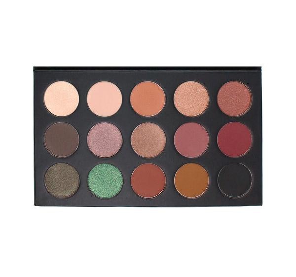
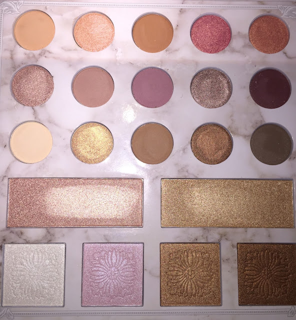
Carli Bybel Deluxe Palette: Review and Swatches
For the holidays, I was fortunate to receive a Carli Bybel Deluxe Palette. It was one of the items I had anti-hauled in the past, but now that I have it, I thought I would provide swatches and reviews.
This palette sells at Ulta for $19.50, which I think is an excellent value.
This the interior of the palette (after swatches and use)

1. An orange-toned cream shade. Dupes of this include Coloured Raine Angel Face and Heir, and ABH Orange Soda, as well as MuG Peach Smoothie. This is a very popular transition shade for many skin tones.

2. A peach-pink shimmer, with aspects of duochrome. It is like a more opaque, but drier Fireball by UD.
3. This shade is like a darker #1, and reminds me of Burnt Orange from the Modern Renaissance Palette.
4. This is a very popular pink shimmer with gold reflect. You can also find it in the new Wet 'n Wild Not a Basic Peach Palette, as well as the Jaclyn Hill palette.


5. A peach-toned shimmer with gold reflect. A very reflective and pigmented shade.
6. A pink shimmer. pretty but standard.
7. A cooler almond-toned light brown. For me, also a very nice transition.
8. Basically a dupe for Buon Fresco from ABH, but a tad more pink-toned.
 Buon Fresco on the left, an CB #8 on the right. I actually like the CB more!
9. A breathtaking silvery purple shimmer, like ABH Pink Champagne.
10. A blackened burgundy.


Thoughts:
I think the quality of the shadows and face powders are excellent. The mattes are soft but drier, so blending is very easy. CB also made it very easy to pair colors together and get a cohesive look. It was all very thoughtful.
Additionally, this palette has a shelf life of about two years, which makes me happy to know I can pace myself when using it (contrary to the ABH palette, which is reported to last 6 mos- boo!)
This palette sells at Ulta for $19.50, which I think is an excellent value.
This the interior of the palette (after swatches and use)

And swatches, in order of the palette from left to right. I will go shade by shade. Click on the pictures to get full size!

1. An orange-toned cream shade. Dupes of this include Coloured Raine Angel Face and Heir, and ABH Orange Soda, as well as MuG Peach Smoothie. This is a very popular transition shade for many skin tones.

Coloured Raine Heir, Angel Face, and CB palette #1
2. A peach-pink shimmer, with aspects of duochrome. It is like a more opaque, but drier Fireball by UD.
3. This shade is like a darker #1, and reminds me of Burnt Orange from the Modern Renaissance Palette.
4. This is a very popular pink shimmer with gold reflect. You can also find it in the new Wet 'n Wild Not a Basic Peach Palette, as well as the Jaclyn Hill palette.


6. A pink shimmer. pretty but standard.
7. A cooler almond-toned light brown. For me, also a very nice transition.
8. Basically a dupe for Buon Fresco from ABH, but a tad more pink-toned.

9. A breathtaking silvery purple shimmer, like ABH Pink Champagne.
10. A blackened burgundy.

11. A yellow-toned cream matte shade.
12. A light gold shade.
13. A warm orange-brown matte, like Raw Sienna or Burnt Orange from the ABH palette.
Actually, this is very similar to #3, just as Raw Sienna and Burnt Orange are similar in the MR palette. Comparison swatches reveal this to be very true:


I actually can't tell which is the MR, and which is the Carli Bybel palette! Oops.
14. A shimmery mid-toned brown.
15. And a cool-toned dark brown matte.
For the highlighters:
16.-17. A rose-gold and gold, respectively.
18. A white metallic with a blue-toned reflect.
18. A pink metallic with more subtle blue-toned reflect.
19. A mid-toned copper shimmer
20. And a darker toned bronze shimmer.
For me, this palette is wonderful for beginners and enthusiasts alike. For my skintone, I find this mostly to be a shadow of lid colors and transition colors.
Additionally, this palette has a shelf life of about two years, which makes me happy to know I can pace myself when using it (contrary to the ABH palette, which is reported to last 6 mos- boo!)
I am so excited to keep using this palette, and think that it is worth it.
Monday, December 25, 2017
About Viseart...
So I watched a very interesting episode of Kimberly Clark's "What Happened to Your Face." Kim indicated that she was very underwhelmed with the performance of her eyeshadow, and you could see visible wear and fading/flaking. She had used the Viseart Neutral mattes. She offered a possible inconsistency in batches as a solution to the problem, the problem being that Viseart palettes cost $80 a pop and are supposed to be the *gold* standard, and yet they clearly did not perform that way.
Now, having a bit of Christmas change on me, I do have to ask myself, it is worth it? And what was the cause of the palette performing terribly?
Someone in the comments noted that the intended use for the palettes did not include heavy-duty drag gigs, but I disagree. This is for movie and TV sets, and for the arts. It should be able to hold up to lights and heat and sweat. It is NOT for the average consumer.
Let me reiterate, as much as the internet and Sephora and all the beauty influencers who can spend eighty dollars like it is no big deal will tell you otherwise, it is not for the average consumer. If it was, the packaging would be so much different (i.e., nicer).
Another person who expressed the idea that the price of the palettes are not entirely justified is the Anti-Haul blog. Go check her out.
It concerns me that we are being convinced by brands who have literally no identity- and let me just include Natasha Denona here-that they are the gold standard, just because they are expensive. This is a fallacy, one that is so hard to see past, because we want to believe it, especially if we have already dropped the coin.
I am not going to buy Viseart. It's not for me. And I am a makeup enthusiast, and I do love eyeshadow. But not that much. Not that much to tell myself I need professional grade, expensive, product.
We all have different needs and preferences anyway. Due to the particular shape and texture of my eyes and lids, I actually have found I prefer shadows that are dry and powdery. They need to last long, of course, but they don't muddy on my eye if they have this formula.
And yet the rhetoric is all about buttery and smooth and pigmented, yada yada yada. I believed it for a couple of years that good eyeshadow should be this way. But I've learned.
I don't know what the consistency and formula of Viseart shadows are like. But then again, I am okay with not knowing.
My two cents- Kimberly Clark's video was really enlightening, and I am a bit relieved that perhaps the gold standard does not actually exist.
Buh-bye!
Becca's Lilac Geode is Dreamy (Review)
The internet experienced a blip of hysteria when this was released in August. Though the rush has definitely died down, the product is still for sale. And I think it's beautiful.
In terms of the highlighter market, I feel like we're reaching a limit with what kind of shiny stuff can we put on our face. I myself own tons of highlighters.
Most of the highlighters I owned are budget friendly- from Wet 'n Wild, Colourpop, and Milani. My only "higher-end" highlighter is the Mary Loumanizer. Oh, and I also have a sample of UD's Sin highlighter.
I wasn't going to buy any more highlighters, but the near-perfect reviews this product received, as well as its concept, piqued my interest. Lilac Geode is a purple leaning pink highlighter with golden reflect. It also comes in a purple metallic case. It contains about a gram less than the permanent highlighters, but because I did pay less I don't mind. I did not buy the Becca Shimmering Skin Perfector (pressed) full price. I was able to purchase it for $30.
Being a highlighter fan, I was also skeptical of Becca highlighters. I did not see the big deal, and thought drugstore highlighters were just as good. And don't get me wrong- I love my drugstore highlighters.
But I can't deny that Lilac Geode lasts a good deal longer on my face than other my other highlighters. That was new for me. I was also taken with the really pretty color shift.
As of now, I've decided that I can get away with using this as both a blush and a highlighter, as there is a pink tone to the product.
I can say that this was absolutely worth it. Though I am OFFICIALLY all good with highlighters for a while, I would consider buying a Becca highlighter in the future.
On to the pictures!


Below, I also have posted a comparison with all the other duochrome highlighters I own. From top to bottom we have Lilac Geode, Midnight Moon (Wnw), Millennium (Nabla), Royal Calyx (Wnw), and the Milani Holographic Beams Highlighting trio.
The only one that truly compares in terms of color-shiftiness and richness in color is WnW Midnight Moon. I ought to wear this more often!


Subscribe to:
Posts (Atom)