Thursday, February 28, 2019

Maybelline x Puma Color Gloss Face Stick: Review and Swatches

Greetings!

I had a mini-Ulta haul recently and among the things I purchased was a piece from Maybelline's newest collaboration with the brand Puma. Puma has a soft spot in my heart because for me it is one of the hallmarks of early-mid 2000's fashion, though I never was a sport-glam kind of person.

The collection has been met with a kind of bemused ambivalence, aside from the Chrome highlighter in the shade Knockout. Swatches of the highlighter are certainly impressive, but I did not buy it because I have the suspicion it is a close enough dupe of Lilac Geode from Becca, which I already own.

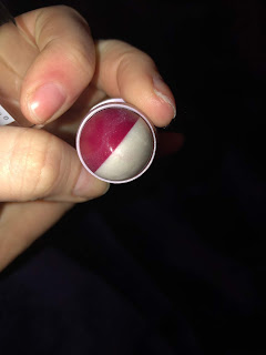
Instead, I opted to buy the product that looks like play-makeup. I don't mean that necessarily as an insult, but there is a plasticine quality to the product itself.

Anyway, the blush and highlight duo stick contains 6 g of total product, cost $11.00, and is housed in a nice looking tube the color of a kind of millennial lilac, if you will. Maybelline claims this product is waterproof and blendable. I can't attest to the waterproof claims, but I agree that the product is quite blendable.


The blush is a blue-toned red that applies in a nice wash of color. It was very easy to blend out.

The gloss half looks pearly, and I was afraid that when it would apply the pearl would be patchy, but that is not the case. We'll talk more about application shortly.


So below is all three swatches of product, but the most prominent swatch is the red, of course. 


Then, in a much brighter light, from left to right we have 1.) both the gloss and blush swatched together, 2.) the blush on its own, and 3.) the gloss on its own. 


I think the big question for many people is if the "gloss" side of this product actually behaves like a gloss. My answer? Sort of. On my skin the pearl pigments do look glossy. The product did not really dry down, but it wasn't sticky, either- just slightly powdery and emollient. The gloss can be blended out and leave microshimmers- the desirability of which depends on one's preference.

It did last longer than I thought it would- 5 hours on the face. I did reapply halfway through the day, which was easy to do. I have been very into the trendy, glossy look lately, especially during the time of year my skin is actually dry and craves moisture, and I definitely looked dewy, but in a good way.

This product is definitely not as long lasting as my Pearl highlighter from PF and my cream blushes from Lipstick Queen. I have never tried stick/glossy products from Milk or Glossier, so I can't exactly comment on how this product compares to others from those brands. 

In sum, I think this is a nifty product that I will continue to use, but if you are looking for durability and a super bright highlighter, I would not look here. The blush was nice, especially because I do like when blushes are on the sheerer side, and the color is definitely different than anything else I own in my blush collection.

I also had the urge to put this on my lips, but I have not done so. Yet. 

As always, thanks for reading. 

Thursday, February 21, 2019

Makeup of the Week in the Review

Hello! I decided to do a post on the collective things I used this week. Frankly, I wasn't feeling too adventurous in terms of color, but I did return to some forgotten faves as well as some new-ish faves. I'll talk about them all here! 

Wet 'n Wild Blush, Blazen Berry. I continue to really enjoy this blush, and am so impressed with how affordable and high-quality it is. I tend to pair it with more neutral eye looks, because the blush itself is neither particularly cool nor warm on me. 

Physician's Formula Eye Quad in Canyon Classics. The benefit of rebranding is the eventual clearance of the old stock, at reduced prices. For for $3 or $4 I picked up this quad at TJ Maxx. While I think the quality of the shades is there, especially the grey shade, the two "mid" tones are way too light and similar for my liking. I think PF could have included greater variety in this quad, and I wonder what the new version of Canyon Classics looks like.

Jordana Creamy Contour Stick in Light Sometimes I set this with bronzer, and sometimes I don't. It really depends on my mood. Still, I enjoy it and hope that I am making a dent in the amount of product. 

Wet 'n Wild Loose Highlighting Powder in Written in the Stars. Speaking of dents, this product will take me forever to use up. But that's okay- it is super pretty and I have found that it also makes a nice glossy eye shimmer if you sweep it on the eyes. If you can still find this highlighter, I strongly recommend it.  


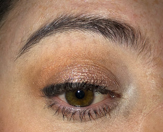
The next day I stepped out with some more neutral colors. From left to right:

1.) The inner corner highlight was Shiro's Fleece Lined Pillow Fort. I love this shadow so much that I actually emailed Shiro about it a few months ago. I am very picky with my inner corner highlights. The satin formula and warm white color make this a very natural but bright looking highlight.

2.) ABH Modern Renaissance, Burnt Sienna. I haven't used the MR in months, which is a shame. It contains a lot of mid tones and in-between tones to complement the Norvina palette, which is what I tried to do today.

3.) ABH Norvina, Eccentric. A gorgeous, pigmented, blend-able, etc. warm caramel matte.

4.) ABH Norvina, Passion. Surprisingly easy to work with, dark brick.

5.) Naked Cosmetics, Desert Sunset #02. I was very much surprised with my choice of lid. I wanted a natural "glossy" looking shimmer that would just melt onto my lid. Fortunately, this shadow did exactly that, and it wasn't a pain to use it at all. It is a warm pink shimmer.


I really liked this look, and it is:


In the past, my "easy look" consisted of oranges and gold, but as of late I have been realizing that cooler-tones work better for me.

Additionally, I have been using my Maybelline Age Rewind Concealer in Fair. Compared to my other concealers, this one is made best to last under the eye and it does. Recently, Maybelline has released more shades, including Ivory, which I did pick up.

Also, I've been struggling a bit with the Body Shop Drops of Youth Sleeping Mask. It does cause me to break out when overuse it. When my skin is really dry, it will do a great job of re-hydrating my skin, but if I use it multiple days in a row, it will break me out. I am not sure if it is because of the fragrance- which is heavy- or other ingredients, but I have to use it sparingly.

I have hauled quite a bit, which I should feel bad about but I don't. I bought four Sydney Grace shadows after much deliberation, as well as the Feral Palette from Menagerie Cosmetics. I also bought some skin care from Soap & Glory, and a lower lash mascara from Innisfree.

In terms of what else I am working on for the blog, I actually have my first empties post coming up! It never occurred to me to do one before.

Also, the releases are picking up and do I have an anti-haul of considerable proportions....

That's it from me! Thanks so much for reading! 😊

Wednesday, February 13, 2019

The Red Edit: My Favorite Red Makeup Products! (+ swatches)

A while ago, I did a write-up on my favorite pink products. While I do have to add more to that list, I wanted to make a list of my favorite red products, considering Valentine's Day is just hours away. On one hand, I don't really care for the blatant commercialization of that day, but on the other hand, hearts, and pink and red, and prettiness! Okay, favorite red products coming up:


So, from left to right, top to bottom, we have the Maybelline Matte Bar Palette, the Wet 'n Wild Coloricon Blush in Blazen Berry, the Coastal Scents single Shadow in Baked Clay, and the Hard Candy Cashmere Silk demi-matte cream gloss in Tartufo. 


Then we have three shades from the Modern Renaissance palette: Red Ochre,  Venetian Red, and Love Letter. 


And finally, the shade Passion from the Norvina palette. 


Here is a shot of all the eyeshadows: Baked Clay, Red Ochre, Venetian Red, Love Letter, Passion, and Brickhouse (from the Maybelline palette). 

Baked Clay is a shade I use once in a while to brighten up my crease when I am using darker reds. It is the closest thing I have to a true red shade, and I keep it around because it blends so well with other colors. 

And while it took me time to figure out how to use and love the reds in the Modern Renaissance, I am really in love with Passion from Norvina. I have been using it in my outer corner constantly, and I think it's useful in the way that so many people loved and used Bitten from Makeup Geek. 

Finally, the shade Brickhouse is of such excellent quality and is so comparable to the other reds here. If you do not have many warm-toned mattes in your collection, and want an easy way to use mattes, I would strongly recommend the Maybelline palette. 

Our last two swatches our of the lip gloss and blush.

Tartufo (left) is like a glossy lip stain, and is the only way I have worn red tones on my lips. Other than that I tend to avoid true red products. Blazen (right) is a perfect shimmery brick blush, and its shimmer has a slight pale pink reflect. I highly recommend all of these products- I also think you can find the Hard Candy Cashere Silk glosses at half off, as Walmart is phasing them out. 


So there you have it! It really does surprise me how versatile red is as a color. I do feel that this year, more than any year before, I have embraced red colors.

Thanks so much for reading!

Tuesday, February 12, 2019

Hard Candy Gitteratzi Eyeshadow Duo in Mercury Rising: Review and Swatches

This is a new release from Hard Candy, in the style of the new-ish Huda liquid eyeshadow duos. I found mine in Walmart for $7.00.

Each side contains a "glitter" and "chrome" finish, each containing 4.6 g of product.

Each side also has a slanted doe-foot applicator.

I selected the duo Mercury Rising, because I love pink-shifting duochromes with a neutral base.

Let's get into product pics, swatches, and an eye look!


In person, the colors look a bit different. The glitter side actually has a slight pink shifting coppery base, with cool-toned gold micro glitters. In the bottle, it almost looks like a bit of a green shift in certain lights, but that is not apparent on the eye.

The true stunner for me is the chrome side. The pink shift is actually quite strong and cool toned against a warm base. I really like it.


As with all products that have this type of pink pigment, the true intensity of the product can only be caught in certain lighting:


 To its credit, each side of the product sets quickly and did not budge when I rubbed it with my finger. It does remove easily with miscellar water and other cleansing products.

The chrome side is quite easy to build up, while the glitter side is pretty, but does not build up as nicely as the chrome side.

I do have sensitive eyes and I do tend to experience a light stinging sensation when I apply liquid eyeshadow products. I did experience that as well here, but I also experience it with the higher-end Stila liquid shadows. If you are like me and tend to experience a bit of stinging that quickly goes away, you can expect that with this product. For me it's not unbearable, and I will probably use the chrome side again, but I am not going to use the glitter side again.

Here is a look I did using eyeshadow primer. The mattes are from the Maybelline Matte Bar Palette.

The chrome side is on my lid and was fairly easy to work with. It spread evenly and did not clump up. To be on the safe side, though, I did apply it after I completed using the matte shadows.

The glitter is on my inner corner and on the inner part of my lid.


Like I said before, the chrome side is the real winner for me, and I don't really care about the glitter side. I will continue to use this product, even though I do caution people with sensitive eyes, due to the very short-term stinging I felt upon application.

Thanks so much for reading!

Thursday, February 7, 2019

What's New in my Makeup World?

It's been a while, has it not? I feel like I was on such a blogging roll, but necessity dictated a little bit of a break. Still, I collected some talking points on the way that I do want to share with you:

1.) I've been super neutral lately. Not that there's anything wrong with that. One shade that really has inspired this spate of neutral looks is L'Oreal's Goldmine, a long-discontinued shade from their Infallible line that I feel, rivals the sheen and delicacy of higher-end brands. I repressed it into a pan, and this is what it looks like:


In terms of matte colors I have really been favoring, all of my looks this week have been featuring the shade Toasted from Clionadh cosmetics. Toasted is a good name for it, as it is quite brown and warm.

2.) After much deliberation, I bought the updated version of the Menagerie Cosmetics Feral Palette. For reference, this is what it looks like:


I have seen some really cute looks with this palette, so I am eager to try for myself. Some looks I think are especially inspirational are:


Autumn love Everyone is waiting for spring and I'm waiting for autumn. I like this alternative wings in the moment. 😅 I love the eyeshadow formula from @menageriecosmetics so much. I can't wait to try the liquid lipsticks. 👀 Eyes: @makeuprevolution Conceal & Define Concealer in C1 @makeupgeekcosmetics Vanilla Bean @menageriecosmetics Feral Palette: Night Eyes, Mariposa, Ivy and Pack Leader @catrice.cosmetics Glow Patrol Glowy Highlighter in C01 Muse @festivalface Winter Maple glitter @jeffreestarcosmetics Velour liquid lipstick in Yummy and Drug Lord @essence_cosmetics liquid ink eyeliner waterproof @colourpopcosmetics creme gel liner in Puppy @kosmetik4less Lenilash in Twinkle Eyebrows: @colourpopcosmetics Precision Brow Colour in Black'n Brown @essence_cosmetics Make me brow in 02 browny brows
A post shared by Nekki (@mrsracoona) on


3.) I also bought the new body mist from Sol de Janeiro in the scent Coco Cabana. It smells like marshmallows and I am here for it. I have been wearing it for three days in a row now.

4.) I have also been using the new mascara from L'Oreal, the Unlimited Mascara, in Brown Black. Though it is a bit gimmicky, I have to say I do like that I can control the angle of the brush, and I do like how it brushes through my lashes. I don't have an official review, but I do like the mascara so far.

5.) I have been watching the tutorials of Regina/Picturresque, and I quite like some of the techniques she uses. She tends to not apply anything directly to her face with an applicator- it's with the brush or fingers. I tried to do that today and will continue to do so.

6.) New Makeup Releases? I am not impressed by what little I have seen from the new Rebel Rose collection from Wet 'n Wild. The colors look boring to me, unfortunately. I also think the new palette Dominique Cosmetics is sneak-peaking is a face palette. We'll see if I'm proven correct.

Also, we're seeing a surge in pink highlighters- which of course I am all for. Melt is coming out with two, which I will probably steer away from as they run pretty high in price. Fenty is also coming out with one called Wattabrat, which I am also appreciating from afar for that same reason.

That's all I got for now! Looking forward to posting more soon!!

Friday, February 1, 2019

3 Looks of the Week: Shimmer and Dark Mattes

I am not going to call myself an ABH stan. I own none of their face or lip products, and only (~oNlY) three of their eyeshadow palettes. But the reason I have three is because I just like the composition of their palettes.

Color-scheme wise, I think the ABH is super usable, and that colors are selected and grouped in very intentional and useful ways. This makes it a pleasure to use the palettes, and a reason I think I stuck to the Modern Renaissance and Norvina palettes- mostly- this week.

If my eyeliner looks weird this week there is very good reason- I am using the Mac eyeliner pot in Blacktrack, and am trying to get the hang of it.

Look One:

Incense in the crease, Volatile on lid, crease, and outer corner, Dazzling on 2/4 of inner lid, and Dazzling on center.


After the entire day passed, I came home and decided Dazzling should have been on the rest of the lid:


Wednesday:

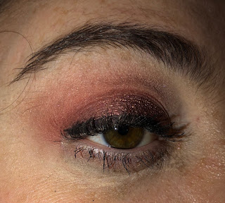
Reds from the Maybelline Matte Bar and Modern Renaissance. Lid was Norvina Rose Gold. 


Thursday:

Basically the same combination of mattes, just less pink.  The lid was a combination of Looxi's Bohemian on the inner 2/4, and then Flamethrower, a copper-pink duochrome from LoveLuxeBeauty. 


Thoughts:

This week I definitely embraced the darker warm mattes, especially red. I really like how it brings out the green in my eyes. I think this weekend I am going to avoid wearing mascara because I did feel like my lashes were a bit more difficult this week.

That's all I have for now- thanks for reading!
© *:・゚Cosmetically Inclined ・゚:*  
Blogger Templates made by pipdig