Showing posts with label coastal scents. Show all posts

Friday, April 26, 2019

My Curated Spring Succulent Palette: Overview and Swatches

Hello hello!

If you've ever given the "makeup organization" tag in my blog a gander, you'll see several posts dedicated to curated/themed palettes that I created out of my single collection. I stopped doing this, to my unhappiness, because I just wasn't being inspired. It's not that the color combinations I chose were not inspiring, it's that they were being housed in utilitarian, plain black palettes. After I gave up on that, my z-palettes were organized into three categories: shimmers, neutral mattes, and "fun" mattes. This was working for me for a while, until I got sick of it.

So enter Colourpop. I thought the palette I ordered from them would be larger, which was my one disappointment. Other than that though, I unintentionally was very much inspired by the design of the palette, and decided to see if I could fit some of my singles into it to build a palette around the design.

Here are my results:


I think this looks so pretty! And I like the balance of warm and cool. We'll go into each shade, and- if I feel like it- why I chose it for the palette. Swatches for each shade, in order of the palette, can be found below. 

1. Clionadh, Strawberry Mousse. While this pink is very light and is hard to see on my skin tone, I do think it looks pretty when built up over primer. It is also useful for blending out the edges of pink and purple looks. 

2. Clionadh, Maize. This is a cooler-toned yellow, which I appreciate it. Overall it's just a happy, vibrant, easy to blend yellow. 

3. Colourpop, Howlin'. This is a matte light warm lilac. I find this shadow really easy to work with. 

4. Nabla, Lotus. This is the one shadow that makes me think I do NOT need the Linda Hallberg Spectral palette. This matte is the perfect purple-pink for me and I love it. 

5. Colourpop, Lay Low. I bought this last summer, but this shade is still going strong. The quality of this shadow is excellent, but I didn't get much use out of it so far, which I don't get. 

6. Dose of Colors, Blueberry Swirl. From my old Eyes Cream palette, which feels like eons ago. It doesn't swatch all that great, but it is a useful muted cool-toned mauve to have around. 

7. BH Cosmetics Neon Chartreuse, depotted from the Back to Brazil palette. One of the few shades that stood out to me, quality wise,  from that palette. 

8. Looxi Green Apple, a warm light yellow-green. 

9. Coastal Scents, Tangelo Tint. 

10. Looxi, Pumpkin Spice Life. 

11. Coloured Raine, Princess. One of my favorite neutral pinks. 

12. Clionadh, Toasted. A very warm brown matte. 

13. Dose of Colors, a cool-toned brown from the Eyes Cream Palette. 

14. Colourpop, Team Captain. This shade is very soft. I barely use it, which I am trying to change. 

15. Sydney Grace, Tiara. A stunning metallic taupe. My description barely addresses how complex and multidimensional this shade is- it can be paired with a multitude of mattes. 

16. CP, On a Whimsy. A soft, pigmented, cool-toned true silver. A stunner. 

17. Looxi, Charmed. A duochromatic highlighter/topper. Excellent for layering or inner corner.

18. Nabla, Calypso. I have reviewed this on my blog before, check out my post here. 

19. Sydney Grace, Officer. This blurple-toned dark grey matte is so effortless and easy to work with and pair with a whole host of colors. 

20. Nabla, City Wolf. A warm grey matte. I've used this a lot and like it. 

21. Sydney Grace, Moon Landing. A brown-taupe matte, also very blendable and surprisingly unique.

22. Sydney Grace, a very interesting and frosty champagne duochrome with a lilac base. I love wearing this on easy, one-shadow days. 

23. Sydney Grace Siren. A blue-toned pink shimmer. Also complex, beautiful, gorgeous shade. Can't be more effusive. 

24. Looxi, Bohemian. A warmer rose-gold that is very intense. I put this in for another pink option, just warmer. 


Please click on the pics for a better view!

In many ways, this palette feels like a culmination of all the collecting I've been doing for that last couple of months, and I really feel I have something that is both inspiring and "me." If it were not for the cool packaging of Colourpop's palette, I don't know if this would ever come to fruition.  I look forward to continue using it!

As always, thanks for reading!

Wednesday, February 13, 2019

The Red Edit: My Favorite Red Makeup Products! (+ swatches)

A while ago, I did a write-up on my favorite pink products. While I do have to add more to that list, I wanted to make a list of my favorite red products, considering Valentine's Day is just hours away. On one hand, I don't really care for the blatant commercialization of that day, but on the other hand, hearts, and pink and red, and prettiness! Okay, favorite red products coming up:


So, from left to right, top to bottom, we have the Maybelline Matte Bar Palette, the Wet 'n Wild Coloricon Blush in Blazen Berry, the Coastal Scents single Shadow in Baked Clay, and the Hard Candy Cashmere Silk demi-matte cream gloss in Tartufo. 


Then we have three shades from the Modern Renaissance palette: Red Ochre,  Venetian Red, and Love Letter. 


And finally, the shade Passion from the Norvina palette. 


Here is a shot of all the eyeshadows: Baked Clay, Red Ochre, Venetian Red, Love Letter, Passion, and Brickhouse (from the Maybelline palette). 

Baked Clay is a shade I use once in a while to brighten up my crease when I am using darker reds. It is the closest thing I have to a true red shade, and I keep it around because it blends so well with other colors. 

And while it took me time to figure out how to use and love the reds in the Modern Renaissance, I am really in love with Passion from Norvina. I have been using it in my outer corner constantly, and I think it's useful in the way that so many people loved and used Bitten from Makeup Geek. 

Finally, the shade Brickhouse is of such excellent quality and is so comparable to the other reds here. If you do not have many warm-toned mattes in your collection, and want an easy way to use mattes, I would strongly recommend the Maybelline palette. 

Our last two swatches our of the lip gloss and blush.

Tartufo (left) is like a glossy lip stain, and is the only way I have worn red tones on my lips. Other than that I tend to avoid true red products. Blazen (right) is a perfect shimmery brick blush, and its shimmer has a slight pale pink reflect. I highly recommend all of these products- I also think you can find the Hard Candy Cashere Silk glosses at half off, as Walmart is phasing them out. 


So there you have it! It really does surprise me how versatile red is as a color. I do feel that this year, more than any year before, I have embraced red colors.

Thanks so much for reading!

Saturday, November 24, 2018

This Week's Z-Palette: The Pink Amber Palette

Hello hello! I decided to take inspiration from Angelica Nyqvist, who does weekly quads. To get more use out of my singles, I want to do weekly z-palettes, and then post my results. 

Of course, as I constructed this palette I already had some shades in mind, and then I really just worked around those. I ended up really liking how the names and colors went together, so I am going to call this the Pink Amber Palette.


From left to right, we have:

1.) Angel Face, Coloured Raine (CR). This is a very pale matte peach, excellent as a transition/lid setting shade. I have a considerable dip in this shade already, so my goal is to hit pan.

2.) Lay Low, Colourpop (CP). The quality of this shadow is so good, but I barely got any use out of it this summer. It is a warm leaning pink, so I think it is going to play nice with some of the oranges in this palette.

3.) Tangelo Tint Coastal Scents (CS). I very much enjoy this shade. It works really well on the skin, and provides a nice bit of brightness. I used this a lot a while ago, and am hoping to use more of it this week.

4.) Tangy Dijon, Vanessa's Vanity (VV). All the excitement I had getting this shade came out of the Subculture palette debacle. And then I didn't use it. I actually have been using more and more of it lately, but want to  be more consistent.

5.) Your Majesty, CR. This is such an intense and reflective gold shadow. Again, I don't use it enough even though it is so brassy.

6.) Doll Face, Looxi. This is a recent purchase that I have only swatched. I knew I wanted this to be in the z-palette, so I brought it Lay Low to give myself more options. This shade is a pressed pigment, with a pink base and strong gold shift, so I knew it would work well with the colors in this palette.


7.) Pumpkin Spice Life, Looxi. Another shade from Looxi that is somewhat recent but unused. It is really nice quality, too. This is a bright medium orange, brighter and a little darker than Tangelo Tint.

8.) Durty, Looxi. This one is actually a total surprise for me, in terms of quality. It is a light-medium matte brown that leans quite red-toned on the skin, and works well with a host of colors.

9.) Empress, CR. This is a very interesting and somewhat frustrating orange, because on my skin it looks very pink. I am hoping that pairing it with the other oranges in this palette will keep the look orange.

10.) Royal Prerogative, CR. A matte medium brown that blends so well.

11.) Chauffeur, CP. A shimmery orange-gold slight duochrome. Again, I made a fuss about buying this, and have yet to actually use it.

12.) Boujee, Looxi. This shade I have gotten some use out of. It's a rather insane shadow. In the pan, it looks like a regular gold shimmer, but it has a shift from red to blue/green. It definitely can make a typical neutral look more complex and interesting, and I think it fits well in the palette.

I am so excited to use this palette this week, and I will be sure to update the blog with some lewks!

Thanks for reading :)

Sunday, March 4, 2018

Orange Sheen EoTD


I am very pleased with how my eye look turned out today, so I thought I'd share. Let's get right into pictures, and then I'll describe how I did this look.


 The first thing I did was primed my eyes with Wet 'n Wild primer.

Then with a fluffy/flat brush that is actually called an "Illuminator" brush, I took the Coloured Raine shade Angel Face and then blended that all over my crease and up towards the browbone.

Then, on the primed lid, I applied the shade Caramelized by Coastal Scents onto it with my finger.  I blended some even a little bit in the crease, too.

I then took Coastal Scent's Tangelo Tint on a medium-sized blending brush and blended that into the crease, making sure that all the shimmer in the crease was blended away.

On the outer corner I took the Coloured Raine Shade Empress and blended that into the outer corner, into the crease. I used a larger blending blush for this.


Overall, I was super pleased with this look! 

Thanks for reading!

Friday, March 2, 2018

Coastal Scents Haul and Review + Face in Review

So my state is currently is getting hit by a storm..a nor'easter. It's really bad, especially for people living on the coast. While I still have internet, I thought I'd use the time I have to blog a bit about more trivial matters, like makeup.

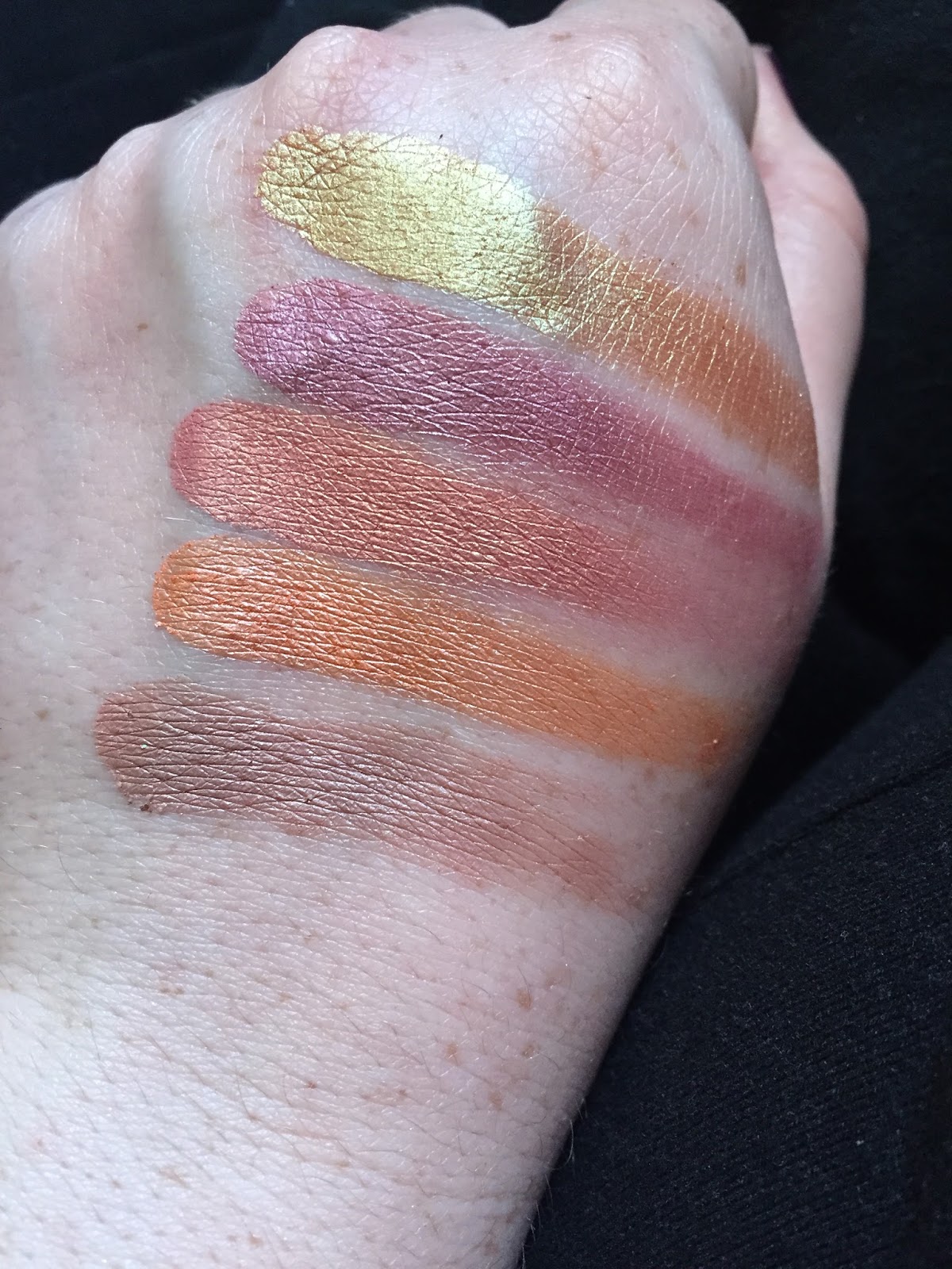
Yesterday my Coastal Scents order arrived. The swatches are below:


From top to bottom, we have Caramelized, 18K Gold, Lakeshore, Pale Pollen, and Tangelo Tint.

1. Caramelized is a smooth, opaque, almost red-toned dark gold. I am very impressed by this one.

2. 18K is also smooth and bright, but sheerer than I imagined. Not as impressed as I thought I would be.

3. Lakeshore is a light blue duo-chrome with a strong gold shift. Pictures of this that I've seen show it a bit more grey-toned, but in person the blue seems a bit more vibrant. Overall nice quality.

4. Pale Pollen is a very light yellow shimmer. I can't decide how I am going to use this!

5. Tangelo Tint is one that I am very excited, and a shade I feel has a place in my spring collection. It is a vibrant yellow-orange, and has a drier formula that can be built up. I wore this all day today, and it held up well over primer. Strongly recommend this one!

Face in Review:

I am saving a discussion of my eye look for tomorrow, as I have some thoughts about the new eyeliner I used. It is Physician's Formula's dupe for Benefit's ill-fated Push-Up Liner. Yeah.

Instead, I wanted to talk about a choice in my technique today as a way to remedy something I noticed yesterday. In the car mirror after work, I noticed the skin around my eyes was drawn and very dry. And I knew it was going to be a colder day, so when I did my makeup, the thought occurred to me after I applied concealer, was to take L'Oreal's Magic Perfecting Base and blend that in as well. I found that by the end of the day, my skin around my eyes still felt hydrated and comfortable. It's taken a while for me to use this product, because I feel I save it some reason for special make-up occasions, but now I have another use for it.

Thanks for reading!

Friday, January 5, 2018

Z-Palettes: Update!


Howdy! I thought I would take the time to talk about my recent changes to my z-palettes. During Black Friday, I bought an empty 12-pan palette from Coastal Scents. I have been trying to do something creative with it. Last week, I was trying to dupe my own "Yes, Please" palette, but found I just did not have to colors for it to even slightly resemble that palette. 

Instead, I made this my own personal palette of colors that I constantly reach for/am panning. 

The keys to the shadows is as follows:            

Soft Gold
ABH
Angel Face
Coloured Raine
Pumpkin Pie
Coastal Scents
Tangy Dijon
Vanessa’s Vanity
Cone
EyesCream
Palette
Peach
Coastal Scents
Amber
ABH
Dark Goldenrod
Coastal Scents
Fudge
ABH
Dark Salmon
Coastal Scents
Topaz
ABH
BH Cosmetics
Foil Palette

In terms of reviews, there's only two I want to talk about:

1. Dark Salmon:
Even though this shadow is technically a shimmer, it is loaded with a dark reddish peach pigment that can be really blended into the crease. This is an impressive shadow, and I put it into this palette when I was trying and failing to dupe the Yes, Please palette. I kept it in because I want to use more of it.

2. Topaz:
I haven't had a chance to use this on my eye yet. I just wanted to talk about how we had a little accident with it. I did drop my palette (not a huge drop at all), and when I went to pick it up, this one had cracked. This is a testament to the formula, I think, and how soft it is.

I also went ahead and re-arranged my z-palette, this time according to color, to get a more aesthetically pleasing look that will encourage me use more of the palette.


Wednesday, December 20, 2017

Z-Palette Talk-Through

So, a while ago I bought a new empty palette from Coastal Scents. It has 12 wells, and I filled it with my most-loved shades. It also includes two new shades, the top and bottom one in the third column from the left, Topaz and and Brownie. These were purchased at TJ Maxx, for $4 ea.

Here is what it looks like:


Also, I've posted a talk-through description and thoughts on the palette. Listen below:


Friday, December 1, 2017

EoTD: Modern Renaissance and Coastal Scents!

Hello hello!

Today I've continued by never-ceasing love of warm eyeshadows with a mostly-matte look. As I've noted before, I feel I've really narrowed down my eyeshadow preferences and have gotten a bit more capable.

Today I used Modern Renaissance, as well as the shade Pumpkin Pie from Coastal Scents. Pumpkin Pie was an instant favorite for me, because it is a bit darker compared to Angel Face from Coloured Raine, and so perfect to use as a transition, for a nice orange glow on the eyes.

Below I've swatched Angel Face (l) and Pumpkin Pie (r) for reference:


Coastal Scents is more known for their shimmers, but they do have some really excellent mattes, such as Pumpkin Pie. Before purchasing from Coastal Scents, I would do some research about which ones perform better than others.

And so here is the eyelook:


So this was my look by the end of the day, after about 10 hours.  We had Pumpkin Pie in the crease, Burnt Orange from MR on the lid and blended into the crease, and the outer corner I used Red Ochre. The only dud for me is Primavera, which I used in the inner corner. It did hold up, but applies patchy and is just an all-around annoying shimmer.

The eye primer I used was Wet 'n Wild, and I've already bought a back-up of it. Eyeliner was the usual Physician's Formula, and mascara was Essence Lash Princess in False Lash Effect. I don't seem to enjoy this as much as I did when I first opened it. Is that normal?

Anyway, I am pleased with the progress I am making on the Modern Renaissance, and I am also very pleased with Pumpkin Pie. After thinking about buying it for so long, I think it was a smart purchase.

Which makes me think of all the other Holy Grails in my collection- they were all things that I feel I did not get out impulse, which makes all the difference.

Thanks for reading!

Sunday, August 6, 2017

EoTD with z-palette single shadows

Good morning!

You know, it's ironic. In my quixotic quest to find the ideal purple eyeshadow, I think I have come to the point where I don't know purple eyeshadow even works on me.

Today's look mainly involved four single eyeshadows. I am trying to go back to enjoying the colors of my z-palette, especially because I know I have to destash at least one of them.

So, we have:
1.) Wet n Wild Creme Brule
2.) Coastal Scents Victorian Pear
3.) Coastal Scents Panama Rose
4.) ABH in Fudge


Now, I chose Victorian Pear as my transition color because it's on my list for possible shades to destash. It's a nondescript satin taupe, but randomly with green glitter that barely shows up.There are literally pieces of green glitter embedded in the shadow. When I first saw that, I thought it was a mistake. But when I actually used the color, I found the glitter was throughout. I'll try to post a picture of what I am talking about:


Anyway, I really liked how the shadow performed. It blended well. None of the glitter showed up.

On the lid I used Panama Rose, and I wish I set down glitter glue on my lid first. It's a really pretty metallic mid-toned purple.

Finally, we have blended in the outercorner ABH Fudge, which I love because its blendable and has just enough warmth. Definitely one of my favorite singles of all time.

Here are pictures of today's look. It's not actually one of my favorites but I am not going to re-do my makeup.


Thursday, June 29, 2017

Some Coastal Scents Swatches

About a year ago I purchased a set of Coastal Scents shadows, one shimmer and a couple of mattes. I was seriously unimpressed with what I received and ended up decluttering all of them. That set included Elven Gold, Paprika, Oktoberfest, Coconut Husk, Chamois Nude, and Oatmeal Tan. Elven Gold was a really boring color, and all the mattes excluding Chamois Nude (which I found patchy) ended up reading very similar on the skin.

For some reason, I ended back on Coastal Scents' site and saw they had another sale, with each hot pot 99 cents.  Doing a bit more research, and especially after viewing Lauren Mae Beauty's recent video on the shadows, I found I was better off buying their shimmers.

I received them and swatched them today. After this purchase, I definitely would buy again from Coastal Scents, though not anytime soon. My z-palette is currently full up and I simply do not have any room.

From top to bottom we have: Dark Goldenrod (my favorite), Panama Rose (second favorite), Peach, Georgia Peach, and Victorian Pear.


I still think I could have selected better shadows over all, as Victorian Pear is a little lackluster, even though it appears to have good color payoff. I tried to use it as a crease shade but on the skin, even with primer, it did not show up as a subtle shadow, as I had hoped. 

Lastly, I did write a lengthy rambling on my "quest" for the perfect purple shimmer, and I think I have finally found it. I did write about how ABH Rosette was still a little too red for me, and that Inglot shade was a total, unpigmented, poor formula (hard pan almost instantly) disaster. Well, please see below, the right shade. 


Here I have the Inglot shade, heavily built up (even though it does not appear so), next to one swipe of Panama Rose. I very much look forward to wearing it! 

Wednesday, June 28, 2017

Thoughts on Colourpop's Yes Please Palette (not a product review)

Currently out of stock, limited edition. Restock to be announced.

This palette is an excellent deal, of $16.00. It is also highly rated, with a score of A- from Temptalia. It is also a dupe for a waaaaay more expensive palette, the Sunset Palette, from Natasha Denonona (sp?).

For me, I think this palette is smart and an excellent summer version of the Modern Renaissance.Take a look:


 I love the bright yellow matte and orange shimmer, especially, and feel that I don't really have anything like that in my collection.

What is deterring me, however, are three things:
1.) I am seeing a lot of shimmers that I already do have in my z-palette.
2.) Aside from the yellow and tangerine, some of these colors can be substituted with the Modern Renaissance.
3.) A few days ago I placed an order with Coastal Scents that included the following:
Georgia Peach


Peach


 Dark Goldenrod


and Pumpkin Pie


Now, I did not plan on duping the Colour Pop palette, but I've found that the actual swatches of Coastal Scents shadows read a lot warmer than what is presented on the site (the above pictures). I do think that if I have these shadows, there's no need for the Colour Pop palette, and if I really wanted to, I should just find a good quality single of the yellow.

Now, if you did not already own any warm/sunny palettes, I see no problem with buying the Colour Pop one. Great deal, nice quality, and hopefully Colour Pop will make it a permanent part of their line.

© *:・゚Cosmetically Inclined ・゚:*  
Blogger Templates made by pipdig