Hello friends and neighbors! Welcome back to my little corner of the internet. Excuse me while I dust off some cobwebs.
To dip my toes back into blogging, I thought I would do something a bit fun. As you may or may not know, there is a tab on this blog called "Misc," where I post random things. This page has not been updated for a while, and currently serves as a relic of what I like or liked about makeup. I am specifically referring to the wish list/palettes I admired section.
Let's see what I picked, and if I would still pick them now.
1.) Pat McGrath Metallurgy Palette (pink and gold mini one)
My feelings on PML and Natasha Denona are not wholly positive, because not only is the cost of products from both brands prohibitive, the tactics that both brands use when it comes to pricing really make apparent the manipulation involved in the industry. At the time I added this to my list, these palettes (limited edition) went for $55. Then they got marked up to $65. They did not even feature the "Special Shades" that most people rave about. So, in short, though I liked one or two of the shades in this palette, looking back I have no desire to purchase this palette, even if it was available again. Too many golds and coppers, and nothing in there that truly interests me.
Not only that, 2019 was a terrible year for PMG fans, as false-scarcity was the name of the game for the year's releases. Not fun, and not encouraging for prospective consumers.
2.) Jouer Skinny Dip Foil Palette ($40 LE). Though this was a palette of metallic earth-toned "neutrals", also limited edition, I wanted to remember this palette and I still remember why. People talked about how the formula was incredibly good. Looking at the swatches on Temptalia's site, the formula appears bold and pigmented. However, any desire for this palette has faded. Why? I've learned that I really don't like thicker metallic and shimmer formulas. I prefer drier ones that can be used with glitter glue. Because of my oily and textured lids, the "wetter" type formulas are not very pleasant to work with. So even though I do think Jouer created a unique product that definitely got lost in the spate of releases, especially more affordable ones, I am content with the idea of never owning this palette.
In terms of the ultra-earth tones color schemes, I do believe that a palettes of those types of shimmers can be useful. But now that I have the sultry palette, as well as a couple of singles that fit the bill, I really don't feel the urgency to purchase it.
3.) Viseart Dark Matte Palette. Oof. I am going to be honest. I purchased the Viseart Coy Palette. I might make a post on that some day, but I will say I have been enjoying that palette immensely. That being said, I am not sure I would spend the same kind of coin for a palette of all mattes, including ones that look very similar. I do have a handful of singles in my collection from Devinah and Sydney Grace that somewhat mimic the vibes of this palette. But, I do have to hand it to Viseart. No matter how many times I look at this palette, it still seems fresh and interesting to me. Of course, I would have to pare down/use up my matte collection significantly before being convinced that I actually need this.
That wraps up a bit of my wishlist. But I do want to end with one palette that I actually do have regrets about, that I may end up adding to my wishlist: the Urban Decay Electric palette. The eventual markdowns on this palette were insane. Sadly, it is discontinued and near-impossible to get a new one, so that truly is my one regret. One shadow in particular- the matte bright yellow-green is something brands can't seem to get right, but the swatches of it from this palette looked amazing. Oh well. Maybe some day.
That wraps up this list. Do you have of these listed products? Let me know your thoughts on them below!
Thursday, December 26, 2019
Wednesday, July 3, 2019
An Eyeshadow 5 Month Retrospective
Exactly five months ago to the day, I posted to my new makeup-focused account for the first time. Prior to that, I had been building up my makeup collection and "skills" for about three years, or however long this blog has been active.
I thought it would be neat to compare a look from then with a look five months later, just to chart my growth, habits, and where I think I still am going.
So, let's get into it!

On my Instagram, I listed the following products: New Wave (in the crease) from the Subculture palette, Toasty from Clionadh Cosmetics (outer corner), and Boujee from Looxi Beauty (lid).
I am pretty sure I used the Colossal Express mascara from Maybelline (yellow bottle), and am certain I used MAC eyelienr gel in Blacktrack. I might have just purchased it.
What I like about this look: I know I wore this look to work, and I think I did a good job of pairing colors together. Because Toasty is a very warm brown, it worked as a natural deepening shade to New Wave, one of the better performing pigments from the Subculture palette. Furthermore, Boujee from Looxi is a gold metallic with a blue/green reflect, so it was an overall nice complement.
What I don't like about this look: The struggle wing- hands down. While it looks like I did also try to put color on the lower lash line, I feel like I could have put some brown there as well to make it a bit more intense. Prior to this, I hardly used color on the lower lashline- I was afraid it would make my eyes look smaller.
More brown overall could have been used more to deepen the outer corner.
I also noticed some transfer of the shimmer onto my crease/brow area, which could have been avoided with glitter glue and a more sparing use of the lid shade.
Finally, I know there must have been a fourth shade that I did not list because it did not show up in this picture that I am fairly confident I used to help blend New Wave up towards the brow bone. It would have been Angel Face from Coloured Raine. Unfortunately, it just didn't show up well enough, so I didn't list it. If I had used a more pigmented eyeshadow base this could have been avoided.
Overall, I would wear this look again, definitely, but with some major improvements.
And now let's move on to today's look:

Products used: Clionadh's Maize (cool-toned bright yellow, brow bone), ABH Eccentric (caramel brown in the crease, from the Norvina Palette), Colourpop Hooky (a mustard yellow in the crease and lid, from the Good Sport palette), Menagerie Cosmetics Mother Dragon (dark matte red on lash line) and Night Eyes (bright yellow under the red) , and Tammy Tanuka Crystals of Heliodor (shimmer on lid).
Mascara was the Innisfree Skinny Mascara paired with the Maybelline Snapscara. Waterline was Nyx Milk, eyeliner was again MAC Blacktrack. Eyeshadow base was Essence I Love Color Base, paired with Wet 'n Wild primer.
Where to begin?
What I like about the look: This look is part of a monthly makeup challenge, the #SummerTreatsMakeup. The look in question was inspired by Pineapple Cake. So right off the bat, the fact that this look is part of my contribution to an online community is something I really enjoy and am excited about.
In terms of the technical, I like the balance of colors, and I love how I managed to make a nice wing. It took me forever to get the hang of doing wings- of even attempting that.
Yellow, to my delight, is becoming more and more appreciated, and I do enjoy how glow-y this looks. Also, I went in with with a lot more color in the lower lashline, so there's definitely improvement there.
There's not really too much to say here. I'd wear it again!
What I don't like: I know the other eye did not have a wing at the same exact angle as this one. That's something I definitely have to work on. This was also the first time I tried to put a color in the waterline- big mistake. While I was very careful and didn't cause a reaction, I knew that either this is something I need to practice more or just give up on entirely.
I also think the outer edge with the brown and yellow could have more of an upturned shape towards my brow- it's just a bit amorphous as it is.
Would I wear it again? Yes, definitely.
Final take-aways:
There are definite improvements, right? And my collection didn't change drastically between then and now- aside from the Tammy Tanuka pigment, all products I used (except for the Mascara ), I've had in my collection already. It's just that my awareness of my face has sharpened, allowing me to more deliberate and creative. Though this was a slow process, it was at my own pace and really the natural outgrowth of being inspired and practice. If it wasn't for seeing what people are doing, how they are doing it, and trying it for myself, then I would have never gotten to the point that I am now.
I can't wait to see what the next five months will bring!
Thanks for reading.
Thursday, June 27, 2019
Re-Designing the BH Cosmetics Mini-Zodiac Cancer Palette
When I first heard, many months ago, that BH Cosmetics' spin-off of their two large zodiac palettes was going to be a set of the mini-palettes for each of the 12 signs, I thought it was a rather creative idea that had the potential to be great.
Well, I was quite wrong. Beginning with the Capricorn palette, each palette has been mostly met with disappointment or ambivalence, primarily due to the fact that the color selections did not jive with people's perceptions/interpretations of the signs.
Before we delve a little deeper into what BH Cosmetics did for the Cancer sign, I do want to give a bit of a disclaimer. I belong to the camp that believes zodiac and horoscope stuff is fun, and the opposite of scientific. I don't think we can justify behavior according to someone's star sign.
That being said, if it doesn't hurt people and allows people to have a way to express and/or understand themselves in different ways, why not?
Personally, I do think that I am pretty representative of the Cancer sign, and I was someone who looked at BH Cosmetics' release and did not respond to it at all:

Based on the brand description of "lunar hues," they seemed to build the palette around the Moon. And while it certainly is smokey and cool-toned and evocative of the sea, it's definitely missing the warmth and prettiness I think a Cancer would appreciate.
The mock-up, which I have already posted to Instagram, is by no means a definitive Cancer palette, but something I tried to construct as more usable, interesting, and cohesive. I hope you enjoy!

1. The center shade is MAC Dazzlepink highlighter. I think a lot of brands are playing with the idea of pink highlighter, and for a sign that is based on emotion and warmth, I think pink is a great color- especially a cooler-toned one with a more sheer base so that the highlighter can be used on a multitude of skin tones. I personally do not own Dazzlepink, but I do have a couple of highlighters in my collection that belong to the same family of pink-reflect highlighters: MAC Snowflushed (extremely glittery), Nabla Divinzer, Colourpop Everybody's Got a Weakness, Nabla Millenium (more of a peach reflect), and Looxi Stripped (has more of a white base but a strong cool pink reflect).
2. Then, moving clockwise at "12 o'clock", we have Nabla City Wolf. I chose this shade because it is a cool-toned medium gray that still evokes some of the feeling of the original palette- those sultry lunar vibes.
3. Speaking of lunar vibes, I wanted some gorgeous shimmers in there that were strange and duochrome and evocative of sea glass and shells, so I went with Earthshine by Colourpop. I do not personally own Earthshine, but similar colors are Glass Bull from Colourpop and Charmed by Looxi.
4. But I knew I needed a cool-toned red berry, to stand for passion, depth, the heart, and the crab. I chose Cascade from Lethal Cosmetics, because I almost bought it the other day, but stopped myself because I own the Modern Renaissance palette. That being said, I think Cascade is redder and warmer than Love Letter, but not enough for me to go and buy it.
5. I knew I wanted a neutral-ish shimmer, because I wanted to give the people options! However, I chose a silver-gold that I have been obsessed with for the longest time- Metallurgy from Pat McGrath. It looks nice and sandy in the palette, but also provides a bit of familiarity, color-wise.
6. Remember when I talked about sea glass? Well, this next shade is literal glass. It does not exist looking like this, but I really really wish something came out that is comparable. For the meantime, I am looking at Clionadh's multichrome shadows, specifically the shades Torch and Engrave. I thought this "shade" really captured the more imaginative side of Cancers.
7. MAC Uninterrupted- a classic Caramel shade. I think Cancers can be quite sweet and warm, and this shade is meant to capture that, as well as provide a neutral option for the shimmers, or even pair with the more vibrant mattes.
8. Papaya Juice by Prima Makeup. Prior to this project I had never heard of this brand, but I was on the hunt for a coral-like color that was the perfect balance of orange and red. I think this would pair brilliantly with Uninterrupted or Cascade, and definitely shows the passionate side of the Cancer.
9. Finally, Sydney Grace Officer. I wanted a cool-toned purple bruise shade- because (no joke) crabs also are blue, but also to represent the very deep funks and moods we can get ourselves in. Officer also functions as an excellent deepening shade for a variety of warm and cool colors.
This week I'll try to follow up with some looks inspired by this palette. And, who knows, maybe I'll make more mock-ups in the future!
Thanks for reading.
Sunday, June 23, 2019
Menagerie Cosmetics: Feral Palette and Single Shadows Swatches and Review
Towards the end of February, I purchased the Feral Palette from Menagerie Cosmetics for $40.00. Each pan contained 2g of product each. Though the color palette was definitely out of my comfort zone, it was one of those cases where I couldn't get it out of my head (cue Kylie Minogue). It reminded me of a field of wildflowers, and though I barely knew anything about the brand, I decided to take the leap.
The palette feels sturdy and is small-medium in size. Its packaging feels pretty luxe, and worth the cost. But, let's get into the shadows.


The palette ended up looking like this:

Lucky, Canary, Snuggle, Snoot, and Mother Dragon
Finally, Mother Dragon. I love this color and am so pleased to have it.
The palette feels sturdy and is small-medium in size. Its packaging feels pretty luxe, and worth the cost. But, let's get into the shadows.

1. Harmonia, a green blue matte. This is a super pigmented yet soft shade.
2. Wolfling, a coppery metallic base with a very strong pink reflect and sparkle. This shimmer formula is incredibly soft, so I advise caution when using it- a sticky base and a light hand is needed. The end result is gorgeous and very sparkly.
3. Canis Lupis, a milk chocolate matte. Very easy to blend.
4. Alpha, a darker matte taupe. This one required a little bit of building- but is soft and easy to work with. I find the color quite unique- depending on the other colors, it can come off more green or more brown.
5. Pack Leader. Seems a little more densely packed than Wolfling. It is a hot pink metallic with a gold sheen. The gold comes out more with glitter glue, and/or using it against other hot pink colors. This one stains.
6. Allium. A swatch of this is also in my second set below. A cooler-toned shade of purple that is one of the more "drier" mattes- but very easy to blend out.

Second set!

7. The bright red/orange is Mariposa. Highly pigmented and blendable.
8. Night Eyes. A true yellow. Its strong white base is being a little reflected in the flash photo above- in person, it reads a bit darker. Very blendable and bright, though.
9. Wisteria. A matte hot coral. It stained my skin slightly, but also very easy to work with. As with Night Eyes, the picture is showing the swatch a bit lighter than it really is.
10. Fenris. A yellow-toned matte green that is more densely pressed. It builds up evenly and quickly, though.
11. For me, Ivy was probably the most intimidating at first- it is a dark matte green. However, it still has a soft formula and just requires careful and deliberate placement before blending out.
12. Huechera, a highly reflective and flakey green with some golden sheen. This one definitely stained.
Okay, so as much as I was enjoying the colors and formula of the original Feral Palette, I also wanted to branch out and buy some singles to make my own custom palette. It ended up being quite neutral, so I renamed the palette The Domestic Palette. Funny, right?
The new shades are:
1. Lucky ($5.00), a light peachy gold metallic
2. Mother Dragon ($4.00), from the Dragon Child palette, a dark matte burgundy.
3. Canary ($5.00), a light warm yellow metallic shimmer with a strong pink glitter reflect
4. Snuggle ($4.00), a warm pastel pink
5. Snoot ($4.00) a soft rose-brown matte

Lucky, Canary, Snuggle, Snoot, and Mother Dragon

The two shimmers had the same formulation as Wolfling- very soft and requiring some sticky base. I probably didn't need to get Canary- its strong pink reflect makes it kind of repetitive among the other shimmers in the palette. Lucky, though, is proving to be quite multi-functional, with its slight silvery sheen that can be paired with both warm and cool colors.
I was quite pleased with Snuggle- I had not yet owned a warm pastel pink, and really enjoy how pigmented it is. Snoot was probably the other redundant purchase- I know I probably have shades like it in my collection, but I can't deny the quality of this one.
Finally, Mother Dragon. I love this color and am so pleased to have it.
All in all, I very much enjoy the matte formula especially of my collection. I think the shimmers are beautiful, but I am not yet sold on the different formulations they are using. I tend to prefer a drier shimmer, because I feel I have more control, but these are definitely wetter. Still, the colors are like nothing else in my collection.
I will continue to keeping track of Menagerie Cometics' releases. I am certain they will keep coming up with fun things.
Have you tried any of their products yet? Let me know your thoughts below!
Friday, May 31, 2019
Flower Beauty Blush Bomb in the shade Nectar: Review and Swatches
This has been the year of cream blushes for me. Despite the fact that I have historically been afraid of blush and cream products, I have found that certain cream color products do, in fact, work- and work well. This is certainly true of a new product from Flower Beauty, The Blush Bomb Color Drops. When I saw Temptalia review them favorably (she was the only one at the time who even featured the product), I knew I had to try one.
I picked up the shade Nectar for $9.99.


Blended out:

I will say that I personally prefer using a synthetic blush brush to blend out the product after I dot a little on my face- and if I have to build up, I will. When I first tried it out, I used my fingers, but I found that a brush creates a more even effect.
On the face, the finish is not matte, but not overly luminous. Moderately dewy, if you will. And with my combination skin, this stuff lasted the entire work day on my face.
In short- I highly recommend this product. While I can't definitely say it is a dupe for any Glossier Cloud Paints (because I have not purchased any), the Flower Beauty is an affordable option that also gives you a better deal. While Glossier Cloud Paints equal to $54.00/fl oz, Flower Beauty clocks in at $33/fl oz. Make of that what you will.
I am very excited to continue using this for the summer!
Thanks for reading! 🌞
I picked up the shade Nectar for $9.99.

The blush is housed in a squeeze tube and has a really cool applicator- the nozzle is entirely transparent.

It contains 0.3 oz of product, and the tube was definitely smaller than I thought it would be. However, the drops are quite concentrated and you only need a little bit.

Nectar is a very orange-leaning peach. I think it is quite unique to the berry and mauve tones already in my collection.

Blended out:

I will say that I personally prefer using a synthetic blush brush to blend out the product after I dot a little on my face- and if I have to build up, I will. When I first tried it out, I used my fingers, but I found that a brush creates a more even effect.
On the face, the finish is not matte, but not overly luminous. Moderately dewy, if you will. And with my combination skin, this stuff lasted the entire work day on my face.
In short- I highly recommend this product. While I can't definitely say it is a dupe for any Glossier Cloud Paints (because I have not purchased any), the Flower Beauty is an affordable option that also gives you a better deal. While Glossier Cloud Paints equal to $54.00/fl oz, Flower Beauty clocks in at $33/fl oz. Make of that what you will.
I am very excited to continue using this for the summer!
Thanks for reading! 🌞
Friday, May 17, 2019
Quick Reviews: Palettes I've Purchased @ TJ Maxx
I have talked before about the lure of TJ Maxx. I have admonished myself for falling prey to the discount and accessibility of products that normally I would not see in person. And despite all of this, I have in my stash three palettes from TJ Maxx. I'm going to review them for you today quickly by stating my thoughts, how I've used these products, but forego my usual swatches and looks.


For me, the standouts of this palette are the neutral mattes- I know that is ridiculous, but still. They blend really smoothly. My personal favorite is Flodder, which is a really cool yellow neutral beige. I don't have anything else like it.


First up is the infamous Subculture, purchased for about $22.00:

I actually have used this palette quite a bit, and think there's a lot of potential here. The darker shades are excellent to pack along the lash line, and the lighter mattes work really well on the lid and crease. Part of the failure of this palette comes from the two shimmers Cube and Electric. As you can see with my palette, these sealed up pretty badly, rendering them unusable.
Some bloggers have reported success with the two shades I mentioned, but I know ABH has different batches floating out there in the world. I didn't do my research, it seemed, and should have looked up the batch code prior to making the purchase. That being said, the strength of this palette is how it adds depth and coolness to looks, and works well with other palettes.
The next is my most recent purchase, the Bon Bons palette from Too Faced, for $20.00:
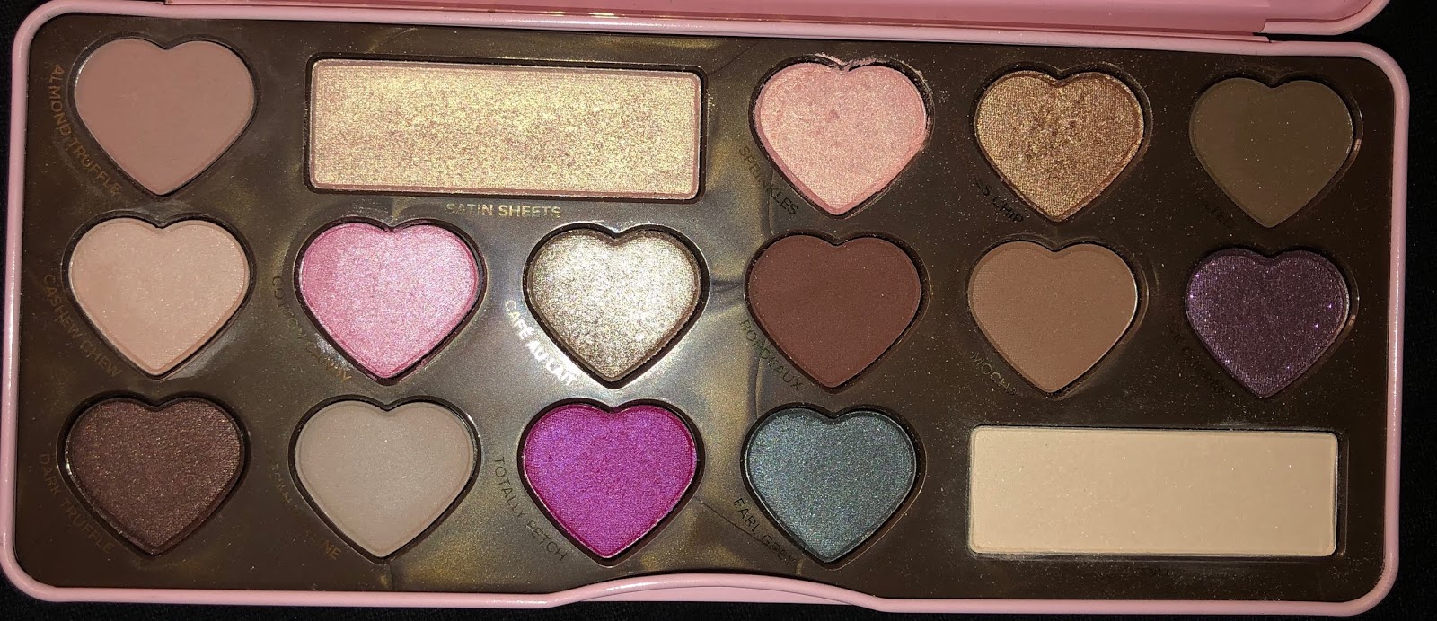
Right of the bat, I am shocked- SHOCKED- that at one point this palette was sold for $49.00. Only some of the mattes- like Mocha and Bourbon- are blendable and have impact, others get pretty muddy. I have been enjoying Satin Sheets as an inner corner highlight, as well as the cream matte to set my primer. I think the two standouts are the two brown shimmers.
To me this palette is a sign of the times and the beauty landscape of 2015, which included extremely neutral shadows, and formulas that were meant to go with techniques that are not used as commonly- like shimmers and satins in the outer corner (which I believe is making a comeback). Though I do think this is a pretty palette, and the smell of it is divine, I do believe this thing is completely superfluous. I'll take the L there.
Finally, we have the most inexpensive palette in this trio, and the one that I have the most to talk about, the Marvycorn palette from BH Cosmetics, which I think I got for about $6.00.
Let's first start with the highlighters. They are super creamy and could possibly run the risk of being chunky, though the formula is not dense, nor tightly packed. All three do contain micro shimmer. They look pretty on the skin- the darkest one I have to use as an eyeshadow, though.
For me, the standouts of this palette are the neutral mattes- I know that is ridiculous, but still. They blend really smoothly. My personal favorite is Flodder, which is a really cool yellow neutral beige. I don't have anything else like it.
The shimmer eyeshadows are a bit disappointing- thin formulas and not high-shine. The only one worth anything, the one that does not require glitter glue or any additional help- is the fourth shade in the top row- the slightly duochrome red-copper shimmer. That one is quite metallic and creamy.

The packaging, of course, is a major draw. It is prone to getting dirty, but I don't mind. I don't use this palette every day, but I do pull it out every so often and I enjoy it every time.
Looking at all of these palettes, do I have a life lesson? Yes, stop it. Not the most helpful advice. But I let curiosity get the better of me- especially with the Bon Bons palette. If I had really thought about what my collection looked like, I could have easily realized I didn't need it. The goal is to be a bit more thoughtful next time.
So that's all I got for today!
Thanks so much for reading.
Monday, May 6, 2019
May Inspiration Board
Greetings! I don't have much in the way right now of immediate products reviews. I have one very large review of Menagerie Cosmetics Eyeshadow coming up, as well as an updated highlighter master post. But, for now, let's talk about what is inspiring me, and what is not.
These types of posts fall under my Beauty Bookmarks tag. For more extreme versions, I do have old anti-hauls/and TMOS.
 I'm going to throw my hat into the ring (that's a phrase, right?), and make some guesses about what this palette is about, using some key words:
secret cove, tropics, meridian, island, beach, mermaid
Those are my guesses. I tend to like the color layout of Nabla palettes, though I have not yet actually purchased one. We'll see if I take the plunge.
Moving on, for about a year now I've had my eye on another Italian makeup brand, Neve Cosmetics.

Now, Neve currently does not ship to the US. But they did tell me via instagram they are working on it, and their instagram posts have been featuring text in both English and Italian. So, let's hope. I have my eye on a number of things, and I will say that Neve has an excellent range of duochrome shadows and powders that I have not yet seen from other brands.
One makeup artist on Instagram who I have been really inspired by is @lana_makeup_nails. One of her recent books I bookmarked is:

I think her use and placement of color is really cool and something I can replicate, while still looking quite unique.
I've been on a real kick with more watercolor-type shades, and this post from Clionadh is making me think I can use a shade with a blue shift on the lid with a warmer transition color, and it would look really cool.
The lid shade featured is Clionadh's new multi-chromes. Right now they are probably one of the most interesting things going on eyeshadow wise in the indie-verse. I would have to agree, though I wouldn't buy more than one or two.
I am wondering if a potential downside to multichromes is if they are not as versatile as regular shimmers or duochromes.

Anyway, my last bookmarked post is Glossier's new Bubblewrap, and eye and lip cream that is supposed to reduce texture for $26. As someone with sensitive eyes, I love eye cream. I am still using up my Soap and Glory eye gel, but once I finish I will gladly use the Glossier one.

Finally, let me comment on a couple of things I am staying far away from, mostly high-end single eyeshadows.
Most recently Viseart released its single eyeshadows, for $12 for about 2g. Pat McGrath is offering singles at $25 for 1 g. Now, I enjoy buying singles quite a bit. But I am not impressed by these prices. I do think Viseart is definitely giving you a better deal, but both companies have left me a bit disappointed- they are fully capable of producing gorgeous, interesting colors, and I don't see them.
For PML, the singles serve as a complement to the palettes- the assumption is you have at least one large one and one small one, and you need a transition color or something. For Viseart, the color selection is a bit more interesting, but the colors have a muted quality (save for the handful of literally neons).
For me, I prefer to collect singles that are unique and singular, and that complement my palettes, not the other way around. Especially if I am going to invest more than the usual amount, and especially if indie companies are offering a lot of product at a good price, too. While it is exciting that a person does not have to pay $100-something to try PML, I don't think it's exactly fair that we have to pay a fourth of that to "sample" or "try," PML. I think that mentality minimizes how much money you're putting into it, exactly.
So, that's my spiel. Let me know your thoughts!
These types of posts fall under my Beauty Bookmarks tag. For more extreme versions, I do have old anti-hauls/and TMOS.
First thing coming up is what I assume to be a new palette from Nabla. Now, I do love Nabla singles, but the quality of the palettes is a little more contentious. They have been sneak-peaking the cover of the palette which features rich burgundy, gold accents of suns, seashells, and other symbols, and maybe tropical flowers?

secret cove, tropics, meridian, island, beach, mermaid
Those are my guesses. I tend to like the color layout of Nabla palettes, though I have not yet actually purchased one. We'll see if I take the plunge.
Moving on, for about a year now I've had my eye on another Italian makeup brand, Neve Cosmetics.

Now, Neve currently does not ship to the US. But they did tell me via instagram they are working on it, and their instagram posts have been featuring text in both English and Italian. So, let's hope. I have my eye on a number of things, and I will say that Neve has an excellent range of duochrome shadows and powders that I have not yet seen from other brands.
One makeup artist on Instagram who I have been really inspired by is @lana_makeup_nails. One of her recent books I bookmarked is:

I think her use and placement of color is really cool and something I can replicate, while still looking quite unique.
I've been on a real kick with more watercolor-type shades, and this post from Clionadh is making me think I can use a shade with a blue shift on the lid with a warmer transition color, and it would look really cool.
The lid shade featured is Clionadh's new multi-chromes. Right now they are probably one of the most interesting things going on eyeshadow wise in the indie-verse. I would have to agree, though I wouldn't buy more than one or two.
I am wondering if a potential downside to multichromes is if they are not as versatile as regular shimmers or duochromes.

Anyway, my last bookmarked post is Glossier's new Bubblewrap, and eye and lip cream that is supposed to reduce texture for $26. As someone with sensitive eyes, I love eye cream. I am still using up my Soap and Glory eye gel, but once I finish I will gladly use the Glossier one.

Finally, let me comment on a couple of things I am staying far away from, mostly high-end single eyeshadows.
Most recently Viseart released its single eyeshadows, for $12 for about 2g. Pat McGrath is offering singles at $25 for 1 g. Now, I enjoy buying singles quite a bit. But I am not impressed by these prices. I do think Viseart is definitely giving you a better deal, but both companies have left me a bit disappointed- they are fully capable of producing gorgeous, interesting colors, and I don't see them.
For PML, the singles serve as a complement to the palettes- the assumption is you have at least one large one and one small one, and you need a transition color or something. For Viseart, the color selection is a bit more interesting, but the colors have a muted quality (save for the handful of literally neons).
For me, I prefer to collect singles that are unique and singular, and that complement my palettes, not the other way around. Especially if I am going to invest more than the usual amount, and especially if indie companies are offering a lot of product at a good price, too. While it is exciting that a person does not have to pay $100-something to try PML, I don't think it's exactly fair that we have to pay a fourth of that to "sample" or "try," PML. I think that mentality minimizes how much money you're putting into it, exactly.
So, that's my spiel. Let me know your thoughts!
Saturday, April 27, 2019
Quick and Cheap Recommendations
I know, cheap is sort of a subjective term. But bear with me. All the products listed here can be found at Walmart or Target (some at Ulta), and are reasonably affordable for the amount of product you get and the quality of it, compared to other brands in the same product category.

Let's begin with the Elf Lip Lacquer in Clear. It costs $2.00 and contains 8 fl oz. I picked this up because I thought the packing was nice and minimal, and the plastic looked thick and sturdy. I do quite like clear lip gloss, and this was kind of a careless purchase that I didn't really think much about. After applying it, I was happily surprised. For one, it doesn't have that typical mineral-oil flavor that comes with many cheaper lip glosses. Instead, it has a mild vanilla flavor that disappears. In a word, this lip gloss is comfortable. I have been reaching for it constantly, and have made a large dent in the tube.
Next is The Good Stuff intensive nourishment cream (leave-in conditioner), bought at Target for $8.00 for 7.7 fl oz. The story with this one is that all winter I was using the Bumble and Bumble Hairdresser's Oil Shampoo and Conditioner. At first, it made my hair really nice, but over time and as the weather got warmer, I felt my hair getting oilier and oilier. So I stopped using conditioner all together, and my hair got very dull. So I was kind of hapless and frustrated when I stumbled across this product- surprised at first by its reasonable price point. Be aware, though, this isn't some salon/indie hair brand with a magically low price point- it's owned by Unilever.
Still, after washing my hair with Head and Shoulders (because I have a dry/itchy scalp), I applied this to my damp hair. I really like how it brought back sheen and softness to my hair, without making me feel greasy. It also has a really nice salon-shampoo scent that definitely lingers throughout the day.
FYI, my hair is medium-thick is naturally kind of inconsistently wavy. *shrug*.
The mascara that I am currently using and would definitely recommend is The Pret a Volume Smoky Mascara in Velvet Black from Catrice. I did not get the Waterproof one because I feel waterproof sticks to closely too my lashes and is too difficult to remove.
It costs $.7.00 and you get .37 oz of product. Snooping around other mascaras from other ranges, this mascara is quite hefty and contains more product than the L'Oreal Lash Paradise (0.28 oz), and the Benefit Roller Lash (0.3 oz).
I have seen some mixed reviews of this mascara online. My own lashes are naturally curled and chaotic at times. I don't really want length out of a mascara, just volume and definition, which this mascara most certainly provides. The formula was a bit creamier and easier to work with when the mascara was newer. Some mascaras get better as they "age," but I felt this one was more potent in the beginning. Still, I am continuing to quite happily use this.
Next is Ponds Rejuveness Anti-Wrinkle Cream. I buy mine at Walmart in the mini, which contains 1.75 oz (50 g) and cost maybe $3.00. I can't find the mini online :(. I would buy it from the travel-friendly section. . It does come in two other sizes, the largest containing 14.1 oz (40 g), and currently on sale for $13.82. This is my second time using up a container of this, and I have definitely mentioned this product on the blog before.
Still, it bears repeating. As someone who uses Retinol 1-2 times a week, this is a great product for those days when I am not applying Retinol. The cream has a strong fragrance, and I usually take a break after using it for a couple of days, to prevent breakouts. If you have sensitive skin or skin that is raw from exfoliation or something else- be aware. Even today because my nose was red and raw from allergies, getting the tiniest speck of this cream on my nose was a bit painful.
Other than that, I really enjoy this cream. It makes my skin feel plump and does minimize lines on the face.
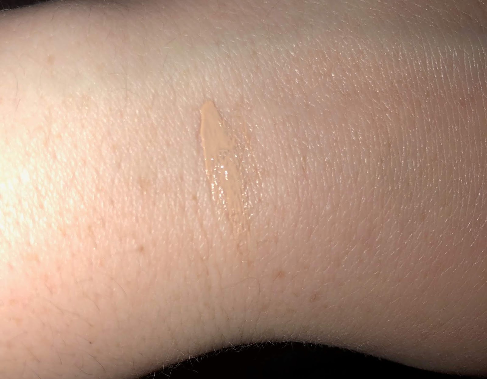
The next one is a newer purchase, the Neutrogena healthy skin anti-aging perfector (whew looong name). Mine is in the shade ivory to fair (10). This one is the priciest item on my list, at $10.59 (Target), for 1 FL oz of product. I have been on the look out for a BB Cream with SPF that is light enough for me. When I saw this, and read that The Muse approved this, I snapped it up.
I was unsure how well it would match me, but I am happy to say that it does a great job of blending into my skin tone:


It don't wear it alone, though, I layer it on top of Australian Gold SPF 50.
Overall, I have found myself pretty open to trying things from Neutrogena, even though some of their offerings are weirdly expensive- like that $15.00 highlighting stick?? If they can scale back the cost of some of their products, I think they would be even in a better spot- because I do like what I have tried from them so far.
And last, we have a brush! The Elf Flawless Concealer brush has been so much more enjoyable to use than my Real Techniques concealer brush. The Elf one costs $3.00, and has a fluffy, outward shaped brush head that is also rounded. I find it to be the perfect shape to blend under my eyes, as well as on my face. The shape of the brush really makes it easy to buff out concealer, rather than patting it or brushing it, which is what I felt the somewhat flat head of the RT brush was doing. I picked mine up at CVS, I believe.
So those are all my recs! Would love to know what you think- have you tried any of these?
Thanks for reading.
*** Redacted Rec: Burt's Bees Intensive Overnight Lip Treatment. Oh hey, if you made it this far down the page, then congrats! I have some bonus content for you- a redacted recommendation. This means that I was going to recommend the Burt's Bees lip mask on the premise that it was cheap, but some simple math has proven me wrong!
I really need to thank one of my fave bloggers, Brutally Honest Beauty. On her instagram stories, she was posting price comparisons of comparable drugstore vs. high-end products according to price per gram or oz, and actually found that in some cases the higher end product was actually the more cost-effective option.
This is true of the BB Lip Mask, which costs $8.68 for .25 oz. This means it costs $34.75/oz.
Let's compare this with a higher end mask- Laniege, a company that is known for its lip masks. Well, theirs costs $20 for .7 oz, or $28.00 for 1 oz. So the Laniege one seems to be the more practical option, especially for a product that does get a lot of use.
In sum, I redacted it because I don't think consumers are exactly getting the best deal. And now I have something to add to my wishlist- I saw that Laniege had a vanilla option!

Let's begin with the Elf Lip Lacquer in Clear. It costs $2.00 and contains 8 fl oz. I picked this up because I thought the packing was nice and minimal, and the plastic looked thick and sturdy. I do quite like clear lip gloss, and this was kind of a careless purchase that I didn't really think much about. After applying it, I was happily surprised. For one, it doesn't have that typical mineral-oil flavor that comes with many cheaper lip glosses. Instead, it has a mild vanilla flavor that disappears. In a word, this lip gloss is comfortable. I have been reaching for it constantly, and have made a large dent in the tube.
Next is The Good Stuff intensive nourishment cream (leave-in conditioner), bought at Target for $8.00 for 7.7 fl oz. The story with this one is that all winter I was using the Bumble and Bumble Hairdresser's Oil Shampoo and Conditioner. At first, it made my hair really nice, but over time and as the weather got warmer, I felt my hair getting oilier and oilier. So I stopped using conditioner all together, and my hair got very dull. So I was kind of hapless and frustrated when I stumbled across this product- surprised at first by its reasonable price point. Be aware, though, this isn't some salon/indie hair brand with a magically low price point- it's owned by Unilever.
Still, after washing my hair with Head and Shoulders (because I have a dry/itchy scalp), I applied this to my damp hair. I really like how it brought back sheen and softness to my hair, without making me feel greasy. It also has a really nice salon-shampoo scent that definitely lingers throughout the day.
FYI, my hair is medium-thick is naturally kind of inconsistently wavy. *shrug*.
The mascara that I am currently using and would definitely recommend is The Pret a Volume Smoky Mascara in Velvet Black from Catrice. I did not get the Waterproof one because I feel waterproof sticks to closely too my lashes and is too difficult to remove.
It costs $.7.00 and you get .37 oz of product. Snooping around other mascaras from other ranges, this mascara is quite hefty and contains more product than the L'Oreal Lash Paradise (0.28 oz), and the Benefit Roller Lash (0.3 oz).
I have seen some mixed reviews of this mascara online. My own lashes are naturally curled and chaotic at times. I don't really want length out of a mascara, just volume and definition, which this mascara most certainly provides. The formula was a bit creamier and easier to work with when the mascara was newer. Some mascaras get better as they "age," but I felt this one was more potent in the beginning. Still, I am continuing to quite happily use this.
Next is Ponds Rejuveness Anti-Wrinkle Cream. I buy mine at Walmart in the mini, which contains 1.75 oz (50 g) and cost maybe $3.00. I can't find the mini online :(. I would buy it from the travel-friendly section. . It does come in two other sizes, the largest containing 14.1 oz (40 g), and currently on sale for $13.82. This is my second time using up a container of this, and I have definitely mentioned this product on the blog before.
Still, it bears repeating. As someone who uses Retinol 1-2 times a week, this is a great product for those days when I am not applying Retinol. The cream has a strong fragrance, and I usually take a break after using it for a couple of days, to prevent breakouts. If you have sensitive skin or skin that is raw from exfoliation or something else- be aware. Even today because my nose was red and raw from allergies, getting the tiniest speck of this cream on my nose was a bit painful.
Other than that, I really enjoy this cream. It makes my skin feel plump and does minimize lines on the face.
The next one is a newer purchase, the Neutrogena healthy skin anti-aging perfector (whew looong name). Mine is in the shade ivory to fair (10). This one is the priciest item on my list, at $10.59 (Target), for 1 FL oz of product. I have been on the look out for a BB Cream with SPF that is light enough for me. When I saw this, and read that The Muse approved this, I snapped it up.
I was unsure how well it would match me, but I am happy to say that it does a great job of blending into my skin tone:

It don't wear it alone, though, I layer it on top of Australian Gold SPF 50.
Overall, I have found myself pretty open to trying things from Neutrogena, even though some of their offerings are weirdly expensive- like that $15.00 highlighting stick?? If they can scale back the cost of some of their products, I think they would be even in a better spot- because I do like what I have tried from them so far.
And last, we have a brush! The Elf Flawless Concealer brush has been so much more enjoyable to use than my Real Techniques concealer brush. The Elf one costs $3.00, and has a fluffy, outward shaped brush head that is also rounded. I find it to be the perfect shape to blend under my eyes, as well as on my face. The shape of the brush really makes it easy to buff out concealer, rather than patting it or brushing it, which is what I felt the somewhat flat head of the RT brush was doing. I picked mine up at CVS, I believe.
So those are all my recs! Would love to know what you think- have you tried any of these?
Thanks for reading.
*** Redacted Rec: Burt's Bees Intensive Overnight Lip Treatment. Oh hey, if you made it this far down the page, then congrats! I have some bonus content for you- a redacted recommendation. This means that I was going to recommend the Burt's Bees lip mask on the premise that it was cheap, but some simple math has proven me wrong!
I really need to thank one of my fave bloggers, Brutally Honest Beauty. On her instagram stories, she was posting price comparisons of comparable drugstore vs. high-end products according to price per gram or oz, and actually found that in some cases the higher end product was actually the more cost-effective option.
This is true of the BB Lip Mask, which costs $8.68 for .25 oz. This means it costs $34.75/oz.
Let's compare this with a higher end mask- Laniege, a company that is known for its lip masks. Well, theirs costs $20 for .7 oz, or $28.00 for 1 oz. So the Laniege one seems to be the more practical option, especially for a product that does get a lot of use.
In sum, I redacted it because I don't think consumers are exactly getting the best deal. And now I have something to add to my wishlist- I saw that Laniege had a vanilla option!
Friday, April 26, 2019
My Curated Spring Succulent Palette: Overview and Swatches
Hello hello!
If you've ever given the "makeup organization" tag in my blog a gander, you'll see several posts dedicated to curated/themed palettes that I created out of my single collection. I stopped doing this, to my unhappiness, because I just wasn't being inspired. It's not that the color combinations I chose were not inspiring, it's that they were being housed in utilitarian, plain black palettes. After I gave up on that, my z-palettes were organized into three categories: shimmers, neutral mattes, and "fun" mattes. This was working for me for a while, until I got sick of it.
So enter Colourpop. I thought the palette I ordered from them would be larger, which was my one disappointment. Other than that though, I unintentionally was very much inspired by the design of the palette, and decided to see if I could fit some of my singles into it to build a palette around the design.
Here are my results:


Please click on the pics for a better view!
In many ways, this palette feels like a culmination of all the collecting I've been doing for that last couple of months, and I really feel I have something that is both inspiring and "me." If it were not for the cool packaging of Colourpop's palette, I don't know if this would ever come to fruition. I look forward to continue using it!
As always, thanks for reading!
If you've ever given the "makeup organization" tag in my blog a gander, you'll see several posts dedicated to curated/themed palettes that I created out of my single collection. I stopped doing this, to my unhappiness, because I just wasn't being inspired. It's not that the color combinations I chose were not inspiring, it's that they were being housed in utilitarian, plain black palettes. After I gave up on that, my z-palettes were organized into three categories: shimmers, neutral mattes, and "fun" mattes. This was working for me for a while, until I got sick of it.
So enter Colourpop. I thought the palette I ordered from them would be larger, which was my one disappointment. Other than that though, I unintentionally was very much inspired by the design of the palette, and decided to see if I could fit some of my singles into it to build a palette around the design.
Here are my results:

I think this looks so pretty! And I like the balance of warm and cool. We'll go into each shade, and- if I feel like it- why I chose it for the palette. Swatches for each shade, in order of the palette, can be found below.
1. Clionadh, Strawberry Mousse. While this pink is very light and is hard to see on my skin tone, I do think it looks pretty when built up over primer. It is also useful for blending out the edges of pink and purple looks.
2. Clionadh, Maize. This is a cooler-toned yellow, which I appreciate it. Overall it's just a happy, vibrant, easy to blend yellow.
3. Colourpop, Howlin'. This is a matte light warm lilac. I find this shadow really easy to work with.
4. Nabla, Lotus. This is the one shadow that makes me think I do NOT need the Linda Hallberg Spectral palette. This matte is the perfect purple-pink for me and I love it.
5. Colourpop, Lay Low. I bought this last summer, but this shade is still going strong. The quality of this shadow is excellent, but I didn't get much use out of it so far, which I don't get.
6. Dose of Colors, Blueberry Swirl. From my old Eyes Cream palette, which feels like eons ago. It doesn't swatch all that great, but it is a useful muted cool-toned mauve to have around.
7. BH Cosmetics Neon Chartreuse, depotted from the Back to Brazil palette. One of the few shades that stood out to me, quality wise, from that palette.
8. Looxi Green Apple, a warm light yellow-green.
9. Coastal Scents, Tangelo Tint.
10. Looxi, Pumpkin Spice Life.
11. Coloured Raine, Princess. One of my favorite neutral pinks.
12. Clionadh, Toasted. A very warm brown matte.
13. Dose of Colors, a cool-toned brown from the Eyes Cream Palette.
14. Colourpop, Team Captain. This shade is very soft. I barely use it, which I am trying to change.
15. Sydney Grace, Tiara. A stunning metallic taupe. My description barely addresses how complex and multidimensional this shade is- it can be paired with a multitude of mattes.
16. CP, On a Whimsy. A soft, pigmented, cool-toned true silver. A stunner.
17. Looxi, Charmed. A duochromatic highlighter/topper. Excellent for layering or inner corner.
18. Nabla, Calypso. I have reviewed this on my blog before, check out my post here.
19. Sydney Grace, Officer. This blurple-toned dark grey matte is so effortless and easy to work with and pair with a whole host of colors.
20. Nabla, City Wolf. A warm grey matte. I've used this a lot and like it.
21. Sydney Grace, Moon Landing. A brown-taupe matte, also very blendable and surprisingly unique.
22. Sydney Grace, a very interesting and frosty champagne duochrome with a lilac base. I love wearing this on easy, one-shadow days.
23. Sydney Grace Siren. A blue-toned pink shimmer. Also complex, beautiful, gorgeous shade. Can't be more effusive.
24. Looxi, Bohemian. A warmer rose-gold that is very intense. I put this in for another pink option, just warmer.


Please click on the pics for a better view!
In many ways, this palette feels like a culmination of all the collecting I've been doing for that last couple of months, and I really feel I have something that is both inspiring and "me." If it were not for the cool packaging of Colourpop's palette, I don't know if this would ever come to fruition. I look forward to continue using it!
As always, thanks for reading!
Tuesday, April 23, 2019
Covergirl TruNaked Peach Punch Eyeshadow Palette: Review and Swatches
Is it bad that I forgot I owned this?
As I was prepping for a skin care declutter (more on that later), I found the palette among all of my skin care products, and I realized I never did give it a good go. So, today I bring to you my results!
The TruNaked line from Covergirl costs about $10.00 per palette. Many of them dupe higher-end palettes, but some do not. The one I purchased, Peach Punch, is meant to dupe the Too Faced Peach Palette, which I have never tried.
Also notable is that the Trunaked line uses a "slurry" formula, as coined by Musings of a Muse, to describe the manufacturing process of pouring the product into the pans, as opposed to pressing loose powder. Maybelline also has this in their City Mini and Lemonade/Soda palettes.
I am somewhat a fan of the slurry type of eyeshadows. However, I do find that when they are tricky, they can be a double-edged sword-the metallics end up being too subdued, and the mattes too soft and easily muddied. Is that true of this palette, though?
Let's get into pictures.

Each shade is swatched below on the back of my hand, which was primed with a foundation mix I was trying out (it did not go well- the mix, I mean).


Let's get to the bottom line. Would I repurchase this palette? No, not at all. It was a bit redundant to begin with, considering what my collection looks like.
You should know that the mattes are finicky- do not use more than one at a time (when it comes to blending). The neutral shimmers are lovely, but not very metallic, and not very unique.
The peach smell, before I forget, is okay. I am pretty sensitive when it comes to fragrances, and this one did not bother me.
I have to say that I don't recommend this palette. I think there are better options out there.
Thanks for reading!
As I was prepping for a skin care declutter (more on that later), I found the palette among all of my skin care products, and I realized I never did give it a good go. So, today I bring to you my results!
The TruNaked line from Covergirl costs about $10.00 per palette. Many of them dupe higher-end palettes, but some do not. The one I purchased, Peach Punch, is meant to dupe the Too Faced Peach Palette, which I have never tried.
Also notable is that the Trunaked line uses a "slurry" formula, as coined by Musings of a Muse, to describe the manufacturing process of pouring the product into the pans, as opposed to pressing loose powder. Maybelline also has this in their City Mini and Lemonade/Soda palettes.
I am somewhat a fan of the slurry type of eyeshadows. However, I do find that when they are tricky, they can be a double-edged sword-the metallics end up being too subdued, and the mattes too soft and easily muddied. Is that true of this palette, though?
Let's get into pictures.

Each shade is swatched below on the back of my hand, which was primed with a foundation mix I was trying out (it did not go well- the mix, I mean).

On the back of my hand, the matte browns were very vivid and pigmented, par the course. The coral/peach matte, which actually contains lavender microshimmers that do not appear on the arm, swatched terribly- even with my finger over primed skin! Some of the more neutral shimmers appear to swatch evenly and with intensity.
I did two eye looks. The first is a very standard eye look I thought most people would go for when using this palette.
On primed eyes (that I did NOT set), I first went in with the coral matte on my crease. It seemed to apply evenly and with pigment, but then I went in with the mid-toned reddish brown, located at the far right of the palette. That's when things got a bit muddy and patchy.
Still, I soldiered on, and applied glitter glue to my lid. I then applied the second shade in the palette, a pink shimmer with gold reflects, which barely showed up on my lid.

Feeling a bit forlorn, I decided to go an all-shimmer route for Look #2, using the two colors that swatched the best. I applied glitter glue all over my lid and applied the fifth shade- a brown champagne shimmer- to the inner half on my eye, and the seventh shade- a dark brown shimmer- on the outer corner. Taking a pointed-tip fluffy brush, I carefully applied the two shimmers above my crease, blending them together.
I really liked how this look came out!


Let's get to the bottom line. Would I repurchase this palette? No, not at all. It was a bit redundant to begin with, considering what my collection looks like.
You should know that the mattes are finicky- do not use more than one at a time (when it comes to blending). The neutral shimmers are lovely, but not very metallic, and not very unique.
The peach smell, before I forget, is okay. I am pretty sensitive when it comes to fragrances, and this one did not bother me.
I have to say that I don't recommend this palette. I think there are better options out there.
Thanks for reading!
Monday, April 22, 2019
Shimmery Spring Recommendations! (+ swatches)

It seems that Spring has finally arrived! I have a couple of products to bring to you today that you might enjoy if you are in the mood for some transitional spring-time shimmer and glow! As always, click on the pics for higher resolution.
The first product is from Catrice. It is the 3D Glow Highlighter in the shade Pinch of Rose. The pan contains 3 g of product for $4.89. The design mimics ABH's old design for their highlighters, but nevertheless I did find this highlighter pretty unique in its own right.

For starters, it's incredibly soft. Catrice claims that the pan contains "two tones," but I am not sure if I can make them out. Some squares look darker than other ones? Some swatches below:


And here we have everything blended out.
If you are concerned the product seems too dark for you, I have found the product's pink base looks quite flattering. The highlighter is much warmer in the pan, and I tend to see a silvery lilac reflect, which is quite cool. And don't let the finger swatches fool you- on the skin, it is less metallic and more "glass skin" finish. Highly recommend.
Next, another product from Catrice is their Eye Gloss stick, which I purchased at Ulta for $6.00. I quite like the concept of this, especially if you think about how Mac, Linda Hallberg, and Danessa Myricks all have a clear gloss like product, but for a lot more. Of course, the Catrice pen only contains 2 g, and I should note that I only use it on my face as a highlight. Still, I think it's a nifty product if you want a more natural shimmer and glow on your face.
We also have another lip icing from Pixi, which I picked up from Target for $14.00. have reviewed the first one that came out as a limited edition collaboration with Chloe Morello. The one I picked up, Toffee, is like the Chloe Morello one but amped up.It is even more jam-packed with shimmer.It does the slightest grit, but also the same comfortable and hydrating formula.

Pixi on left, Catrice eye gloss on right.

Moving on, we have a new face product from Milani called Soft Focus Glow Complexion Enhancer, in the shade Nude Glow, the lightest. It cost $11.00. According to Milani, this product provides an instant boost of hydration and brightness. Some reviewers claim it is a dupe for the Charlotte Tilbury Hollywood Filter, but I can't verify that claim. All I know is that I find it absorbs quickly, and does leave a nice glow on the skin. I also enjoy the fact that it comes in a pump bottle.

Unblended, left and blended, right.

And our last product is very exciting- the new Kaja Beauty Bento Bouncy Shimmer (oh my that's a lot of words) Eyeshadow in the shade Orange Blossom! Each shade in the trio contains 0.85 g of product, for a total of $21.00.
The shades are: Sandy Peach, Sun-Kissed Tan, and Baked Cinnamon.


Overall, the Orange Blossom Trio is quite pretty and quite easy to use! It has this multi-faceted yet glossy finish, and is just very pretty. I don't have anything else like them in my collection and have been really enjoying using them.
So that's all I got for today! Let me know if you have tried any of these!
Thanks for reading.
Monday, April 8, 2019
My Sheer Lipstick/Color Balm Collection: Reviews and Swatches
With the weather getting warmer, I wanted to make a post of all the (4 total) lip products in my collection that are not quite lipsticks, and not quite lip glosses. They are the sheer in between, designed to be hydrating and give a natural tint to the lips.
Before we go any further, I should say that I have fair cool toned skin, and I love brown-toned lipsticks. My aims when buying brown toned lip products include avoiding ones that are too warm and yellow. All of the products listed are ones that I very much enjoy and use often.
Let's get started!

4.) Lastly, we have the Stila Color Balm Lipstick in Jessie. I originally had the grey-toned shade, Grayson, which I used up completely. Grayson provided a nice bit of coolness to my lips, and I was happy to have paid full price for it, which was $22.00. However, by chance I spotted Jessie, a brown-taupe shade at TJ Maxx for $8.00. It is a bit warmer than I would have preferred, but I do enjoy the formula. The balms from Stila are probably the most moisturizing, and have the most melty formula. They also have a mint scent to them. Currently Stila is selling them at $8.00 as well.


Hope this was informative! Let me know if you tried any of these!
Before we go any further, I should say that I have fair cool toned skin, and I love brown-toned lipsticks. My aims when buying brown toned lip products include avoiding ones that are too warm and yellow. All of the products listed are ones that I very much enjoy and use often.
Let's get started!

From left to right, we have:
1.) Clinque Almost Lipstick in Black Honey. I bought this a while ago from Ulta for $18.50. It contains nearly 2g of product. While Black Honey provides a natural, glossy, mulberry stain to my lips, I will say this product is not hydrating. I usually layer it with a lip balm like Carmex or Vaseiline. Still, the color is very flattering, but I do not think I would repurchase.
2.) Becca Lush Lip Colour Balm in Chai. Originally sold for $22.00, I picked this up by chance for $5.99. It contains a little more than 5g of product. Though I paid so little for it, I would happily pick up other colors in the line as well- like Milk Chocolate. This also has a natural glossy finish, and is very close to my actual lip color. It is not too warm and the color pigments adhere more to the skin than the other products in this post. It also has a sweet vanilla taste to it.
3.) Flesh Fleshy Lips Lipstick in Gorge, a warm brown that looks cooler in the bullet. Gorge costs $18.00 for more than 5g of product, so its a better deal than Black Honey. It is the sheerest product in the collection, but it does deliver in providing a warm tone. The texture is very smooth, buttery, and balm-like and feels quite hydrating. It leaves a natural, glossy finish.
4.) Lastly, we have the Stila Color Balm Lipstick in Jessie. I originally had the grey-toned shade, Grayson, which I used up completely. Grayson provided a nice bit of coolness to my lips, and I was happy to have paid full price for it, which was $22.00. However, by chance I spotted Jessie, a brown-taupe shade at TJ Maxx for $8.00. It is a bit warmer than I would have preferred, but I do enjoy the formula. The balms from Stila are probably the most moisturizing, and have the most melty formula. They also have a mint scent to them. Currently Stila is selling them at $8.00 as well.


Hope this was informative! Let me know if you tried any of these!
Subscribe to:
Posts (Atom)