Showing posts with label bh cosmetics. Show all posts

Thursday, June 27, 2019

Re-Designing the BH Cosmetics Mini-Zodiac Cancer Palette

When I first heard, many months ago, that BH Cosmetics' spin-off of their two large zodiac palettes was going to be a set of the mini-palettes for each of the 12 signs, I thought it was a rather creative idea that had the potential to be great.

Well, I was quite wrong. Beginning with the Capricorn palette, each palette has been mostly met with disappointment or ambivalence, primarily due to the fact that the color selections did not jive with people's perceptions/interpretations of the signs.

Before we delve a little deeper into what BH Cosmetics did for the Cancer sign, I do want to give a bit of a disclaimer. I belong to the camp that believes zodiac and horoscope stuff is fun, and the opposite of scientific. I don't think we can justify behavior according to someone's star sign.

That being said, if it doesn't hurt people and allows people to have a way to express and/or understand themselves in different ways, why not?

Personally, I do think that I am pretty representative of the Cancer sign, and I was someone who looked at BH Cosmetics' release and did not respond to it at all:


Based on the brand description of "lunar hues," they seemed to build the palette around the Moon. And while it certainly is smokey and cool-toned and evocative of the sea, it's definitely missing the warmth and prettiness I think a Cancer would appreciate.

The mock-up, which I have already posted to Instagram, is by no means a definitive Cancer palette, but something I tried to construct as more usable, interesting, and cohesive. I hope you enjoy!


1. The center shade is MAC Dazzlepink highlighter.  I think a lot of brands are playing with the idea of pink highlighter, and for a sign that is based on emotion and warmth, I think pink is a great color- especially a cooler-toned one with a more sheer base so that the highlighter can be used on a multitude of skin tones. I personally do not own Dazzlepink, but I do have a couple of highlighters in my collection that belong to the same family of pink-reflect highlighters: MAC Snowflushed (extremely glittery), Nabla Divinzer, Colourpop Everybody's Got a Weakness, Nabla Millenium (more of a peach reflect), and Looxi Stripped (has more of a white base but a strong cool pink reflect).

2. Then, moving clockwise at "12 o'clock", we have Nabla City Wolf. I chose this shade because it is a cool-toned medium gray that still evokes some of the feeling of the original palette- those sultry lunar vibes.

3. Speaking of lunar vibes, I wanted some gorgeous shimmers in there that were strange and duochrome and evocative of sea glass and shells, so I went with Earthshine by Colourpop. I do not personally own Earthshine, but similar colors are Glass Bull from Colourpop and Charmed by Looxi.

4. But I knew I needed a cool-toned red berry, to stand for passion, depth, the heart, and the crab. I chose Cascade from Lethal Cosmetics, because I almost bought it the other day, but stopped myself because I own the Modern Renaissance palette. That being said, I think Cascade is redder and warmer than Love Letter, but not enough for me to go and buy it.

5. I knew I wanted a neutral-ish shimmer, because I wanted to give the people options! However, I chose a silver-gold that I have been obsessed with for the longest time- Metallurgy from Pat McGrath. It looks nice and sandy in the palette, but also provides a bit of familiarity, color-wise.

6. Remember when I talked about sea glass? Well, this next shade is literal glass. It does not exist looking like this, but I really really wish something came out that is comparable. For the meantime, I am looking at Clionadh's multichrome shadows, specifically the shades Torch and Engrave. I thought this "shade" really captured the more imaginative side of Cancers.

7. MAC Uninterrupted- a classic Caramel shade. I think Cancers can be quite sweet and warm, and this shade is meant to capture that, as well as provide a neutral option for the shimmers, or even pair with the more vibrant mattes.

8. Papaya Juice by Prima Makeup. Prior to this project I had never heard of this brand, but I was on the hunt for a coral-like color that was the perfect balance of orange and red. I think this would pair brilliantly with Uninterrupted or Cascade, and definitely shows the passionate side of the Cancer.

9. Finally, Sydney Grace Officer. I wanted a cool-toned purple bruise shade- because (no joke) crabs also are blue, but also to represent the very deep funks and moods we can get ourselves in. Officer also functions as an excellent deepening shade for a variety of warm and cool colors.

This week I'll try to follow up with some looks inspired by this palette. And, who knows, maybe I'll make more mock-ups in the future!

Thanks for reading.

Friday, May 17, 2019

Quick Reviews: Palettes I've Purchased @ TJ Maxx

I have talked before about the lure of TJ Maxx. I have admonished myself for falling prey to the discount and accessibility of products that normally I would not see in person. And despite all of this, I have in my stash three palettes from TJ Maxx. I'm going to review them for you today quickly by stating my thoughts, how I've used these products, but forego my usual swatches and looks.


First up is the infamous Subculture, purchased for about $22.00:


I actually have used this palette quite a bit, and think there's a lot of potential here. The darker shades are excellent to pack along the lash line, and the lighter mattes work really well on the lid and crease. Part of the failure of this palette comes from the two shimmers Cube and Electric. As you can see with my palette, these sealed up pretty badly, rendering them unusable. 

Some bloggers have reported success with the two shades I mentioned, but I know ABH has different batches floating out there in the world. I didn't do my research, it seemed, and should have looked up the batch code prior to making the purchase. That being said, the strength of this palette is how it adds depth and coolness to looks, and works well with other palettes. 

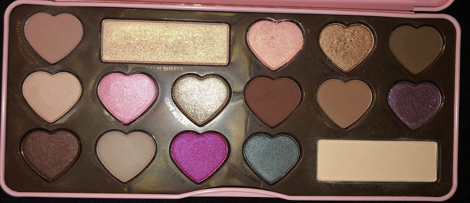
The next is my most recent purchase, the Bon Bons palette from Too Faced, for $20.00:


Right of the bat, I am shocked- SHOCKED- that at one point this palette was sold for $49.00. Only some of the mattes- like Mocha and Bourbon- are blendable and have impact, others get pretty muddy. I have been enjoying Satin Sheets as an inner corner highlight, as well as the cream matte to set my primer. I think the two standouts are the two brown shimmers. 

To me this palette is a sign of the times and the beauty landscape of 2015, which included extremely neutral shadows, and formulas that were meant to go with techniques that are not used as commonly- like shimmers and satins in the outer corner (which I believe is making a comeback). Though I do think this is a pretty palette, and the smell of it is divine, I do believe this thing is completely superfluous.  I'll take the L there. 

Finally, we have the most inexpensive palette in this trio, and the one that I have the most to talk about, the Marvycorn palette from BH Cosmetics, which I think I got for about $6.00. 

Let's first start with the highlighters. They are super creamy and could possibly run the risk of being chunky, though the formula is not dense, nor tightly packed. All three do contain micro shimmer. They look pretty on the skin- the darkest one I have to use as an eyeshadow, though. 

For me, the standouts of this palette are the neutral mattes- I know that is ridiculous, but still. They blend really smoothly. My personal favorite is Flodder, which is a really cool yellow neutral beige. I don't have anything else like it. 

The shimmer eyeshadows are a bit disappointing- thin formulas and not high-shine. The only one worth anything, the one that does not require glitter glue or any additional help- is the fourth shade in the top row- the slightly duochrome red-copper shimmer. That one is quite metallic and creamy. 


The packaging, of course, is a major draw. It is prone to getting dirty, but I don't mind. I don't use this palette every day, but I do pull it out every so often and I enjoy it every time. 

Looking at all of these palettes, do I have a life lesson? Yes, stop it. Not the most helpful advice. But I let curiosity get the better of me- especially with the Bon Bons palette. If I had really thought about what my collection looked like, I could have easily realized I didn't need it. The goal is to be a bit more thoughtful next time. 

So that's all I got for today! 

Thanks so much for reading.

Sunday, April 7, 2019

BH Cosmetics Aurora Lights 10-Piece Brush Set Review

It is no secret that I am a fan of BH Cosmetics. When it comes to their brushes, though, it can be hit or miss. Some of my brushes from them have lasted years, while others have just fallen apart. I do think they are stepping up their game, though, as evident in a more recent (as in a couple of months old already) Aurora Lights set.

Still available online for about $18-$22.00, I was lucky enough to find mine at TJ Maxx, for $13.00. 


The bristles are very soft,  synthetic, and dyed black. I for one am a huge fan of this because I hate staining. The handles are of a solid weight and are a vibrant mint color. The ferrules feel secure on the handle. 

I know that I will use all of these, save for the slanted contour brush. My top three brushes, though, are these:


From top to bottom, we have the
#2 Tapered Blush Brush
#4 Tapered Blending Brush
#10 Detailing Pencil Brush. 

The reason I like #2 and #4 so much is because BH has given me a lot of length so the brush is not too stiff and can be manipulated easily. I like that #4 can be used on both the eye and face, and #2 is a perfect size for applying powder underneath my eyes. 

But the true winner? #10. For some reason, this type of brush has been hard to find. I am getting tired of using slanted brushes to apply gel eyeliner, and thought that this type of brush would give me the most control. I was right- it is a total game-changer. The bristles have some- but not too much-give, so that applying gel eyeliner, and even making a small wing, is easy. 

I even like the bag it came with. The design is printed on both sides, and is of a decent size. I will probably store my makeup for work in there. 

Overall, I think this is a great collection and would recommend it. 


Tuesday, January 22, 2019

Weekend Makeup Weirdness@_@

All of the looks you will see today are me just playing around and practicing with makeup.  None of the looks are great on their own, but I will still critique them and think about what I've learned from each.

Before I start, I should say that Monday was 10 degrees, and I think that even though my house is warm enough, the coldness is definitely disorienting. I've had a massive headache and sinus problems all day.

Alright, back to the program:

1. Lewk One: Yellow and Green


lololol just. what was I doing. 

So this weekend was all about getting crease colors throughout my entire crease, and not just the outer 3/4, as is the case with all my looks. Then, I blended in Looxi's Green Apple something matte, and Colourpop Team Captain on the outer corner. I used a yellow and green shimmer from the CP Good Sport Palette. 

The yellow is Clionadh's Maize, a formula which I really enjoy. I just wish I didn't put it on the lower lash line. 

The highlighter I am using is Shiro Milk-Light of Moon, a green iridescent highlighter. 

Overall, I am not going to replicate this look any time soon. I feel too much like a tropical bird.


Look #2: A Lavender look inspired by Makeup Mouse. 

I liked this look a lot more, but I didn't like how much product and blending it required. I am way too lazy. So, crease is Clionadh's Strawberry Mouse and Dose of Color's Blueberry Swirl. Lid was Give Me Glow Ride or Die, and outer corner was the dark purple from the BH Cosmetics' Zodiac Palette.

Inner corner was a highlighter- Looxi's Stripped, a pink/lavender iridescent. 

Overall, in the future I would probably due a more simple version of this look, just more toned down.


Look Three: Good and Gold

This was a really simple look using a loose pigment from Meech and Mia in Copper, and then two brown mattes from the Maybelline Lemonade palette. 

My entire brow bone looks glossy- something I rarely do- using Wet 'n Wild's loose highlighter in Written in the Stars (current favorite). 


The Maybelline mattes muddied together a bit, but I do like the warm and cool contrast of the shimmers.


Favorites?

Clionadh's Maize (though it had no business being shmeared all over the lower lash line), WnW's Written in the Stars,  and Meech and Mia's Copper.

Surprise fails?

Looxi's Stripped continues to underwhelm me, as both an inner corner highlight and highlighter on the face. I just don't get the intensity that I want and I don't know why 😣

Saturday, December 15, 2018

Teeny Flower Eye Art

Last night for some reason I remembered how flower graphic eye art was a thing for a while. Though that trend calmed down, I thought it was a reasonably easy and pretty thing for me to practice.

The only thing I was missing was a paint palette/colorful liquid liners. As I somewhat expected, the Wet 'n Wild paint palettes were on sale at Walmart, and I bought the Brights one for a dollar. Woo! I set most of my products with the BH Cosmetics Back to Brazil palette, except for the white, which I used the Nyx Milk crayon.

Here are my results:


So I primed my eye with Mac paint pot in Painterely. I set my brown bone and crease with neutral shades from the Maybelline Lemonade palette.

I then lined my eyes with the L'Oreal Paradise Liquid liner. I then made my wing green by placing the green shade from the Wet 'n Wild paint palette, and then dark green to light green eyeshadow on top to set it.

I then made the flowers, beginning with the red. This was a bit time consuming, and I had to use a very steady hand. I did not  do anymore than I had to because I was afraid of ruining it.

What cinches it and makes the flowers look like flowers is the orange/yellow in the center, as well as the dashes of light green for leaves.


Overall, I would definitely do this look again. I probably won't try to make the end of my wing green, and instead just make a solid black wing for greater contrast. 

The biggest thing was selecting the right brushes, which had to be small enough to such small details. And of course...lots of practice:


Thanks for reading!  
(❦ ᴗ ❦ ✿)

Friday, November 23, 2018

Greenery: EoTD


 How did I get this look? I used the following products:

-Wet 'n Wild Eyeshadow Primer
-Too Faced Glitter Insurance Glitter Glue
-BH Cosmetics Take Me Back to Brazil Palette
-Colourpop Good Sport Palette
-Colourpop Single Team Captain
-Looxi Green Apple Eyeshadow Single
-LA Splash Ark-i-tekt Limer
-Essence Lash Princess Mascara

 -After applying primer, I used the chartreuse pigment in the BH Cosmetics palette. As discussed elsewhere on the blog, it is probably one of the better shades, quality wise, in the palette. I ran that in the crease and up towards the brow bone.

-I then took Green Apple and blended that into the crease and on the lid.

-I then took, very carefully, Team Captain from CP, and Trophies from the GS palette, and blended that into the outer corner.

-To diffuse the look a bit more, I used the chartreuse pigment again, blending it down a bit towards my lower lash line.

-Finally, I used two shimmers from the Good Sport palette, after applying glitter glue to the first half of my lid. I used the gold shimmer Licious in the inner corner and inner part of the lid, and then the green shimmer EBB on the rest of lid, as seen below.


All in all I really like this look and would probably wear it again. Maybe not to work, though....

Thanks for reading!


Tuesday, May 29, 2018

Cool-Toned EoTD

I used a total of three eyeshadow palettes for this look, and I have no regrets.

Let's take a look at a picture of my eye, after a long day of work:

So, here is what I used:
-BH Cosmetics Back to Brazil Palette (purple in crease)
-Modern Renaissance Warm Taupe in crease and lid. I've missed this color so much!
-Queen of Hearts palette by Coloured Raine in Royal Highness on Lid.

Overall, I quite liked this look, and definitely want to go a little warmer tomorrow, but still use Warm Taupe. I forgot how much I liked it!

Tuesday, May 22, 2018

BH Cosmetics Liquid Foundation Naturally Flawless Review

So a couple of days ago, I bought the BH Cosmetics Naturally Flawless Liquid Foundation. I am running out of Maybelline Fit Me, and wanted to try something new.

I liked the fact that it came in a pump bottle and was (and still is) on sale for $6.00.

The color I chose was 201- ivory.

Right off the bat, I noticed a couple of things. This foundation is completely fragrance free. It has an odd consistency that I have not noticed with other foundations before- like sticky. You know how on baking shows, whipped cream is ready when it becomes glossy and you can make peaks with the whisk or beater? This also makes peaks, and is ever so slightly stiff when blending out.

I myself use a stippling brush- but for it to work I cannot drag it across my face, I have to actually take the time to stipple. It works really nicely with a beauty sponge as well.

Coverage-wise, I would say it is solidly medium. A first layer did not cover completely a bit of redness I have on my cheeks- I needed a second layer for those. However, the finish was luminous and flattering, and it wore well on my face.

I like the color-match, and the stickiness does dry down. I am impressed with the wear-time. Being combination dry-oily, after the end of the day I did not perceive much of a difference in terms of wear time and oiliness with that of my other foundations.

It definitely competes with Maybelline Matte and Fit Me, and I will happily keep using this.

Onto the pics:


One pump. See what I mean about the peak?

Heavy Swatch

Just after blending the swatch out. Notice the glossy finish that will eventually set. 


Saturday, May 19, 2018

Today's EoTD w/ Take Me Back to Brazil

Well, I got it. After months of being sold out, I bought with a brush set: the BH Cosmetics Take Me Back to Brazil palette.

There is a lot to like about this palette. It feels sturdy, with a really gorgeous design. On the inside, the 35 pans are on the smaller side, and are comprised the whole spectrum of bright colors. There is also a lot not to like, which I will talk about in my official review of the palette.

But for now, let me show you the eye look that I made with it and another palette:


So, for this look, I set Mac Painterly Paint Pot with Colourpop's Hear Me Out. However, I only placed the matte cream shade on the brow bone and crease.

With a large BH fluffy crease brush, I swept a yellow matte into the crease. The yellow matte was a mix of a couple from this palette.

I then took and orange matte with a smaller crease brush and blended that in.

With the same brush, I also added some pink tones in there.


 I then took the shade Crown from the Queen of Hearts palette from Coloured Raine, and applied that to the lid.
 Eyeliner was my usual, Physician's Formula.

Mascara was Lash Princess by Essence (I go back and forth on this one- currently I like it) and Pixi Lower Lash Mascara, with some Lash Princess on top of that 

We'll see how it wears throughout the day. I'm most interested to see if the colors will just ended up mixing together, especially because I am not technically wearing primer. As of now, I think this is a rather pretty look.

Thanks for reading!

Thursday, April 26, 2018

Cool-Toned EoTD w/ Rose Gold

The more I do this, the more I realize that I am perfectly capable of creating nicely executed looks on the spot. This may sound a bit braggadocious, but I enjoyed today's look a lot more than yesterday's. Let me show you the pics of my eyes after a full day of work:


blurred to show shine

a teensy bit of creasing with the cream color shade- without flash it was not noticeable

So overall this was a clean little look. I used a couple of products, and in the same order:

1.) Wet 'n Wild Eyeshadow Primer
2.) Mac Painterly Paint Pot
3.) Carli Bybel Palette Cream Shadow (browbone and crease)
3.) Ardency Inn Rose Gold Single on lid
4.) Carli Bybel Palette light mauve matte blended into the crease
5.) Shiro Cosmetics Fleeced Line Pillow Fort in the inner corner

Face powder wise, my highlighter was a light-handed Hustle and Glow from ittse.

Saturday, March 3, 2018

Monday, February 26, 2018

Battle of the BH Palettes: Zodiac vs. Carli Bybel Deluxe (CBD)

I got this idea because these are two palettes in my collection from BH Cosmetics, and they don't fit in my palette organizer. Storing them is a little awkward and annoying. Both of them are square-shaped, with the Zodiac palette being slightly larger. They both cost about $20, with the same amount of product and came out this past year.

I want to review them against each other because to me they kind of are night and day. Depending on eyeshadow preference and style, you might choose one over the other. The thing is, the both are excellent palettes, but so different. 

I. Formula
  • Matte:
    • The CBD palette contains very soft mattes that do not skip on me if I use them in the outer corner of my eye. In my experience, though, softer formulas such as these tend to muddy if over-blended or used with multiple colors. 
    • Meanwhile, the Zodiac mattes are drier, and allow for a bit more intricacy in color layering. 
    • Both palettes the mattes are not over-pigmented, and one can build them up nicely. The purples in the Zodiac palette are so good. 
  • Shimmer
    • CBD palette shimmers are creamy, but must be applied with a finger or over a sticky base
    • the Zodiac palette shimmers are baked, and require a glitter glue to minimize fall-out. Applying with a finger or wet brush is also helpful. 
II. Shades:
  • CBD palette contains very on-trend, "millenial" mattes that one can find in other popular palettes. It all gears very light, though. Highlighter shades are a bit more varied. 
  • Zodiac palette has a more interesting range of colors, especially the mattes. I love them. There is some repetition in the shimmers, though. I can count three repeating "rose-gold" shimmer shade. 

III. Face Products:
  • The CBD palette contains A LOT of highlighters. I think it should have been a separate palette. The amount of powder is a bit overwhelming. The formula of these highlighters is very creamy. They're okay. 
  • There is one highlighter in the Zodiac Palette. It is a baked white-gold reflect powder that is NOT for the faint of heart. I like it, though. 

IV. Duds in the palette
  • I only dislike two shades in the Zodiac palette: a shimmery silver, which I think should have been a lot more opaque for what it is, and a khaki green, which is just not impactful on the skin (that's a word, right?). Because of that khaki shade I ended up buying Colour Pop Team Captain, so I'd have a decent taupey-green. 
  • As for the CBD palette, when it comes to the eyeshdow, there is only one dud. It is the UD Fireball "dupe," which acts like an eyeshadow "topper," meaning it has weak pigment. I don't have any patience for those. 
Takeaways?
the CBD palette is good for no fuss, easy glam looks. But the Zodiac palette is richer in tones and variety. But sometimes I am not in the mood for that. Both of them are excellent palettes, but I think concept-wise, the Zodiac palette comes out on top. Formula-wise, the CBD palette wins for me in that I can use the mattes in my outer corner without worrying out my brush skipping.

Using them together is another story, entirely!

Thanks for reading.

Friday, February 9, 2018

Another Purple Zodiac Palette EoTD

For such a large palette, I am really trying to get a handle on the BH Cosmetics Zodiac Palette. Without giving my full review, I will say that I really like it.

I have been trying to do more colorful looks lately, and I've been really enjoying the purple mattes. 

This is a look I came up with:


I used the shimmer shade Taurus on the lid, with the two light purples in the crease, and the dark cool purple matte on the outer v.

This look is a little intense and not something I would wear to work. 

However, the mattes are really blendable, and I think this palette makes it very easy to incorporate color. 

Sunday, February 4, 2018

Weekend Look of the Day and Other Stuff, too!

Hello!

Today I thought I would share a look I recently did with the BH Cosmetics Zodiac Palette. I have a review on that coming soon, but I want to make good use of the palette before giving my verdict.

These are the colors I decided to work with:


Pink and purple in the crease. Shimmer on the lid. The two burgundy shades in the outer corner.


Overall, I have been very impressed so far with the quality of the palette. But I do have a more in-depth review in the works. 


Also, in addition to the palette, I also have other products of note to talk about:

We have in addition to the Zodiac Palette, the Covergirl BB Cream, as well as the Sonia Kashuk eye makeup remover. I needed a new eye makeup remover after using up all of my Simple one, and the SK was half the price (due to the brand exodus from Target). Overall, I am really impressed by the SK remover, and think it actually is more effective than the Simple one. 

In terms of the BB cream, I will not give my full thoughts yet because I just started using it today. 

So, that's it, really! I am not going to talk yet about recent releases because I really don't care. Lol. I mean, I have been keeping track, because I usually do, but I have reached peak brand apathy. 

© *:・゚Cosmetically Inclined ・゚:*  
Blogger Templates made by pipdig