When I first heard, many months ago, that BH Cosmetics' spin-off of their two large zodiac palettes was going to be a set of the mini-palettes for each of the 12 signs, I thought it was a rather creative idea that had the potential to be great.
Well, I was quite wrong. Beginning with the Capricorn palette, each palette has been mostly met with disappointment or ambivalence, primarily due to the fact that the color selections did not jive with people's perceptions/interpretations of the signs.
Before we delve a little deeper into what BH Cosmetics did for the Cancer sign, I do want to give a bit of a disclaimer. I belong to the camp that believes zodiac and horoscope stuff is fun, and the opposite of scientific. I don't think we can justify behavior according to someone's star sign.
That being said, if it doesn't hurt people and allows people to have a way to express and/or understand themselves in different ways, why not?
Personally, I do think that I am pretty representative of the Cancer sign, and I was someone who looked at BH Cosmetics' release and did not respond to it at all:
Based on the brand description of "lunar hues," they seemed to build the palette around the Moon. And while it certainly is smokey and cool-toned and evocative of the sea, it's definitely missing the warmth and prettiness I think a Cancer would appreciate.
The mock-up, which I have already posted to Instagram, is by no means a definitive Cancer palette, but something I tried to construct as more usable, interesting, and cohesive. I hope you enjoy!
1. The center shade is MAC Dazzlepink highlighter. I think a lot of brands are playing with the idea of pink highlighter, and for a sign that is based on emotion and warmth, I think pink is a great color- especially a cooler-toned one with a more sheer base so that the highlighter can be used on a multitude of skin tones. I personally do not own Dazzlepink, but I do have a couple of highlighters in my collection that belong to the same family of pink-reflect highlighters: MAC Snowflushed (extremely glittery), Nabla Divinzer, Colourpop Everybody's Got a Weakness, Nabla Millenium (more of a peach reflect), and Looxi Stripped (has more of a white base but a strong cool pink reflect).
2. Then, moving clockwise at "12 o'clock", we have Nabla City Wolf. I chose this shade because it is a cool-toned medium gray that still evokes some of the feeling of the original palette- those sultry lunar vibes.
3. Speaking of lunar vibes, I wanted some gorgeous shimmers in there that were strange and duochrome and evocative of sea glass and shells, so I went with Earthshine by Colourpop. I do not personally own Earthshine, but similar colors are Glass Bull from Colourpop and Charmed by Looxi.
4. But I knew I needed a cool-toned red berry, to stand for passion, depth, the heart, and the crab. I chose Cascade from Lethal Cosmetics, because I almost bought it the other day, but stopped myself because I own the Modern Renaissance palette. That being said, I think Cascade is redder and warmer than Love Letter, but not enough for me to go and buy it.
5. I knew I wanted a neutral-ish shimmer, because I wanted to give the people options! However, I chose a silver-gold that I have been obsessed with for the longest time- Metallurgy from Pat McGrath. It looks nice and sandy in the palette, but also provides a bit of familiarity, color-wise.
6. Remember when I talked about sea glass? Well, this next shade is literal glass. It does not exist looking like this, but I really really wish something came out that is comparable. For the meantime, I am looking at Clionadh's multichrome shadows, specifically the shades Torch and Engrave. I thought this "shade" really captured the more imaginative side of Cancers.
7. MAC Uninterrupted- a classic Caramel shade. I think Cancers can be quite sweet and warm, and this shade is meant to capture that, as well as provide a neutral option for the shimmers, or even pair with the more vibrant mattes.
8. Papaya Juice by Prima Makeup. Prior to this project I had never heard of this brand, but I was on the hunt for a coral-like color that was the perfect balance of orange and red. I think this would pair brilliantly with Uninterrupted or Cascade, and definitely shows the passionate side of the Cancer.
9. Finally, Sydney Grace Officer. I wanted a cool-toned purple bruise shade- because (no joke) crabs also are blue, but also to represent the very deep funks and moods we can get ourselves in. Officer also functions as an excellent deepening shade for a variety of warm and cool colors.
This week I'll try to follow up with some looks inspired by this palette. And, who knows, maybe I'll make more mock-ups in the future!
Thanks for reading.
Showing posts with label eyeshadow palette. Show all posts
Thursday, June 27, 2019
Sunday, June 23, 2019
Menagerie Cosmetics: Feral Palette and Single Shadows Swatches and Review
Towards the end of February, I purchased the Feral Palette from Menagerie Cosmetics for $40.00. Each pan contained 2g of product each. Though the color palette was definitely out of my comfort zone, it was one of those cases where I couldn't get it out of my head (cue Kylie Minogue). It reminded me of a field of wildflowers, and though I barely knew anything about the brand, I decided to take the leap.
The palette feels sturdy and is small-medium in size. Its packaging feels pretty luxe, and worth the cost. But, let's get into the shadows.
The palette ended up looking like this:
Lucky, Canary, Snuggle, Snoot, and Mother Dragon
Finally, Mother Dragon. I love this color and am so pleased to have it.
The palette feels sturdy and is small-medium in size. Its packaging feels pretty luxe, and worth the cost. But, let's get into the shadows.
1. Harmonia, a green blue matte. This is a super pigmented yet soft shade.
2. Wolfling, a coppery metallic base with a very strong pink reflect and sparkle. This shimmer formula is incredibly soft, so I advise caution when using it- a sticky base and a light hand is needed. The end result is gorgeous and very sparkly.
3. Canis Lupis, a milk chocolate matte. Very easy to blend.
4. Alpha, a darker matte taupe. This one required a little bit of building- but is soft and easy to work with. I find the color quite unique- depending on the other colors, it can come off more green or more brown.
5. Pack Leader. Seems a little more densely packed than Wolfling. It is a hot pink metallic with a gold sheen. The gold comes out more with glitter glue, and/or using it against other hot pink colors. This one stains.
6. Allium. A swatch of this is also in my second set below. A cooler-toned shade of purple that is one of the more "drier" mattes- but very easy to blend out.
Second set!
7. The bright red/orange is Mariposa. Highly pigmented and blendable.
8. Night Eyes. A true yellow. Its strong white base is being a little reflected in the flash photo above- in person, it reads a bit darker. Very blendable and bright, though.
9. Wisteria. A matte hot coral. It stained my skin slightly, but also very easy to work with. As with Night Eyes, the picture is showing the swatch a bit lighter than it really is.
10. Fenris. A yellow-toned matte green that is more densely pressed. It builds up evenly and quickly, though.
11. For me, Ivy was probably the most intimidating at first- it is a dark matte green. However, it still has a soft formula and just requires careful and deliberate placement before blending out.
12. Huechera, a highly reflective and flakey green with some golden sheen. This one definitely stained.
Okay, so as much as I was enjoying the colors and formula of the original Feral Palette, I also wanted to branch out and buy some singles to make my own custom palette. It ended up being quite neutral, so I renamed the palette The Domestic Palette. Funny, right?
The new shades are:
1. Lucky ($5.00), a light peachy gold metallic
2. Mother Dragon ($4.00), from the Dragon Child palette, a dark matte burgundy.
3. Canary ($5.00), a light warm yellow metallic shimmer with a strong pink glitter reflect
4. Snuggle ($4.00), a warm pastel pink
5. Snoot ($4.00) a soft rose-brown matte
Lucky, Canary, Snuggle, Snoot, and Mother Dragon
The two shimmers had the same formulation as Wolfling- very soft and requiring some sticky base. I probably didn't need to get Canary- its strong pink reflect makes it kind of repetitive among the other shimmers in the palette. Lucky, though, is proving to be quite multi-functional, with its slight silvery sheen that can be paired with both warm and cool colors.
I was quite pleased with Snuggle- I had not yet owned a warm pastel pink, and really enjoy how pigmented it is. Snoot was probably the other redundant purchase- I know I probably have shades like it in my collection, but I can't deny the quality of this one.
Finally, Mother Dragon. I love this color and am so pleased to have it.
All in all, I very much enjoy the matte formula especially of my collection. I think the shimmers are beautiful, but I am not yet sold on the different formulations they are using. I tend to prefer a drier shimmer, because I feel I have more control, but these are definitely wetter. Still, the colors are like nothing else in my collection.
I will continue to keeping track of Menagerie Cometics' releases. I am certain they will keep coming up with fun things.
Have you tried any of their products yet? Let me know your thoughts below!
Monday, December 3, 2018
What's In My Eyeshadow Z-Palettes?
Currently I have three z-palettes in my collection of different sizes. For a while I used my Coastal Scents 12-pan palette as my "weekly" palette, with the other two with no other specific purpose. I decided to change things up a bit, for my own ease of use.
Let me show you what I ended up with!
My large z-palette ended up being my favorite, visually. It contains my neutral shimmer singles, as well as non-neutral mattes.
From left to right (top to bottom), we have:
Stila Kitten, CR Crown, ABH Soft Gold, CP 20-Something
BH Cosmetics shimmers (x3), CR Your Majesty, CR Your Highness
ABH Amber, ABH Topaz
Looxi Pumpkin Spice Life, CR Ladyship, DoC Blueberry Swirl, CP Howlin'
Vanessa's Vanity Tangy Dijon, Mac Chrome Yellow, BH Cosmetics Neon Yellow Green, Looxi Green Apple, CP Team Captain
CS Tangelo Tint, CR Empress, CP Lay Low, CP Making Moves, CS Baked Clay
CS Oatmeal Tan, CR Royal Prerogative, CR Duchess, ABH Fudge, DoC Hot Fudge
Next, we have the Coastal Scents palette, which I decided to put my more "special" shadows, which are duochromes. From top to bottom and left to right, we have:
CP Prowlin', Looxi Charmed, Fyrinnae Serendipity
Ardency Inn Rose Gold, CP Glass Bull, Looxi Bohemian
Fyrinnae Rapunzel Had Extensions, Looxi Bouhee, CP Chauffeur
Looxi Dollface, Looxi Tesla, Looxi Mirage
Last is my palette of "essential" neutral/crease/transition shades, aka "my boring palette." These are shades that I would pair with the ones in my other palettes. A good chunk of this palette is comprised of the mattes from the Zodiac palette from BH Cosmetics. The mattes are excellent, but I was not a fan of the packaging- it really was cumbersome to use, especially in the morning.
So, anyway, let's go ahead with me doing my best to break down the shades in this palette:
The large gray pan is Nabla Wild Child, a great way to shadow the eyes. As I mentioned before, the longer, thinner rectangular pans are the BH mattes. The pink square pan is an Inglot matte.
Then, we have CS Pumpkin Pie, CR Princess, DoC Cone
CP Hear Me Out, Looxi Durty, CR Heir
Wet 'n Wild Brulee, DoC Berries 'n Cream, and CR Angel Face
Thoughts:
I do like the choices I have given myself here, and that I feel like there is greater thought to the placement of all the pressed single shadows (63) I have.
How does this compare to your own organization style? Let me know!
Thanks for reading!
Tuesday, July 24, 2018
Eyeshadow Palette Collection Post
Hi everyone! I was inspired to do a palette collection post. I am not going to count my two z-palettes, but rather complete, pre-made palettes. With each palette I'll talk about how much I use it and give my thoughts on each.
The first section of palettes I am going to talk about are all from BH Cosmetics.
The Carli Bybel Deluxe Palette (top)
I have had this for one year. I have hit pan on the cream shade, and reorganized some shades from this palette by depotting two of the highlighters to put in my highlighter z-palete. Overall, this is a really easy to use palette with some excellent lid shades. It has subtle color to what could be considered neutral shades, which is what I prefer.
Where the palette falls short is just the sheer amount of highlighter/repeat shades. If she could have just stuck to an eyeshadow palette and maybe a separate highlighter palette, that would have been a lot less overwhelming and I'd want to use the palette even more.
I use this palette especially for a matte burgundy shade when I need something for the outer corner of my eye, because it is so soft and does not skip on my skin.
The Zodiac Palette (right):
My own palette is a bit of a mess because the center highlighter cracked and got everywhere. Other than that, though, I love this palette for glittery and high-shine lid shades. The mattes are of excellent quality, but I find they blend (especially the dark brown ones) little too easily, so less is more when it comes to those shades. It's a great palette, especially for the fall and winter.
Take Me Back to Brazil Palette (bottom):
This is such a fun palette but the shimmers are useless. They have no pigmentation. The reason this palette is worth anything is the mattes, which have pigment, but should be built up. In this way, for me at least, this palette is very useful for infusing colors into a look. I stick to the yellows, purples, pinks, and reds, though, and far away from the blues.
The next set of palettes are some of my smaller ones:
The Tarteist Pro to Go palette (left):
I got this from ebay after obsessing after it for months. Why? Ugh. I don't know. It feels so long ago. It is a nice little palette, with a nice selection of shimmers and mattes. It just feels like a thoughtful palette. The mattes are very smooth and soft.
The Wet 'n Wild Not a Basic Peach Palette (top):
This was part of WnW's brand update and reformulation. I really enjoy the this palette, especially the transitional mattes. However, the quality is a bit inconsistent, as I did discard two shades that were not working for me.
The Too Faced Peanut Butter and Jelly Palette (bottom):
I got this from TJ Maxx on discount, but I don't regret it. This is an adorable palette, and really easy to make orangey brown looks with it. I really like the quality of the eyeshadow, except I think Bananas is very sheer.
Physician's Formula Classic Nudes (left):
This was part of their anniversary collection, and my review of this palette was very positive. It is a handy palette to have around.
Wet 'n Wild, Walking on Eggshells (center):
I purchased this solely to have the original formula in my possession. The quality is lovely. Unfortunately, I do have many overlaps with the color in this palette, but I do occasionally use it when I am in the mood for an easy look.
Wet 'n Wild 6-pan Palette in Greed (right):
I don't use this palette as much any more, but the salmon matte is my everything and I can't let it go because of that.
Finally, we have my larger, higher-end palettes:
ABH, Modern Renaissance.
I'll be honest. I am still using it after two years, and have panned six shades. I still really enjoy the quality of this palette.
Coloured Raine, Queen of Hearts palette.
This is a gorgeous palette, and the quality is commendable. The mattes are super blend-able, except for Ladyship. She's a (royal) pain. For me, the shimmers are a little intense for the day to day, which is why I don't use this palette as much as I'd like. If their mini-palettes would have been of better quality, I think I would have been better off using that. Still, I really enjoy using this palette.
ABH, Norvina.
I have been using this for a couple of days now, and I am very pleased. This palette has a lot of what I have been looking for color-wise. I do think there are too many shimmers, and that the palette would benefit from one or two more mattes. Still, I really enjoy this palette and look forward to continue using it. I find it to be very inspiring.
I have decluttered a couple of palettes in the past that I definitely talked about on the blog. These include The Balm Meet Matt(e) Nude, The Balm Nude 'Tude, Urban Decay Pulp Fiction (this one pained me), Cargo Venice Enchantment, and Kat Von D Chrystalis and Innerstellar. With that in mind, I really like the collection I ended up with today.
The first section of palettes I am going to talk about are all from BH Cosmetics.
The Carli Bybel Deluxe Palette (top)
I have had this for one year. I have hit pan on the cream shade, and reorganized some shades from this palette by depotting two of the highlighters to put in my highlighter z-palete. Overall, this is a really easy to use palette with some excellent lid shades. It has subtle color to what could be considered neutral shades, which is what I prefer.
Where the palette falls short is just the sheer amount of highlighter/repeat shades. If she could have just stuck to an eyeshadow palette and maybe a separate highlighter palette, that would have been a lot less overwhelming and I'd want to use the palette even more.
I use this palette especially for a matte burgundy shade when I need something for the outer corner of my eye, because it is so soft and does not skip on my skin.
The Zodiac Palette (right):
My own palette is a bit of a mess because the center highlighter cracked and got everywhere. Other than that, though, I love this palette for glittery and high-shine lid shades. The mattes are of excellent quality, but I find they blend (especially the dark brown ones) little too easily, so less is more when it comes to those shades. It's a great palette, especially for the fall and winter.
Take Me Back to Brazil Palette (bottom):
This is such a fun palette but the shimmers are useless. They have no pigmentation. The reason this palette is worth anything is the mattes, which have pigment, but should be built up. In this way, for me at least, this palette is very useful for infusing colors into a look. I stick to the yellows, purples, pinks, and reds, though, and far away from the blues.
The next set of palettes are some of my smaller ones:
The Tarteist Pro to Go palette (left):
I got this from ebay after obsessing after it for months. Why? Ugh. I don't know. It feels so long ago. It is a nice little palette, with a nice selection of shimmers and mattes. It just feels like a thoughtful palette. The mattes are very smooth and soft.
The Wet 'n Wild Not a Basic Peach Palette (top):
This was part of WnW's brand update and reformulation. I really enjoy the this palette, especially the transitional mattes. However, the quality is a bit inconsistent, as I did discard two shades that were not working for me.
The Too Faced Peanut Butter and Jelly Palette (bottom):
I got this from TJ Maxx on discount, but I don't regret it. This is an adorable palette, and really easy to make orangey brown looks with it. I really like the quality of the eyeshadow, except I think Bananas is very sheer.
Physician's Formula Classic Nudes (left):
This was part of their anniversary collection, and my review of this palette was very positive. It is a handy palette to have around.
Wet 'n Wild, Walking on Eggshells (center):
I purchased this solely to have the original formula in my possession. The quality is lovely. Unfortunately, I do have many overlaps with the color in this palette, but I do occasionally use it when I am in the mood for an easy look.
Wet 'n Wild 6-pan Palette in Greed (right):
I don't use this palette as much any more, but the salmon matte is my everything and I can't let it go because of that.
Finally, we have my larger, higher-end palettes:
ABH, Modern Renaissance.
I'll be honest. I am still using it after two years, and have panned six shades. I still really enjoy the quality of this palette.
Coloured Raine, Queen of Hearts palette.
This is a gorgeous palette, and the quality is commendable. The mattes are super blend-able, except for Ladyship. She's a (royal) pain. For me, the shimmers are a little intense for the day to day, which is why I don't use this palette as much as I'd like. If their mini-palettes would have been of better quality, I think I would have been better off using that. Still, I really enjoy using this palette.
ABH, Norvina.
I have been using this for a couple of days now, and I am very pleased. This palette has a lot of what I have been looking for color-wise. I do think there are too many shimmers, and that the palette would benefit from one or two more mattes. Still, I really enjoy this palette and look forward to continue using it. I find it to be very inspiring.
I have decluttered a couple of palettes in the past that I definitely talked about on the blog. These include The Balm Meet Matt(e) Nude, The Balm Nude 'Tude, Urban Decay Pulp Fiction (this one pained me), Cargo Venice Enchantment, and Kat Von D Chrystalis and Innerstellar. With that in mind, I really like the collection I ended up with today.
Monday, April 23, 2018
Anti-Haul: Lime Crime Venus III (updated)
The internet is awash in....I don't know actually...about Lime Crime's newest release, the Venus 3. Let me be clear, I established long ago that I don't support this brand. So, I thought because it is a rather pretty palette, why not anti-haul the beans out of it? Note- it will cost $38 @ 2 g each.
Let's go.

When I first saw this palette, I thought to myself, Coloured Raine must be maaaad. Why? Take a look at their Berry Cute palette ($36/1.5 g each)

The same!! It's the saaaame. But the Berry Cute formula I heard was not great, except for the shimmers. Something about that purple and red.
Let's get back to Venus. If you put your finger over the red and purple, you get a very monochromatic palette. Sure, there are different finishes, but to me it appears very grey. I myself would not get much variety out of that look.
In my own stash, I have the Modern Renaissance for dark reds and pinks. But Buon Fresco is also a cooler tone that jives with the Venus 3. I also have the BH Cosmetic Zodiac Palette:
Not really. I have tried my share of purple frosts from the BH Cosmetics Foils eyes palette, and have learned it is not for me. The colors that do pique my interest I am confident I already have.
Update: we have swatches! They look quite bad. I mean to the point where the promotional imagery looks far more saturated than what is going on the arms..
Let's go.

When I first saw this palette, I thought to myself, Coloured Raine must be maaaad. Why? Take a look at their Berry Cute palette ($36/1.5 g each)

The same!! It's the saaaame. But the Berry Cute formula I heard was not great, except for the shimmers. Something about that purple and red.
Let's get back to Venus. If you put your finger over the red and purple, you get a very monochromatic palette. Sure, there are different finishes, but to me it appears very grey. I myself would not get much variety out of that look.
In my own stash, I have the Modern Renaissance for dark reds and pinks. But Buon Fresco is also a cooler tone that jives with the Venus 3. I also have the BH Cosmetic Zodiac Palette:
I've marked all the places where I see parallels.
Finally, the Queen of Hearts palette:
So, for me, though I would not be buying this palette anyway, I am actually quite convinced that I really don't need it. I don't feel like the formula will be that interesting, given the shimmers on the Polly Pockets were not liked by many.
I also think this palette bears a striking resemblance to the coolness of the Too Faced Chocolate Bon Bons palette, but even a teensy bit the PB & J Palette ( a bit of a stretch, I know)
Would I get a single inspired by this palette?
Not really. I have tried my share of purple frosts from the BH Cosmetics Foils eyes palette, and have learned it is not for me. The colors that do pique my interest I am confident I already have.
Update: we have swatches! They look quite bad. I mean to the point where the promotional imagery looks far more saturated than what is going on the arms..
For fun, I have a video on my favorite purple products:
Sunday, April 1, 2018
Duping the Soft Glam Palette
Though I think there is something very beautiful about the Soft Clam palette, I can't deny that it is a very dupe-able palette. So I decided it would be fun to go through my collection and see what I can actually dupe!
7.) Mulberry. This is the Mulberry from the Carli Bybel palette. Unlike the ABH, it is satin, not ultra-matte. I love the formula on this one.
8.) Dusty Rose. I mean, it's pretty much Buon Fresco, right?
9.) Fairy. Another weak gold?! I am honestly shocked. I have seen countless pictures of this palette online, but it really did not occur to me how many sheer gold shades this palette contained. I decided to use Bananas from the Too Faced PB & J palette because that is a sheer gold.
10.) Burnt Orange. I have it! It's in the MR palette.
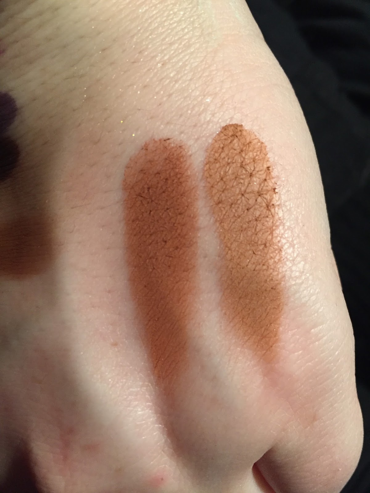
11.) Sienna. This one caused me some contention. Temptalia said a lighter dupe is from the PB & J palette, the shade "Nuts About U." I then swatched Realgar from the MR palette, thinking that could work. I ended up not liking either as dupes. The picture below contains two swatches- the left the second transition color from WnW's Not a Basic Peach palette, and the second one "Crisp" from the Tarte Pro to Go. I think the WnW comes out on top.
12.) Rustic: A neutral mid-toned brown. I used Duchess from the Queen of Hearts palette, though that may be too dark.
13.) Cyprus Umber: From the MR palette.
What did I learn?
1.) Tempera. Now, I owned Tempera in my Modern Renaissance palette. I have used up most of it, though. While there is still a teeny bit of usable powder left on the sides of the pan, I thought the best thing to do would be to use the dupe of Tempera that is in some of the new WnW palettes. There is one in the Not a Basic Peach palette that I swatched. Basically, any satin cream color will do.
2.) Our first (there will be more) golden shade. Temptalia noted this as having an olive-tone. I myself used the shade Hype from the Tarteist Pro to Go palette, swatched below. I am not sure if that has the same precise undertones as Glistening, but do I care? No.
3.) Orange Soda was easy for me. I have two dupes in my collection, both by Coloured Raine. I've got the single Angel Face, as well as the shade Heir in the Queen of Hearts palette.
4.) Rose Pink: This is a berry shimmer- but more red toned/pink. I honestly do not own something like that. I have a cool-toned pink shimmer in the Eyes Cream palette, but that would not do. I ended up settling for the metallic shade from the Zodiac Palette from BH Cosmetics. It is from the Leo segment of the palette. Though it is highly metallic and lighter than Soft Glam, it does have a rose tone to it.
5.) Sultry. The picture of the palette is a bit deceiving. It looks pink, but ABH describes this as a "chocolate brown." So I chose the metallic copper shade from the Pro to Go called Boss. It is gorgeous, and has a pink tint to it.
6.) Bronze. I don't understand this one. This is another gold, but it is called bronze. It has a strong yellow/brown tone to it, nearly a duochrome, but swatches pretty straightforward as gold. I pretty much just shrugged on this one and used what I thought worked as an actual bronze shade (which I am not even sure what that means anymore), from the Too Faced PB & J palette: Peanut Butter Cup.
7.) Mulberry. This is the Mulberry from the Carli Bybel palette. Unlike the ABH, it is satin, not ultra-matte. I love the formula on this one.
8.) Dusty Rose. I mean, it's pretty much Buon Fresco, right?
9.) Fairy. Another weak gold?! I am honestly shocked. I have seen countless pictures of this palette online, but it really did not occur to me how many sheer gold shades this palette contained. I decided to use Bananas from the Too Faced PB & J palette because that is a sheer gold.
10.) Burnt Orange. I have it! It's in the MR palette.
11.) Sienna. This one caused me some contention. Temptalia said a lighter dupe is from the PB & J palette, the shade "Nuts About U." I then swatched Realgar from the MR palette, thinking that could work. I ended up not liking either as dupes. The picture below contains two swatches- the left the second transition color from WnW's Not a Basic Peach palette, and the second one "Crisp" from the Tarte Pro to Go. I think the WnW comes out on top.
12.) Rustic: A neutral mid-toned brown. I used Duchess from the Queen of Hearts palette, though that may be too dark.
13.) Cyprus Umber: From the MR palette.
14.) Noir: A matte black. I have two in my collection, and one I really like. It is from the Zodiac palette, which is swatched on the right.
| (l) WnW, (r) BH Cosmetics |
When I originally learned of this palette, I knew there were so many parallels to the Modern Renaissance. But I still thought it was a stronger palette than the Modern Renaissance. For starters, the shimmer shades in the MR were way too similar, and one had pretty weak pigmentation (Primavera). The variety of shimmers in SG APPEAR to be more diverse.
But, as a result of this project, I learned that the shimmers are still an issue in this palette. Three shimmery golds is not something I am too happy about. The only shimmer I don't actually own is that Rose one, but I could always get a single or something, if I really wanted to.
Ultimately, I can replicate the palette enough in my own collection, and there is no pressing urge to buy it.
Tuesday, March 20, 2018
Dupe Alert? Too Faced Peanut Butter and Jelly and Milani Earthly Elements
Let's get this right out of the way, first: the Milani Earthly Elements (EE) palette contains no actual purple elements. So, it is not an exact dupe of the Too Faced Palette. However, certain shades are very, very similar, that one could replicate the same look.
The Too Faced PB & J palette is sold at full retail price for $32.00. However, many discount outlet stores are selling it for half price, which is $16.00, and which is the price that I paid.
The Milani Earthly Elements palette cost $11.00. So, in terms of the way I am going to evaluate it, the way I see it the Too Faced palette was only $5.00 more.
We'll go shade by shade. Only the Too Faced palette has shade names, and all Too Faced swatches will be on the left, with Milani on the right.
Soft & Sweet is a very light matte peach, with sparse bits of microgitter. It's "dupe" in the EE palette is a satin that is light peach as well, but pinker than the PB & J palette.
Peanut Butter is a light matte orange-brown. Its dupe in the Milani palette is more brown than orange, and less warm.
Peanut Butter Cup is a gorgeous mid-toned brown with golden shimmer and some sparkle. It's potential dupe is the next shade in the EE palette, which is cooler toned.
Peanut Brittle, the star of the palette, is a high-impact metallic copper. The closest in the EE palette is a shade very similar to the brown shimmer, just more red-toned. These are not close at all.
Nuts About U is a dark orange matte, very similar to Realgar from the MR palette. It's potential dupe in the EE palette is lighter and brighter.
Rich and Creamy is a pale golden shimmer, which I wish was a bit more pigmented. A potential dupe was scraped out by me ages ago- it appeared to be a champagne "shimmer," but really it was just pressed glitter that flew everywhere and had no pigment, so I exorcised it from the palette. Therefore, I don't have any comparison photos to show you.
Overall, I do see significant overlap with these two palettes, but not enough for me to think buying the PB & J palette was a waste. That palette has a matte cream, a dark shade, and greater variation in the shimmers. It also has that purple, which I don't seem to mind! The formula seems excellent as well. However, this exercise is also an illustration of the fact that Milani is an excellent brand as well, and there are some looks you could make with one palette that you could definitely make with the other.
I did notice that the Milani mattes, as nice as they are, needed to be built up a bit more, but this is not necessarily a bad thing. Its shimmers definitely need to be applied with a finger and used with primer, which is not too much extra work.
Though I wouldn't say this palette as a whole is a dead-on dupe, I do think the Earthly Elements palette is a good buy for someone wanting to create trendy warm toned looks.
Thanks for reading!
The Too Faced PB & J palette is sold at full retail price for $32.00. However, many discount outlet stores are selling it for half price, which is $16.00, and which is the price that I paid.
The Milani Earthly Elements palette cost $11.00. So, in terms of the way I am going to evaluate it, the way I see it the Too Faced palette was only $5.00 more.
We'll go shade by shade. Only the Too Faced palette has shade names, and all Too Faced swatches will be on the left, with Milani on the right.
Soft & Sweet is a very light matte peach, with sparse bits of microgitter. It's "dupe" in the EE palette is a satin that is light peach as well, but pinker than the PB & J palette.
Peanut Butter is a light matte orange-brown. Its dupe in the Milani palette is more brown than orange, and less warm.
Peanut Butter Cup is a gorgeous mid-toned brown with golden shimmer and some sparkle. It's potential dupe is the next shade in the EE palette, which is cooler toned.
Peanut Brittle, the star of the palette, is a high-impact metallic copper. The closest in the EE palette is a shade very similar to the brown shimmer, just more red-toned. These are not close at all.
Nuts About U is a dark orange matte, very similar to Realgar from the MR palette. It's potential dupe in the EE palette is lighter and brighter.
Rich and Creamy is a pale golden shimmer, which I wish was a bit more pigmented. A potential dupe was scraped out by me ages ago- it appeared to be a champagne "shimmer," but really it was just pressed glitter that flew everywhere and had no pigment, so I exorcised it from the palette. Therefore, I don't have any comparison photos to show you.
Overall, I do see significant overlap with these two palettes, but not enough for me to think buying the PB & J palette was a waste. That palette has a matte cream, a dark shade, and greater variation in the shimmers. It also has that purple, which I don't seem to mind! The formula seems excellent as well. However, this exercise is also an illustration of the fact that Milani is an excellent brand as well, and there are some looks you could make with one palette that you could definitely make with the other.
I did notice that the Milani mattes, as nice as they are, needed to be built up a bit more, but this is not necessarily a bad thing. Its shimmers definitely need to be applied with a finger and used with primer, which is not too much extra work.
Though I wouldn't say this palette as a whole is a dead-on dupe, I do think the Earthly Elements palette is a good buy for someone wanting to create trendy warm toned looks.
Thanks for reading!
Labels:
affordable makeup,
drugstore,
dupes,
eyeshadow palette,
highend,
milani,
swatches,
too faced
Tuesday, December 26, 2017
Carli Bybel Deluxe Palette: Review and Swatches
For the holidays, I was fortunate to receive a Carli Bybel Deluxe Palette. It was one of the items I had anti-hauled in the past, but now that I have it, I thought I would provide swatches and reviews.
This palette sells at Ulta for $19.50, which I think is an excellent value.
This the interior of the palette (after swatches and use)
1. An orange-toned cream shade. Dupes of this include Coloured Raine Angel Face and Heir, and ABH Orange Soda, as well as MuG Peach Smoothie. This is a very popular transition shade for many skin tones.
2. A peach-pink shimmer, with aspects of duochrome. It is like a more opaque, but drier Fireball by UD.
3. This shade is like a darker #1, and reminds me of Burnt Orange from the Modern Renaissance Palette.
4. This is a very popular pink shimmer with gold reflect. You can also find it in the new Wet 'n Wild Not a Basic Peach Palette, as well as the Jaclyn Hill palette.
5. A peach-toned shimmer with gold reflect. A very reflective and pigmented shade.
6. A pink shimmer. pretty but standard.
7. A cooler almond-toned light brown. For me, also a very nice transition.
8. Basically a dupe for Buon Fresco from ABH, but a tad more pink-toned.
Buon Fresco on the left, an CB #8 on the right. I actually like the CB more!
9. A breathtaking silvery purple shimmer, like ABH Pink Champagne.
10. A blackened burgundy.
Thoughts:
I think the quality of the shadows and face powders are excellent. The mattes are soft but drier, so blending is very easy. CB also made it very easy to pair colors together and get a cohesive look. It was all very thoughtful.
Additionally, this palette has a shelf life of about two years, which makes me happy to know I can pace myself when using it (contrary to the ABH palette, which is reported to last 6 mos- boo!)
This palette sells at Ulta for $19.50, which I think is an excellent value.
This the interior of the palette (after swatches and use)
And swatches, in order of the palette from left to right. I will go shade by shade. Click on the pictures to get full size!
1. An orange-toned cream shade. Dupes of this include Coloured Raine Angel Face and Heir, and ABH Orange Soda, as well as MuG Peach Smoothie. This is a very popular transition shade for many skin tones.
Coloured Raine Heir, Angel Face, and CB palette #1
2. A peach-pink shimmer, with aspects of duochrome. It is like a more opaque, but drier Fireball by UD.
3. This shade is like a darker #1, and reminds me of Burnt Orange from the Modern Renaissance Palette.
4. This is a very popular pink shimmer with gold reflect. You can also find it in the new Wet 'n Wild Not a Basic Peach Palette, as well as the Jaclyn Hill palette.
6. A pink shimmer. pretty but standard.
7. A cooler almond-toned light brown. For me, also a very nice transition.
8. Basically a dupe for Buon Fresco from ABH, but a tad more pink-toned.
Buon Fresco on the left, an CB #8 on the right. I actually like the CB more!
9. A breathtaking silvery purple shimmer, like ABH Pink Champagne.
10. A blackened burgundy.
11. A yellow-toned cream matte shade.
12. A light gold shade.
13. A warm orange-brown matte, like Raw Sienna or Burnt Orange from the ABH palette.
Actually, this is very similar to #3, just as Raw Sienna and Burnt Orange are similar in the MR palette. Comparison swatches reveal this to be very true:
I actually can't tell which is the MR, and which is the Carli Bybel palette! Oops.
14. A shimmery mid-toned brown.
15. And a cool-toned dark brown matte.
For the highlighters:
16.-17. A rose-gold and gold, respectively.
18. A white metallic with a blue-toned reflect.
18. A pink metallic with more subtle blue-toned reflect.
19. A mid-toned copper shimmer
20. And a darker toned bronze shimmer.
For me, this palette is wonderful for beginners and enthusiasts alike. For my skintone, I find this mostly to be a shadow of lid colors and transition colors.
Additionally, this palette has a shelf life of about two years, which makes me happy to know I can pace myself when using it (contrary to the ABH palette, which is reported to last 6 mos- boo!)
I am so excited to keep using this palette, and think that it is worth it.
Saturday, December 23, 2017
"Be...by BubzBeauty" Palette Review
Well, the other day in Burlington Coat Factory, I spotted some discounted palettes from BH Cosmetics. Some of these included one of the BH's earliest youtuber collaborations, the "Be..." palette. I had always had an interest towards this palette, so I decided to pick this up.
I'll make this a pretty quick review, since I feel that the palette only contains a couple of gems.
The next two are mattes,Optimistic and Inspired, and they perform nicely on the eye. I really enjoy those. But Bold, a slightly shimmery deep grey-brown, has pretty terrible pigmentation.
In the next row, we have Charismatic, a warm-toned gold metallic. This is a beautiful shadow, and in fact I already have a dupe for it. It is the same exact color (and perhaps even formula) from the BH Cosmetics foil palette.
After that is Thoughtful, an strongly pigmented copper shimmer. I suspect it could also be found in the Foil palette.
beginning at the bottom, Able, Confident, Hopeful, Kind)
Able makes me frustrated. It is a gold-pink sparkly shade that appears that it foiled, but it is almost impossible to pick it up with the brush or the finger. You really have to exert pressure to get any product. When you do, the color is lovely, but still.
Confident is a purple matte of workable quality.
Hopeful and Kind are of terrible quality and have already formed hard pan after 1-2 swatches.
So, that's it! For $6.00, I am a little disappointed. Half of the palette is decent, but half is filled with filler shades and terrible formula.
Even if you see this on clearance, I would skip. There's better stuff out there.
I'll make this a pretty quick review, since I feel that the palette only contains a couple of gems.
In order of the palette, beginning at the bottom of swatches (Happy, Grateful, Genuine, Optimistic, Inspired, Bold, Charismatic, Thoughtful)
The first three shades are pretty chalky and give only the slightest color pay-off.
The next two are mattes,Optimistic and Inspired, and they perform nicely on the eye. I really enjoy those. But Bold, a slightly shimmery deep grey-brown, has pretty terrible pigmentation.
In the next row, we have Charismatic, a warm-toned gold metallic. This is a beautiful shadow, and in fact I already have a dupe for it. It is the same exact color (and perhaps even formula) from the BH Cosmetics foil palette.
After that is Thoughtful, an strongly pigmented copper shimmer. I suspect it could also be found in the Foil palette.
Confident is a purple matte of workable quality.
Hopeful and Kind are of terrible quality and have already formed hard pan after 1-2 swatches.
So, that's it! For $6.00, I am a little disappointed. Half of the palette is decent, but half is filled with filler shades and terrible formula.
Even if you see this on clearance, I would skip. There's better stuff out there.
Labels:
bh cosmetics,
bubzbeauty,
drugstore,
eyeshadow palette,
review,
swatches
Saturday, December 16, 2017
Review and Swatches: The Queen of Hearts Eyeshadow Palette
Well, this is long overdue. This palette by Coloured Raine was certainly the palette of the summer, maybe even the past year. It was first limited edition, then became permanent, which was cool of Coloured Raine. I bought this during a flash sale, for $40. Shipping was $6.00. Full price, the palette costs $50.00.
So, let's talk about it, shall we? I have blogged about this palette often. I have featured it in many TMO's, and have compared it to other palettes in my collection, specifically the Tarte Pro to Go, as well as the Modern Renaissance.
I am happy to report that this palette has a unique place in my collection, but I do not think it is worth the full price of $50. Let's talk about this palette. I'll start with pictures:
Over top of the mirror, I've placed the sleeve. I am in the camp that believes the sleeve should have just been the packaging itself, but whatever. The mirror is on the smaller side, but it is covered in the picture. The packaging is sleek hard cardboard, a black outer covering, and gold foil inside. It's really lovely.
Some specs below. Each shadow is 1.5 g.
For this look, we have Princess in the crease, Ladyship also blended in the crease, and Queen Mother patted on the outer corner. Royal Highness is on the lid.
Overall, I am glad that I also have the Modern Renaissance palette to work with this. On its own, I do feel I am a bit limited with the amount of transition colors. The shimmers are really beautiful, and the palette presents a lot of options. Glitter glue is an absolute must for me, however, because of my particular eyeshape, to prevent transfer of shimmer shades.
When I first got this palette, I was a little intimidated, but once I delved in I found that this palette has a welcome place in my stash, and is perfect for the fall and winter.
I highly recommend it, but only if the colors are up your alley. Personally, I would not pay the full price for it, which is $50. Forty, however, is a good deal.
Let me know if you have this palette. I am always looking for new ways to use this!
My final rating is four and a half stars.
So, let's talk about it, shall we? I have blogged about this palette often. I have featured it in many TMO's, and have compared it to other palettes in my collection, specifically the Tarte Pro to Go, as well as the Modern Renaissance.
I am happy to report that this palette has a unique place in my collection, but I do not think it is worth the full price of $50. Let's talk about this palette. I'll start with pictures:
Over top of the mirror, I've placed the sleeve. I am in the camp that believes the sleeve should have just been the packaging itself, but whatever. The mirror is on the smaller side, but it is covered in the picture. The packaging is sleek hard cardboard, a black outer covering, and gold foil inside. It's really lovely.
Some specs below. Each shadow is 1.5 g.
So the way I have them swatched is the order of the palette, from left to right. The first shade is the bottom one on my arm, Crown, and so on. The metallic/shimmer shades were swatched with my finger, as that is how I apply them to my eye. The mattes were applied with a shader brush.
1. Crown: An opaque metallic white duochrome, with a pink shift. This is a really impressive shadow because of its opacity and staying powder. I've found that shades like this don't last long, especially in the area of the inner corner, but this one sticks around. It is also really easy to mix this shade with others.
2. Royal Highness: A taupe metallic shade. This has been my favorite so far. But for this and the other shades of the same formulation, glitter glue is necessary for my eye shape, to avoid transfer. This also is a very creamy shadow.
3. Your Majesty: An orange leaning metallic gold. The only bummer about this is that it inexplicably contains bits of silver glitter. It also requires glitter glue for me, but it is of the same excellent quality as Royal Highness.
4. Princess: A brown leaning dusty rose matte. A beautiful, creamy shade, perfect for me as a transition shade. The mattes are not as soft and delicate as ABH's, which I am grateful for. I can build, and the mattes last a while.
5. Empress: A bright orange, also of excellent quality and pigmentation.
6. Queen Mother: This one reminds me of Rosette from ABH, but not as red-toned. Queen Mother has a strong brown base, and though it swatches beautiful and applies on the eye just as nicely, I am afraid that it looks like its sealing up in the pan, as Rosette once did.
7. Heir: I already own this shade, actually. It is called Angel Face, also by Coloured Raine. Actually, Angel Face is softer and a tad more pigmented than Heir.
8. Royal Perogative: A soft, blendable, mid-toned brown.
Beginning with the shade on the bottom, we have,
9. Noblewoman: A creamy, metallic shimmery burgundy leaning red. This is very intense, and I still have to get a handle on it.
10. Ladyship: If I were to do a finger swatch of this particular shade, you would be disappointed. On the brush, however, it works fine. It lasts a long time. I did even experience some staining.
11. Duchess: A dark matte brown.
12. Dethrone: This is a gorgeous shade. It is a bit dark for me, but I love to use it patted on the outer corner- it is very shimmery.
Here is an example of a look I did with this. Also posted on my instagram (@beldamsansmerci).
For this look, we have Princess in the crease, Ladyship also blended in the crease, and Queen Mother patted on the outer corner. Royal Highness is on the lid.
Overall, I am glad that I also have the Modern Renaissance palette to work with this. On its own, I do feel I am a bit limited with the amount of transition colors. The shimmers are really beautiful, and the palette presents a lot of options. Glitter glue is an absolute must for me, however, because of my particular eyeshape, to prevent transfer of shimmer shades.
When I first got this palette, I was a little intimidated, but once I delved in I found that this palette has a welcome place in my stash, and is perfect for the fall and winter.
I highly recommend it, but only if the colors are up your alley. Personally, I would not pay the full price for it, which is $50. Forty, however, is a good deal.
Let me know if you have this palette. I am always looking for new ways to use this!
My final rating is four and a half stars.
Subscribe to:
Posts (Atom)