Showing posts with label dupes. Show all posts

Friday, January 18, 2019

My Own Purple Palette

Aka,  the purpliest purple palette that ever purpled.

And it was because of Colourpop's newest release, at the alluring price of $12.

When I saw this palette released, I was ready to buy it. But I waited a day, and paused. Even though the colors and their names are so completely right up my alley (Chick Lit, Fanfiction, and Sleeper especially), I couldn't shake the feeling that I had these colors already, and that purchasing the palette would add nothing to my collection.

So, I endeavored to make my own purple palette, inspired by My Pleasure. It's a bit expanded, and made up of singles and depotted shadows (some of which got a little banged up 😢) .

Instead of going over every single color, I will list the top ones that I think truly capture the spirit of the CP Palette.


1.) Looxi, Charmed. This is the shadow right underneath the white one. Colourpop has been doing a bit with duochromes lately, especially with blue reflects. I have a feeling that Do or Dough from the CP palette is an exact dupe of this Looxi shadow, which can also be worn as a highlighter. I also included another blue shifter shade, Glass Bull.

2.) Nabla, Calypso. This is literally at the center of my palette because it is my perfect purple shimmer shadow. Looking at the two darker shimmers in the Colourpop Palette, Bare Minimum and Chicklit, one looks too red and one looks too blue. Calypso for me is just right.

3.) No Filter, a "blue based dusty rose," from Give Me Glow. This is the largest pan in my palette. Though I think the CP palette could have benefitted from actual mid-tones of purple, rosy saturated mattes can be found, which is what I hope No Filter is replicating. I did expand upon matte options by just including more in my palette.

So, again, even though I really like what CP did, I just don't have the heart to buy it, because I know I have this palette. But, I do know CP is coming out with a series of "monochromatic" palettes, so I am exciting to see what they will do.

If you want to know what the other shadows are, please let me know! I'll also be doing some looks with this palette in the coming week, so stay tuned!

Thanks for reading.


Tuesday, December 25, 2018

Duping Nars Danger Control Palette

Does anyone remember this palette? It came out almost a year ago, and I literally do not remember anyone talking about it. Partly the reason for that is the fact that Nars limited edition eye palettes have a very uniform look to them, so it's hard to distinguish among them.

However,  I was browsing swatches of some new palette on Temptalia's site, and I noticed she listed a shade called "Aeryn Sun" as a dupe. Interesting, I thought to myself. That's the name of one of the best characters in a really great show called Farscape. To what indie brand does this belong to?

And that led me to finding out about this palette- a palette of light duochrome shimmers that was technically limited edition, but still can be purchased on some online retailers, like Macy's.

The palette is called Danger Control, cost $59, and looks like this:


No, this is not a mind-blowing palette. Other brands have done duochromes, and these are very light. I get that.

But I still find this palette very...me. But rather than spend money on it, I thought I would conduct research to see if I could dupe it in my collection.

So, let's begin!

The first shade is called Rave, and I duped it with Colourpop's Prowlin'. Rave is definitely more silver/gray toned, and while Prowlin' has a pale gold reflect. While I definitely am interested in silver tones now, Prowlin' makes a suitable replacement.

The second shade is Elektra, and it has been done to death. This was the shade of 2017-2018, in a way, making appearances in many a palette- basically a warm pink with a gold reflect. I have this in a pressed glittery pigment version in Looxi's Dollface, and the fourth shade in the Carli Bybel Deluxe palette.

Third was surprisingly difficult- the name that began my quest for this dupe palette, Aeryn Sun. The picture above is misleading. It is a really pale champagne shimmer with a silvery shine. The best I could do was Stila Kitten.

Fourth is Bionic, another classic duochrome- a warm white with gold reflect. You can find this in many places, including Coastal Scents Elven Gold and Colourpop Now and Zen. For me, I chose the center highlight shade in the BH Cosmetics Zodiac Palette.


And fifth was the most difficult, because the color shift was really hard to see online. Haedus is a weird light peachy base with a pink/purple shift. Looking at more pictures, Nabla Millennium probably would have sufficed, but I chose Surreal Makeup highlighter in Frost Wyrm, which is described as lilac shifting.

Finally, Tonic is a cool toned purple shimmer. I chose Nabla's Calypso which is warmer, but that is my ideal purple shimmer. Another option is Celestial from the Norvina palette.


And below I swatched Celestial and Carli Bybel #4 for reference.


So what did I learn? As much as I like the idea of an all-duochrome palette, I have to consider that in a palette, the subtleties of each color can get a little lost. Stepping back, the palette just looks very light, and it looks like it can be a face palette for most skin tones, if the actual base color of the shades are sheer enough. Though duochromes are special and fun, I definitely think something got lost in this palette.

If Nars could make face duos or just eye duos with the same formula and the shades broken up this way, I think that would be more consumer-friendly.

So that's all I got, thanks for reading!

Friday, April 13, 2018

Drugstore Dupes for Dreamsicle


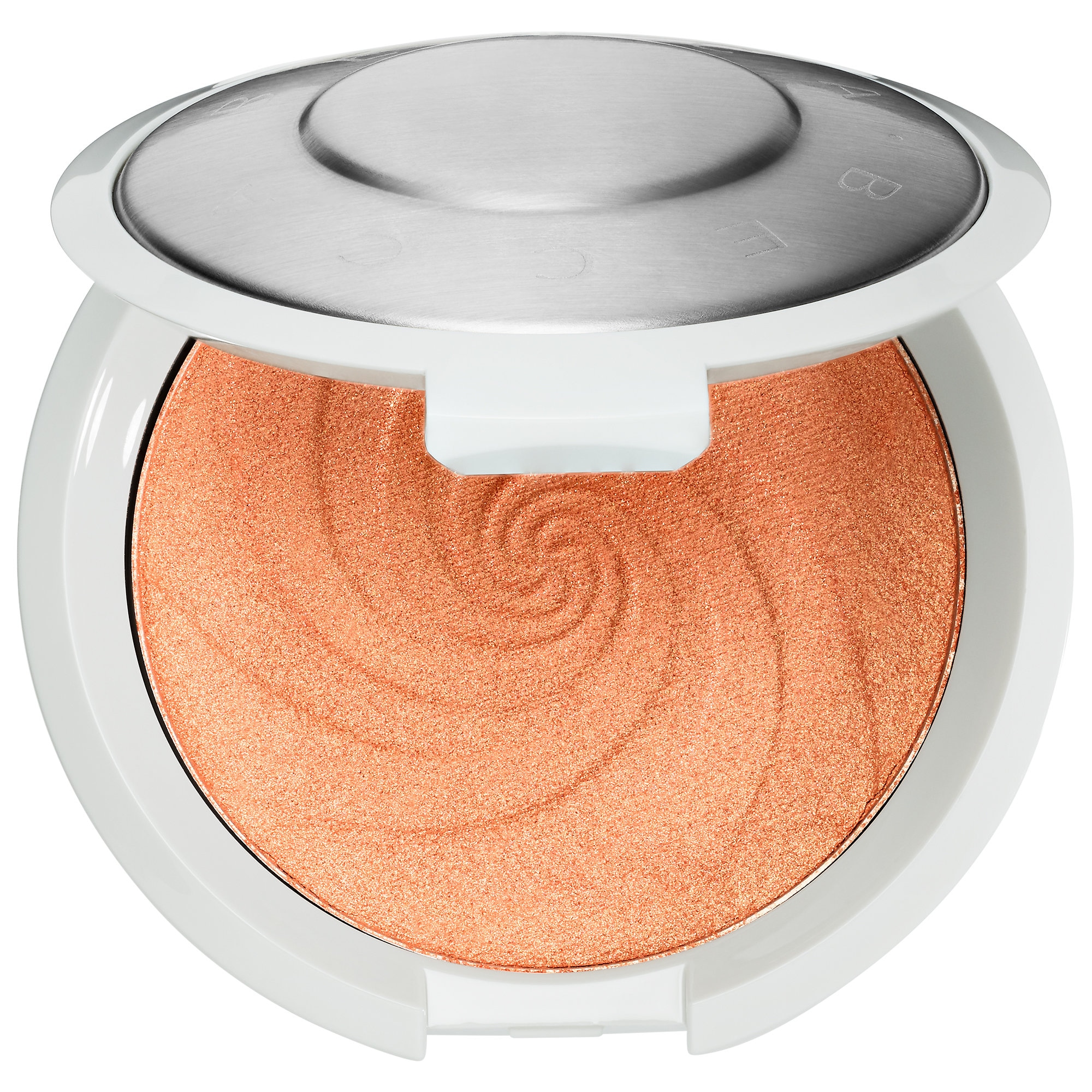
Hello! I made a terrible quality video on shopping my stash to find possible dupes for Becca's latest release, the Dreamsicle Shimmering Skin Perfector (aka a highlighter).

Dreamsicle costs $38, contains 7 g of products, and looks like this:

Image result for dreamsicle highlighter

It is geared toward medium and dark skin tones.

As I state in my video, I love orange makeup and found Dreamsicle to be pretty inspiring, which is why I shopped my stash and found possible alternatives for this product.


Option 1: Milani Holoraphic Beams, 4 g per pan (12 g total), for $13.00, the shade Otherworldly. It is a very orangey-gold powder that has a lot of sheen. I also reviewed and swatched it here. 

Option 2: Wet 'n Wild Precious Petals, 5.4 g for $5.00. More of a pink-toned, but still clearly orange and gold. I don't own Crown of My Canopy, but it also appears to be orange toned, as well, just darker. Also swatched in this post. 

Holographic Beams (l), Precious Petals (r)
My video and live swatches:


Thanks for reading!

Sunday, April 1, 2018

Duping the Soft Glam Palette

Though I think there is something very beautiful about the Soft Clam palette, I can't deny that it is a very dupe-able palette. So I decided it would be fun to go through my collection and see what I can actually dupe!


1.) Tempera. Now, I owned Tempera in my Modern Renaissance palette. I have used up most of it, though. While there is still a teeny bit of usable powder left on the sides of the pan, I thought the best thing to do would be to use the dupe of Tempera that is in some of the new WnW palettes. There is one in the Not a Basic Peach palette that I swatched. Basically, any satin cream color will do. 

2.) Our first (there will be more) golden shade. Temptalia noted this as having an olive-tone. I myself used the shade Hype from the Tarteist Pro to Go palette, swatched below. I am not sure if that has the same precise undertones as Glistening, but do I care? No. 


3.) Orange Soda was easy for me. I have two dupes in my collection, both by Coloured Raine. I've got the single Angel Face, as well as the shade Heir in the Queen of Hearts palette. 

4.) Rose Pink: This is a berry shimmer- but more red toned/pink. I honestly do not own something like that. I have a cool-toned pink shimmer in the Eyes Cream palette, but that would not do. I ended up settling for the metallic shade from the Zodiac Palette from BH Cosmetics. It is from the Leo segment of the palette. Though it is highly metallic and lighter than Soft Glam, it does have a rose tone to it. 

5.) Sultry. The picture of the palette is a bit deceiving. It looks pink, but ABH describes this as a "chocolate brown." So I chose the metallic copper shade from the Pro to Go called Boss. It is gorgeous, and has a pink tint to it. 

6.) Bronze. I don't understand this one. This is another gold, but it is called bronze. It has a strong yellow/brown tone to it, nearly a duochrome, but swatches pretty straightforward as gold. I pretty much just shrugged on this one and used what I thought worked as an actual bronze shade (which I am not even sure what that means anymore), from the Too Faced PB & J palette: Peanut Butter Cup. 


7.) Mulberry. This is the Mulberry from the Carli Bybel palette. Unlike the ABH, it is satin, not ultra-matte. I love the formula on this one.

8.) Dusty Rose. I mean, it's pretty much Buon Fresco, right?

9.) Fairy. Another weak gold?! I am honestly shocked. I have seen countless pictures of this palette online, but it really did not occur to me how many sheer gold shades this palette contained.  I decided to use Bananas from the Too Faced PB & J palette because that is a sheer gold.

10.) Burnt Orange. I have it! It's in the MR palette.

11.) Sienna. This one caused me some contention. Temptalia said a lighter dupe is from the PB & J palette, the shade "Nuts About U." I then swatched Realgar from the MR palette, thinking that could work. I ended up not liking either as dupes. The picture below contains two swatches- the left the second transition color from WnW's Not a Basic Peach palette, and the second one "Crisp" from the Tarte Pro to Go. I think the WnW comes out on top.


12.) Rustic: A neutral mid-toned brown. I used Duchess from the Queen of Hearts palette, though that may be too dark.

13.) Cyprus Umber: From the MR palette.

14.) Noir: A matte black. I have two in my collection, and one I really like. It is from the Zodiac palette, which is swatched on the right.

(l) WnW, (r) BH Cosmetics
What did I learn?

When I originally learned of this palette, I knew there were so many parallels to the Modern Renaissance. But I still thought it was a stronger palette than the Modern Renaissance. For starters, the shimmer shades in the MR were way too similar, and one had pretty weak pigmentation (Primavera). The variety of shimmers in SG APPEAR to be more diverse.

But, as a result of this project, I learned that the shimmers are still an issue in this palette. Three shimmery golds is not something I am too happy about. The only shimmer I don't actually own is that Rose one, but I could always get a single or something, if I really wanted to.

Ultimately, I can replicate the palette enough in my own collection, and there is no pressing urge to buy it. 

Tuesday, March 20, 2018

Dupe Alert? Too Faced Peanut Butter and Jelly and Milani Earthly Elements

Let's get this right out of the way, first: the Milani Earthly Elements (EE) palette contains no actual purple elements. So, it is not an exact dupe of the Too Faced Palette. However, certain shades are very, very similar, that one could replicate the same look.


The Too Faced PB & J palette is sold at full retail price for $32.00. However, many discount outlet stores are selling it for half price, which is $16.00, and which is the price that I paid.

The Milani Earthly Elements palette cost $11.00. So, in terms of the way I am going to evaluate it, the way I see it the Too Faced palette was only $5.00 more.

We'll go shade by shade. Only the Too Faced palette has shade names, and all Too Faced swatches will be on the left, with Milani on the right.

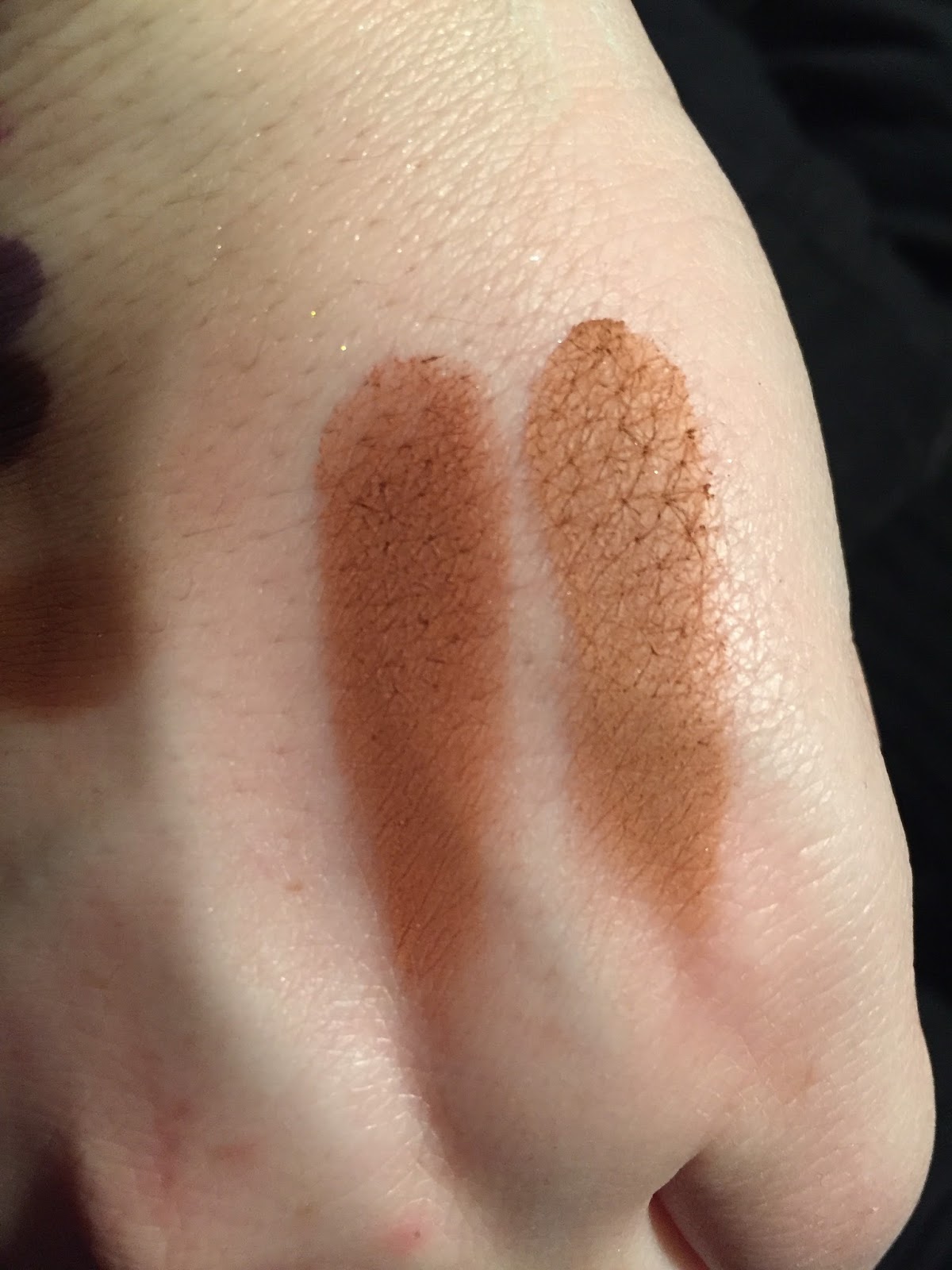
Soft & Sweet is a very light matte peach, with sparse bits of microgitter. It's "dupe" in the EE palette is a satin that is light peach as well, but pinker than the PB & J palette.


Peanut Butter is a light matte orange-brown. Its dupe in the Milani palette is more brown than orange, and less warm.


Peanut Butter Cup is a gorgeous mid-toned brown with golden shimmer and some sparkle. It's potential dupe is the next shade in the EE palette, which is cooler toned.


Peanut Brittle, the star of the palette, is a high-impact metallic copper. The closest in the EE palette is a shade very similar to the brown shimmer, just more red-toned. These are not close at all.


Nuts About U is a dark orange matte, very similar to Realgar from the MR palette. It's potential dupe in the EE palette is lighter and brighter.


Rich and Creamy is a pale golden shimmer, which I wish was a bit more pigmented. A potential dupe was scraped out by me ages ago- it appeared to be a champagne "shimmer," but really it was just pressed glitter that flew everywhere and had no pigment, so I exorcised it from the palette. Therefore, I don't have any comparison photos to show you.

Overall, I do see significant overlap with these two palettes, but not enough for me to think buying the PB & J palette was a waste. That palette has a matte cream, a dark shade, and greater variation in the shimmers. It also has that purple, which I don't seem to mind! The formula seems excellent as well. However, this exercise is also an illustration of the fact that Milani is an excellent brand as well, and there are some looks you could make with one palette that you could definitely make with the other.

I did notice that the Milani mattes, as nice as they are, needed to be built up a bit more, but this is not necessarily a bad thing. Its shimmers definitely need to be applied with a finger and used with primer, which is not too much extra work.

Though I wouldn't say this palette as a whole is a dead-on dupe, I do think the Earthly Elements palette is a good buy for someone wanting to create trendy warm toned looks.

Thanks for reading!
© *:・゚Cosmetically Inclined ・゚:*  
Blogger Templates made by pipdig