Wednesday, May 31, 2017

Selecting a Palette (somewhat a TMO): Sephulta

At this point in the year my job becomes acutely stressful. Not only that, my birthday is also coming up, and I'd like to start thinking about adding a palette to my collection. 

Now, as I do have 6 palettes (counting my z-palette, and not counting my singles), I want to be especially careful when selecting a new palette. I am comfortable in my collection right now, but I also want to branch out and incorporate more subtle versions of color into my everyday look. Just because. 

So, here are my palette picks from both Sephora and Ulta. I'll also add a post on indie palettes I am interested in. 

1. Laura Mercier Eye Art Artist's Palette: The palette was rated A by Temptalia, and I do like the mix of browns and purples. I think this is an all-purpose palette, but I can see how it can be repetitive. The value of this palette is not great, as each shade is less than 1 g, compared to the Naked palette, $54, with 1.41 g of product. Though the quality of this palette I'm sure is excellent, and that I can make flattering looks, I am not convinced this is the palette I want.

2. Viseart Petit Pro Palette: This palette costs less than regular-sized Viseart palettes, and I love that purple. However, I know I don't need the mattes, and I don't want to shell out $30 just to "sample" a brand, especially just for one shade.

3. Tarte Pro to Go: This is a better option than the Viseart for me, and Temptalia did rate this palette highly. I find them similar, but the Tarte one has better value, and less needless mattes. I have had my eye on this one for quite some time, so I am strongly considering this palette. 

Ulta picks:

4. Too Faced PB& J palette: This one I've also had my eye on for quite sometime. I like the concept and the packaging, but it does not have the purples that I am looking for. 

5. Another popular one: The Lorac Unzipped Palette. Not really handy for travel, and not great color variation, though I know the palette is quite well-loved.

6. Nyx Cosmic Metals: I've also been eyeing this one for quite some time, but reviews were slow in coming. After seeing the swatches, the palette is not what I hoped it would be. I would have to pass. 

7. Butter London: Okay, I really don't want to buy this palette. I just wanted to include it because I find it quite ridiculous. 

8. Mally Nude Attitude Eyeshadow Palette: Just going by the image, I find the colors interesting on this palette. It almost reminds me of a Lorac palette. But after researching more about the swatches, I am not that impressed. 

Thoughts:
As of now, the Tarte palette is the one that I find most tempting still. 

Sunday, May 28, 2017

TJ Maxx Finds, ctd.

Continuing with my posts about finds at TJ Maxx, I thought I would go through my collection today to review it all- the good, the bad, and the bottom line.


To begin, I am learning not to buy things simply because they are on sale. I once found both the Too Faced Cat's Eye (or something like that) palette, and the MUFE Artist's palette at very reduced prices, but I did not purchase- knowing I would never have bought them at full-price, knowing I would never use them.

Part of the fun, though, has to do with taking a risk. Sometimes I buy things blindly, and it ends up working out. Sometimes it does not. Let's begin, shall we?

I. Buxom Full Bodied Lipstick in Dolly. Full price, $22. Bought for $6.00. I am so glad I found this. It is a perfect color for me, lasts long, has excellent pigmentation and texture. This was definitely a good buy.

II. Buxom Eyeshadow Brush, bought for $5.00, maybe? retails now for $11.00. I don't use this brush as much as I once did, but its shape and bristle density make application very easy.

III. Soho Naturals Powder Brush, retail price $10.00. I don't know how much I paid for it. It is my oldest brush, and the only brush I have that I feel comfortable applying blush with. Still a very good buy.

IV. Too Faced Bullet Proof 24-Hour Shadow Liner in Mink. Regular retail is more than $20, and I paid half. I have not used this yet, but I have swatched it, and this stuff lasts forever. I am saving it for an occasion where I have to be at work all-day.

V. Kat Von D High Voltage eye primer. This stuff is so gross :( . It smells like paint, and has a yellow tinge that I can see through my eyeshadow. Definitely not as good as any of my other primers. Will declutter.

VI. Marc Jacobs eye palette in The Tease. Regular retail $59.00, bought for $20.00. Definitely a good cool-toned palette with a lot of possibilities. One shade was slightly damaged when I bought it, but I will hold onto it. Not planning on buying any more of these palettes, full-price or no.

VII. Ecotools Brush Cleaner, bought for $3.00, regular retail $7.00. I don't feel as though I am getting a thorough clean with these, but they are good for quick temporary clean.

VII. Boscia Cool Blue Foundation Essence, bought for $12.00. Regular price $20.00. I am not too impressed with this moisturizer, but I do enjoy the cooling sensation. I use it once in a while.

VIII. Stila Jewel Eyeshadow in Topaz. Bought for $6.00, regular $20.00. Nope, not worth it. Haven't really used it, don't want to use it. Depotting did not help.

IX. Algenist Reveal Concentrated Luminzing Drops in Rose, $5.00, regular price..Sephora sold a duo of this for $22, making one worth $11. I LOVE this. I thought this would be a dupe for Nyx's Born to Glow Liquid Illuminator in Sunbeam, as they are both a pale pink with microshimmer. They do appear very similar, with perhaps Algenist having finer shimmer. The difference, though, is that while Nyx's fades quickly, Algenist Drops last ALL DAY. Once blended, that stuff does not budge.

X. Dr. Brandt Save our Skin Comfort Cream, $10.00. Now, a quick google search reveals that the company was sent warning letters from the FDA regarding unsupported/unsupportable claims they made about their product, especially as these claims would suggest that the company is using ingredients not approved by the FDA. I don't know how this issue was resolved, and I would certainly like to know! Save Our Skin comfort cream is sold for $55.00, and I would never EVER pay that kind of money for this kind of product, especially with a government agency sending them warning letters. Not a good look. Still the cream itself is quite "comforting" and does feel good on the skin. I''ll continue to use it when I feel like it.

Decluttered/not pictured:

X. Kat Von D Chrysalis Palette, bought for $20.00
XI. Kat Von D Innerstellar Palette, bought for $20.00

Am I crazy? Quite possibly. I didn't like these palettes because I did not feel they offered enough variety and consistency. Some mattes and shimmers in both were impressive, and I did end up decluttering them. Some I would never use. Both palettes are long gone now.

TM(yself)O: The Carli Bybel Palettes

Part of the reason I began this blog was to document my makeup journey. Part of it was also to participate in the ever-growing online discourse of consumerism and consumer-awareness. I do enjoy a good "TMO" or talk-me-out-of a specific product, and today I am going to cover both palettes that Carli Bybel (a fellow Jersey girl) and BH Cosmetics have produced.


As of now, the original Carli Bybel palette from BH Comsetics is on sale online at Ulta for $10.00. That's a pretty good deal, and the reason I am including it in my TMO is because it is so affordable and tempting. Let's take a look:
PROS: 1) These are trendy, neutral colors, with colors that appeal to me. I feel as though many low-maintenance, yet glam-pretty looks can be made from this. 2) This palette will disappear soon, so the collector in me sort of wants to try something before it disappears forever.

CONS: 1) I don't believe that BH Comsetics highlighters can be fully used as eyeshadows. 2) There is not a whole lot of color variation in this palette, and I am seeing a lot of beige. 3) I am not seeing, for my skintone at least, many transition/mid-toned colors.  4) BH Cosmetics mattes are suspect 5) The deluxe palette contains some of these shades also.

Bottom Line: Not going to purchase. I have many of these colors, and the palette does not offer anything new or interesting for me at this point. It is affordable, but if I do not use it, it is still a waste of money.


The deluxe palette, meanwhile, is currently being sold by BH Cosmetics for $19.50. Right now there is a site-wide sale going on, but of course it does not count for the deluxe palette. That palette is pictured below, and please click on it for full size.

PROS: 1) More mid-toned shades 2) more subtle, wearable colors, for both mattes and shimmers. I am eyeing the gold-pink duochrome, as well as that blue-tinged white highlighter. 3) The palette has an abundance of both highlighters/bronzers for a range of skin-tones, as well as many eyeshadows 4) The colors themselves are still neutral, but more unique 5) $20.00 is still a reasonable price for a palette 6) The formula is reported to be improved upon

CONS: 1) I will never use up the highlighter, nor will I wear them as eyeshadows. 2) All I really care about are 2-3 shimmers (including that pink)- I can always look for a single to get the same effect 3) Did I mention that is far too many (6) highlighters???

Bottom line: The deluxe one is more tempting to me than the original. But I wish I BH Cosmetics could chop the palette in half- have one highlighter palette for $10-$12 and have one eyeshadow palette for $10-$12. I could see myself buying the eyeshadows that way, because the palette would seem less colossal, and I would get more product that I would actually use.

Or, they could even release some of those shimmers as singles, but that is unlikely. 

Ugh....I know I am not going to get this palette. I do agree that it is an improvement in color from the original, but the sheer amount of highlighter is unnecessary, and does not add to the quality for me. Aside from two or three shimmers I have my eye on, I have a lot of these colors already. So there is no need to purchase. 

Wet n Wild Highlighters Review: Cult Favorites

One of my favorite Beauty YouTubers at the moment is Samantha March, who has said recently that she has bought way too many highlighters. I feel like I am in the same boat.

Not only did a get a nice sample size of UD's Sin highlighter in my May Ipsy bag, I also bought two Wet n' Wild highlighters this month that I thought have reached cult status, which brings my count of Wet n' Wild cult status highlighters to three.

I thought I would take the time to share my thoughts on each of them, and how they compare to my more expensive ones.

To begin, Reserve Your Cabana is listed on my inventory as something I use as a setting powder. It does provide a very subtle sheen, and even has some SPF (15), which I think gives it a distinct fragrance, which I like. I've owned it for almost a year. It is not as luminous as my other highlighters, but it is nice to tone down a look or just to use a powder.

My more recent purchases are:

1. Precious Petals: a baked gelee formula highlighter which is a warm gold, but with a distinct pinkish-undertone. To make it work, a brush and a light hand is necessary. This is a really beautiful product.

2. Boozy Brunch- many report this as a dupe for Becca's Champagne Pop, and I agree it comes close. It is also a warm gold, but the pink and brown stripes give it a sort of tan/brassy undertone. A light hand is also a must with this, because the pigmentation is so intense.

I highly recommend both highlighters. Reserve Your Cabana is also nice, but the other two are interesting products. I have been using these two highlighters instead of my UD Sin and my Algenist liquid highlighter in Rose (two other new recent acquisitions) because these are simply just fun and summer-appropriate.

They are also excellent quality. None of these highlighters have chunky glitter, and the two newest ones have a complexity and uniqueness that set them apart, and for that reason I enjoy using them.

Wet n' Wild has been doing such a good job of being innovative  and I hope they keep going. Because I own these I have no need to buy really expensive full-sized highlighters or highlighter palettes, like from Becca. There is simply no need!

Swatches down below!
Reserve Your Cabana

Precious Petals (l), Boozy Brunch (r)

(from top-bottom) Precious Petals, Boozy Brunch, and RYC

Precious Petals, Boozy Brunch, RYC

no flash, same as above

The Ordinary, Advanced Retinoid 2 %, Review (and some Paula's Choice Shade)


I was never really a skin care person. At almost 26 years of age, I never really maintained a skin regimen. I am rather lazy, forgetful, and apathetic when it comes to that.

However, I did have tightly clustered lines on my forehead, as well as fine lines near my eyes. I also had redness around my nose area- Not really significant issues, but these things bothered me.

I bought the Retinoid 2% from The Ordinary, an oz for $9.80 and have been using it daily for three weeks. I have seen significant difference and am really very impressed with this product. It is not greasy, does not really smell like anything, and absorbs quickly.

I did do a bit of research on retinols, and though The Ordinary says this is a gentler retinol, I do moisturize and use sunscreen anyway.

The lines on my forehead have relaxed, especially the tight cluster of lines above my right eyebrow.

My skin has cleared up and evened out in tone, and I really have not had any breakouts since.

I would definitely recommend this and give it a full ⭐⭐⭐⭐⭐.

As a side note, the Beautypedia reviews, owned by Paula's Choice, give three stars for this product, and these are two of their main drawbacks of the product: "
The formula isn't as multi-faceted as today's best retinol treatments.
Initial application has a grainy sensation, which may be a stability issue."

What does "multi-faceted' mean? And by "today's best retinol treatments," they do mean Paula's Choice? And how can you claim a texture (which I did not personally notice) MAY indicate a stability issue, if you can't prove it? And how do I know they can't prove it? They said it:

"Although the grainy sensation fades quickly, it’s an unusual issue worth pointing out as this kind of formula should not be grainy. We worry that it’s indicative of a stability issue, but we weren’t able to verify this. Nevertheless, at any price, a retinol product should be pleasant to use, and this one comes up a bit short in that department."

So, an initial texture which fades QUICKLY (which, again, texture that I did not experience) ultimately makes application (WHICH IS A NOT A LENGTHY EXPERIENCE) unpleasant, which is also a very subjective concept?

My research into this product inadvertently lead me down a road to seriously question Beautypedia's veracity and credibility. If anyone else has noticed such problems, such as making unjustly inflammatory suggestions about products which they acknowledge cannot be verified, I would love to know. It's inappropriate, especially when we all know they all have a horse in this race.

As a result, I am never going to buy Paula's Choice products. But I will definitely purchase the Retinoid 2 % again.

L'Oreal Infallible Liquid Eyeshadow Paints Review: Cool Ivory

Good morning! I picked this up from CVS yesterday, for $8.00, for about 7 g of product. 

I really like (not love) the L'Oreal Infallible line. I own the setting spray, and the pro-matte foundation, as well as my all-time favorites- the Infallible 24-Hour Shadow. 

In the store, this was the last one of the shade Cool Ivory, a dual shimmer of white and light gold. I stayed away from the mattes because I was a bit hesitant on the effect of liquid mattes- and the fact that I have more powder matte shades than I know what to do with.

I could probably say the same about shimmer shadows too, but I really like the idea of swiping on a lid shade and being done. It also makes me think of an easy cut-crease look. 

After swatching the two, it is clear that they are not the same quality. The gold one (right) is far more opaque, while the white is a lot runnier. 


When blended out in the above picture, you can see how the gold remains, but the white sheers out a little.

For the eye look below, I tried to do my normal look of white shimmer on the inner corner of my eye, and gold all over the lid. For the white, this failed a bit because it sheered out immediately, leaving behind some sparse shimmer. I had much more success with the gold, and added a pinky-purple matte in the crease.


You can see the high-shine of the gold, which is really impressive. You can also see some remnants of the white on the inner corner, not of the same opacity and sheen as the gold. It does last a long time. The applicator does dispense a lot of product, and makes control somewhat difficult. I blended it out with both a finger and brush with no issues. Using the applicator by itself was a little tricky.

I'll continue to use the gold side of this duo, but not the white shimmer.

Overall I would give this product a ⭐⭐⭐1/2 out of 5 stars.


Friday, May 26, 2017

My Z-Palettes

This has been one of the most stressful weeks. It is characteristic of this time of year, I know that. But it does not make it any easier. The good thing, though, is that the school year will end soon enough and life will begin again in the fall.

Okay, enough rambling. You know what else is difficult but rewarding? Depotting.

Now, I know a lot of people are not fans of depotting. And certainly I think it is a personal thing. For example, I would never de-pot my Modern Renaissance palette or my Eyes-cream palette. To me, they are cohesive palettes and exist in its totality. However, I have done plenty of depotting over the last couple of months, and have come to some important conclusions.

Let's take a look at my two magnetic palettes:
My face powder palette
 I. The blushes: the one in the left-corner is a MUG blush in "Puppy Love." It is very pigmented and a rose-brown shade. It was easy enough to pop out of its compact- I should have just ordered the refill without the compact.

The rest of the blushes come from Tarina Tarantino's Dollskin blush palette- all are really nice though my favorite is the one to the right of "Puppy Love," called Feather. I depotted all four of these because the packaging was becoming too bulky for my container.

II. Highlighters: The largest highlighter is Mary Lou-manizer. This was incredibly easy to pry out with no damage. I found myself with so many compacts that I wanted an easier place to store all my face powders.

The square pan is Urban Decay's Sin, came as an Ipsy sample. Very generous sample size. I prefer it to the Mary Lou ,because it is pinker and paler.

The small circle highlighter is a sample of Candlelight by Kevyn Aucoin. Not really too impressed yet with it.

The rectangle is Japonesque pixellating (?) powder. I don't know what this does.

III. Contour: The light grey is from Lunatick Cosmetic labs. I ordered it as a single. It is best mixed with my taupe contour powders for even more of a shadowy look.

The actual taupe powder, though, came from a Bliss contour palette. This was the only one I kept, because it is cool toned and perfect for me. I was really impressed with the silkiness of the powder, and I wonder if Bliss sells single contour pans.It was really cheap from TJ Maxx and I hope to find a powder like it once I run out. I currently also own Nyx's blush in taupe, but I do find it has red-undertones that are not as flattering as the Bliss poweder.

As you can see with the Taupe color, depotting did some damage to it. It had to be repressed but it still is crumbly.

The eyeshadow. For clarity's sake, I won't break down each eyeshadow. Most of these singles are depotted from the BH Cosmetic's foil eyeshadow palette. It was extremely easy to depot these, but they did require a magnet. I also have four ABH singles, one Lunatick Cosmetic Lab's single, one Stila single (the larger circular pan, have only swatched it a couple of times), as well as a repressed shadow from a Sleek palette.)

The rectangular pans are Kat Von D, because I think that the palettes I had from her were inconsistent in color choice. I really like her matte formula. For me, when I depot her palette's damage is guaranteed.

I use both of these z-palettes constantly. The eyeshadow palette especially demonstrates my color preferences- I enjoy both warm and cool toned browns, purples, and golds- and a whole lot of shimmer.

Monday, May 22, 2017

Eyeshadow Wish List/ TMO

With my birthday at the end of June, I thought I would partake in a rather self-indulgent post, my eyeshadow wishlist:

1. The Coloured Raine Queen of Hearts Palette, $50.00. This will be a permanent palette, in what I believe is a smart move. I think this palette is absolutely stunning.

The realist in me, however, knows that this palette is similar in composition to the Modern Renaissance.  They share the same type of mattes. In some ways, in bests the MR in terms of variety of shimmers. When it comes to the shimmers, though. I already have these colors- all except for that purple: Queen Mother. When I think about it, I would only want this palette for that one color- which makes no sense. I would much rather buy a dupe of it in the form of a single.

2. Ardency Inn Modster Manuka Pigments (or something) in Rose Gold, $21. $21 for a single sounds ridiculous. At 1.7 g, it is almost twice as large as a typical eyeshadow single. What gets me about this is the almost duochromatic look of this shadow, and how metallic it appears. I would much rather purchase this single itself than the entire Naked 3 palette.

I don't have many reasons not to buy it- except for the fact that it is money I don't need to spend. I also wonder if I would be able to depot it for my z-palette....

3. Lorac Unzipped Palettes- It seems that people either love these or hate them, especially when it comes to the texture. While I think the Rose Gold one is beautiful, I am seeing a lot of neutral shimmer shades and not a lot of variety when it comes to looks.

4. Pretty Vulgar Palettes- I LOVE trying new brands. And I do love the design of their products. However, I do agree with one reviewer who said their palette layout and selection in a way reminded them of Too Faced. I have to agree. Though I enjoy the fact this brand appears unique, it really is not.

5. Natasha Denona five pans- Okay, talk about indulgent. This one would be not be as ridiculous as her larger palettes, but still. Looking at the color selections of the palettes that I would actually purchase, I know I have these colors. They may not have the same exact quality, or staying power, but they work just fine as of now. It would be cool to have, but I can't see it changing my routine or life.

6. Viseart Petit Pro (1). $30.00 There is that purple again. I know I have the mattes, and I think it is ridiculous that people think it is reasonable to drop thirty dollars to "sample" a product. However, this would make an excellent travel palette, as well as the fact that the shimmers are beautiful, and I do not have anything else quite like them.

*shrugs*

Sunday, May 21, 2017

Red Dwarf Inspired Eyeshadow

Hi all,

So today I have been binge-watching one my favorite British sci-fi series, Red Dwarf. Purely for fun, I decided to combine it with my other favorite thing, eyeshadow.

Please enjoy the color swatches I've selected from my stash that I thought best represents the characters of Red Dwarf, especially if I ever want to do a wearable look inspired by one of the characters.

I. David Lister
These are inspired by the predominant color's of Lister's clothes, from the Modern Renaissance palette. For his worn leather jacket, Cyprus Umber. For a neutral/nude transition, warm taupe. For his bandana, Red Ochre, and for his "sheriff badge," and to symbolize his essential heroism, a bright sparkling gold- Primavera.

II. Arnold Judas Rimmer
While Lister's palette was warm toned as Lister represents the better qualities of humanity, Rimmer is essentially a cooler toned sampling. The three mattes are Kat Von D, and through the qualities of the shadows are soft, the colors are to represent his bland-ness and inflexibility. Except for, of course, ABH "peacock"." Rimmer is a fan of greens, and one season he wore an iridescent green uniform. Not to mention, he easily brags and boasts, not unlike a peacock. 

III. The Cat
The Cat is one for fashion statements and flair, and the above represent a range neutrals- two from the Pulp Fiction palette, while the pops of color are my personal favorites that could be easily paired and blended with the neutrals.While Cat is flashy, he would never clash, so we have a mix of cool and warm colors.  For the pops of color, I tried to pick ones from my favorite of his outfits that I remember. 

IV. Kryten
His palette is a bit boring, to represent his entire color scheme, including his head. Three are from the Pulp Fiction Palette, and the shimmery one- though apparently a basic peach- has a beautiful sheen to it that represents Kryten's sensitivity and individuality.

Bonus: Two matte mustard shades to represent one of Lister's favorite foods- curry:

(Not a) Perfume Review: Not a Perfume

Ah, minimalistic makeup. The entire concept is challenging to me, chiefly because it is a lie. I don't buy brands like Glossier and Milk Makeup because I do not mind looking like I wear makeup. I've put labor into the face. Anyone who wears makeup does.

To make consumption less conspicuous is a slippery slope, because it still is consumption, just packaged differently.

No other fragrance represents this better than Juliet Has a Gun's "Not a Perfume." I would never buy a full-size of this, but I had been quite interested in the claims of this product for some time. According to the company, "A fragrance made out of a single element called Cetalox. Usually used in perfumery as a base note, it plays here the lead role... Another advantage of this particular composition, is that it is entirely allergen free. The result is minimalist, elegant, pur.(sic)"

 Cetalox crystals can be purchased here, 8 g for $13.50. The travel size spray of this perfume can be purchased from Sephora for $28.00, which contains .25 oz, or 7 g. Now, I am not saying one should go ahead and start crushing and dissolving Cetalox crystals into alcohol to make their own perfume. I don't even know how to do that, though I'd be willing to learn. The point is this company is profiting HIGHLY off of one single ingredient, through marketing and "minimalism," which is not necessarily honest. 

I purchased the travel spray along with a bundle of sample and travel size perfumes from Ipsy, for $15.00, which is a really good deal. At the time, this perfume was the draw. Ipsy, as well as other perfume sites- not Juliet Has a Gun nor Sephora- claimed that the perfume reacted specifically to one's skin to produce a unique scent. 

Mine, I guess, is my grandmother's bathroom?

Okay, let me break my review does into pros and cons:

Pros:
  1. It did not give me a headache, and I am susceptible to them.
  2. The scent is (aggressively) simple, and clean, and a quick whiff is not unpleasant. 
  3. I am wondering, because of its one main scent, if it can be layered with other perfumes. *Maybe I will try to do so and update this review with my findings*
Cons:

1. It fades extremely quickly.
2. It does not wear-down or alter it scent in any way.
3. Could be described as sour smelling, and musky. 

So, that's it then. This "Not a Perfume," is simply not a good perfume, for me. My tastes in perfumes range from gourmand to woody and sweet, but even for someone who does not wear perfume often, I do not think this would be a good deal. The full-size and travel size are both expensive, and for such a simple product what is the company exactly charging for?

A narrative, of course. Of products that will just meld into one's being for one to achieve one's ideal, ambergris-smelling self.  I mean, look at this ad:
A product is a product is a product. It is produced and it is consumed, end of story. I am getting tired of company's who ask us to suspend our disbelief, to believe they are bottling fairy dust and dreams. 

They are not. And we have to live with that. 

Friday, May 19, 2017

Palette Review: Marc Jacobs Palette: The Tease

Happy Friday! Today I am going to share a review of an exciting find from TJ Maxx: Marc Jacobs Beauty Style Eye-Con No. 7, in The Tease.

It retailed for $59.00, and I picked it up for $19.99. As I bought it, I thought about Kimberly Clark's advice- that buy something on sale only if you would purchase it at full price.

I agree with that mentality to an extent, and agree that it saves people money in the long-term. If I used this logic, I don't know if I would have bought this palette. It has got some excellent shades, and some not-excellent ones. It also is a purple-toned palette, which is different than anything I own.

Let's start with the finger swatches. The colors don't match up with the layout of the palette as I ran out of room.


Shade #1: This is a metallic cool-toned purple, of nice quality. The shadow itself is soft, and true to color throughout. The purple pigment is not suspended in some kind of cloudy grey base. However, the shade itself is a bit washed out- I would have liked it to be more vibrant and rich.

Shade #2: A matte grey, with an almost satin finish. This is of excellent quality. I have been using it as a transition color for minimal makeup looks. It will pair well with a multitude of shades.

Shade #3: A pink-toned white matte powder. Also very soft, but a bland shade that can be used for highlighting the brow bone.

Shade #4: I am so mad that THIS was the shade that was damaged. It is a beautiful peachy shade with a golden reflect. It is a very soft shadow, and of excellent pigmentation.

Shade #5: I was surprised Temptalia had rated this shade so high. It is a basic frosty light pink. For me, I needed to scrape the top layer off of the shadow, and the quality improved drastically. I am just not impressed with the color.

Shade #6: A matte fuchsia, much more cool toned compared to the shades of the Modern Renaissance that belong to this color family. Very wearable, of good pigment and blend-ability.

Shade #7: This one makes me sad. A gritty brown with glitter. Very dry formula makes working with it difficult.

So there it is- my first experience with a Marc Jacobs palette. Would I ever buy another one? Probably not. I am concerned that the consistency among the different shades in quality varies so greatly. For such a typically high-priced palette, it does not seem worth it.

However, it is worth it for me to hold onto this and use the shades I like. Because I am a collector at heart, I know that this palette will be complementary to the other palettes in my collection!

Monday, May 15, 2017

Modern Renaissance 2, Subculture: Will I Buy It? (updated)

So, that happened.

I am not sure how permanent the colors are, or what the final product will be, but boy do I have thoughts about this palette.

One of these thoughts is...maybe I don't want to buy it.

To me, this looks like a more mainstream version of Lime Crime's Venus 2 Palette. See below:

Now, are these two identical? No, of course not. But when it comes to the concept of an "inverted palette," the concepts and "color stories" are undeniably similar.

I'm not going to start giving my money to Lime Crime, but it does not make the "cooler nighttime sister" of Modern Renaissance any more disappointing. Especially because the first glimpse of the palette really doesn't live up to those claims- there are a lot of pastels.

Lastly, the two shimmers of the Modern Renaissance were a point of disappointment for me- too similar and not of enough color. Well, the two discernible shimmers here belong to that same champagne color family- again, boring. The original Modern Renaissance just worked. It captured a moment, it was undeniably innovative. Can't say the same for this one. 

Update: I found a clearer image of the palette:

I'm pretty confident that my thoughts were pretty much on the right track with this one. Pass.

Sunday, May 14, 2017

Anti-Haul, Part I "That's a No From Me, Thanks"

Happy Sunday! Today I thought I'd fight the Sunday blues by writing an anti-haul, one of my favorite types of videos/articles to see/read. As I've said before, Kimberly Clark is one of my faves, and she really brought this type of video/discourse into the online beauty community.

For me, anti-hauls are personal in a way that benefits others. These are based upon my personal preference and experience, so a reader might agree or learn that perhaps a specific product would then support their needs.

Please be aware that much of my reasoning will also be hyperbolic, much in the way hauls themselves are "OMGEE guise you neeeeeeed this!!!!"

Let's begin. The following are products that I actually want reeeeeaaaly bad. But I don't need them!!

1. TONYMOLY Inked Cushion Gel Liner, 2g/$10 g. Okayso this is one of those purchases that seem like a good deal. Ten dollars, and a good amount of product. Also, I will be perfectly honest when I say that I only want this because of the packaging. Check it out:


The reviews on Amazon, when filtered through Fakespot, are pretty positive. These are also similar in concept to the Storybook Cosmetics product, and I don't want to give money to Storybook Cosmetics. However, the reason I am not going to buy this is because I already have eyeliner. And when it comes to irresistible packaging, who am I really trying to impress? So it looks cute but....it's just for my eyes only. And I'm not positing to instragram to hundreds and thousands of followers...so what's the big deal? If you see the way I store my some of my eye product, the "display" element is kind of moot:


Finally, I am not going to buy this because it is a cushion eyeliner. In a way it does not matter how much product it has. Earlier this year, I purchased the Physician's Formula Eye Booster Cushion Eyeliner, which has 3 g. And it was completely dried out. I tried to revive  it, but it was too late. Cushion products in both are exposed to a lot of air, due to the amount of surface area, so they don't last very long. So even though there's a lot a lot of product, it won't last long. 

So while I admire the outer design of the product, and the way it appeals to my lit nerdy self, I have no use for this. I'm not going to buy it. 


2. Natasha Denona eyeshadow. Her singles are more than $20 dollars. Five-pan palettes are almost $50. And other palettes range from $129-$139.00. I am not a professional makeup artist. I am not trying to be. There is no point in buying any of this. One, you would expect for each and every shade to be perfect across the board. You are paying for this. Of course, looking at Temptalia's reviews, that is not the case. 

3. Viseart. My saltiness for Viseart was kindled yesterday when I was watching EmilyNoel83's video on the Pretty Vulgar brand's eyeshadow palette. She was pretty "meh" about the shades, but it was her reasoning that annoyed me. According to her, when compared to Viseart, it is hard to gauge the quality/appreciate the quality of other eyeshadow brands. I call BS. That can be said about every single brand apart from Viseart, if that is the case. She should then, in all future eyeshadow reviews, say the same thing, that essentially Viseart ruined all eyeshadow for her.

Of course, that is unreasonable. I think she was completely apathetic about the brand's quality, and really had nothing else to say. Which, if that is the case, just say so.

I won't purchase Viseart because I have too many matte eyeshadows, and their other shimmer palettes are not that well-received, apart from the Bijoux Royal palette. I would consider purchasing that one, but it has colors I just would not wear. I am also not a makeup artist, again. 


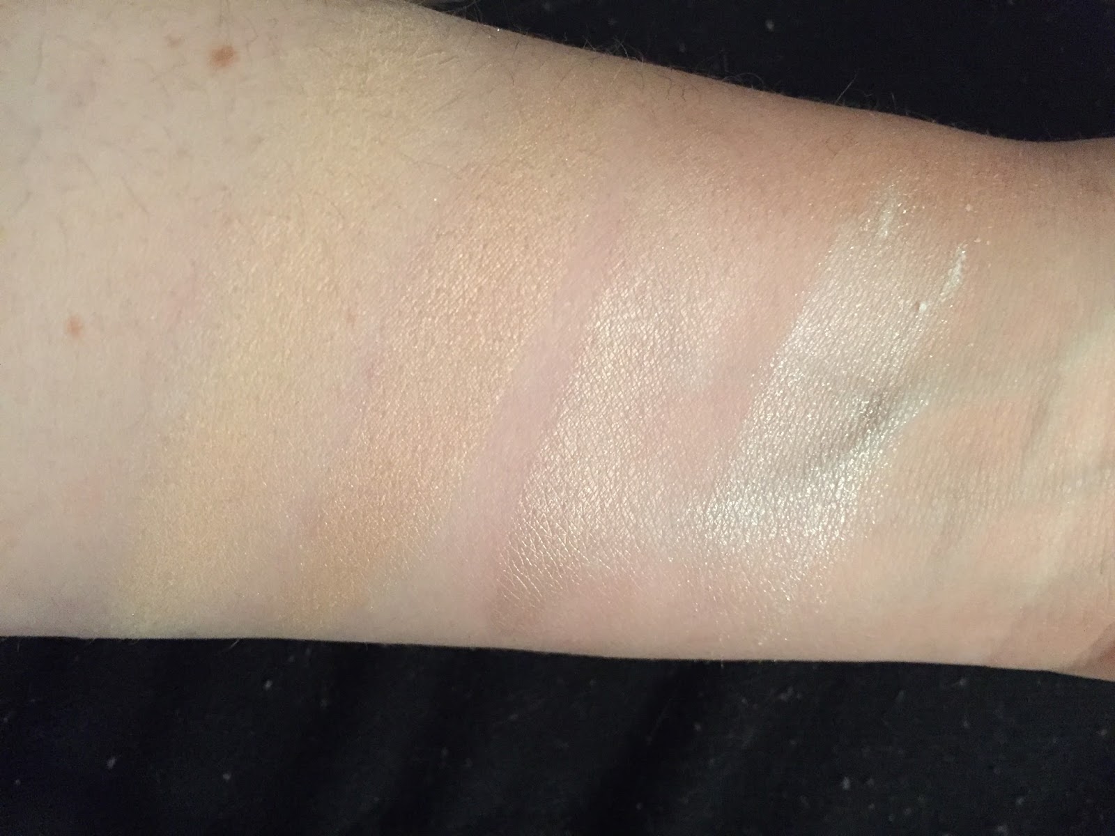
4. Ardency Inn Manuka Honey in Rose Gold, $20-something. Okay, this one pains me because it is getting harder and harder to find this online. But it is soo pretty. But I keep telling myself it is just eyeshadow, and rose gold eyeshadows are not that uncommon. We'll see. 

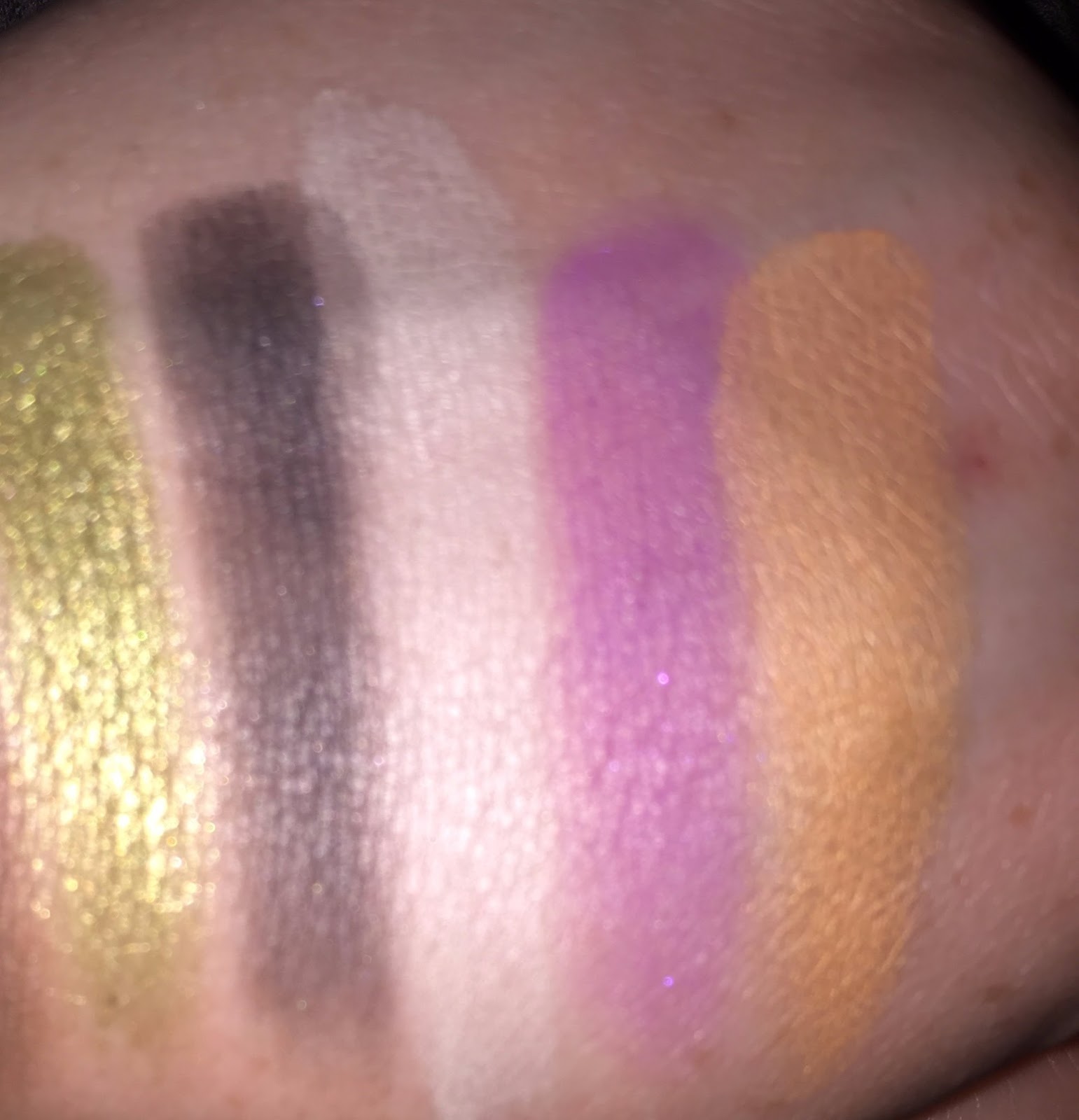
5. Stila, Magnificent Metals. This one is is getting a lot of buzz. For .15 oz, it sells for $24. I feel like that's pretty pricey for Stila. I am not going to buy this because the quality varies too much from shade to shade, and it's pretty inconsistent. This is due to the fact that some of the shades have an actual color liquid base, while others do not. I've also heard reviews of the glitter falling off/being chunky. After looking at the swatches at Temptalia, hardly any except for the Rose Gold look opaque. And the "mermaid/unicorn" pink/purple/blue duochrome ones are simply not my style.

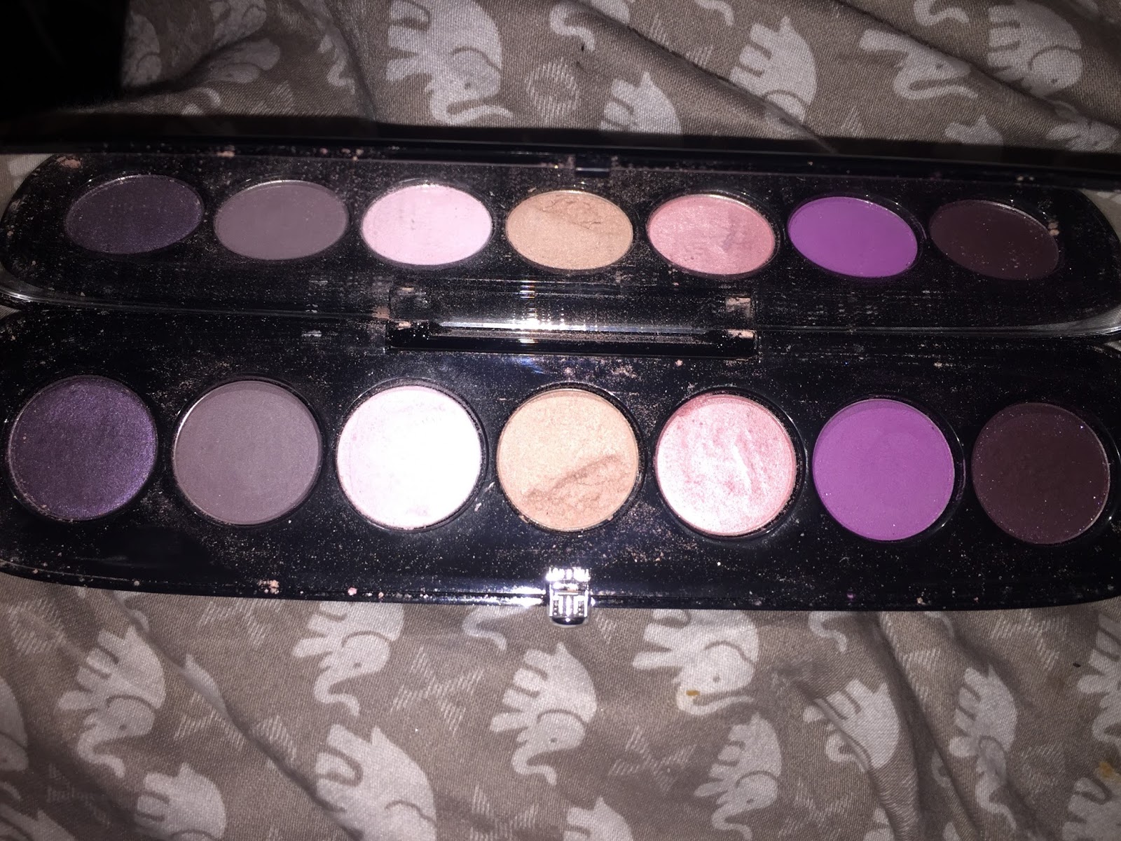
6. Carli Bybel Deluxe Palette from BH Cosmetics, $19.00. I am one of those few who did not purchase the original one. For me, most of the shades looked exactly the same, and I am not a fan of BH Cosmetics matte eyeshadow. The Deluxe palette, which came out last month, certainly looks deluxe. I've watched a couple of videos that have swatches of this palette, but no live swatches, which I thought was strange. I am not going to purchase this. Though I think the shimmery shades are quite pretty, I would love to see BH Comsetics sell them as singles. Again, the mattes would be redundant for me, and the sheer amount of highligher in this palette is overwhelming. This palette looked bloated.
And I don't really buy the claim that some highlighters can be used as eyeshadow. It really depends on the formula. If the highlighters are of a looser formula than the eyeshadows, then one would require glitter glue or a really sticky primer, because many highlighters are actually formulated to blend and sheer out.

I see a lot of people talk about her original palette on YouTube. She ends up in a lot of decluttering videos. Whether or not people declutter it, many of them attest to the fact that they simply do not use it. While I do think the deluxe palette  is certainly more inspiring than the original one, I have a feeling that in a couple of months, people will be saying the same thing about the deluxe one as well. 

Saturday, May 13, 2017

Shiro Matte Eyeshadow, Review

My very first indie makeup purchase was Shiro cosmetics, earlier this year. I bought two matte sample jars, and one full size jar highlighter. We'll save the highlighter for another day. Let's talk about the two mattes. All swatches in photos on bare skin with no primer, and w/finger for ABH, brush for Shiro (as finger swatches with the loose formula are impossible.)

1.  There's No Such Thing as Magic. This one is mentioned a lot in recommendations, especially as a dupe for the Modern Renaissance palette's Buon Fresco. As the pictures will show, the Shiro shade is lighter, with particles of holographic glitter lightly scattered throughout. What I will note, though, is that when I use this shade in my crease with primer, it will darken on the skin. The formula seems to be...absorbent in some way? Buon Fresco has a more powdery formula that is much easier to blend. As I will mention below, the formula of this shade makes blending difficult, and involves tugging on the skin. Though this matte looks pretty, when I run out of Buon Fresco I'll probably just buy the ABH single, rather than try to use the Shiro shade up. ⭐⭐⭐ 1/2


2. Pietrisycamollaviadelrechiotemexity. As in, I have experienced the aforementioned word when thinking of what this possibly could reference. Seems like a waste of print. The shade itself, however, is a good crease shade for my skin tone, a peachy matte. This one does not experience the same color change on the skin as the first shade. Both have nearly identical formulas, except for carnuba wax, which "There's No Such.." contains.  Perhaps this accounts for the texture and performance difference. I don't use this particular shade up very much, but it is one of those easy ways to add warmth and color to an eye look. On my hand, I did want to compare it also with a shade from Modern Renaissance, so I've compared it to Burnt Orange, on the right. While this shade is more muted compared to Burnt Orange, sometimes that can be a good thing. ⭐⭐⭐⭐

 
w/ flash, Shiro mattes are the inner two shades, ABH is outer two

Blurred to show sparkles on Shiro swatch. Note the slight difference in color around the edges.


Thursday, May 11, 2017

Unicorns and Makeup (essay) 🦄

I blame tumblr.

I have not used the blogging platform for about two years, for personal reasons. One, I was getting a job and did not want a digital footprint in that sand. Two, though I think tumblr during my college days was invaluable in learning about social justice, privilege, critical thinking, etc., I can't deny the fact that, as with every form of social media, one contributes to a discourse consciously, and is rewarded with reblogs and likes. 

And of course, "the aesthetic."  The opalescent pastel aesthetic of the cool kids that typified much of site.

The past two years it was mermaids. 

And now it's unicorns?

The mermaid trend was reflected in makeup, hair ornaments, makeup, music videos, and dress. I understood the mermaid trend, as mermaids are 1/2 human, and perhaps have a standardized iconography and style one can mimic.

The unicorn thing is sinister.

What is it? Rainbows? Holographics? But unicorns are horses with horns on their heads. A quick google search shows they are white horses, in fact, with pastel (mostly lavender) hair, and rainbow horns. They are associated with magic and sparkles.

If we were going to go far back in internetland, there was a coveted shade of Clarins nail polish with the nickname Unicorn Pee. It was not in reference to any color scheme, but rather a humorous comment on the elusive nature of this product.

So if we were to reduce, if we were to collect all the unicorn makeup in the world and set it on a pan to boil at high heat, what would be left? 

From my observations of all the recent releases, including Tarte and Wet n' Wild (with Colourpop coming in soon), in can be reduced to the following:
  1. blues
  2. pinks
  3. purples
  4. rainbows
  5. pastels
  6. sparkles
  7. unicorn horns
Also illustrated in the following (sans horns):


Let me take a breath. Aside from the way "unicorn horns" have been integrated into lines- which is, to sell makeup brushes that look like horns, everything else has been done already. Those are not themes. Those are colors. 

So why is it sinister?

Because even when "mermaid" was a trend, not every single brand was playing along. Now they are. And it is a shame because these are repeated colors and aesthetics. And brands lose their identity. And the market will be bloated with unicorns until- and I suspect this will be soon- it will move onto the next "thing." 

When I think of unicorns, I don't think of makeup. Mermaids, on the other hands, were sirens. Were women. Unicorns are horses. They are associated with maidens, sort of, but the Ophelia-looking kind. Not a girl bedecked in glowsticks and glitter. I don't know. At the end of the day, all a company has to do is slap a buzzword onto a product to reel people in. I guess the whole unicorn thing is just so blatantly transparent. They're not even trying anymore.

Take Wet n' Wild. This is one of their upcoming "unicorn" products (referring to center compact) :

And this was one of their highlighters from last summer: 

To me, this illustrates the fact that these are not new products, not completely. None of these companies are doing anything really new. Even the make-believe in yourself palette from Tarte was not entirely convincing, though it was a step in a different direction. The quality was a bit dubious for me, especially for that crucial matte shade. 

To wrap up, I think companies are severely limiting themselves with following such particular trends, especially with something as inane as unicorns. It is almost like the phenomenon with the "Minions." There's really no basis for their popularity, but because they are ubiquitous as a result of keen marketing tactics, people accept them. 

And hey, maybe that means in the near future, we'll see Minions be the new unicorns. I do enjoy wearing yellow and spouting gibberish, after all.  

Problem Brands, continued (rambling/rant)

Yesterday one YouTuber, whom I admired, posted a picture of themselves wearing a LimeCrime lip product. And I really did not have to hesitate. I unsubscribed. I understand that makeup is all about personal preference, choice, and how it's not that deep. But it's also personal preference which circles of conversation and influence I choose to pay attention to, and how we normalize exchanges with untrustworthy individuals and the companies they represent.

So, yeah. LimeCrime. Kimberly Clark is oddly forgiving of them as well, which annoys me. It's quite possible that some bloggers simply do not know the entire story, but a quick rifling through the internet will yield answers.

What other brands beside J* and Too Faced I won't personally give money to?

Lorac. With the holographic-packaging brunch palette came the beginning of the end. Lorac does churn out holiday editions and sets that simply are of crappier formulations than their permanent editions, but now even their "pro-formula" special editions look bad. The Pirates of the Caribbean palette has already been lambasted by the internet, but I think it's indicative of the brand itself. There was no attention to color, and the fact that no one is checking for this franchise any more. When I was in middle school, I thought the first one was something special-and it was. But after the second one it was clear that there was no need for more. And of course, if Johnny Depp profits off this thing in any way, why would I want to facilitate that?

As for brands that have been annoying this week:

Urban Decay. Now there's a Naked perfume? It is quite interesting to me that the trajectory of the Stinky Peach is mirrored in the trajectory of the Naked line- in both cases, a concept is squeezed until there is nothing left, to make a maximum product. Pass.

The Ordinary. Now, I just made a post about how their apology worked in some way. But I've been doing a little reading and there are murmurs that this is not the first time Deciem pulled this stunt. Hmm..

Bite Beauty Prismatic Pearl Creme Lip Gloss: Oyster Pearl, Review

I think it is safe to say that the liquid ultra-matte lipstick trend is on its way out. A year ago I bought two liquid lipsticks from Ipsy, and I haaaaated them. I'm seeing a lot of this sentiment on YouTube, as people acknowledge they were on a bandwagon, but it just didn't work out. However, that is not to say that people who enjoy liquid lipstick are wrong for their preference. Something I've learned is that trends can be thankless, and it's better to stick with what you love.

I love traditional bullet lipsticks, as well as glosses, as long as they are not sticky. I've been very interested in the Bite brand, as I was really impressed with the holiday duo I purchased in bronze/pepper. Pepper was a little too warm for me, but the bronze shade was really lovely. It was one of the most shimmery makeup things I've ever owned, and I am sad that I am almost finished with it.

Bite's Pearl Creme Lip Gloss line is relatively new, and the pictures on Sephora are really something. The entire line is as follows:
Video still courtesy of Sephora site
I bought the fourth one from the left, Oyster Pearl, which is the mauve shade with silver and blue shimmers. I ordered it from Sephora on the 5th of May, and it was delivered on Monday, May 8.

I have been using it for about 3 days now daily, and I do have some answers to the questions I had initially about the product:

  1. Can a lip gloss be worth more than $20?
  2. Does this gloss last a long time?
  3. What is the texture like?
  4. Will the shimmery color shift be wearable? 
To begin with #1: No, I don't necessarily think this product is worth such a high price point. For the small amount that you are getting, especially, .14 oz. 

#2. Yes, this gloss does last a long time. Over time it does fade with shimmer left behind, for a subtle effect. I can't factor in eating and drinking, though.

#3. The texture is comfortable and hydrating, and the "flavor" is the typical sugared-citrus flavor that was in my holiday lipstick duo. For texture, I can detect the sensation of slight grittiness due to concentrated amount of shimmer in the formula. Personally, I don't mind this, but I can see how others would. 

#4. In terms of how wearable this particular shade was, I would say very. Yes, the shimmer is striking, but not messy or goopy. 

I have some pictures below:
one swipe, w/ flash


The applicator dispenses a generous amount of product, but one can easily control how much is actually applied. If you are using a light hand, this could be worn as a topper, but I have not done so myself.

Overall, I think this is a beautiful line of products, and that Oyster Pearl is a welcome break from my typical array of nude lipsticks. I give it ⭐⭐⭐⭐1/2 

Deciem's Apology

When do apologies work? When the company offers some transparency about where they went wrong. I'll be honest, I'm not mad at them. Especially with inexpensive the product was. See the apology below:

I placed my order on April 22. I contacted them about the status of my order on May 1. I received this email because my order has not yet been shipped.

What I don't like about this apology? I don't know what "very soon" means. No one can know what it means. Except for Deciem.

I also think it would have been better for them to offer a sample or discount or something with these late orders, but they did not do that.

Still, we'll let the products speak for themselves.

Tuesday, May 9, 2017

The Rush Routine

This morning I was set back 30 minutes due to sleeping late. I jolted awake at 6:00 on the dot, without an alarm, though I usually wake up at 5:30, even 5:15. Disoriented, panicked, I knew I would have to cut corners on my daily make up routine. With this in mind, today I learned what I would count as "essential" and "nonessential." Now, realistically, make-up is not essential. At all. I know this. But I knew if I was going to brave the day, I was going to put some color on my face.

On a day in which I am feeling right on time, early even, my routine is as follows:

  1. Micellar Water
  2. Laura Mercier Illuminating Primer
  3. Urban Decay Primer Potion
  4. Eyeshadow:
    • Base cream powder shade
    • Transition
    • Fyrinnae Pixie Epoxy + Lid shade
    • outer corner shade
    • eyeliner
    • mascara primer
    • mascara
  5. foundation, which is a mix of:
    1. Manic Panic Virgin White
    2. La Roche-Posay's BB Blur
    3. Japonesque strobing liquid highlighter 
  6. setting spray
  7. highlight
  8. blush
  9. contour
This usually takes 20 min. Today, however, that time needed to be cut in half. I knew I wouldn't be able to do my eyes until I got to work and I could be sure I had enough time. So my super abridged makeup routine turned into:
  1. cold water
  2. Primers, (touch in sol no poreblem, and PP)
  3. foundation (no japonesque in the mix)
  4. setting spray
  5. lipgloss
I stuffed my Z palette, mascara, brushes, and liner into my purse and went to work. At work, I then finished with my eye look, which consisted of five colors in my Z palette:
  1. 2 Kat Von D shadows for base and transition color
  2. ABHs' Amber for lid
  3. fudge for outer corner
  4. White Gold for inner corner. 
This is a tried and true eye look that does not take much effort, and I finished in 5 min. 

With that in mind, I learned that for me, lash priming, blush, and contour are non-essential, while foundation, eyes, and lips are. I defaulted to an eye look that I've done countless times before, which I did not mind, but the early morning is such a difficult time to gather my bearings. 

Sunday, May 7, 2017

May 2017 Haul

Okay, I am not a fan of haul videos or posts specifically. But because I know that this is a personal blog of personal ramblings with a non-existent readership, I've decided to keep track of my most recent purchases. I like the idea of "hauled it, but how was it?" videos I've seen lately, and that is precisely what I intend to write once I've made use of the following items, which are also listed as new on my inventory (save for the perfume and lip products):

1. The Ordinary:
                -Serum Foundation. I probably didn't need ANOTHER foundation...but I wanted to try this! I am curious to see how it matches my skin tone.
                -Retinoid 2%. As I've mentioned elsewhere, aside from moisturizes and cleansers, I am not interested in multi-step skin care regimens. I've started to look into other types of skin care after noticing some signs of crow's feet and forehead lines. We'll see what happens!

2. Too Faced:
               -Glitter Glue: I needed a dupe of Pixie Epoxy. I honestly don't know how this is going to compare. This purchase was made because the Fyrinnae shipping times are ridiculous. If I ever buy from Fyrinnae again, I would buy 2 full sizes of the PE. (arriving Monday)
               -Shadow Insurance, sample. I am running out of my original UD Primer Potion, and wanted to look into other primers. I do have UD PP in Sin, but I hate the formula of that one, as it is both greasy and gritty, and I even suspect it might be a fake. (arriving??)

3. Bite Beauty Pearl Creme Lip Gloss, Oyster Pearl:
                - I am so exited about this one! I have noticed this line as soon as they came out on the Sephora site, and I absolutely loved the shimmer side of the "bronze/pepper" holiday duo. Of course, I loved the look of the daring shades, but Oyster Pearl, a glittery, shimmery mauve, was the most "me" color, and the highest rated one on Temptalia! (arriving Mon.)

4. Lavanila Labs:
                  -Roll-on perfume in Coconut Vanilla: Not as popular as the original vanilla scent, I wanted to try this because the descriptions in the reviews were interesting. I owned the vanilla scent, loved it, got many compliments when wearing it, and then lost it. It is driving me nuts. The original vanilla scent was beautiful, especially with notes of tonka, which I thought was really special. Of course, I wanted something summer and new, so here we are. (arriving Wed.)
                   -Sport deodorant in Vanilla. The amazon rating was convincing, as well as Livloveshermakeup, a youtuber who has praised the Lavanila deodorants. I usually wear anti-perspirants, but do not wear them on weekends, so I can easily adjust between those types of products. I've been noticing that I hate the way I smell at the end of the day, even with antiperspirant, so I am curious to see how this works. (arriving Wed).

So there it is! Seven products! My goal is not to buy any more by the end of this month. Next month I can treat myself to a birthday splurge, but I do have to put serious brakes on.

My Highlighter Collection

As of now, I have four highlighters in my collection that I have picked for daily use. I have decluttered some this past year, and the four I have work best for me. At this point, I don't really have a need for a new highlighter, nor do I particularly like the "duochrome" trend, commonly known as "holographic." Let's dive in, shall we:
No flash: RYC, Marry Lou, Crystal Glare, Vessel...


w/ flash
1. Wet n' Wild's Reserve Your Cabana (RYC), about $4.00. I never knew this powder contained SPF, but it does, 15, which is not much, but still something. I wouldn't go about using this as one's only source of UV protection, though. This powder is lovely, with a subtle sheen. I commonly use this to set my under eye. I can't use it to dust all over my face, however, because it would be a tad too dark. As a highlight though, it is flattering, and I love the way it smells, though it is not perfumed. This highlighter I rarely use by itself, but frequently as a powder base for other highlighters. Overall I'd give this ⭐⭐⭐⭐ out of 5.


2. Mary Lou-manizer, The Balm. $23. I knew I wanted to purchase a higher end highlighter, but I had no idea where to begin. If I had to start over, would I have picked this? Maybe not. Maybe I would have spent my money on the Hourglass ones, just to see, or some other brand. But this one was the most consistently mentioned one online. It is a beautiful highlight, and I do not need to use a heavy hand with it. I do not find it particularly long lasting, and have found that I bring it to work for touch-ups throughout the day. ⭐⭐⭐⭐

3. NYX, Away We Glow, Liquid Highlighter in Crystal Glare. OH MY. How are people not talking about this one? First, let me say I bought this, for $7.00, because Temptalia gave it an A-. Now, I have a love-hate relationship with Nyx, but I have been on a quest to find some sort of substitution, not really a dupe, for Kevyn Aucoin's Candlelight liquid highlighter. This is terribly pretty, and a paler,less sparkly version of Mary Lou. It is long-lasting, and because it is liquid, it gives a nice, dewy look. Application can be tricky of you are working with a powder base, so I only use this when I have used liquid foundation only. The doe-foot applicator can deposit a lot of product, so I dot it along the tops of my cheekbone and my temple and blend it with a damp makeup sponge. Compared to the other line of Nyx liquid highlighters, the "born to glow," the sheen of this is natural but strong, while the born to glow illuminators were glittery.  Lastly, I love the name of this. Crystal Glare. Staring daggers at anyone who dares. ⭐⭐⭐⭐⭐

4. Shiro Cosmetics, Vessel for Dissacharides, $9.00. One blogger on YouTube once gave a really solid critique of indie brands, saying "I have to protect my nerds." She was referring to the fact that many indie brands bank on the fact they can appeal to niche audiences while larger corporations cannot. Even if the product has a tenuous relationship to the concept at hand, by slapping a reference on it they generate an association that makes people want to buy the product. I found myself in this predicament when purchasing from Shiro. First, the name of this product, a reference to A Series of Unfortunate Events, makes reviews extremely hard to locate. Second, I find myself a bit reluctant to use this highlighter, because of the glitter. It can easily be brushed away, and the highlighter itself is the lightest one I have, white, with a good sheen and almost creamy formula. So, I do like this product. In a way. I just feel I do not particularly need it, but I do not want to declutter this Very Finicky Dust. ⭐⭐⭐1/2

Decluttered Highlighters:

1. PIXI Rosegold highlighter blush duo, IPSY bag. Retail price $18.00. This product makes me roll my eyes. Pixi makes me roll my eyes. The blush had zero pigmentation, the highlighter was not bad, but I disliked the texture of it.

2. Wet n' Wild Rainbow Highlighter. Sigh. No reason to purchase this but hype. Can create an effect of the face with all the colors, making a slightly greenish gold highlight, but will show texture.

3. Essence Glow with it (?) highlighter, $3.00. Found at Target, clearance. I loved the look on this on my face. But did not last at all.

Final thoughts:
I have a lot of golden champagney tones. I myself am a cool toned person, with light skin. I think I would be willing to try a slightly pink toned highlighter. I am expecting UD's Sin highlighter in my next Ipsy bag, so we'll see how that goes!
© *:・゚Cosmetically Inclined ・゚:*  
Blogger Templates made by pipdig