It's has been a while, hasn't it? I caught myself a nice little cold this past week, and spent the weekend recovering from it. I've sort of been out of the makeup/beauty sphere for as long as I've been in this funk, so naturally I missed a couple of things.
I hope you don't mind that I am opting to not include any pictures of these releases. Most of my bookmarks come from the Trendmood account, but to keep reposting pictures seems redundant. It's also time consuming and I am a very lazy person.
The last beauty purchase I made was actually one of those magnetic sewing containers, which I am going to repurpose as a z-palette. Other than that, I have not added anything to my collection. But after browsing Instagram, I have bookmarked some things. Lessgo.
1. Ace Beaute's Flair palette ($39.00). I anti-hauled this brand in the past because- as much as I liked their release- I was not convinced of the value. They just put out this new palette that contains a chartreuse, as well as rich blues, oranges, reds, and berries. Now, I am strongly tempted to make a dupe post on this, but the only thing I would not be able to dupe are the three blue shadows, because I don't own any. And if you take those away, you are left with an expanded version of their Classical Paradise palette. With that in mind, I know I personally won't be getting this, though I can honestly say the palette looks beautiful, and it's definitely inspiring.
2. Wet 'n Wild's Four New Dupe Palettes. Allegedly, these are dupes for Prism, Soft Glam, Lila (ND), and the Tropical palette (ND). To be honest, I have tried this formula and the shimmers are nothing compared to the older, softer formula. They're not bad, though, and I do think it's great that they are bringing fun color options to the drugstore. Keep on keeping on, Wet 'n Wild.
3. I also bookmarked the new The Tribe palette from Juvia's place. Another bright light green! This seems to be a color we are going to see a lot, which I think is interesting. For me, this type of color seems like either a lid or a transition color, like yellow. I have my own version of it from the BH Cosmetics Back to Brazil palette, and I have a couple of greens, browns, golds, and oranges, so this palette would be a bit redundant.
However, another interesting thing Juvia's Place is doing is making mini palettes. Now that I find to be quite, quite promising. I remember saying a while back how I wished their palettes were smaller. Hmmmmm.....looks like I was not the only one. The downside is they seem to be downsizing the palettes in order of their releases, so they're starting with the first palette they introduced, The Nubian, a super neutral palette. Like, super, super neutral. So while I love the idea of mini palettes, I know I will have to wait until Juvia's releases a more colorful one. I just hope they don't do what Natasha Denona sometimes does with their mini versions, which is to take all the interesting shades out and make a repetitive little shrug of a palette (like their mini Star palette.) Fingers crossed.
4. Physician's Formula has two or three new palettes coming out that are part of the Butter line. They seem to have a nice balance of neutral and color, but I will be skipping only because I don't know what the formula is like (of the butter ones) and I don't need any of the colors.
5. Christmas palettes- ones that feature green and red. So far, Give Me Glow, Linda Hallberg, and Pat McGrath Labs all have these types, but as festive as they are, I would be the type of person to enjoy them during the holiday, and then move on to something else when the festivities are over. The nice thing about the Give Me Glow Christmas Morning Palette is that you can take the shadows out, and replace them as needed, which is useful. I am also obsessed with silver for some reason, and need it on my eyelids, so if Give Me Glow can sell Santa's Sleigh as a single I would be much obliged.
6. Finally, we'll end with a very general overview of whatever the hell Colourpop is doing. Their release reminds me of the Fairy Oddparents episode where Timmy accidentally released all the Anti-Fairies into the world. Yes, Colourpop's swarm of supershock shadows are, in my mind, anti-fairies. I have no doubt that the colors and quality are good- I've read plenty of reviews. But when a release is so numerous and massive, I have no recourse but to just ignore it. I'm the type of person to just buy something when I am looking for something specific, so if CP has that, then fine. But they don't now. Is there is a reason why Colourpop is not selling a silver pressed shadow? We need to talk, CP. Don't be an anti-fairy.
Okay, I did not mean for this post to be so rambly. There is plenty I missed, like a Pizza Palette, but honestly if I don't see the potential in it, I am not going to post about it.
P.S. If I do get gift money for Christmas this year, a small little part of me is debating whether I should get a Pat McGrath palette. I know that would be super ridiculous. I know. But still....
Okay, now I'm going. Thanks for reading.
Showing posts with label tmo. Show all posts
Showing posts with label tmo. Show all posts
Sunday, December 9, 2018

Wednesday, July 4, 2018
Beauty Bookmarks, #1
Hello! So this is a new feature from my blog, which really isn't dissimilar from what I've already been doing. I like to TMO/anti-haul things I like, but it's really draining to sustain a negative viewpoint. Even in my TMO's, I don't really do that completely. If a product seems interesting, I'll concede to that, but also talk about why I won't personally be purchasing it.

So I got a little bit of push-back on reddit for suggesting that this palette is similar to the Natasha Denona Star palette. Here me out:
So, for the sake of clarity, I am going to call my product release posts Beauty Bookmarks, because they're usually literally posts on Instagram that I've bookmarked. There are releases that I am aware of but have chosen not to discuss, only because I would never buy them.
The first item is hot off the presses, in terms of news about its release. We are talking about a blush and eyeshadow palette, called Fetish, from Kat Von D. You may remember an Instagram post from 6 mos ago (lul), which was a sketch of the calligraphy for the palette design. Both palettes are ovoid, with raised print. The names of the blushes/highlighters are: Roseshock, Magick, Telepathy, Bathory, Salem, and Coven. Three pans are larger than three others, but I am not sure which she would make the big pans. The Alchemy palette was pretty small, so if she is reusing those supplies, then my prediction is that the highlighters will be the smaller ones.
Now usually I really don't care about product names, but Erzabeth/Elizabeth Bathory was a serial killer. Not a good look. And as someone who teaches The Crucible, I don't think of Salem as really needing to belong in this hodgepodge mystical assemblage she has going on here. It's a bit lazy.
As for the eyeshadow, there are quite a lot of them in this palette. Like a lot. And all of them have names related to certain practices and lifestyles that I am sure Kat Von D is misusing or misappropriating in some way.
The interior of both palettes have not been released, but let me tell you, aside from two steeply discounted palettes I bought from her one time, I have no intention of buying her products ever again. The anti-vaccination stupidity, neo-nazi associations, etc., are inexcusable and I am not funding it.
From a product point of view, face palettes are a gamble. Unlike an eyeshadow palette, face palettes have bigger pans of product that might not work for you. As for her eyeshadows, she seems incapable of producing permanent eyeshadows anymore, so essentially she's glutted her own market. I have been expressing fatigue with the Ma Vida Loca palette craze for the longest time, and every palette since then has been some spin on "dark rainbow." Okay. Not for me.
Let's move on, shall we?
The BH Cosmetics Desert Oasis Palette. In terms of brands that have the potential to be direct competitors with Colourpop (you've heard it here first, folks), BH Cosmetics is one of them. Just start selling singles, darn it! Anyway, they are releasing this summer palette that actually looks quite pretty. This is Trendmood's pic:

Though I have most of these colors, and would not wear blue eyeshadow, I think the composition of this palette is nice. I don't quite get the placement of the larger pans, but it still feels balanced in terms of shimmer and matte shadows. The larger pans could also be bronzers. The way this palette is designed is to be an all-purpose summer palette, and for someone who does not have this already, it would not disappoint them. I trust BH Cosmetics's both shimmer and matte formulas (which have improved so much!).
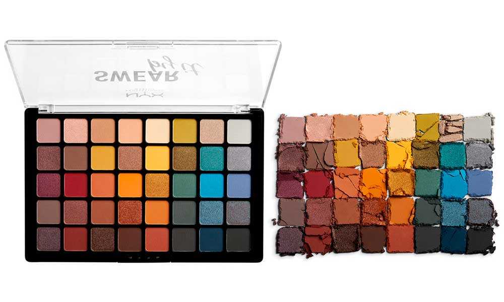
Nyx Swear By It giant eyeshadow palette: $35. 40 shades. Can you imagine that for five dollars less you could have purchased an Element palette? Yeah, neither can I. Here is a promotional pic:
Hm. I have not tried the Nyx non-neutral matte or shimmer formula. To me, this is bit intimidating, and I wish they offered this palette in halves or quarters. From a brand point of view, this is an interesting move. They are really trying to get a sense of what people will pay for, and what they won't. This mimics the Sephora Pro palettes set-up, and maybe even a little Viseart. My issue with palettes like these are the colors they choose to make shimmer. In the case of this palette, I think Nyx made smart choices and the palette is balanced. While I do think this is an interesting release, and though I am curious to see the quality of the shadows, I know I am skipping this one because I do have a lot of eyeshadow already. I would never get through all those colors.
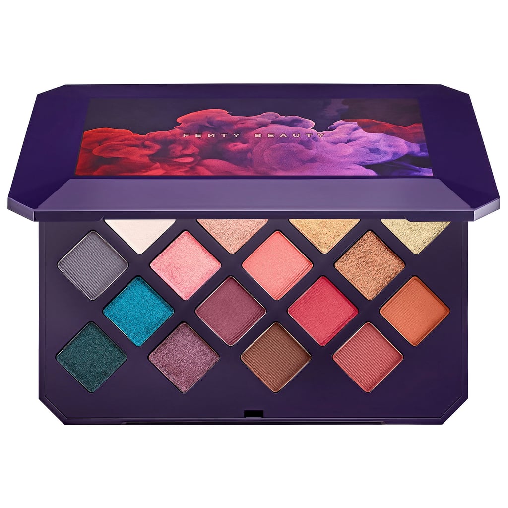
Fenty Moroccan Spice Palette:
$59 and sold out already.
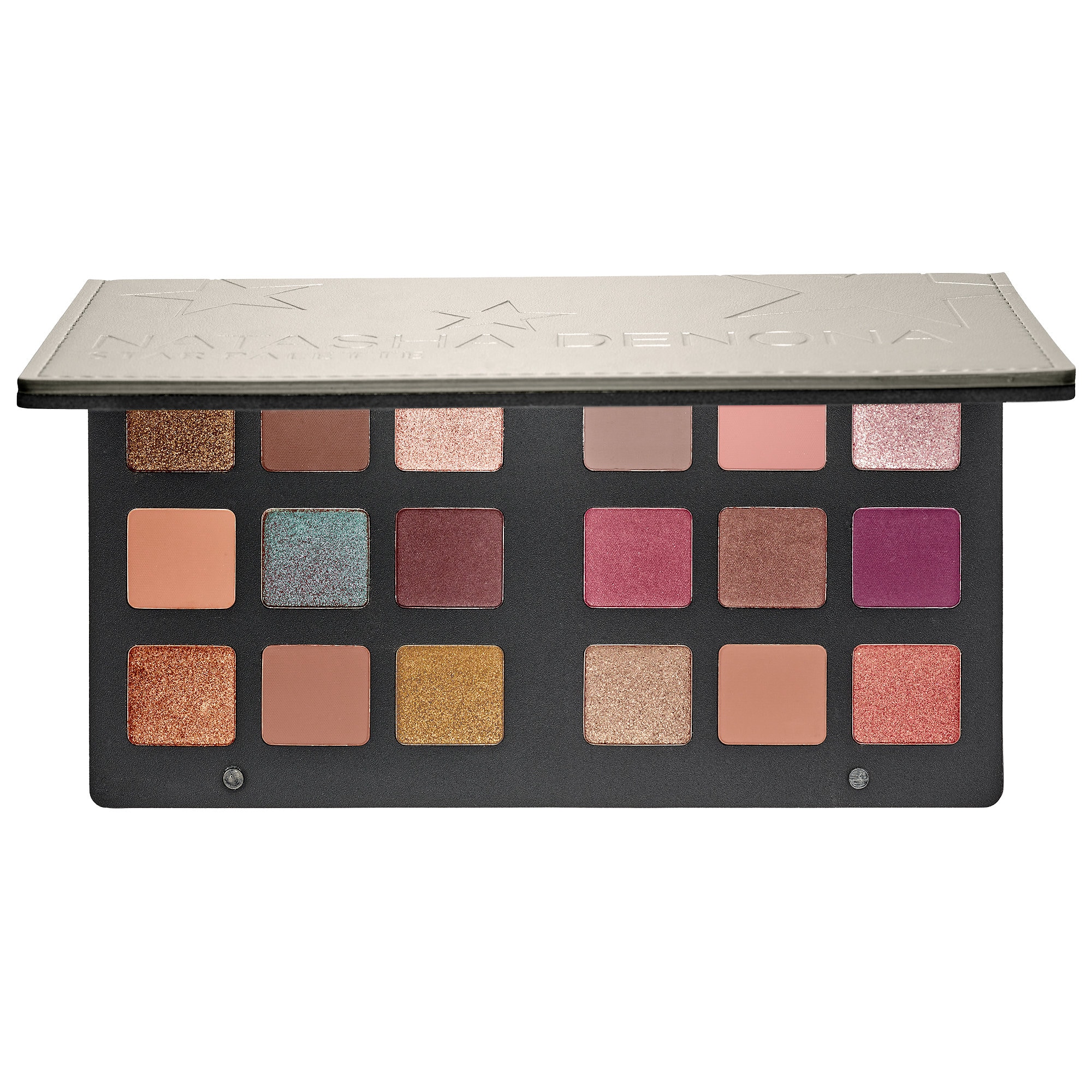
So I got a little bit of push-back on reddit for suggesting that this palette is similar to the Natasha Denona Star palette. Here me out:
Granted, the initial images Fenty releases were VERY cool-toned, hence my associations with this palette. Still, I do see some parallels. Now, if I did not have the Modern Renaissance, or Looxi shadows coming in, or tons of other eyeshadows, I'd buy it. I think Fenty did a really cool job with colors. It is not a neutral palette.
So, those were my thoughts! Thanks for reading!
Thursday, May 24, 2018
My Sort of Makeup Wishlist for Summer 2018
This post is inspired by the Innisfree Birthstone collection. I was so tempted because I love gemstones, and I love the No Sebum powder. However, my birthstone is June, and this is what I would have been getting:

So while everyone gets a cool looking gem graphic, June Pearl looks rather...bland. And I was considering buying another month, but that felt silly. It shouldn't feel silly, because it is just a superficial design, but there you go.
If I really wanted to nitpick, they could have picked Alexandrite for June. I'm not sure if it is as universally recognized as a birthstone compared to Pearl, but it is a green-red shifting stone that would look comparable to the other months and not such a dud.
Next, we have the Gemini Palette from Melt Cosmetics. Now, I have always been a little resentful of Melt Cosmetics, because they seem like a fun brand, but a tad too expensive. They came out with the Gemini Palette, and....I like it...a lot.
 It is definitely different from everything I have so far, and everything that I have seen in a while. I like the warm greens, and I would need to swatches first to make sure the shimmers are unique. if that's the case, I could definitely see myself getting this as a birthday present. To me.
The next item is not technically on my wishlist, but rather on here due to sheer confusion:
 So this is a Becca palette, cosplaying as an Hourglass palette. Here Becca has ditched its singular round pan design in favor of a beveled, baked looking powders, in the form of a face palette. Limited Edition Becca Face (not eye) palettes are usually good, but I just don't think it looks unique. The swirled blush kind of looks interesting, but its one of the smaller sized products.
Lastly, the next item is a palette that I just think is pretty.
 This is the Summer Vibes palette from Give Me Glow Cosmetics. The problem with this palette is that I have been basically curating a palette like this for the past year and a half. Aside from the blues, I pretty much have these colors. I also think there's a tad too many beige shimmers in there. I know I personally don't need this, but if the price and quality is right I could see how this would be a fun palette for many.
So, that's it for now!
Oh, I forgot to mention. I bought this contraption on Amazon last night because I am weak of spirit:
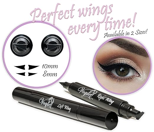
I get it on Saturday. We shall see....
Thanks for reading!

So while everyone gets a cool looking gem graphic, June Pearl looks rather...bland. And I was considering buying another month, but that felt silly. It shouldn't feel silly, because it is just a superficial design, but there you go.
If I really wanted to nitpick, they could have picked Alexandrite for June. I'm not sure if it is as universally recognized as a birthstone compared to Pearl, but it is a green-red shifting stone that would look comparable to the other months and not such a dud.
Next, we have the Gemini Palette from Melt Cosmetics. Now, I have always been a little resentful of Melt Cosmetics, because they seem like a fun brand, but a tad too expensive. They came out with the Gemini Palette, and....I like it...a lot.

The next item is not technically on my wishlist, but rather on here due to sheer confusion:

Lastly, the next item is a palette that I just think is pretty.

So, that's it for now!
Oh, I forgot to mention. I bought this contraption on Amazon last night because I am weak of spirit:
I get it on Saturday. We shall see....
Thanks for reading!
Wednesday, May 23, 2018
TMO: The Lemonade Palette by Christen Dominique Cosmetics
Hello everyone! Today I thought I'd bring you a TMO of the Lemonade Palette by Christen Dominique Cosmetics, as the image of the interior of the palette was released today.
For reference, this was the last release of CDC, the Latte Palette:


For reference, this was the last release of CDC, the Latte Palette:

While the quality of the shadows were reputed to be decent, the color story was a bit bland and repetitive. Many people were looking forward to the Lemonade Palette, with the assumption that it would be summery, bright, and more varied in terms of color.
This is the palette:

I can see about three colors that repeat: the light peachy cream shade, the deep burgundy shade, and the orange brown.
While I think this palette is a better than, say, the Tarte Aspyn Ovard palette, the most immediate criticism I can draw is the fact that this is called the Lemonade Palette, but there are no actual Lemonade shades. This might as well be called the Summer Sweets palette, because it's surprisingly, in terms of shimmer shades, a bit washed out.
I don't doubt that people could make pretty looks with this. But in terms of what is unique about it- I am not really sure. These palettes are $42, so it is important to consider what a person is actually willing to pay that money for.
While I like the fact that this palette seems to have a balance of warm and cool, I think marketing it as a Lemonade Palette is a little confusing. I think the palette offers some easy ways to incorporate color into a look, but I think even more could have been offered- Strawberry, Peach, Lemon Soda, and Pink Lemonade seem to be very frosty, even the green one, so I wonder exactly how vivid these colors will be, and how distinct, on different skin tones.
After owning the Eyes Cream palette from Dose of Colors, as well as three BH Cosmetics palettes, I know I personally have no need for this in my collection.
Thanks for reading!
Wednesday, March 21, 2018
It's Time to Anti-Haul Again
Why? Because I've decreed it.
As per yoozsh, I've been squirreling away posts on products that I see on Instagram, until I've got enough to discuss.
We'll start with this new collab with Colourpop and a blogger I've never heard of. It's a summer/mermaid collection, comprised entirely of neutrals. There are two separate eyeshadow quads, one warm and one cool, which is smart, but I don't want this. It does not seem fun to me. Some pics are below:
 |
| So..summer? |
Next is the $80 ofra All in One palette. Right off the bat, this claim is impossible. It's not going to be everyone's all in one. It appears to have three highlighters, including the one that looks like they already sell in a single, two bronzers, a contour, and some eyeshadows. Now, I have no desire to buy this because I have too much highlighter, I've got blush and contour. I'll concede that the eyeshadow colors are a lot of fun, especially compared to what else has come out so far. However, notice that the "fun" colors aren't mattes? I have a feeling that even though Ofra charges so much, it still has not worked out how to manufacture decent color mattes. Actually, this feeling can be corroborated by an excellent review on their last colorful large eyeshadow palette, by BelleBlushh, found here. Until Ofra can figure out matte eyeshadows, count me out.
 |
| Add caption |
 |
| Who though this was a good idea??? |
I am also not going to buy the Staple Palette by Give Me Glow Cosmetics. Though Makeup Struggles did not like this when it first came out, the brand is saying the shadows are reformulated, and the swatches look pretty nice. The palette is a tad expensive for my liking, at $54. Though I do like the color scheme, I pretty much have this palette in my Queen of Hearts palette, my Zodiac Palette, and my Colourpop and Coastal Scents singles.
 |
Let's end with a really difficult one for me. This one is the new stack by Melt, called Baby Girl. It is $58, comprised of reds and corals, and is inspired by Aaliyah. Now, this has been a really difficult palette to photograph, I think. All of the images I've seen online have this searing brightness to them. But if you get swatches of them in regular lighting, the palette looks pretty standard:

Actually, Kelly Gooch on youtube was anti-hauling these today, and mentioned that she has a Colourpop single called Making Moves that mimics the vivid pink-coral tones of this palette. I have this as well! I also have tons of oranges and some reds in my collection courtesy of a couple of palettes, including the Modern Renaissance, so no, I would not pay $58. Even if I did not have those colors, I would opt for more affordable options because I simply do not see the value.
Speaking of value, I am not going to add pics of Pat McGrath's newest release of 6-pan palettes, because I shocked really at how boring they were. So yeah. Just saying. It's not, quite literally, for me.
So, that's my little anti-haul! Thanks for reading.
Saturday, March 10, 2018
Product TMO: Face and Eyes (3)
This is going to be a quick TMO post. I've noticed that I am doing a lot more text posts recently, which I hope is okay for some people. Sometimes it's just a lot easier to describe a product than find a photo and insert it and blah blah blah. It really depends on my mood. Anyway, as always, I write these as I collect information about new product releases. Many times they are things I want to purchase as well, but through the art of the TMO and anti-haul, I point out why a person would not need this in their collection, to ultimately save everyone money.
Let's begin.
The first product I am going to talk about is the Benefit Gold Rush boxed blush. Contrary to what I just said, I kind of have to post a promotional image here:
 Where to begin? Now, I am not a packaging or brand snob, but I was shocked to learn that this product is going to be almost $30, based on the packaging alone. It looks like BH Cosmetics. And I say that having purchased and enjoyed BH Cosmetics products. The design of the cake of blush itself is okay, but a bit like crumpled up tinfoil. And that is a tremendous amount of gold overspray. How do I know it's overspray? Because Trendmood posted a swatch comparison of this and the other Benefit boxed blushes, and this appeared to be a lighter Rockateur. Nothing distinctive, just a vaguely peachy reddish color. That's it. This is an easy pass for me because I like blushes that are a little more unique- not ones that try to fool you into thinking they are. Gold Rush? More like Fool's Gold heh.
Next, I am not going to show you the entire line, but just two as examples. TAM Beauty (owners of I <3 Makeup and Makeup Revolution) are coming out with makeup eggs that contain eyeshadows and face powders. Overseas, they are five pounds each. Here, that equates to about $8.00.
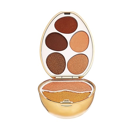
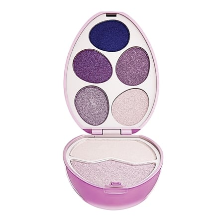
Eight dollars is not bad, but shipping is another 8 or 9 dollars. So now I am paying $17, which is definitely not worth it. I know some people can separate shipping from the value of the product, or that they are paying for another product/service, but I can't.
While I think this concept is terribly adorable, and while I was so tempted that I had one of these (the Rose Gold one) in my cart, ready to check out, I couldn't. I just have these colors. And no matter how hard I tried to justify the purchase on the utility of the palette alone, I couldn't. I just think the colors in each egg are so similar, that unless you really like the shade, you're not going to use this product. The amount of repetition was annoying. I also just don't think Makeup Revolution shadows are that great. I've seen swatches of their palettes, including the collaborative SophX palette, and I just was not impressed.
Moving on, the last thing I want to talk about is something I was avoiding a post on because it just seemed rather obvious. I am talking about the Viseart Tryst palette.
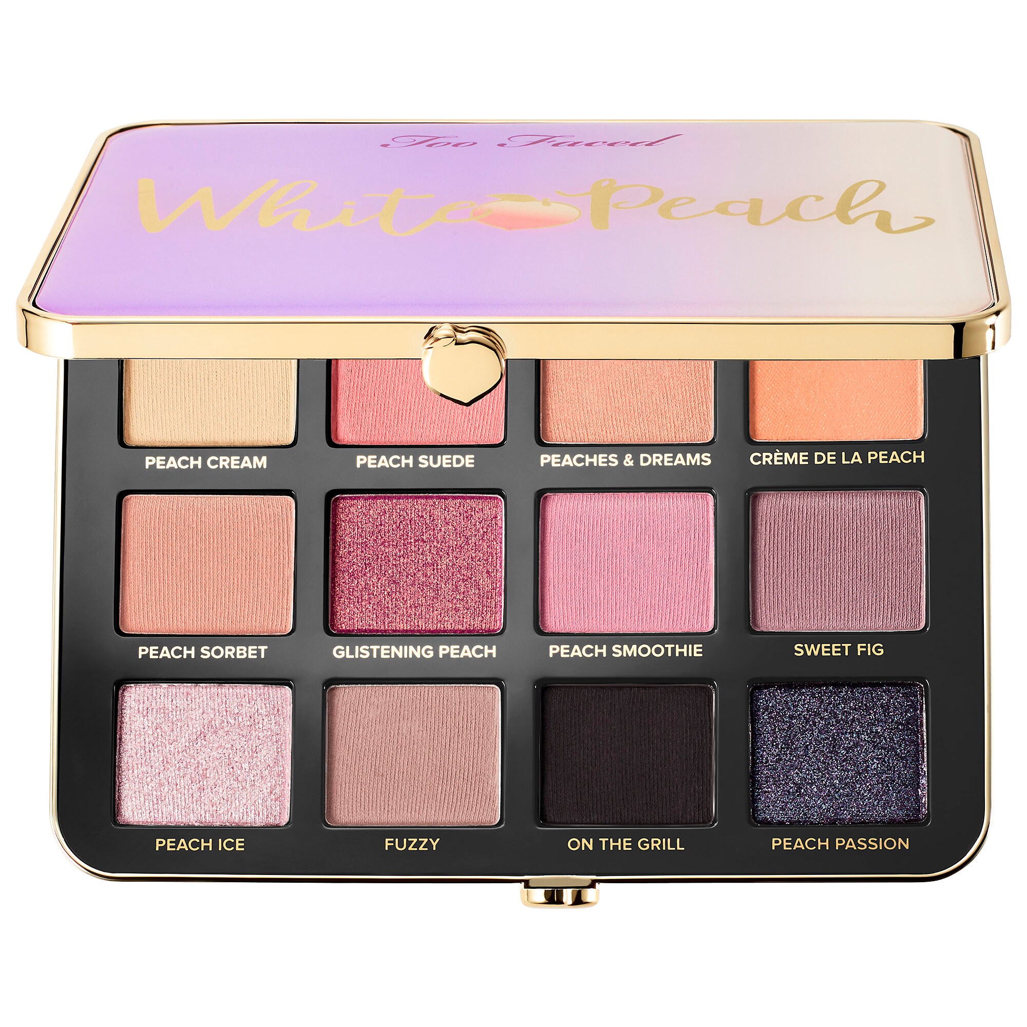
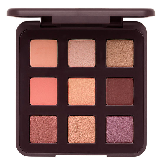
First, let's look up the definition of "Tryst." A tryst is a "private, romantic rendezvous between lovers." Ooooh, spicy. What comes to mind are dark, intense colors. Smokey eyes. A more intense, saturated Modern Renaissance, perhaps. What did we get? Basically the Sweet Peach/White Peach palette. Observe:
Let's begin.
The first product I am going to talk about is the Benefit Gold Rush boxed blush. Contrary to what I just said, I kind of have to post a promotional image here:
Next, I am not going to show you the entire line, but just two as examples. TAM Beauty (owners of I <3 Makeup and Makeup Revolution) are coming out with makeup eggs that contain eyeshadows and face powders. Overseas, they are five pounds each. Here, that equates to about $8.00.
Eight dollars is not bad, but shipping is another 8 or 9 dollars. So now I am paying $17, which is definitely not worth it. I know some people can separate shipping from the value of the product, or that they are paying for another product/service, but I can't.
While I think this concept is terribly adorable, and while I was so tempted that I had one of these (the Rose Gold one) in my cart, ready to check out, I couldn't. I just have these colors. And no matter how hard I tried to justify the purchase on the utility of the palette alone, I couldn't. I just think the colors in each egg are so similar, that unless you really like the shade, you're not going to use this product. The amount of repetition was annoying. I also just don't think Makeup Revolution shadows are that great. I've seen swatches of their palettes, including the collaborative SophX palette, and I just was not impressed.
Moving on, the last thing I want to talk about is something I was avoiding a post on because it just seemed rather obvious. I am talking about the Viseart Tryst palette.
First, let's look up the definition of "Tryst." A tryst is a "private, romantic rendezvous between lovers." Ooooh, spicy. What comes to mind are dark, intense colors. Smokey eyes. A more intense, saturated Modern Renaissance, perhaps. What did we get? Basically the Sweet Peach/White Peach palette. Observe:
 |
| $49 |
 |
$45 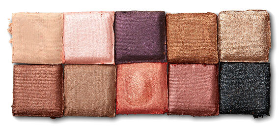 |
$20
 |
| $49 |
I am just annoyed at this point.
If Viseart is the proclaimed upper crust of makeup, than why is it just repeating trends? And for a worse value than what people already have access to? Pass pass pass.
If Viseart is the proclaimed upper crust of makeup, than why is it just repeating trends? And for a worse value than what people already have access to? Pass pass pass.
That's all I got for now! Thanks for reading.
Monday, March 5, 2018
I Have a Problem With Glossier's New Lidstar Eyeshadows [quick TMO]
Sold in $30 duos. That does not make this a better deal than Stila. Because I still need to pay $30. If I had the option to pay $15 for one, than it would be a better deal. But I don't have that option. So even though it's more product, I am still making a more expensive purchase.
But there's more. Let's look at the colors:
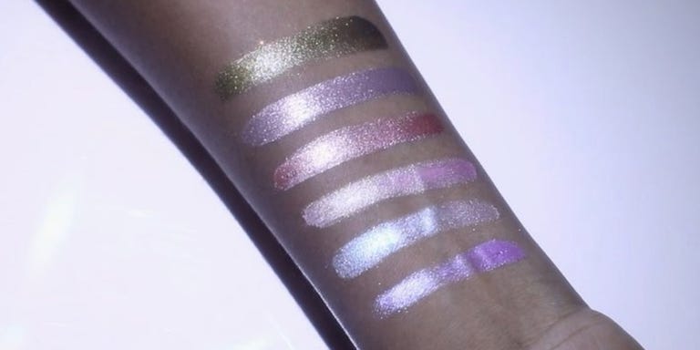
These swatches...are not helpful. Besides the shimmery bronze, they all look the same. Ridiculously light.
Seriously. I would hope that the colors would be complex, vibrant, but we really have subtle washes here, folks.
It's quite boring, quite expensive, and to the magazines proclaiming one will want to empty their wallet for it is....repugnant.
I am not going to buy these because I have metallic shades. Because these do not impress me. Because I am not in love with the value, either. Hard pass.
Wednesday, February 28, 2018
So about that new Tarte palette...[TMO]
Tarte, Tarte, Tarte. I think it's time to calm down. But think about what they wanted to accomplish. They wanted to compete with Too Faced. And they are doing just that.
Given Tarte's past w/ racism, I don't feel the need to buy anything from them anymore. So why am I going to do this TMO, right here, right now?
Because Tarte is not going to win. Not like this. Not ever.
 |
| Behold: Becca Ocean Jewels, Huda Desert Dusk, the Sweet Peach, the Naked Three, the Jaclyn Morphe palette, the Kathleen Lights Dream St. palette etc. etc. etc. |
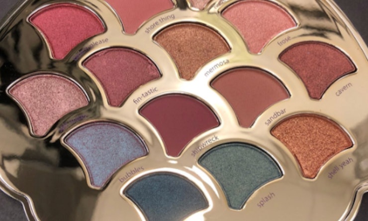
I can't give you a price yet. But I can say, quite emphatically, that this is not a summer palette. Summer is supposed to be sunny and bright, but the colors look muted.
The swatches make this look like every single palette that's been coming out:
 |
| screen grab |
But those blues. Of course, the blues. So you know that of course this palette is different.
There is no reason to buy this. Except, of course, for the packaging. The palette is housed in a seashell compact that is covered in iridescent/holographic green-blue.
For me, the contents do not justify the packaging. But Tarte hardly cares about that.
This is an easy pass for me.
Buh-bye!
For me, the contents do not justify the packaging. But Tarte hardly cares about that.
This is an easy pass for me.
Buh-bye!
Tuesday, February 13, 2018
Urban Decay Backtalk Palette: TMO
Before I begin this rather rant-y post, I just want to preface it with a disclaimer. I am pretty opinionated and picky when it comes to makeup. It comes from a place of saving money as my first priority.
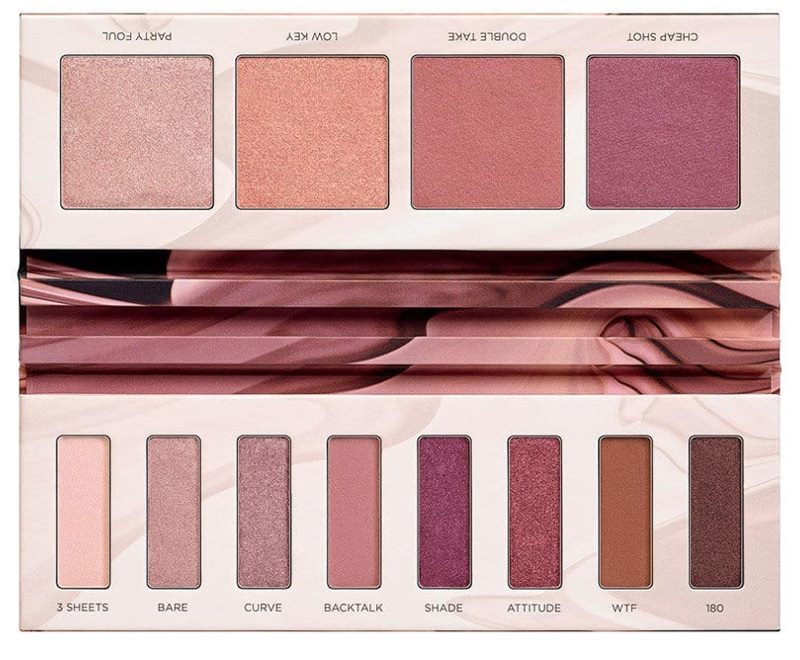
The makeup world was all a titter with news of Urban Decay's palette, the Backtalk Palette. It is a dual-sided palette, in the same way as their concealer and face powder palette. It looks like this:
Now, to say more about where I am coming from- I love purple. I am obsessed with purple blushes, I embarked on a hunt to find the best purple eyeshadow (another post somewhere on the blog- just search for it), purple is very important to me. However....this is not a purple palette I particularly want. Because...well, a couple of reasons.
1. This is the Laura Mercier palette


The makeup world was all a titter with news of Urban Decay's palette, the Backtalk Palette. It is a dual-sided palette, in the same way as their concealer and face powder palette. It looks like this:
1. This is the Laura Mercier palette
2. And the Naked 3 Palette:
3. And the Colourpop Give it to Me Straight Palette:
To name a few.
This is not a new concept, nor are these new colors, but the way Urban Decay has managed to catch the eye of consumers is to do the exact opposite of what they did with the Naked 1 Palette- complete monochrome.
Backtalk is the name of one of their lipsticks, which is a purple-pink. They constructed an entire palette around one color.
Monochrome is visually appealing, but think about what people became frustrated with when they were using the Naked Heat palette- the types of looks they were doing all came out similarly.
Furthermore, we know purple is a tricky color to pull off, and I am not confident that a lot of these are going to be very high quality.
Would I be interested in these colors? Not all of them. And I could not see myself using a face palette and and eye palette like that together. I would much rather prefer singles. I really don't appreciate that UD is making you purchase all four face products as well as the eyeshadow together. It seems unwieldy and I like those products separate. Urban Decay is being rather rude, frankly.
Even though I am curious to see swatches, it seems UD is doing a quiet release on this, sending it to smaller beauty gurus. They are also coming out with a summer palette soon. Which makes we wonder why they released it at all.
Thanks for reading!
Saturday, January 27, 2018
TMO: Becca Ocean Jewels
Now, I thought I would do a quick TMO not because I really am trying to stave off the urge to buy this palette. On the contrary. I wanted to do a write-up on this palette because it has become pretty clear that Becca does not know what it wants to do with eye palettes.
I mean, first the Jaclyn Hill scandal, then the Apres Ski stupidity, and now we get....the Ocean Jewels palette.
Hm.
It looks like this:

I mean, first the Jaclyn Hill scandal, then the Apres Ski stupidity, and now we get....the Ocean Jewels palette.
Hm.
It looks like this:
Wow. Ocean Jewels, huh? So a ton of browns, that's pretty evocative of the ocean....
So let's do a quick run-down of what this palette copped from.
- The Rainforest of the Sea palettes, Tarte. The originators of interpreting Ocean themes as light brown neutrals. Yay.
- Huda Desert Dusk palette, specifically the Twilight shade. Not an uncommon duochrome, but still very recognizable, and associated with that palete.
- The Huda Desert Dusk palette in Retrograde, or Colourpop Glass Bull. Or Coastal Scents Cherry Moss....you know, that very common blue-green duochrome pigment.
The other shadows are a shimmery taupe, a shimmery gold, a shimmery white, and a cream matte and a cream brown.
Becca is really out here struggling with eye palettes. I predict this will be released and then discounted very quickly.
Don't buy it, people. Just don't.
Friday, January 26, 2018
🔥You Know What It Is: Massive Anti-Haul time!!🔥
This is one of my favorite features to do for this blog, but it does take a lot of energy. I used to need that energy in the past, because if I did not use it for anti-hauling, I'd use it for actually buying crap. But now that I've grown a bit, the urgency to do this is not as intense. But still. I'm here, I'm ready, and we're going to do this.
I am not going to buy:
1. The Smashbox Trios, $22.0
First of all, that price for a trio is ridiculous. Second the quality looks mighty dubious. I can see why trios look really convenient, but honestly I never felt like I wanted to support the brand. Their eyeshadows are all over discount stores, and I really feel like not many people are too interested. Furthermore, they've been selling trios for a long time, so this really is nothing new.
2. The Beauty Creations Frozen palettes, $13.49
Okay, so the Olivia palette is out of stock, and I can't even find the Elsa palette. First off, let me say that I never got into Frozen. I've never seen it, and I don't think I've watched a Disney princess movie for a while now. So I don't think I am the target audience for this. For what it's worth, I thought both looked interesting on Instagram, but not interesting enough for me to want to buy it. A lot of repeating colors bothered me.

You know what else bothered me? The picture of what the palette actually looks like on their website:

3. The Sephora Pro Pigment Palette, $20
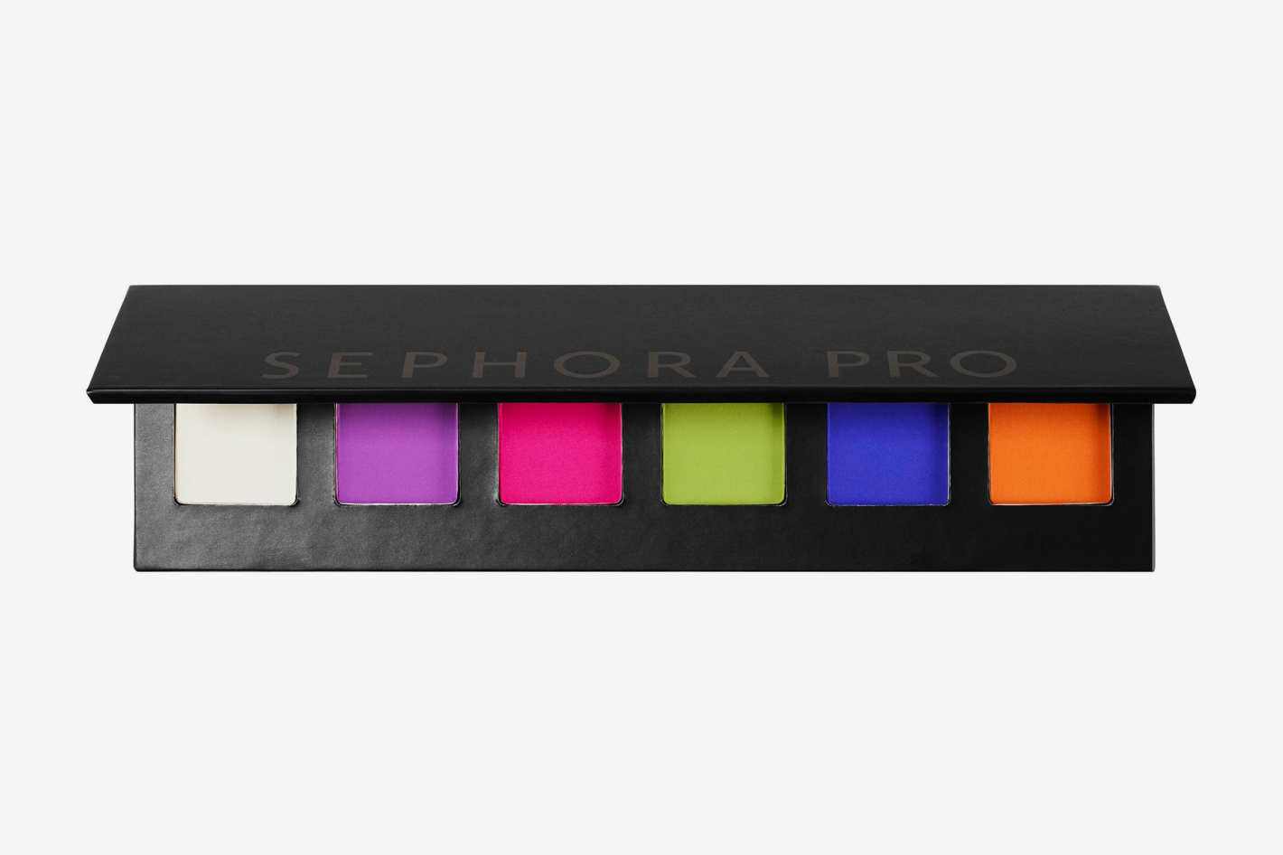 I'll start by saying I really think the price for this is very reasonable. I know I don't wear these colors, and I know people reading or watching anti-hauls get frustrated when a person passes on something simply because they don't wear those colors. But hear me out. For me, it used to be that even if I did not wear the colors, I still would buy something because the price was reasonable and I thought I could convince myself. But it never happened. I ended up wasting my money. This palette is very specific, because it is for a specific demographic with a specific preference. If this was more muted and not neon, I'd be feeling it. But I am not. I am interested, though, in seeing whether or not Sephora releases more.
4. Christen Dominique Palette, $42
Okay I am super excited to anti-haul this one, for a whole host of petty and non-petty reasons. I'll start by saying that I am only familiar with Christen from her Ipsy days. I don't follow her or watch her videos.
Strike one is that her website is impossible to find. You need to go through her link from instagram. If you google "Christen Dominique palette" nothing comes up. That's strange, and makes me wonder who is (or isn't) backing the brand.
When you get there, you find out the her brand is named Dominique Cosmetics, and all her products are stamped with the DC logo, which I find suspiciously similar to the Dose of Colors stylizing. I mean, why not do CDC? It's a palindrome, and a little more luxe (I said I was going to be petty).
Okay, let's look at this palette:
 As of now it's sold out. Whatever. It's going to be back. The thing is, the palette quite transparently adheres to the time-honored tradition of convincing you it is unique by literally throwing in two shades that are "pops of color" that everyone is just going to use in the waterline. I can almost hear Emily Noel saying it. I would love to see people take that blue, use it all over the lid, and then blow it out with that orange-brown. Not going to happen. If I had that palette, I wouldn't even do it.
Take away the blue and purple. You are left with a palette of brown and taupe tones that are everywhere- Colour Pop, ABH, even Wet 'n Wild. So is it worth it? For two colors? For $42? Hell no. And what annoys me most is that it cost extra for the useless imprint of the logo on EACH eyeshadow pan? How much are consumers paying extra for that "feature"? Could they have been paying $35 instead? Maybe? The world will never know.
5. The Blush Duos from Jouer Cosmetics, $30.00
Speaking of poor brand-name/logo choices, check out these blush duos from Jouer cosmetics, a brand I am convinced is the same as Julep.
 Again, useless cost from the imprint. We don't care about that. And two. Wasn't the brand called Jouer Cosmetics? And yet the logo is C...J...? As in Cosmetics Jouer? Why??? Why would you reverse the name of the brand just so you get a nifty little design? You couldn't come up with another design that actually makes sense?
Each pan is $15. The two colors up there look identical. I quit.
6. The Milani Eyeshadow Palettes, $20
7. The Blue Honey Palette, $38.00
Why are people hyping this? Is it truly that interesting?

8. The Karity Posh Palette, $27 also currently sold out.
 I've never bought a palette from Karity before. But I see the appeal in this palette. Aside from the varying pan sizes, which I don't like. This palette looks like a cheaper alternative to Huda's palettes. But you don't have to buy either of them. Again, for the couple pops of color, consider the rest of it- which is pretty common place. Buy a single!!
So that's it folks. This current round of products had potential, but just didn't cut it for me.
Thanks for reading!!
I am not going to buy:
1. The Smashbox Trios, $22.0
First of all, that price for a trio is ridiculous. Second the quality looks mighty dubious. I can see why trios look really convenient, but honestly I never felt like I wanted to support the brand. Their eyeshadows are all over discount stores, and I really feel like not many people are too interested. Furthermore, they've been selling trios for a long time, so this really is nothing new.
2. The Beauty Creations Frozen palettes, $13.49
Okay, so the Olivia palette is out of stock, and I can't even find the Elsa palette. First off, let me say that I never got into Frozen. I've never seen it, and I don't think I've watched a Disney princess movie for a while now. So I don't think I am the target audience for this. For what it's worth, I thought both looked interesting on Instagram, but not interesting enough for me to want to buy it. A lot of repeating colors bothered me.

You know what else bothered me? The picture of what the palette actually looks like on their website:

I mean, that is a washed out pic. And the pans look so unevenly placed and crooked. It just looks bad and poorly made. It's an easy pass.
3. The Sephora Pro Pigment Palette, $20
4. Christen Dominique Palette, $42
Okay I am super excited to anti-haul this one, for a whole host of petty and non-petty reasons. I'll start by saying that I am only familiar with Christen from her Ipsy days. I don't follow her or watch her videos.
Strike one is that her website is impossible to find. You need to go through her link from instagram. If you google "Christen Dominique palette" nothing comes up. That's strange, and makes me wonder who is (or isn't) backing the brand.
When you get there, you find out the her brand is named Dominique Cosmetics, and all her products are stamped with the DC logo, which I find suspiciously similar to the Dose of Colors stylizing. I mean, why not do CDC? It's a palindrome, and a little more luxe (I said I was going to be petty).
Okay, let's look at this palette:
Take away the blue and purple. You are left with a palette of brown and taupe tones that are everywhere- Colour Pop, ABH, even Wet 'n Wild. So is it worth it? For two colors? For $42? Hell no. And what annoys me most is that it cost extra for the useless imprint of the logo on EACH eyeshadow pan? How much are consumers paying extra for that "feature"? Could they have been paying $35 instead? Maybe? The world will never know.
5. The Blush Duos from Jouer Cosmetics, $30.00
Speaking of poor brand-name/logo choices, check out these blush duos from Jouer cosmetics, a brand I am convinced is the same as Julep.

Each pan is $15. The two colors up there look identical. I quit.
6. The Milani Eyeshadow Palettes, $20
7. The Blue Honey Palette, $38.00
Why are people hyping this? Is it truly that interesting?
It's a simple palette that integrates color that I know looks appealing. But the couple of stand-outs- the gold shimmer, the mustard matte, the blue-green matte, and the blue shimmer, can certainly be found elsewhere, and for far cheaper. This is like the Yes, Please palette with pops of green-blue. I think the price is certainly too high, and if I was truly inspired, I'd just buy a single from Inglot or something.
8. The Karity Posh Palette, $27 also currently sold out.
So that's it folks. This current round of products had potential, but just didn't cut it for me.
Thanks for reading!!
Monday, January 15, 2018
TMO: ABH's Soft Glam Palette
Here is the newest addition to ABH's family of palettes, that include Modern Renaissance, Subculture, and maybe Prism? May I introduce you to: Soft Glam.
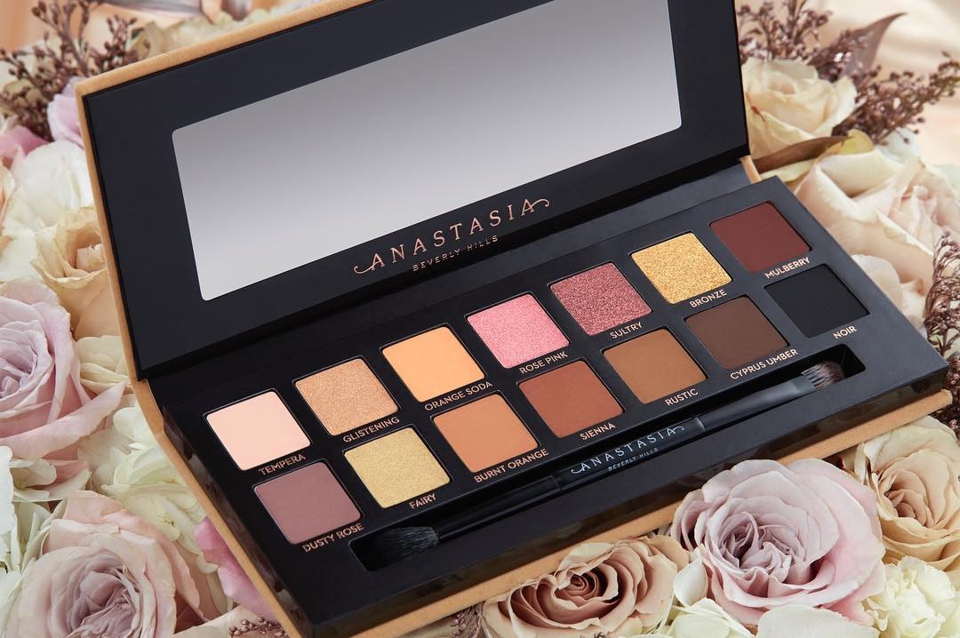
I have many issues, folks. Like how three of these shadows are from the Modern Renaissance palette. While I will say that for people who have a lot of eyeshadow, this is entirely dupe-able, a realization that is very similar to the general consensus. But I also think there are many people out there who would really like this. Frankly, if I did not have the collectoin I currently do, I could see this as being my usual palette.
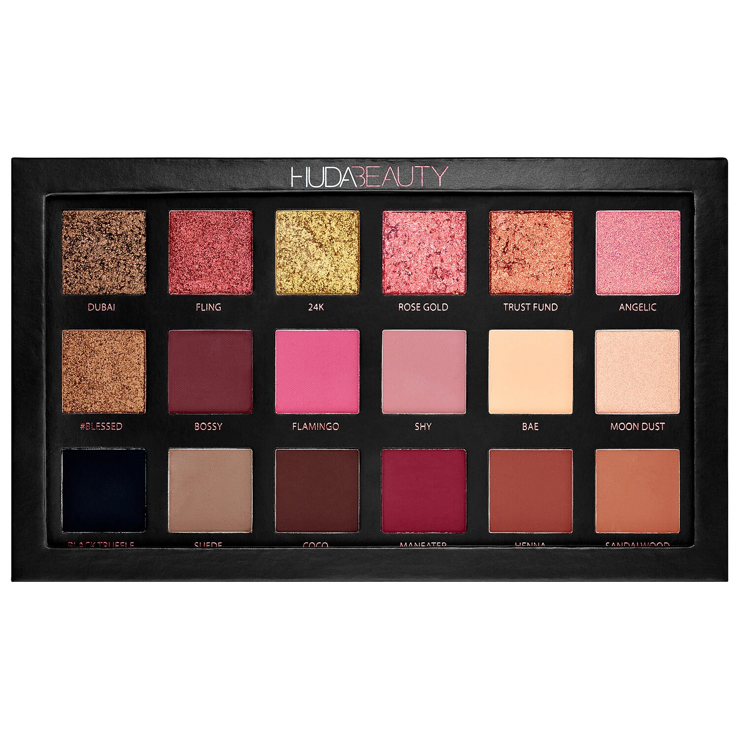
However, I still am frustrated that this appears to be such a repetitive palette. It reminds me of a more toned-down version of the Huda Beauty Rose Gold Palette, which is still available on Sephora:

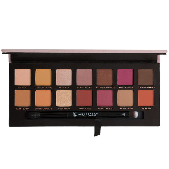
I have many issues, folks. Like how three of these shadows are from the Modern Renaissance palette. While I will say that for people who have a lot of eyeshadow, this is entirely dupe-able, a realization that is very similar to the general consensus. But I also think there are many people out there who would really like this. Frankly, if I did not have the collectoin I currently do, I could see this as being my usual palette.
However, I still am frustrated that this appears to be such a repetitive palette. It reminds me of a more toned-down version of the Huda Beauty Rose Gold Palette, which is still available on Sephora:
This palette just looks a lot more...fun.
Personally, I know I own this palette because I own
this
this
as well as a z-palette full of other dupes.
Come on, ABH! Get it together!!
Tuesday, December 26, 2017
TMO: The Balm Matte Schmaker
So we finally got a good look at the new palette in the Meet Matt(e) line from The Balm...the Matt(e) Shmaker palette. First, the only good thing I will say about the palette is that I love the name. It also reminds me of Cardi B for some reason. Now, onto our regularly scheduled roasting.
This is what the palette looks like:

And I definitely will not be buying it.
So, the normally large pans of the Meet Matt(e) palettes are pared down into pairs of one matte and one shimmer. They are paired according to complementary colors, but was that even necessary?
Their last shimmer palette, The Balm Appetit palette, tanked due to formula issues. And the shimmers on this palette are quite ordinary. I have a feeling that purple is going to be terribly patchy.
I think The Balm is banking on novelty here, and not a lot else. I think it's cute that they are telling the consumer that they can get at least six looks out of this, which is nifty, but I would not wear the blue and purple pair that way.
I predict it will be $42 and then $22, and then eventually $14-16, like all their palettes. [edit] They actually are going for about 30. But you can bet they still we be heavily discounted in the future.
To me, this palette without the shimmers looks a heckuva lot like their most reputable Matt(e):

Without the mattes, the shimmers look like any basic shimmer palette that has come out this year.
Also, while we are on a roll, let's do a bonus TMO of the White Peach palette, from Too Faced
First of all, you can buy the Sweet Peach palette, on sale, right now. Here is an image I got from @Trendmood1:

This is what the palette looks like:

And I definitely will not be buying it.
So, the normally large pans of the Meet Matt(e) palettes are pared down into pairs of one matte and one shimmer. They are paired according to complementary colors, but was that even necessary?
Their last shimmer palette, The Balm Appetit palette, tanked due to formula issues. And the shimmers on this palette are quite ordinary. I have a feeling that purple is going to be terribly patchy.
I think The Balm is banking on novelty here, and not a lot else. I think it's cute that they are telling the consumer that they can get at least six looks out of this, which is nifty, but I would not wear the blue and purple pair that way.
I predict it will be $42 and then $22, and then eventually $14-16, like all their palettes. [edit] They actually are going for about 30. But you can bet they still we be heavily discounted in the future.
To me, this palette without the shimmers looks a heckuva lot like their most reputable Matt(e):
Without the mattes, the shimmers look like any basic shimmer palette that has come out this year.
Also, while we are on a roll, let's do a bonus TMO of the White Peach palette, from Too Faced
First of all, you can buy the Sweet Peach palette, on sale, right now. Here is an image I got from @Trendmood1:

Oy. So the complete first two rows look practially monochrome. I am getting White Chocolate flashbacks all over again. I also see an expanded Matt(e) Trimony palette...quite interesting. To me, this palette was super unnecessary.
And the sad thing is, Too Faced does marketing excellently. Today I stopped by Ulta, and there was a display for all of Too Faced Gold products, and guess what? It was cleared out. They know how to make eye-catching things that people want to buy as gifts because they look like gifts. So unfortunately, though a lot of bloggers have expressed frustration with the brand, I believe that they are steadily going where they want to be.
But I am not going to buy this palette. I have enough transition and base shades, thanks. I don't need an entire palette full of them.
Saturday, December 16, 2017
TMO: Upcoming Winter Eyeshadow Products
I wanted to talk about palettes that I've been hearing about and have been genuinely interested in. Part of why I do these TMOs is for my own benefit. The particular palettes I've taken the time to break down into great detail are ones that I even may buy one day, just not any time soon.
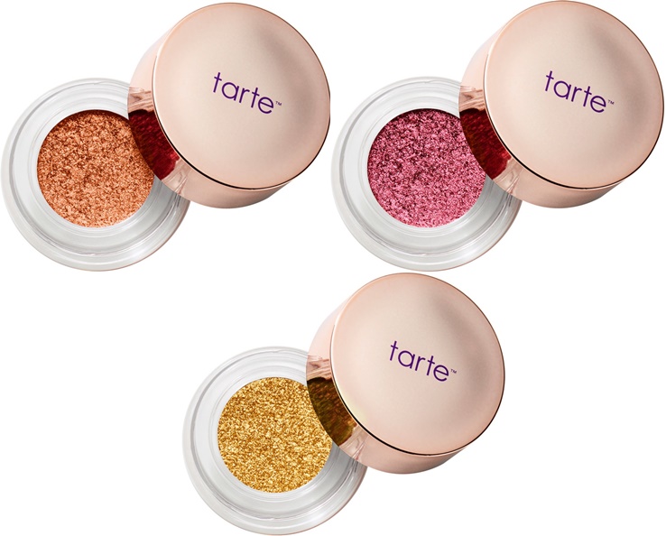
That being said, let's do this. Let's begin with a new line from Tarte:
Tarte Chrome Shadow Paint Pot, $22 for .11 oz (about 3 grams). I especially wanted a Pot of Gold- a very yellow gold eyeshadow. Limited amount of colors in this collection, and limited edition...I don't know. I feel like I'll see this on discount after a while.
 They remind me of the L'Oreal Infallible eyeshadow pots, which cost a whole lot less, and are excellent products. I also found it weird that Tarte kept emphasizing that this should be applied with the finger, and that there is no internal covering over the product. It seems like this would dry out fast.
Tarte is also releasing a foiled eyeshadow palette, for $39, called the Foiled Fingerpaints palette or something like that. Again, emphasizing shadows to be applied with the finger.
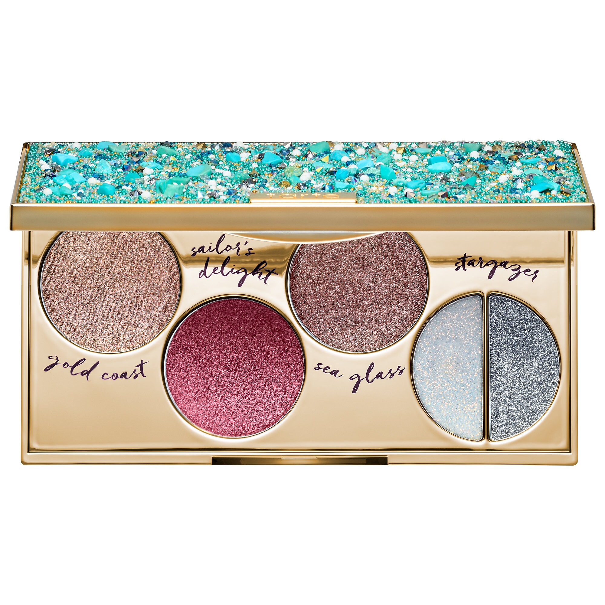
These are the swatches from Sephora:
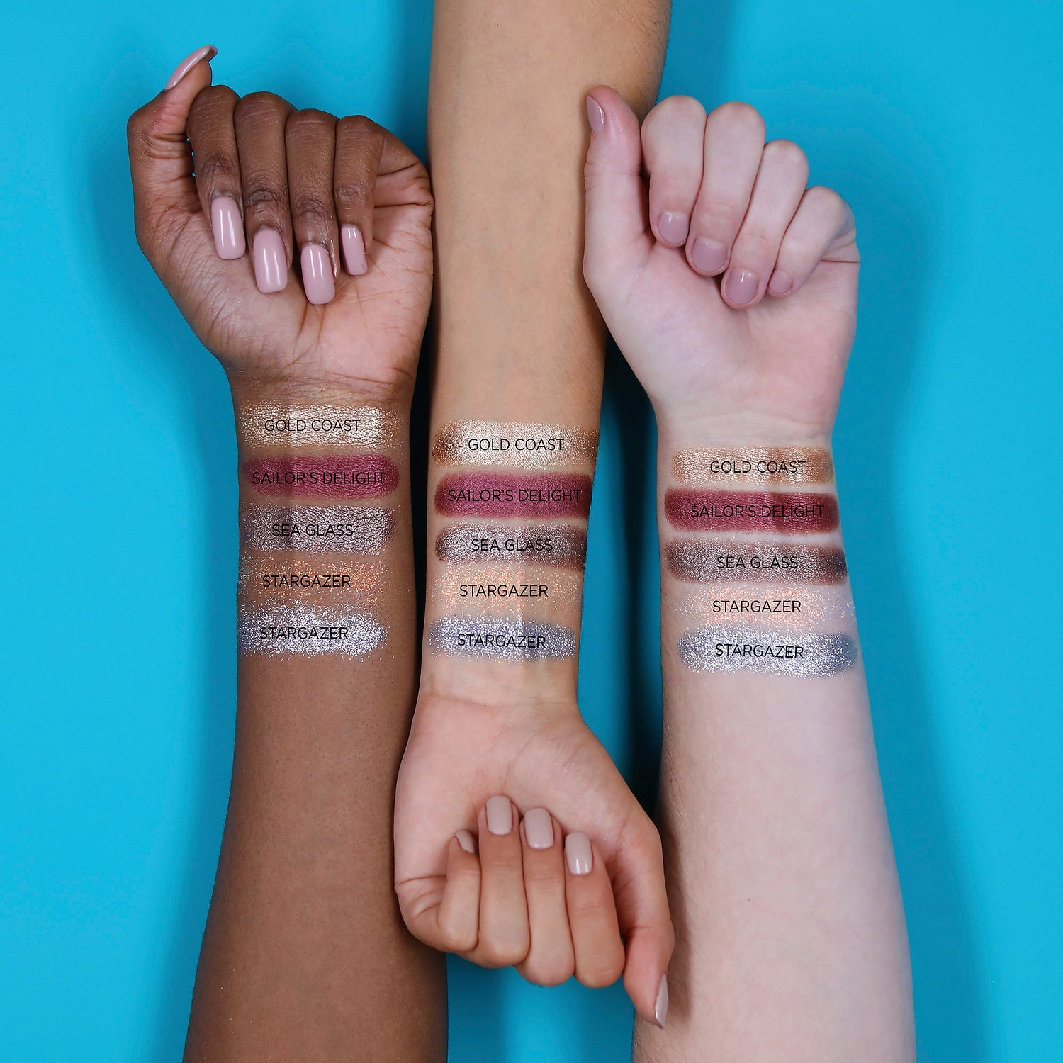 Those glitters are going to be an issue, I know it. And last palette they released, the Buried Treasure, reminds me a little of this. Personally, I think the swatches look interesting, but I feel that this palette would take a lot of effort to create a neat and interesting look, especially if the point is to use your fingers. Again, we'll probably see this product discounted in a few months. I might consider it at at a lower price point, but something about the formula of these I am wary of.
Beauty Bakerie Do It For the Graham Palette, $38.
First of all, I love the name of this palette so much, on multiple levels.
This is the palette:


I am going to end this post with a brief TMO of the Chocolate Gold palette. I am not even going to insert a picture, because we all know what it looks like. All I will say is it contains, out of 16 shadows, it contains SEVEN coppery/goldy colors. Do not delude yourself that this will appear distinct on your eye. This is all the same sh**. It TF was truly interested in making a holiday, glittery palette, they would have devised a greater variety of shades. That's all. Oh they try to trick you. They put in a vivid pink, green, bright yellow gold, and strong silver, expecting you to notice those only. But look in between the colors- the majority of the palette. And that's when it becomes tiresome. Don't do it, folks.
That being said, let's do this. Let's begin with a new line from Tarte:
Tarte Chrome Shadow Paint Pot, $22 for .11 oz (about 3 grams). I especially wanted a Pot of Gold- a very yellow gold eyeshadow. Limited amount of colors in this collection, and limited edition...I don't know. I feel like I'll see this on discount after a while.
Tarte is also releasing a foiled eyeshadow palette, for $39, called the Foiled Fingerpaints palette or something like that. Again, emphasizing shadows to be applied with the finger.
These are the swatches from Sephora:
Beauty Bakerie Do It For the Graham Palette, $38.
First of all, I love the name of this palette so much, on multiple levels.
This is the palette:
While I think this palette could rival the Huda Beauty Desert Dusk palette in terms of having both warm and cool tones, as well as interesting duochrome shadows, I am not going to be buying this palette. It actually reminds me of some of the shadows from the WnW palette that I am expecting, the Not a Basic Peach palette (which costs $5.00). Furthermore, I don't feel there is a lot of variety- I can count three or four coppery shimmers, and the two color shifting shades don't seem that different. I think this could be a very wearable palette for many, but the amount of repeating shadows does not seem inspiring to me.
Next, is a palette that Coloured Raine has been sneak-peeking for a while now. Finally, they released the promotional images of the Cheers to the Beauty palette, for $56. This is what it looks like:
To begin, I do think that Coloured Raine should be applauded for doing something different. This palette looks like a rainbow. However, I do have to refrain from buying this for a couple of reasons:
1. I really don't like the face product in an eye palette. And of course, the rationale is that the face product can also be used as an eye product, or that this is an eye product that gets the most use which is why the pan is so large, but for everyone? I don't know. I don't like the placement of it, and it bothers me that this could have been a $50 palette without the stupid highlighter.
Moving on, I do think the colors are gorgeous. However, I am not going to pretend that this palette is gong to inspire me to wear blue or green shimmer eyeshadow. it won't, because I don't, unless the shadow is some sort of duochrome that has more of a neutral base. I have tried to wear blues and greens, but they are not for me. And dropping $56 is not going to push me to.
Just by looking at the pans, there seems to be a lot of crossover with their Queen of Hearts palette, which I own. The swatches tell a different story, and the palette does seem more unique than I originally thought, but I still can count three or four similar colors to the QoH palette.
If you are not going to love most of the colors, especially the really distinct ones, don't get this palette. Especially at this price point. If there is a single shadow that calls to you, go for it. Coloured Raine has excellent singles that are glimmery and bright and you just need one that you will use and love.
Another palette I will be staying far away from is the new Violet Voss Purple Palette. Now, the color scheme is very sunset-like, which is right up my alley. But I have heard that Violet Voss is way overpriced for what it is, and I feel like the palette could be condensed into a couple of colors, instead of repeats. With that being said, I have those colors in one shape or another. Reds, oranges, purples, etc., and purples that I know are decent. And if I really wanted a matte purple that I did not have, I would just buy a single, instead of shelling out $45.
Another palette I thought that was really pretty is the Sephora x House of Lashes Secret Garden eyeshadow palette. There are some greens in this palette, as well as some browns and peaches, and it reminds me of the color scheme of a Monet painting. It is $45. The packaging resembles a music box. Now, this is right up my alley. But, I've never tried eyeshadow products from a lash company, though I know that it is a common practice. The packaging is rather bulky, and I know I don't have the space for it. It appears to come with a compartment for eyelashes- but I don't wear lashes. I tried, and I really did not enjoy the sensation of lashes on my eyes. So there goes that. Overall, I just don't see myself coming up with a variety of looks from this palette, so I do have to pass.
Subscribe to:
Posts (Atom)