That being said, let's do this. Let's begin with a new line from Tarte:
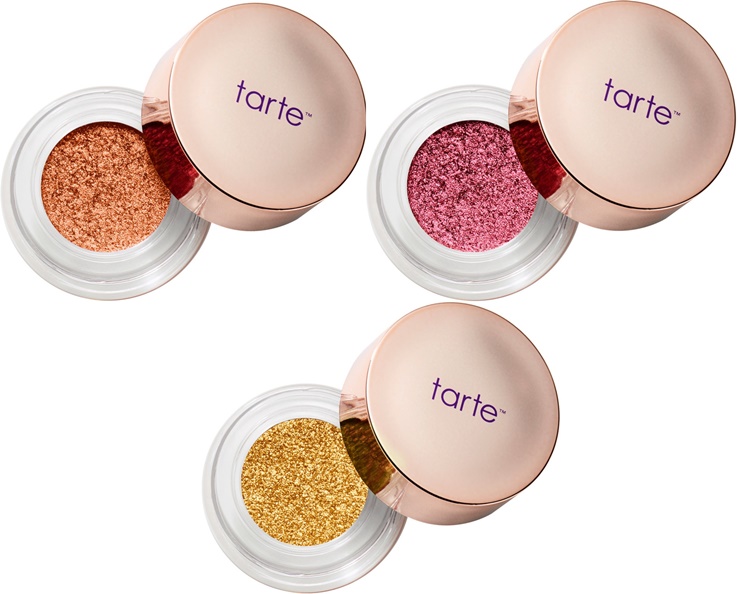
Tarte Chrome Shadow Paint Pot, $22 for .11 oz (about 3 grams). I especially wanted a Pot of Gold- a very yellow gold eyeshadow. Limited amount of colors in this collection, and limited edition...I don't know. I feel like I'll see this on discount after a while.
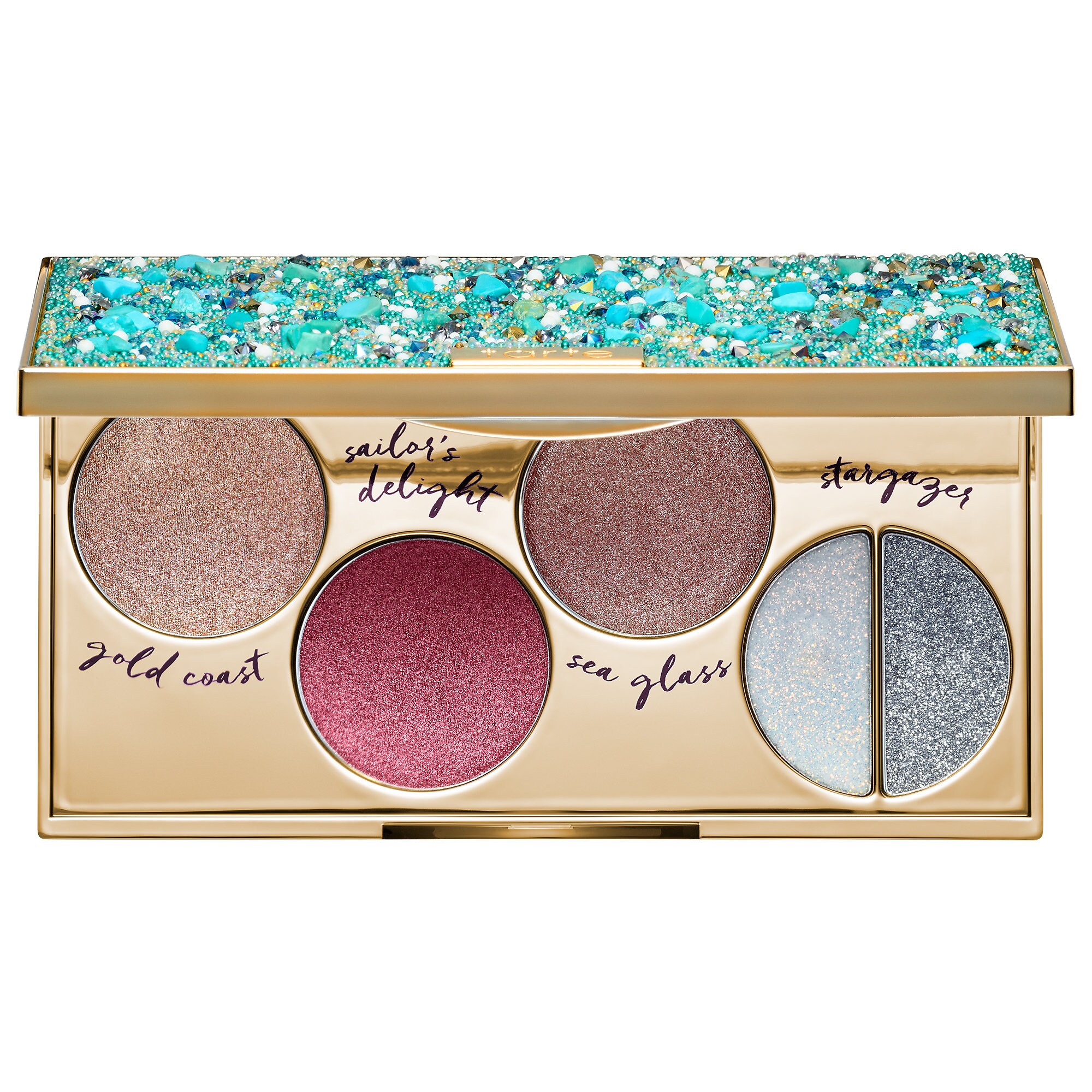
Tarte is also releasing a foiled eyeshadow palette, for $39, called the Foiled Fingerpaints palette or something like that. Again, emphasizing shadows to be applied with the finger.
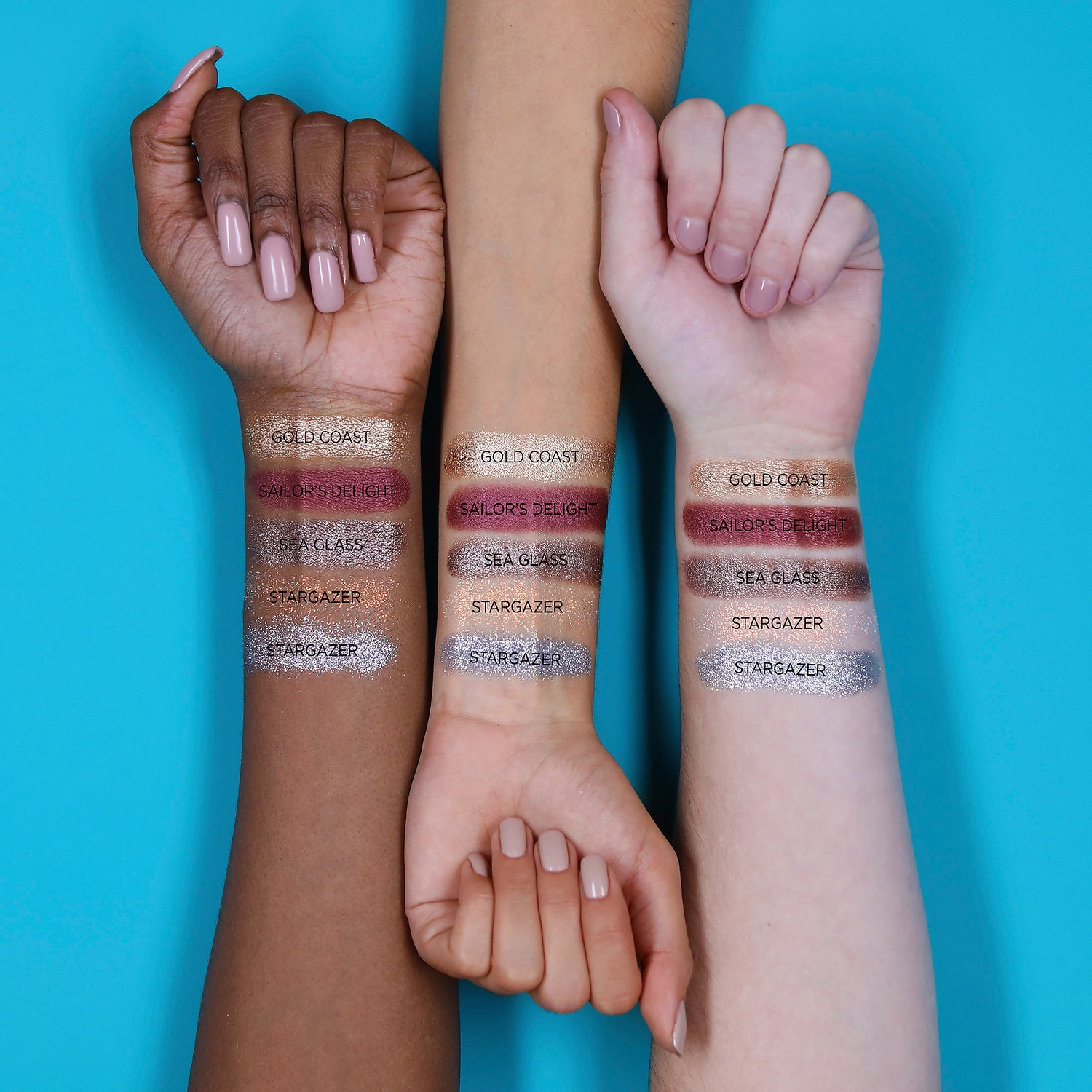
These are the swatches from Sephora:
Beauty Bakerie Do It For the Graham Palette, $38.
First of all, I love the name of this palette so much, on multiple levels.
This is the palette:


While I think this palette could rival the Huda Beauty Desert Dusk palette in terms of having both warm and cool tones, as well as interesting duochrome shadows, I am not going to be buying this palette. It actually reminds me of some of the shadows from the WnW palette that I am expecting, the Not a Basic Peach palette (which costs $5.00). Furthermore, I don't feel there is a lot of variety- I can count three or four coppery shimmers, and the two color shifting shades don't seem that different. I think this could be a very wearable palette for many, but the amount of repeating shadows does not seem inspiring to me.
Next, is a palette that Coloured Raine has been sneak-peeking for a while now. Finally, they released the promotional images of the Cheers to the Beauty palette, for $56. This is what it looks like:


To begin, I do think that Coloured Raine should be applauded for doing something different. This palette looks like a rainbow. However, I do have to refrain from buying this for a couple of reasons:
1. I really don't like the face product in an eye palette. And of course, the rationale is that the face product can also be used as an eye product, or that this is an eye product that gets the most use which is why the pan is so large, but for everyone? I don't know. I don't like the placement of it, and it bothers me that this could have been a $50 palette without the stupid highlighter.
Moving on, I do think the colors are gorgeous. However, I am not going to pretend that this palette is gong to inspire me to wear blue or green shimmer eyeshadow. it won't, because I don't, unless the shadow is some sort of duochrome that has more of a neutral base. I have tried to wear blues and greens, but they are not for me. And dropping $56 is not going to push me to.
Just by looking at the pans, there seems to be a lot of crossover with their Queen of Hearts palette, which I own. The swatches tell a different story, and the palette does seem more unique than I originally thought, but I still can count three or four similar colors to the QoH palette.
If you are not going to love most of the colors, especially the really distinct ones, don't get this palette. Especially at this price point. If there is a single shadow that calls to you, go for it. Coloured Raine has excellent singles that are glimmery and bright and you just need one that you will use and love.
Another palette I will be staying far away from is the new Violet Voss Purple Palette. Now, the color scheme is very sunset-like, which is right up my alley. But I have heard that Violet Voss is way overpriced for what it is, and I feel like the palette could be condensed into a couple of colors, instead of repeats. With that being said, I have those colors in one shape or another. Reds, oranges, purples, etc., and purples that I know are decent. And if I really wanted a matte purple that I did not have, I would just buy a single, instead of shelling out $45.
Another palette I thought that was really pretty is the Sephora x House of Lashes Secret Garden eyeshadow palette. There are some greens in this palette, as well as some browns and peaches, and it reminds me of the color scheme of a Monet painting. It is $45. The packaging resembles a music box. Now, this is right up my alley. But, I've never tried eyeshadow products from a lash company, though I know that it is a common practice. The packaging is rather bulky, and I know I don't have the space for it. It appears to come with a compartment for eyelashes- but I don't wear lashes. I tried, and I really did not enjoy the sensation of lashes on my eyes. So there goes that. Overall, I just don't see myself coming up with a variety of looks from this palette, so I do have to pass.

No comments:
Post a Comment