Showing posts with label holiday 2017. Show all posts

Saturday, December 16, 2017

TMO: Upcoming Winter Eyeshadow Products

I wanted to talk about palettes that I've been hearing about and have been genuinely interested in. Part of why I do these TMOs is for my own benefit. The particular palettes I've taken the time to break down into great detail are ones that I even may buy one day, just not any time soon.

That being said, let's do this. Let's begin with a new line from Tarte:

Tarte Chrome Shadow Paint Pot, $22 for .11 oz (about 3 grams). I especially wanted a Pot of Gold- a very yellow gold eyeshadow. Limited amount of colors in this collection, and limited edition...I don't know. I feel like I'll see this on discount after a while.
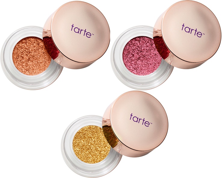
They remind me of the L'Oreal Infallible eyeshadow pots, which cost a whole lot less, and are excellent products. I also found it weird that Tarte kept emphasizing that this should be applied with the finger, and that there is no internal covering over the product. It seems like this would dry out fast.

Tarte is also releasing a foiled eyeshadow palette, for $39, called the Foiled Fingerpaints palette or something like that. Again, emphasizing shadows to be applied with the finger.
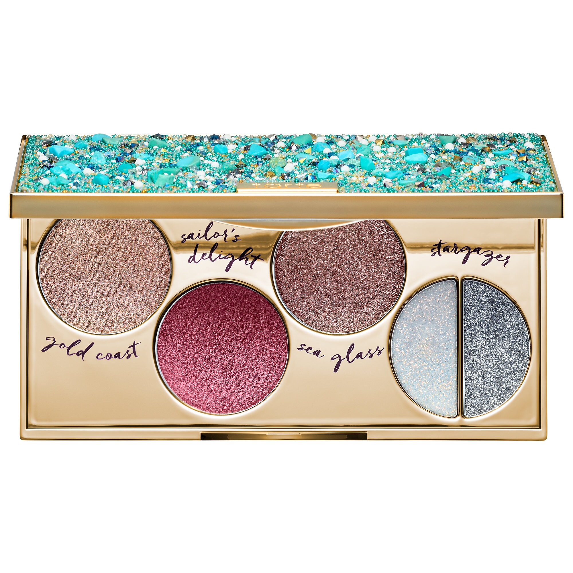
These are the swatches from Sephora:
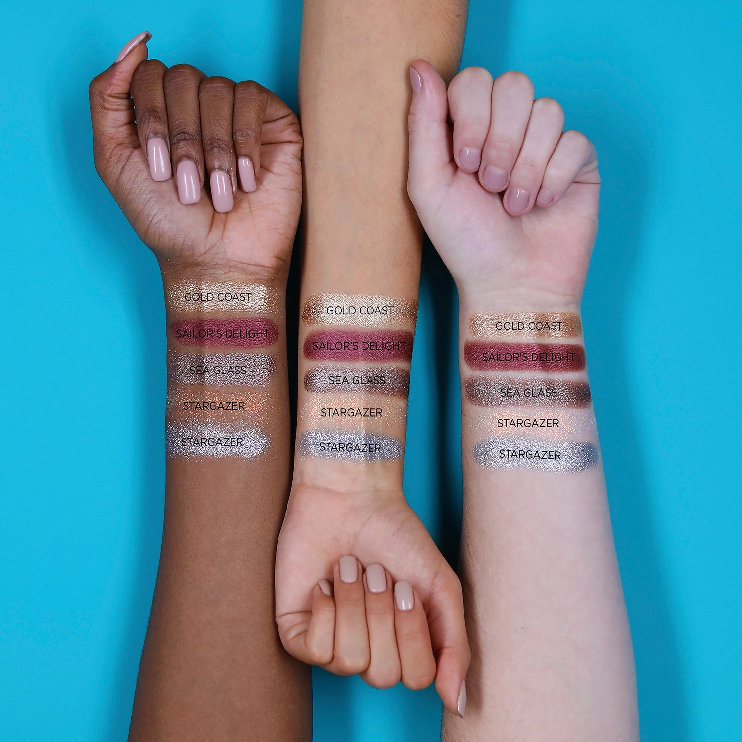
Those glitters are going to be an issue, I know it. And last palette they released, the Buried Treasure, reminds me a little of this. Personally, I think the swatches look interesting, but I feel that this palette would take a lot of effort to create a neat and interesting look, especially if the point is to use your fingers. Again, we'll probably see this product discounted in a few months. I might consider it at at a lower price point, but something about the formula of these I am wary of.

Beauty Bakerie Do It For the Graham Palette, $38.
 First of all, I love the name of this palette so much, on multiple levels.

This is the palette:

While I think this palette could rival the Huda Beauty Desert Dusk palette in terms of having both warm and cool tones, as well as interesting duochrome shadows, I am not going to be buying this palette. It actually reminds me of some of the shadows from the WnW palette that I am expecting, the Not a Basic Peach palette (which costs $5.00). Furthermore, I don't feel there is a lot of variety- I can count three or four coppery shimmers, and the two color shifting shades don't seem that different. I think this could be a very wearable palette for many, but the amount of repeating shadows does not seem inspiring to me. 

Next, is a palette that Coloured Raine has been sneak-peeking for a while now. Finally, they released the promotional images of the Cheers to the Beauty palette, for $56. This is what it looks like:
To begin, I do think that Coloured Raine should be applauded for doing something different. This palette looks like a rainbow. However, I do have to refrain from buying this for a couple of reasons:
1. I really don't like the face product in an eye palette. And of course, the rationale is that the face product can also be used as an eye product, or that this is an eye product that gets the most use which is why the pan is so large, but for everyone? I don't know. I don't like the placement of it, and it bothers me that this could have been a $50 palette without the stupid highlighter.

Moving on, I do think the colors are gorgeous. However, I am not going to pretend that this palette is gong to inspire me to wear blue or green shimmer eyeshadow. it won't, because I don't, unless the shadow is some sort of duochrome that has more of a neutral base. I have tried to wear blues and greens, but they are not for me. And dropping $56 is not going to push me to.

Just by looking at the pans, there seems to be a lot of crossover with their Queen of Hearts palette, which I own.  The swatches tell a different story, and the palette does seem more unique than I originally thought, but I still can count three or four similar colors to the QoH palette.

If you are not going to love most of the colors, especially the really distinct ones, don't get this palette. Especially at this price point. If there is a single shadow that calls to you, go for it. Coloured Raine has excellent singles that are glimmery and bright and you just need one that you will use and love. 

Another palette I will be staying far away from is the new Violet Voss Purple Palette. Now, the color scheme is very sunset-like, which is right up my alley. But I have heard that Violet Voss is way overpriced for what it is, and I feel like the palette could be condensed into a couple of colors, instead of repeats. With that being said, I have those colors in one shape or another. Reds, oranges, purples, etc., and purples that I know are decent. And if I really wanted a matte purple that I did not have, I would just buy a single, instead of shelling out $45. 


Another palette I thought that was really pretty is the Sephora x House of Lashes Secret Garden eyeshadow palette. There are some greens in this palette, as well as some browns and peaches, and it reminds me of the color scheme of a Monet painting. It is $45. The packaging resembles a music box. Now, this is right up my alley. But, I've never tried eyeshadow products from a lash company, though I know that it is a common practice. The packaging is rather bulky, and I know I don't have the space for it. It appears to come with a compartment for eyelashes- but I don't wear lashes. I tried, and I really did not enjoy the sensation of lashes on my eyes. So there goes that. Overall, I just don't see myself coming up with a variety of looks from this palette, so I do have to pass. 

I am going to end this post with a brief TMO of the Chocolate Gold palette. I am not even going to insert a picture, because we all know what it looks like. All I will say is it contains, out of 16 shadows, it contains SEVEN coppery/goldy colors. Do not delude yourself that this will appear distinct on your eye. This is all the same sh**. It TF was truly interested in making a holiday, glittery palette, they would have devised a greater variety of shades. That's all. Oh they try to trick you. They put in a vivid pink, green, bright yellow gold, and strong silver, expecting you to notice those only. But look in between the colors- the majority of the palette. And that's when it becomes tiresome. Don't do it, folks.

Friday, November 10, 2017

MASSIVE TMO Time! New-ish Eyeshadow palettes (aka ANTI HAUL)

I am back tonight ready to TMO some new eyeshadow palettes.

The two I want to begin with are not as new as the others, and I feel like either I was purposefully ignoring their existence, or they just flew way past my radar- though I know I was aware of Colour Pop coming to Sephora. Let's...just look at them, shall we?

Both retail for $26, and though the price is steeper than Colour Pop's smaller size palettes that they've been releasing since the summer, the price is not the biggest grievance I have with these.
First, I am not going to even discuss these as two distinct entities. I do not consider them that. I scoff at the idea they contain any variation in color that is meaningful. I laugh and then sob at the fact they are all shimmer and contain repeating colors, and that any company would be so brazen to suggest that either are worth your coin. Period. Goodbye. Moving on. 

Now, being kind of drawn to vintage quirk and kitsch, one would think I would be interested in something like Besame's Snow White palette. WRONG.

For some reason, the inside of the palette is not being displayed on the Besame site. I found this image off of pinterest, and a reverse image search indicates its publication in many online blogs. 

So here we go, a palette for $68:


To begin, I do not believe this is a well made palette. The pans are very ill-fitting, and crookedly placed. Strike one.  

In terms of color selection, we have a lot of muted pastels. My issue is that the color red, in all its vibrancy, is a pivotal motif in the film. So why do we get instead a pinkish brick and a slightly darker and greyer pinkish brick? I see a lot of repetition over all in types of colors, but I am afraid that the point of this palette is a "wash of color" look that you can get at a lot cheaper. 

Honestly, grab yourself Physicians Formula Canyon classics:
And two singles of blue and/or red. Done. 

Furthermore, this feels like the first time Besame has done eyeshadow before, which is a huge drawback for me. 

Let's look at the "smaller" eyeshadow palette in the collection, which retails for $42:
The inside of the palette reads "Make a wish...love's first kiss."

So, this is one criticism of the collection that I have not seen yet, but one that I feel is pretty important. Snow White was 13 years old, okay? 13. It was creepy in 1937, and it still is creepy now to develop a  film and a whole line of cosmetics dedicated to this fictional 13-year old's "beauty." 

Color wise, the smaller palette is more interesting to me because some colors seem more saturated, and one color looks like it has shimmer (the green), but still, same complaints. Very muted, uninteresting colors. And the Snow White on the packaging- her eye look is literally a wash of grey. So, yay? 

I dunno folks. And considering the fact that Snow White has such toxic undercurrents of beauty=whiteness, do I really want to support that narrative? And are those pastel muted shades going to appear the same on every skin tone? 

It just does not seem timely to put this out- and yeah, I know it is vintage. But what about a Disney Princess eyeshadow palette, with princess getting a shade or two? Or a Disney Villain palette?

Eh, I am going to gladly pass. On all of it. 

What else can I roast?
Oh yes, this is a good one. This is a good one because yes, I kind of wanted it. This is the BH Cosmetics Zodiac palette:


So, this drew immediate comparisons to the precious snowflake of a  palette, the KvD Mi Vida Loca Remix palette. And I only got into makeup way after that palette was released, so I did not suffer the pangs of FOMO when it was sold out.

So yeah, immediate comparisons due to the wheel design. Overall, I think it's a cute concept, but very similar to the points I made about the Nyx element palette- appealing to those themes or even identities fosters an artificial connection with a palette that you would not necessarily have otherwise. For example, I am a Cancer, but if those colors were called Matte Violet, and Baked Metallic Grey, would I care? Nope. And I still don't actually. Now even though I like the color pairings, the baked formula absolutely needs primer, glitter glue even, to avoid fall-out. The only mattes I've tried are from the Missy Lynn palette, and I ended up decluttering that, but they were not bad at all. 

Overall, there are way too many sparkly light shades for my liking, and aside from that metallic green, I know I have these colors in one form or another. 

I also think this palette took a cue from Tarte by putting a highlighter in the center of it, as with the Magic palette. I don't think that really is a universal highlighter, but I will update with swatches.

It does not anger me as much as the aforementioned palettes, but it is not something that is not necessary to buy. 

Let's move on to Morphe, shall we?

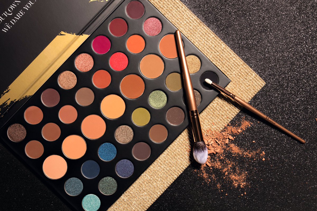
This retails for $32, and is notable for having larger pans of a variety of skin tone shades, for the base or transition. Which is nice. I do think it is hi-larious though, that Morphe still wants to convince you that ALL THE SHADES are necessary, and all THEIR shades are distinct. For me, let's see which colors pop. The bright grapefruit red tone, maybe the orange next to it, and maybe that pinkish shimmer next to the orange, because it possibly looks like a duochrome. That's it. 

Below, that olive green, a blue shimmer, and a green shimmer are the only ones distinct to me. Out of a palette of FORTY shades. While I think this palette is a push in a better direction for Morphe, we still have a long ways to go before I would consider buying anything from them. And considering this is holiday and short lived, I don't know if that day will ever come. 

Okay, the last one I have to embed from Trendmood1:


A post shared by TRENDMOOD (@trendmood1) on
 This is the newst stack of eyeshadows by Melt cosmetics, called the....actually I don't know. They are only posting the names of the individual shadows.

On their sites, stacks of four shades are $48, while the Rust Stack, of five shades, is $58. A single eyeshadow cost $17....

Hm.

Their pricing seems shady to me. Okay so in a palette of four, each shade cost $12. In a  palette of five, then, each cost 11.60, which is nice. They could have charged $60. But then why make the singles so much more expensive?

That seems a bit too much on the nose/to aggressive to suggest the palettes are a better deal.The price discrepancy is too large for me.

But let's move on to the color scheme. I have never purchased Melt, and probably will never, so I can't comment on quality.

But I can comment on the swatches and color scheme.
1.) Skeleton's Kiss- a little late for the spooky train aren't we? But anyway, this is a sheer duo chrome, and the promotional picture used to show how this can be both a highlighter and an eyeshadow was not flattering at all- showed major texture.
2.) Last Caress- A matte burgundy
3.) She's in Parties- a Cranberry metallic
4.) Meanstreak- a blackened plum.

Yes, the colors are cool, but I don't see how you are going to get distinct looks for this, especially because I think Skeleton's Kiss is kind of a dud. Too much to pay for a one-trick pony.

So, that's all I have for tonight. Happy not-shopping this holiday (lul)!

Friday, October 20, 2017

Holiday Palettes I *Actually* Want?

So, I've been pretty darn good about avoiding all holiday/upcoming brand releases. I haven't bought a single thing. However, the following palettes have been pretty persuasive. While I will attempt to TMO them, I am probably going to end up purchasing no more than one of these palettes.

Let's go!

1.) The Balm The Daily Press Palette
A post shared by TRENDMOOD (@trendmood1) on
Now, I would get this palette primarily because of the packaging. I honestly do have these colors, and if the formula is the same as the Balm Appetit formula, that could be off-putting to me, as I heard those were rather bad. I am not normally swayed by packing, but I like the Newspaper theme. I don't like how many of the shadow names are just synonyms of the same word....hmmm....this is looking pretty unimpressive by the minute.

2. The Dreamy Eyeshadow Palette by the Italian brand Nabla cosmetics. When converted to dollars and without shipping, it costs almost $38.00. This is the palette:
A post shared by TRENDMOOD (@trendmood1) on

To me, this is a dupe or very similar to the Queen of Hearts palette by Coloured Raine. This is perhaps a bit more warmer and muted, I think, but I would definitely be willing to try this one out. It is gorgeous. I mean, I would also be willing to buy the Queen of Hearts palette, after pining after it for so long, it just depends on my mood.

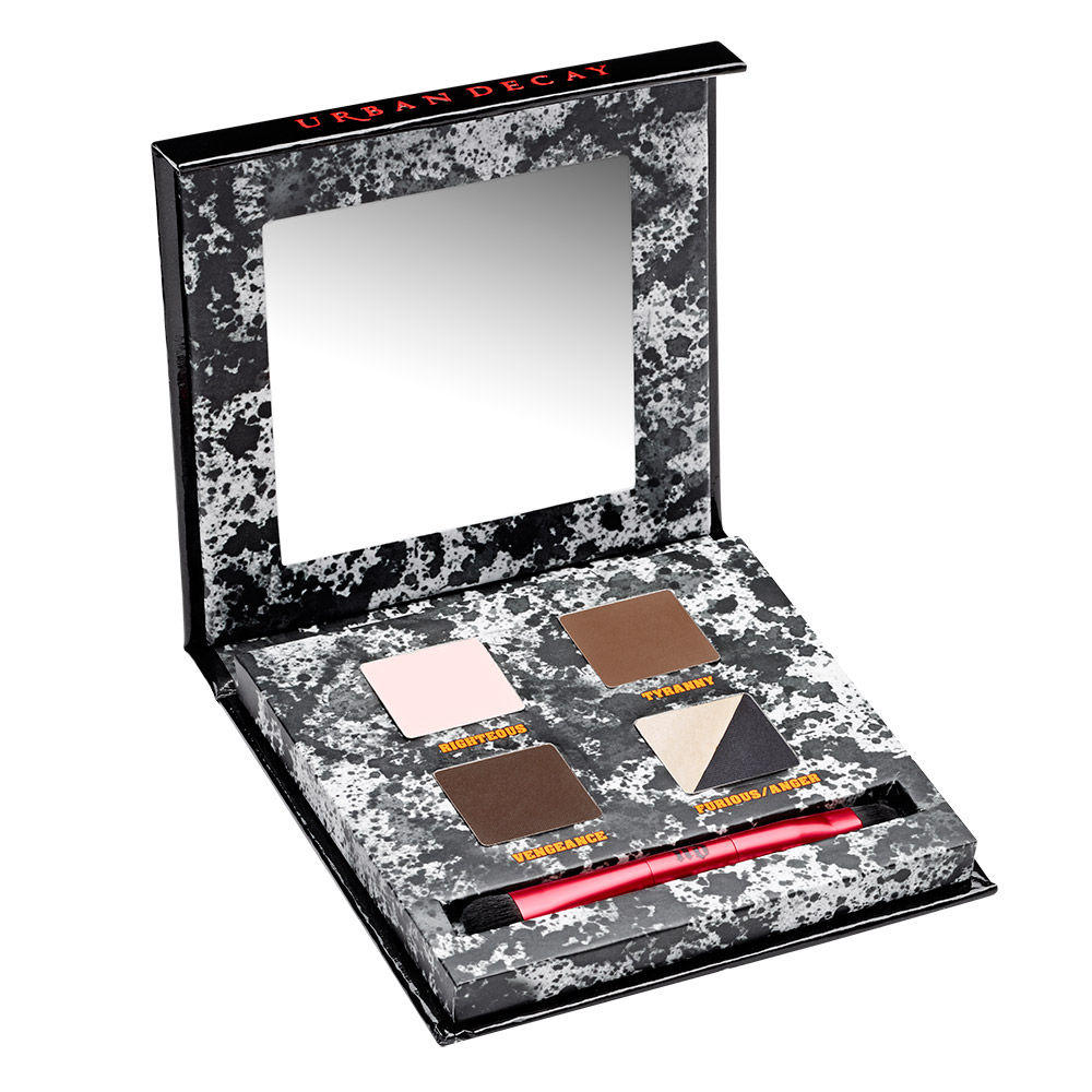
3. Urban Decay Troublemaker Palette
My reasons for wanting this one are weird. Besides the fact that I prefer mini palettes, it reminds me so much of the Urban Decay Pulp Fiction palette, just for the black/white duo and the format of the palette:


A post shared by TRENDMOOD (@trendmood1) on
I think this palette- which has the frustrating black/white duo (which I think they're just trying to get rid of at this point) - makes a lot of sense to me. If it is quality, I would totally be willing to buy it. The only problem is I can dupe 80% of this palette....but we'll see. I really enjoy the color combinations they are offering here. And I would get a kick out of using it with the PF palette.

And finally, I would want to buy:

4. The upcoming Wet 'n Wild reformulated palettes:
A post shared by @makeupcrayz on

I mean, if these are any good, and Wet 'n Wild can really nail mattes, I would probably end up getting all of them, or more realistically, two of them. They are nice revisions to their already-existing products.

Why don't we do a quick run of palettes that I am not going anywhere near:

1.) The Gigi Hadid mess. Not going to support her. Not going to support a company charging $30 for a drugstore makeup palette. Especially not for neutral.

2.) Violet Voss all taupe palette. It is literally variations on the same shade of brown. My head is spinning. Pass.

3.) The resurrected Dose of Colors Hidden Treasure palette. So they are going to re-release it, without fixing the mess that is those pans? Colors are a bit neutral and commonplace for me, but I especially would not want to deal with such an eyesore.

4.) The Fenty Beauty Galaxy Palette. Now I am all for this brand. As soon as I run out of my foundation, I'll give hers a try. But this palette? I do my makeup at five in the morning, and working with glitter at five in the morning is not my idea of fun.

Thanks for reading!

Saturday, October 7, 2017

Me When I Saw the Urban Decay Holiday Palette 2017

The new Urban Decay Holiday 2017 palette:


Me:


I feel as though I was just talking about how UD has been oddly silent on what they were rolling out for Holiday 2017. And here we are.

So, yeah. I'm not buying this. Nooooooooo.

Yes, it's metallic. And I love a good shimmer. It's colorful. It's also neutral. But let's put that aside and do a good old fashioned TMO:

1.) The packaging is a disaster. I repeat: a disaster. It's basically one long tray with a mirror in the middle of two pairs of eyeshadow rows on either end. So how are you supposed to use this, or even hold it? And it looks like it comes with a lid or sleeve or something. This is so unpractical that I actually find it quite ugly to look at.

2.) Don't know what the price will be, but I promise it will be too expensive.

3.) Color selection: I recently learned a secret about shimmer eyeshadows. Let's say you have two bronze shimmer eyeshadows- one is slightly more red-toned than the other. But guess what? Does it make a bit of difference on your eye? Nope! I'm going to try and count the number of repeat pairs in this palette. And I know one has a slightly different tone than the other. My point is that it is unnecessary. If they omitted all the repeats and just went with less colors, they could have charged you less!

So, the two metallic blues, the two metallic purples, the two metallic red-tones, the three golds! It's way too much.

I myself am a gold eyeshadow junkie, but seeing this infuriates me. When I had the BH Cosmetics Foil Eyes (1), I did end up depotting them, and then I found myself gradually decluttering more and more because the repeating/close shades were frustrating me. I find this palette to be frustrating.

Even if the swatches are amazing- which I don't doubt they would be as shimmer shadows swatch very well- I wouldn't let them convince you alone. Sometimes shimmers will swatch very well, but on a small surface area such as they eyelid, they may not perform the same.

It's kind of disappointing UD went this route for the holidays- on one hand they did something different than their usual releases, but in a very boring, lackluster way.


© *:・゚Cosmetically Inclined ・゚:*  
Blogger Templates made by pipdig