Friday, November 30, 2018

Wet 'n Wild Bloom Time: Review and Swatches

Hello! November is nearly over, and winter is soon upon us. But Wet 'n Wild is keeping the spring alive, it seems, with two new highlighter releases.

Their Megaglo Highlighter line is one of the best drugstore lines I know of. These highlighters are imprinted with a flower design, and have a mostly consistent quality.

A couple of days ago I put Bloom Time- a brand new release for the brand- on my wish list, and it just so happens I stumbled upon it at my local CVS.

As with all these powders, Bloom Time contains 5.4 g of product and costs $4.99.

This is what it looks like in the pan:


It appears to be a pale frosty light orange/peach. However, when swatched on my skin, the powder appears a lot warmer. It becomes a light warm pink with a light gold, almost silver, reflect:


On the left we have one swipe of the product, and then on the right it is blended out. 


Here we also have some blurry-ish photos to show the intense pale gold reflect. 

I also have comparison swatches. On the left is Precious Petals, the original shade in the line and the one with the best reported quality. In the center is Bloom Time, and to the right is Sweetest Bling, a pale cool-toned gold. 


 Precious Petals and The Sweetest Bling have excellent formulas, and I feel Bloom Time is no different.  The formula is a little powdery, but in a good way. It does not emphasize texture on the skin, and glides over my skin.

Like the other highlighters from Wet 'n Wild, Bloom Time definitely rivals my more high-end ones. I don't have anything else like it in my collection, aside from Lilac Geode from Becca, which is a touch more purple. I love that it adds a bit of color and glow to my face without being obvious. It's just really, really pretty, and makes me feel like I'm wearing the last bits of springtime sunshine.

I definitely recommend picking this one up!

Thanks for reading! (✿ ͡◕ ᴗ◕)つ━━✫・*。

Wednesday, November 28, 2018

MAC Snowflushed: Review, Swatches and Pics


MAC Extra Dimension Skin Finish in Snowflushed is known to be a re-promote of Stylishly Merry 2, an eyeshadow from last holiday. However, it is marketed now as a face powder, 10 g, for $35.00. 

After being quite interested in the strong sparkly pink shift of the product, I decided to take the plunge and try a MAC holiday powder for the first time. 

Let's look at some pictures:


 The packaging is sleek and simple, albeit a bit too light-feeling. Some might say on the verge of cheap, but I don't mind too much.

Swatches were difficult to capture with my phone, as the strong pink shift tended to disappear. Some photos will appear blurry, but I needed to capture the different dimensions of the product.


My skin is quite light, so if I really pack the powder on my cheek bones the light brownish base will show. I have seen this powder on medium to dark skin tones and this product looks amazing. For me I have to use more of a light hand.

I have used this product for about a week now, and I really like how intense the shimmer is. It is a sparkly highlighter, no doubt, but the sparkle is so finely milled that I like the way it looks. It shows a little bit of texture if I pack too much on. Otherwise, though, it provides a long-wearing pink-copper shimmer on the skin.  It is a similar, delicate, complex, sort of glitter finish that I see in my Kiko Milano and Nabla single shimmer shadows.

Also, I have a shade from Looxi Beauty called Mirage, which some may consider to be a dupe, but I think they just are very similar. The pink shift is much more intense for MAC, though.

Snowflushed (l), Mirage (r)

As an eyeshadow, Looxi's formulation is more wet and dense, while MAC's powder is drier, thinner, and easier to blend out. 

Final thoughts:

I do think this is a special powder that is very unique and multi functional. I will happily continue to use it. However, I do not think I would be willing to spend $35 on a face powder any time soon, though. 

Thanks for reading!

.。*゚+.*.。(❁´◡`❁)。.。:+*

Sunday, November 25, 2018

Five Cold Weather Faves

Even though we are getting a bit of a reprieve from this extremely chilly weather, I know that the following favorites have been helping me through the worst of it. I present to you, my cold weather faves:

1.) Cerave AM Lotion. Now, I have talked about this on the blog a lot. Even when it has not been cold out. But especially now, keeping the skin hydrated and protected is important, and the fact that it contains 30 SPF helps. Of course, I know people wear a lot more than that, but for me I feel this works.

2.) Revlon Candid Foundation, in 110 (Porcelain). This is a new purchase that I was drawn to simply because of the packaging. It comes in a pump-tube, which seems pretty smart. The shade is a hair too dark, but it is not really noticeable. The finish is really natural. Revlon claims that the foundation contains ingredients that protect against pollution and "blue light," and contains no oil parabens, or fragrance. Some have noticed that one of the ingredients is, in fact, a fragrance, but this honestly smells like nothing to me. I've been really liking this foundation, and find that it doesn't turn greasy on me at all.

3.) Burt's Bees Intensive Lip Mask. This is a new purchase, but even though I have been upping my water intake, I still feel like my lips have been super chapped. Though I recently started using this, I really like it so far. I will probably provide an update on prolonged use with it, though.

4.) Physician's Formula Butter Highlighter in Pearl. When winter hits and my skin gets drier, I look for more cream/liquid products to use, and this one takes the cake. Its got the slightest purple shift, but the overall pearl reflect looks very natural on the skin. Natural, but noticeable. On that note, PF's release from the summer- the butter highlighter in Full Moon, has been also used a lot by me this winter, for the same reasons.

5.) Glade Limited Edition Candle in Nutcracker Delight/Praline Hazelnut. Okay, I am by no means a "candle person." But since the fall hit I have purchased this candle three times, in various sizes. I will probably buy another soon in the next two weeks. This scent is part of promotion for the Nutcracker movie, which I will not be seeing. I wonder if Glade sells anything comparable to it. Anyway, this has a sweet warm scent which isn't overpowering, but definitely lingers. According to the Glade site, it has tones of: cinnamon leaf, almond butter, almond flower, hazelnut, maple water, praline, sandalwood, tonka, and buttercream. Yummy. I am someone normally very sensitive to candles and fragrances, but this one has been my favorite.

So that's it! What have your cold weather faves been?

Saturday, November 24, 2018

This Week's Z-Palette: The Pink Amber Palette

Hello hello! I decided to take inspiration from Angelica Nyqvist, who does weekly quads. To get more use out of my singles, I want to do weekly z-palettes, and then post my results. 

Of course, as I constructed this palette I already had some shades in mind, and then I really just worked around those. I ended up really liking how the names and colors went together, so I am going to call this the Pink Amber Palette.


From left to right, we have:

1.) Angel Face, Coloured Raine (CR). This is a very pale matte peach, excellent as a transition/lid setting shade. I have a considerable dip in this shade already, so my goal is to hit pan.

2.) Lay Low, Colourpop (CP). The quality of this shadow is so good, but I barely got any use out of it this summer. It is a warm leaning pink, so I think it is going to play nice with some of the oranges in this palette.

3.) Tangelo Tint Coastal Scents (CS). I very much enjoy this shade. It works really well on the skin, and provides a nice bit of brightness. I used this a lot a while ago, and am hoping to use more of it this week.

4.) Tangy Dijon, Vanessa's Vanity (VV). All the excitement I had getting this shade came out of the Subculture palette debacle. And then I didn't use it. I actually have been using more and more of it lately, but want to  be more consistent.

5.) Your Majesty, CR. This is such an intense and reflective gold shadow. Again, I don't use it enough even though it is so brassy.

6.) Doll Face, Looxi. This is a recent purchase that I have only swatched. I knew I wanted this to be in the z-palette, so I brought it Lay Low to give myself more options. This shade is a pressed pigment, with a pink base and strong gold shift, so I knew it would work well with the colors in this palette.


7.) Pumpkin Spice Life, Looxi. Another shade from Looxi that is somewhat recent but unused. It is really nice quality, too. This is a bright medium orange, brighter and a little darker than Tangelo Tint.

8.) Durty, Looxi. This one is actually a total surprise for me, in terms of quality. It is a light-medium matte brown that leans quite red-toned on the skin, and works well with a host of colors.

9.) Empress, CR. This is a very interesting and somewhat frustrating orange, because on my skin it looks very pink. I am hoping that pairing it with the other oranges in this palette will keep the look orange.

10.) Royal Prerogative, CR. A matte medium brown that blends so well.

11.) Chauffeur, CP. A shimmery orange-gold slight duochrome. Again, I made a fuss about buying this, and have yet to actually use it.

12.) Boujee, Looxi. This shade I have gotten some use out of. It's a rather insane shadow. In the pan, it looks like a regular gold shimmer, but it has a shift from red to blue/green. It definitely can make a typical neutral look more complex and interesting, and I think it fits well in the palette.

I am so excited to use this palette this week, and I will be sure to update the blog with some lewks!

Thanks for reading :)

Friday, November 23, 2018

Holiday 2018 Haul

Hello hello hello!

I told myself that I would avoid any Black Friday sales. Browsing the internet, even Colourpop's sales did not lure me in. However, I did make some purchases this holiday that I want to talk about.

To begin, I have been quite interested with Mac releases for some time. Though Mac has definitely fallen off the wagon in some respects, there is a quality to their releases that seems rather enduring or mythical. Though I have only experience with Mac Fix Plus and the Painterly Paint Pot, I do find interesting how Mac seemed cutting edge with colors and finishes.

One specific color and finish that caught my eye is part of their Holiday 2018 release, the Extra Dimension Skin Finish in Snowflushed.

Snow Flushed has a strong sparkly pink shift from a copper base. I only swatched it once in stores, but I was rather enchanted. I did try to stave off this purchase for as long as I could, though. I looked at my collection for any dupes- Looxi's Mirage was a potential one, but it is not sheer or thin enough to be worn as a face product.

Then I thought I would wait for the Too Faced release, because I am 99.99% sure that the Canary Diamond highlighter is a dupe. But it doesn't seem to have much of a sparkly element, which I actually want. The internet also claims that Looxi's highlighter in Goddess is a potential dupe, but I don't buy it. I have a highlighter by Looxi, and the texture and color shift is completely different.

I know this was an expensive product, but to me it was so unique and multi-functional it just spoke to me.

Last, we have an order I placed with Clionadh Cosmetics.

I have been looking for interesting matte colors I can pair with neutrals, and Colourpop just hasn't been doing it for me lately. All the colors I want are in palettes, but I don't want to buy the entire palette.

So, I went to Clionadh, which was having a sale on select products today. Some eyeshadows that normally were C$6.00 were C$4.20, which converts to almost US$3.00. With $15.00 shipping, my entire order was C$31.00, which converted to about $24.00, which then is about $6.00 for me, which is a reasonable price. So all in all, I was cool with this order. Here are the shadows I bought:

So I ordered Toasty, a mid-toned "caramel brown." This is a very common shadow in my collection, but something about it stood out to me.

Then we have Strawberry Mousse. I am most excited for this shade, primarily because of Strobe Cosmetics Creepy Cute palette. There is precisely one shade in that palette I have not found suitable dupes for, until now- Strawberry Milk. So I am very much looking forward to having this shade.

Next, we have Fantasia. I am very curious about the quality of this shadow, especially because the ones I have in my own collection could be much better in quality.

Last, we have Maize, a bright yellow. I have nothing like this in my collection.

So, that all I got for the holidays! A modest, sensible haul, I think. Reviews forthcoming.

Thanks for reading.


Surreal Makeup Swatches and Thoughts

Today an exciting order of sample products from the indie brand Surreal Makeup came in. About a week and a half ago I placed an order of a variety of samples, for $15.00- all duochrome and lovely.

I thought I would swatch the colors for you, as well as show you a look I did with one of them, and give my thoughts!


As usual, click on the pictures for full size!

Below is a pick of swatches, with no flash. From left to right (and top to bottom) we have:

Lava Dragon, Amethyst Wyrm, and Copper Dragon
Leviathan, Sea Wyvern Highlighter, and Frost Wyrm Highlighter


It was tricky getting a good picture of these shadows- they are much more intense and shiny in person. Though I am wearing Copper Dragon below on the lid, I am most excited to try Leviathan- a gold shimmer with a greeny blue shift.

The powders were easy to work with, but must be used with glitter glue. My favorite way of applying glittery shadows on top of glitter glue is not with a concealer brush, but rather a wide flat brush that has some give to the bristles. 


The rest of the shadows are from the Too Faced PB & J palette.


Overall, I am terribly impressed with these shades. I did try applying one of the highlighters and felt it went on smoothly on my skin. I will most likely purchase a full size of Copper Dragon in the future. It reminds me of Jaybird from the Laura Lee Nudes palette (which I did not buy for obvious reasons- Jaybird was literally the only thing of interest for me in that palette).

Anyway, I look forward to continuing to use these products!

Thanks for reading.

Greenery: EoTD


 How did I get this look? I used the following products:

-Wet 'n Wild Eyeshadow Primer
-Too Faced Glitter Insurance Glitter Glue
-BH Cosmetics Take Me Back to Brazil Palette
-Colourpop Good Sport Palette
-Colourpop Single Team Captain
-Looxi Green Apple Eyeshadow Single
-LA Splash Ark-i-tekt Limer
-Essence Lash Princess Mascara

 -After applying primer, I used the chartreuse pigment in the BH Cosmetics palette. As discussed elsewhere on the blog, it is probably one of the better shades, quality wise, in the palette. I ran that in the crease and up towards the brow bone.

-I then took Green Apple and blended that into the crease and on the lid.

-I then took, very carefully, Team Captain from CP, and Trophies from the GS palette, and blended that into the outer corner.

-To diffuse the look a bit more, I used the chartreuse pigment again, blending it down a bit towards my lower lash line.

-Finally, I used two shimmers from the Good Sport palette, after applying glitter glue to the first half of my lid. I used the gold shimmer Licious in the inner corner and inner part of the lid, and then the green shimmer EBB on the rest of lid, as seen below.


All in all I really like this look and would probably wear it again. Maybe not to work, though....

Thanks for reading!


Wednesday, November 21, 2018

Small Makeup Wish List

Welcome back! Today I have a small wish list of items that I kind of what. This doesn't really tie into the holiday sales or anything, and this year I am not making an effort to actually do anything for Black Friday.

With that being said, there are a couple of releases here and there that I could see myself purchasing in the near future:

1.) Wet 'n Wild's newest highlighting powder, Bloom Time.

This was such a surprise to me! I personally love WnW's highlighting powder, especially for the metallic sheen. Bloom Time is a little different though. It is a warm pink/peach powder with a light gold reflect. I think it is so striking and pretty that I definitely will pick it up. *I just read that WnW actually put out TWO new shades. The second one is called Awesome Blossom, and is a a darker coppery/gold. I will skip that one, though I do think it is beautiful.


2.) The next thing is so far out of my budget, but I do want to commend Becca for being ambitious, but at the same time criticize Becca for being a bit derivative. We are talking about Becca's Lunar New Year palette, with the imprint of a pig (and perhaps other animals?) on a pan with highlighter, blush, and bronzer. While Becca is clearly riding the Zodiac wave (more on that next), as well as doing the same thing over and over by doing all three (blush highlighter bronzer) in one compact,  I do think there is an element of interest there. I probably won't buy, though I know I will probably love the packaging.


3.) BH Cosmetics Zodiac Palette: Love Signs

I still think the signs and colors don't go, but this is a very pretty palette. I ended up depotting some shimmers and all of the mattes from my original Zodiac palette, which I do not recommend, especially for the shimmers. However, that is the only way I am getting use out of it- even though the matte formula is go good. The shimmer formula is really nice too, but I find myself using the mattes in conjunction with almost every palette I have. BH Cosmetics has got a winning matte formula on its hands and they need to do something a bit more well thought out- because these Zodiac Palettes are super clunky. But, again, I do think the Love Signs palette is very lovely, though the likelihood of me buying the palette is slim.


Wow, so that's it! Nothing really has caught my eye. Of course, I do watch tons of upcoming makeup release videos, so I know there is much more going on in the world. If I don't talk about something it's definitely for a reason.

That's all I got! Are you going to pick any of this stuff up?

Thanks for reading.


Monday, November 19, 2018

What kind of indie makeup do I buy?

This is not so much an expose, but rather a caution I am issuing to myself (and others, maybe). As micro-influences are increasing, and their networks are becoming more and more visible, certain brands are popping up that I do not necessarily think meet the qualifications for being an indie company.

An indie makeup company is short for being "independent." It is a rather generic term that comes loaded, at least is the beauty community, with associations that include the following:

  • Recognizable or approachable brand owners
  • "Interesting"/non-conventional colors and finishes
  • Commitment to some sort of ethical position (vegan, cruelty free, etc.)
  • Transparency with ingredient sources. 
 Now, these criteria certainly can apply to many non-indie brands, i.e., brands that are backed by a corporation. However, indie brands especially use these criteria to set them apart from bigger companies. 

My favorite indie brands, at the moment, include:
1.) Fyrinnae
2.) Looxi
3.) Coloured Raine
4.) Colourpop (if it counts)

Let's take Fyrinnae, and examine the ingredients it reports to its consumers:


Now let's go to two indie brands, which I don't think actually are indie. I think they are more akin to Morphe, Coastal Scents, Pinky Rose, and others. I am talking about Blush Tribe and Certifeye. 

Blush Tribes products, prices, and ingredients. 

Let's look at their most recent fall release, for $32, the Fall Fusion palette:


These ingredients are Coastal Scents and Morphe. And similar to Morphe, check out how Blush Tribe started out:

"We started with providing synthetic makeup brushes, gradually introducing false vegan and cruelty free eyelashes followed by a wide range of cosmetics including stunning colour stories in the form of eyeshadow palettes. We anticipate this growth to continue over the coming years." 

Let's move on to its (literal) sister brand (as in the co-owners are sisters): Certifeye. The products are a little more expensive, but with the same exact ingredients:


Check out this $12 Coastal Scents palette, with the same ingredients:


As well as this Morphe manual, that also reveals the same ingredients:


Alright so before I draw the ire of many people who have purchased from Certifeye and Blush Tribe, I understand starting a makeup business is tough. They have to make enough money and carve out a niche and brand identity, and for many brands that means private-labeling for a while to get started. And palettes are a hot commodity right now, so it's safe to get started that way. 

But as a consumer, that does not draw me in. One, it makes me wary of the bloggers and influencers all hyping the product, especially the micro-ones. Micro-influencers are tricky because they appear to be a regular consumer, but have as much to gain as the bigger names. 

Two, I don't think these ingredients are worth the money. If Coastal Scents is selling it for $12, and BH Cosmetics will sell excellent palettes for less than $20, with a better formula, why would I purchase from these brands?

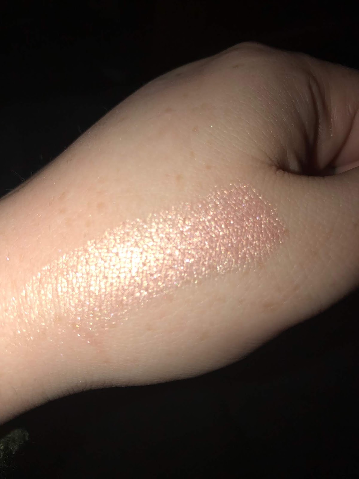
Are the products any good, though? I don't see anything too concerning with swatches, though there are just not that many reviews that are not by people trying to get the attention of the brand. To me some swatches look pretty dry/dusty, but I have personally not tried the product. 

So, my personal rules for buying indie:

1.) Does the brand sell unique singles? If a brand is private labelled, to me a clue is that they only sell palettes. If a brand sells unique singles, that tells me I can trust them.
2.) What story does the ingredients tell? If they tell me Coastal Scents and Morphe (which are not necessarily terrible brands, I have a couple of Coastal Scents shadows I love, but I paid $.99 for them), then I know to keep away. For now.

So to wrap up, these are my suspicions, so please take them with a grain of salt. I have been buying some indie makeup for about three years now, and while I'd like to believe that these brands are being transparent about their origins, I can't help but feeling that this is not the case, and so I probably don't need to spend my money on them. 

Articles you might like:

Friday, November 16, 2018

Four Looks of the Week


What a week! A bit of stress- but makeup wise, I think I was for the most part on point. Usually I wear shimmer when I feel mentally up for it, to do that one extra step. And this week I most certainly was. 

Thursday:

This look was sort of pre-planned. In my combinations I'd like to try post, I mentioned a brown with purple. Nabla Calypso is the shimmer, and it is my perfect shade of purple. On the crease I am wearing Looxi's Durty, a very low-key color that is somehow becoming a favorite of mine. If memory serves correctly I might have added some more browns from the Norvina palette just to cool down the crease on this a bit.

For this look I used an old blending brush I thought I declutted, from Skone (ipsy bag). I didn't like this brush at first, but after washing it a couple of times the bristles took on a normal shape. It's become one of my favorites.

Finally, I used Looxi Stripped and the Too Faced Diamond Highlighter in the inner corner. 

Happy to say I got many compliments on this look!


Next we have today's look. Not the best picture but whatever. So, Looxi's Durty is in the crease. Usually, I apply my transition color over primer that I set, but I didn't do that today. Without primer, Durty applies with more pigment, though it is harder to blend it out. I still like the effect, though.

On the lid is Looxi's Mirage.

On the outer corner and a little bit on the lid and crease is Coloured Raine's Royal Prerogative.


The lewk with my eyes close. This is a standard look for me, but a favorite nonetheless. 


Another look with Mirage! I believe I took a little bit of Soul from the Norvina palette, as well as Blueberry Swirl from Dose of COlours, and but it in the crease. I then took Ladyship from the Queen of Hearts palette on my outer corner. I find the colors in this look cool, but I always struggled with Ladyship. 


Finally, earlier this week I got some use with the Colourpop Good Sport palette. Trooper (a maize yellow matte) as a transition, High Hopes  ( a light orange brown) and Hooky (a darker matte orange) in the crease. On the lid I used Wild Out, a slightly peachy champagne shimmer, which works great. 


Not pictured:

A look I did with the Norvina palette and Kiko Milano Champagne.I took Volatile, a grey-taupe, used it over Incense. This look was pretty neutral, but still interesting.

Overall, I think this was a fun makeup week!

Thanks for reading! :)

Monday, November 12, 2018

5 Eyeshadow Combinations I'd Like to Try

I've got a quite a lot of eyeshadow. And I know there are certain looks I want to try, but I just haven't taken that extra step. So my thinking is that if I commit these thoughts to paper, I'll remember to actually try them out. Or something.


1.) Green + Brown + Gold

So, this is a look incorporating Looxi's Green Apple, a perfect shade for people who wanted the Melt Gemini palette but either could not afford it or did not need the rest of the neutral shades in the palette. So, my plan is to use the green n the crease and as a transition, then use a warm toned brown blended in the outer corner and crease, and then topped off with a gold shimmer on the lid. A perfect gold shimmer I have in mind is Looxi's Boujee, which contains blue, green, and reddish reflects.

2.) Red + Gold

More gold! This time I want to take a shimmer that is more pure gold and use a cooler toned, straightforward red (from the BH Cosmetics Take Me Back to Brazil Palette or the Athena Palette), blended with Red Ochre from Modern Renaissance. I dunno, I feel like red and gold would make a good pair.

3.) Grey Toned

So I've done this look with other colors, but recently I picked up Nabla's Wild Child, a mid-toned grey. I would like to use this as a transition, and then the dark green-toned grey from the Colourpop Good Sport palette called Trophies. I want that to me in the outer corner, and then on the lid the greyish-green shimmer in the palette called Hooked. Just for fun, I might put Licious, a yellow-gold shimmer on the inner corner if I am feeling brave, or just Vermeer from the Modern Renaissance palette, because it is a perfect inner corner shadow and I just don't use it enough.

4.) Warm Brown + Warm Purple

So I have tried to mix browns and purples together, but with not great results. However, I feel that my skills have (marginally) improved, and I have a vision, darn it! So, I just got Calypso, a warm purple shimmer, and it is gorgeous. I think using a brown transition with it would work. I've got to try.

5.) Yellow.

Speaking of monochromatic looks, I love yellow. The Good Sport palette has Trooper, a matte maize shade, and I have Tangy Dijon from Vanessa's Vanity, darker than Trooper. I could just use a light matte brown on the lid, or even

6.) Pink
Pink in the crease, Love from Norvina (warm toned) or a Covergirl Quad Pink (cool-toned) on the crease, and a burgundy on the outer corner,  and a Rose Gold on the lid. It can be either Rose Gold from the Norvina palette, Bohemian by Looxi Beauty (more red toned).

7.) Ardency Inn Rose Gold + Grey (Nabla Wild Child + Norvina Volatile)
This is not a traditional Rose Gold. This color is beautiful and multi-dimensional, and I would counter it with neutral mattes that are grey toned.

So that is my list! Maybe I can make this a menu of sorts, and see how I do during the week! So, if I am wearing a red sweater tomorrow, so I think option 2 or 3 would work best. We'll see!

Thanks for reading!

Thursday, November 8, 2018

Maybelline Fit Me Concealer in Ivory and Fair: Review and Swatches

Good Morning friends and neighbors!

Today I thought I would talk about a product I have been using for quite some time- the Maybelline Fit Me Concealer. Now, I really do think Maybelline has some of the best drugstore lines. The Fit Me Foundation, Concealer, and the Better Skin Foundation Powder and Concealer are all excellent. Now that I think about it, Maybelline also is great with lipstick. But going back to the Fit Me Line, I have used up an entire Matte and Poreless foundation, a couple of months ago. The shade match was great. I have cool-toned light skin.

I also used up and repurchased a Fit Me Concealer, in Fair (formerly 15, but now 10).

Unbeknownst to me, Maybelline actually extended the shade range of its Fit Me line, including the concealers. I found this out yesterday, when I was looking to repurchase another concealer I used up, in Ivory (5). On Amazon, Ivory is only available for pre-order (for $10 for some reason- on Ulta, Target, and Walmart it it no more than $6.00). Then I did a bit of digging and found that Ivory is a new addition to the line.

So, I thought it would be timely to swatch and compare these two for you, in case you are in the market for them.


As I said before, Ivory is 5, and Fair USED to be 15. Now it is 10.


Swatches! I have both with flash and without. With flash, the light flashes back so it looks a bit too light. Light is on the left, and Ivory is on the right. 


In terms of the formula, I find the concealer to set fairly quickly, but not with a really dry finish like Colourpop. I love to use Maybelline Fit Me concealer for spot-concealing and redness, because the formula doesn't slip and wear away during the day. Under the eye works well too, but I do set it with powder to be on the safe side.  The formula is slightly mousse-like, and easily to build and blend, though it gives plenty of pigment in one swipe. 

Together, these concealers work well for me to also provide some highlighting on the face.

Ultimately, I heartily recommend this concealer. I've used a lot of Maybelline concealers in the past (including Better Skin and Age Rewind), and for me the color match is best with Fit Me, as well as the formula works best with my combination skin. 

For my minimal no foundation looks, these concealers are incredibly useful. 

Let me know if you have had any experience with the new shades! How are they?

Thanks for reading. :)


Saturday, November 3, 2018

Makeup Releases That Disappointed Me

When a brand sneak peeks picture of their products, you don't get the whole story. I find that when I see a glimpse of packaging or a swatch, I fill in the blanks about what I thought the product was going to look like. It is not until I see multiple swatches and pictures do I then feel like I got a comprehensive idea of how the product is going to perform.

So let's talk about a few product releases that really disappointed me in this way.

The first up is the upcoming Too Faced Pretty Rich eye palette.

As someone who owns last year's Diamond Highlighter, I was expecting something rather cool-toned, super girly and frilly, and unabashedly feminine. I was excited when I saw promo images that showed the familiar jewelry box-edge.

But then we got the full image of the inside and outside of the palette:


The inside is the Naked Palette. It is the Naked Palette. It is the Naked Palette. To rephrase- this is a super neutral color scheme with randomly shaped pans that contain some questionable formula.

And then the worst part? The packaging ruined by that disgusting stationary font with "Pretty Rich." It destroyed for me any interest I had in this palette. Too Faced out Too-Faced itself, and the results were not pretty.

The next palette I want to talk about is the Natasha Denona little palette in Cranberry, $48. Now, I never was a Natasha Denona person, nor will I ever be, BUT for some reason I loved how this palette turned out. In the past, I felt ND wasted some colors in these small palettes and really did not select the colors thoughtfully, but I thought I liked the look of these:


 Looking at the (heavy) swatches and pictures, I thought this palette had really distinct shades.

And then I saw some more pics:


I noticed that the warmth of the shadows varied from person to person, and I noticed that the two mattes really were not that different after all. The purple shimmer I thought I was obsessed with doesn't look like a purple after all. 

Because of the amount of variance in people's pictures, I just thought it best to avoid altogether. The repetition of colors turned me off this palette completely. 

The next palette is not one I wanted originally, but one that I found disappointing after finding out who the original brand was:


Sigma, what happened? At first I thought this was either a Bare Minerals eye palette, or one of those cheaper private label ones. When I found out it was Sigma, I was shocked. Are they trying to rebrand? I can see the Sigma symbol pressed into the two highlighter pans. I don't know. It just seemed so different than what they were before. 

Finally, for some reason Nabla gets a lot of crap on my blog. I don't know why. I have bought Millenium in the past, and actually just placed an order for two more singles. However, I know I am not a fan of their palette color schemes:


This is their Poison Garden palette. 

Now, I will say that I think the colors are beautiful. I've seen live swatches of this palette, and for the most part each shadow has its own unique quality, which you don't see too often. 

However, I do think a.) it's too similar to the other palettes Nabla's released previously, and 2.) not reminiscent of a Poison Garden. I am sorry. In my head I was picturing sumptuous greens, blues, and wines, and then we get this. It was just a bit disappointing.

So, that's my list for tonight! Any releases that disappointed you?

© *:・゚Cosmetically Inclined ・゚:*  
Blogger Templates made by pipdig