The products mentioned today are specifically things I would buy, for one reason or another, but also products I feel like I do not want to/nor should.
All images used in this review are promotional images releases by the company, used by me to critique and provide commentary.
First up is the Coloured Raine Queen of Hearts Palette ($50.00). Now, this will be a permanent item. There is no rush. NONE. Furthermore, if you have the Modern Renaissance, you have most of this palette:


Down to its packaging, if the Queen of Hearts Palette had a baby, out would pop the Tarteist Pro to Go. Now, I love this palette, and I think it tells the same exact "color story" as the Queen of Hearts palette. And I paid $20 for it, which is why I can't buy the Queen of Hearts palette- I just don't feel as though I need it.
Second is the Colour Pop Yes Please palette ($16). Now, they have restocked it, and will be taking orders TOMORROW. Cue the rush. Full disclosure: I think what happened with the Queen of Hearts palette will definitely happen with the Yes, Please palette. It will be sold out AGAIN and they will make it permanent. So again, there's no rush, especially if you have colors like it. As a reminder, this is what the palette looks like:

Again, if you have the MR or any other neutral palette, you've got the majority of this palette. I fully believe in every palette there's that one color that draws the eye to it, and convinces you it is an original or must-have palette, even if the other colors are rather ordinary. While I do think CP should be commended because I do think there are a variety of interesting shades in this palette, the obvious "diamond" of the palette is the matte yellow.
And I am not going to buy a palette simply for one color.
In fact, I did end up buying a yellow matte. I found a number of possibilities on Coastal Scents, like Cantaloupe Slice (currently sold out, but added to my wishlist.) I then found out Vanessa's Vanity, an indie makeup brand, was having a 50% off sale, so I bought Tangy Dijon, for $3:
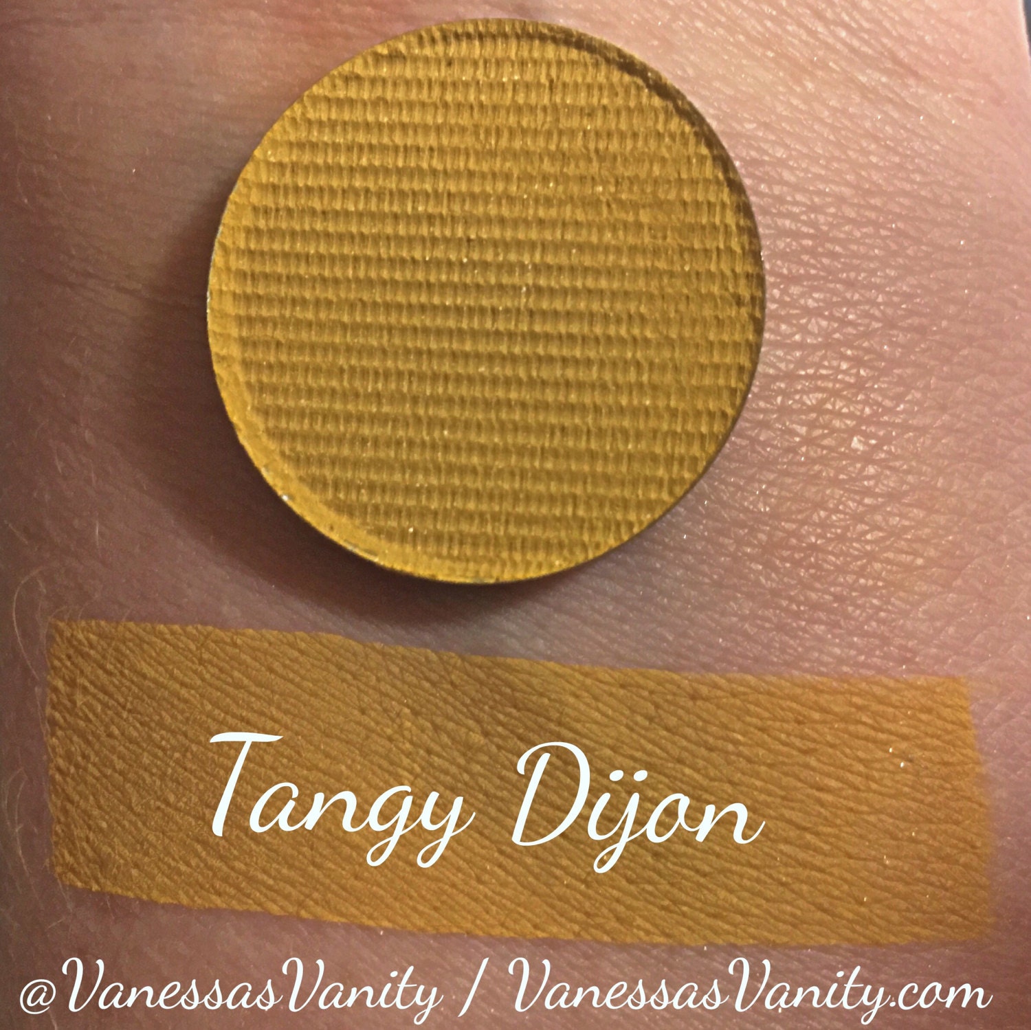
It's a bit darker than the CP shadow, but I prefer that. Of course, this is going to take a while to shop to me because they were flooded with orders, but still. I don't need another palette just to be able to use yellow.
Finally, we have a palette that truthfully is beautiful. I mean, I would save this as wallpaper on my computer:

Very, very pretty. However, let's talk about the aforementioned "diamond" theory- about identifying the 1-2 standout shades in the palette, and breaking it down from there. Twilight looks like (can't confirm if that will be the case) either a textured shadow or heavily metallic shadow with a blue-pink-purple shift. It is definitely something that I know will not look good on my face. The second one is Amethyst, a color we have been seeing this summer in the form of liquid lipsticks from two brands I will not talk about. The formula on this one will be suss.
While her Rose Gold palette (also $65) had I think 8 metallic/shimmer shades, this one has 10, and are not grouped together by row. Aside from the purples, these colors can be found in a multitude of palettes, just perhaps not in that "textured" formula, which was disliked anyway.
Retrograde reminds me of Cherry Moss from Coastal Scents (also on my wishlist), as well as the blue-green pigment from Mac, as well as the Comfort Zone palette from Wet n Wild.
Do I think this palette is pretty:? Yes. But if this palette will be anything like her first one, it will be an expensive risk to take, especially because so much of the palette is neutral.
*Bonus: some released previews of the Desi/Katy collab for Dose of Colours, from trendmood:
In regards to the entire collection, I was first reminded of the Mac Mariah Carey collaboration. I don't think the packaging or concept really are that interesting- just a lot of glitter and glam. I don't think the colors of the shadows stand out either. Texture is another thing that stands out- as glitter can be rough to touch. As for the quality of the eyeshadows go, I hear you have to wet your brush to foil them? Not a new concept, but the shadows look so chunky and textured in the pan I don't think I am drawn to them.
And while we are on this spiel on texture, two of these palettes both emphasize metallic shadows to the point where the product is heavily textured. I think this goes with the mindset of the ABH Subculture palette, where everything had to be intensely pigmented. I think these companies are really overdoing it, for the sake of promotional images, that they are really diminishing the usability of their products.
Next post will be more on products that I did buy!
No comments:
Post a Comment