Wednesday, August 9, 2017

TM(yself)O: Summer/Fall Palette Edition

Hello! So, the makeup world is in a perpetually changing state, and today I have some new and not so new releases to talk myself (and perhaps you, reader) out of. Now, some releases I don't bother with acknowledging (Limecrime, Jeffree Star, Kylie, etc), because I know I will never purchase from them.

The products mentioned today are specifically things I would buy, for one reason or another, but also products I feel like I do not want to/nor should.

All images used in this review are promotional images releases by the company, used by me to critique and provide commentary.

First up is the Coloured Raine Queen of Hearts Palette ($50.00). Now, this will be a permanent item. There is no rush. NONE. Furthermore, if you have the Modern Renaissance, you have most of this palette:

Now, I know they are not identical. As I have mentioned before somewhere on this blog, the strengths of this palette over MR are more of a variety of shimmers. However, I personally can't purchase this knowing I have the MR, as well as another palette I just purchased:
                            
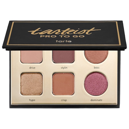
Down to its packaging, if the Queen of Hearts Palette had a baby, out would pop the Tarteist Pro to Go. Now, I love this palette, and I think it tells the same exact "color story" as the Queen of Hearts palette. And I paid $20 for it, which is why I can't buy the Queen of Hearts palette- I just don't feel as though I need it.

Second is the Colour Pop Yes Please palette ($16). Now, they have restocked it, and will be taking orders TOMORROW. Cue the rush. Full disclosure: I think what happened with the Queen of Hearts palette will definitely happen with the Yes, Please palette. It will be sold out AGAIN and they will make it permanent. So again, there's no rush, especially if you have colors like it. As a reminder, this is what the palette looks like:

Again, if you have the MR or any other neutral palette, you've got the majority of this palette. I fully believe in every palette there's that one color that draws the eye to it, and convinces you it is an original or must-have palette, even if the other colors are rather ordinary. While I do think CP should be commended because I do think there are a variety of interesting shades in this palette, the obvious "diamond" of the palette is the matte yellow.

And I am not going to buy a palette simply for one color.

In fact, I did end up buying a yellow matte. I found a number of possibilities on Coastal Scents, like Cantaloupe Slice (currently sold out, but added to my wishlist.) I then found out Vanessa's Vanity, an indie makeup brand, was having a 50% off sale, so I bought Tangy Dijon, for $3:
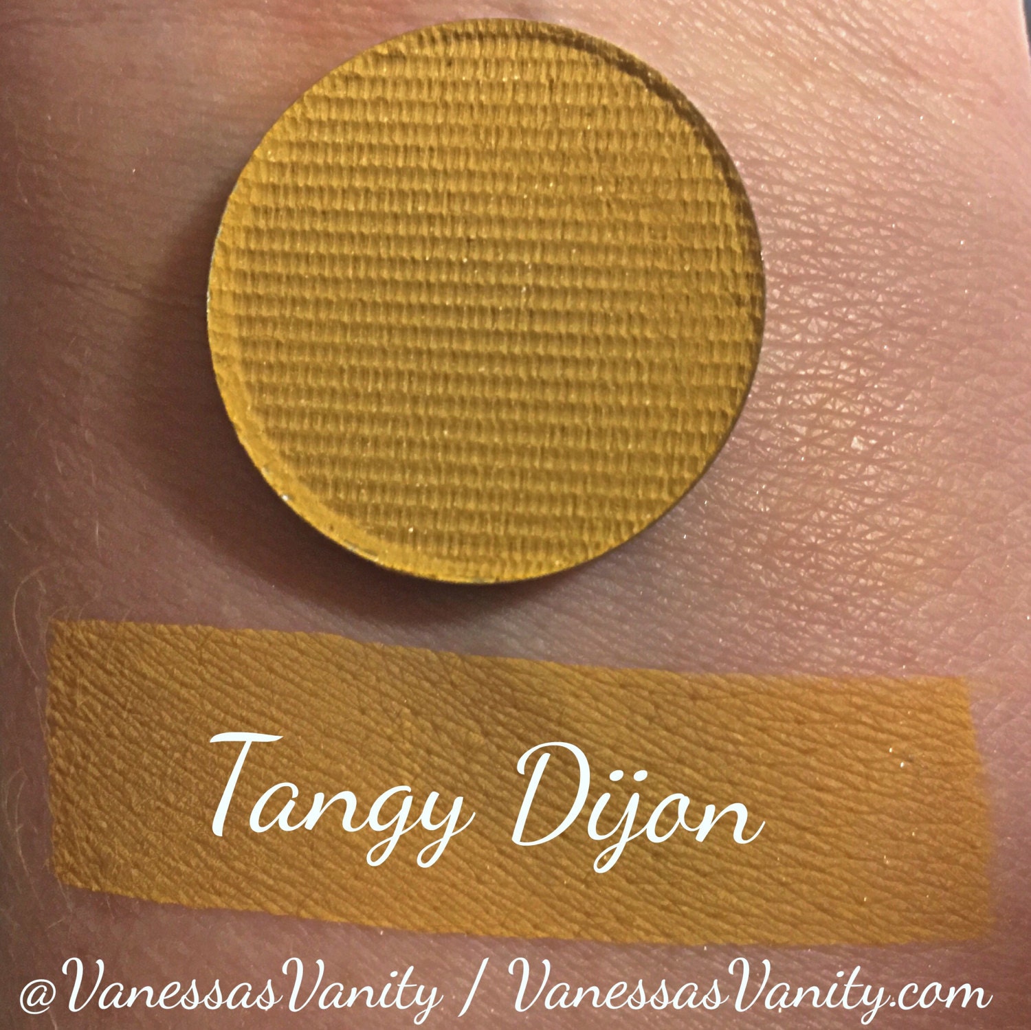

It's a bit darker than the CP shadow, but I prefer that. Of course, this is going to take a while to shop to me because they were flooded with orders, but still. I don't need another palette just to be able to use yellow.

Finally, we have a palette that truthfully is beautiful. I mean, I would save this as wallpaper on my computer:

Very, very pretty. However, let's talk about the aforementioned "diamond" theory- about identifying the 1-2 standout shades in the palette, and breaking it down from there. Twilight looks like (can't confirm if that will be the case) either a textured shadow or heavily metallic shadow with a blue-pink-purple shift. It is definitely something that I know will not look good on my face. The second one is Amethyst, a color we have been seeing this summer in the form of liquid lipsticks from two brands I will not talk about. The formula on this one will be suss. 

While her Rose Gold palette (also $65) had I think 8 metallic/shimmer shades, this one has 10, and are not grouped together by row. Aside from the purples, these colors can be found in a multitude of palettes, just perhaps not in that "textured" formula, which was disliked anyway.

Retrograde reminds me of Cherry Moss from Coastal Scents (also on my wishlist), as well as the blue-green pigment from Mac, as well as the Comfort Zone palette from Wet n Wild.

Do I think this palette is pretty:? Yes. But if this palette will be anything like her first one, it will be an expensive risk to take, especially because so much of the palette is neutral. 

*Bonus: some released previews of the Desi/Katy collab for Dose of Colours, from trendmood:
In regards to the entire collection, I was first reminded of the Mac Mariah Carey collaboration. I don't think the packaging or concept really are that interesting- just a lot of glitter and glam. I don't think the colors of the shadows stand out either. Texture is another thing that stands out- as glitter can be rough to touch. As for the quality of the eyeshadows go, I hear you have to wet your brush to foil them? Not a new concept, but the shadows look so chunky and textured in the pan I don't think I am drawn to them.

And while we are on this spiel on texture, two of these palettes both emphasize metallic shadows to the point where the product is heavily textured. I think this goes with the mindset of the ABH Subculture palette, where everything had to be intensely pigmented. I think these companies are really overdoing it, for the sake of promotional images, that they are really diminishing the usability of their products. 

Next post will be more on products that I did buy! 

Monday, August 7, 2017

Sparkly EoTD w/ Fyrinnae!

For today's look, a couple of things going one.

One: I am getting tired of the whole "set your primer" spiel. One, my lids are not oily. Two, I don't think it does me any favors. I have been getting frustrated with a lot of my looks lately because I feel the colors are muddying together.

Two: I am trying something a little new with eyeliner. I have always liked the look of a legit wing, but it is a scary endeavor. Today I think I worked out a "baby wing" thing that I am going to keep practicing, and continue to use.

Products used:

1- From the Tarteist Pro to go palette: Drive (a pink-toned light brown)
2- Wet n Wild Brulee single (a warm toned cream)
3- Warm Taupe from the Modern Renaissance palette
4- Fyrinnae Single Mythical Dalliance ("rosy and bronze sparkle with lime green shift")
sparkly.

5-Stila Cosmetics- Kitten (champagne shimmer)
6- Milani primer
7- Physicians Formula Eyebooster AND Milani Eye Tech Extreme (for the wing)
8- Fyrinnae Pixie Epoxy
9- Starlooks Voluminizing Mascara

A lot of products for this look! The only one I don't think was necessary was Stila Kitten. That was the look I was originally going for, but I got bored and decided to use a Fyrinnae single instead.

Now, I love Mythical Dalliance, but as the pictures will demonstrate, glitter gets everywhere: in the eyelashes, on one's faces, etc. I have to brush away glitter that has transferred inside the crease.

Overall, I think this is a fun and glamorous look that I intend to replicate. I did NOT set my primer, but did use Brulee only on the brow bone, above the crease.

I continue to love the Pro To Go palette, and am so happy that it is my stash!

Now, onto the pictures:


Sunday, August 6, 2017

EoTD with z-palette single shadows

Good morning!

You know, it's ironic. In my quixotic quest to find the ideal purple eyeshadow, I think I have come to the point where I don't know purple eyeshadow even works on me.

Today's look mainly involved four single eyeshadows. I am trying to go back to enjoying the colors of my z-palette, especially because I know I have to destash at least one of them.

So, we have:
1.) Wet n Wild Creme Brule
2.) Coastal Scents Victorian Pear
3.) Coastal Scents Panama Rose
4.) ABH in Fudge


Now, I chose Victorian Pear as my transition color because it's on my list for possible shades to destash. It's a nondescript satin taupe, but randomly with green glitter that barely shows up.There are literally pieces of green glitter embedded in the shadow. When I first saw that, I thought it was a mistake. But when I actually used the color, I found the glitter was throughout. I'll try to post a picture of what I am talking about:


Anyway, I really liked how the shadow performed. It blended well. None of the glitter showed up.

On the lid I used Panama Rose, and I wish I set down glitter glue on my lid first. It's a really pretty metallic mid-toned purple.

Finally, we have blended in the outercorner ABH Fudge, which I love because its blendable and has just enough warmth. Definitely one of my favorite singles of all time.

Here are pictures of today's look. It's not actually one of my favorites but I am not going to re-do my makeup.


Indie Produtcs Round-Up

Hi all!

Today I thought I would share all of the powder products (and some misc) I have purchased from indie brands. Now, I love indie brands. I love that many times you get a great value, interesting designs and concepts that you would never see (although times are changing) typically in major cosmetics brands. I also love the fact that perhaps if there is a color or product you once wanted but was discontinued, or too expensive, indie companies might have your back. That being said, I don't think that just because a company or product is indie, it is inherently better than a larger makeup company. As you will see below, I myself have only really dipped into indie products, but I feel I have come away with some hits and some misses.

1.) Light Grey Contour Powder from Lunatick Cosmetick Labs. This I use mostly in the winter, when I really need to take away warmth from a bronzer. Because I did order a product that was too light, I cannot use this on its own. It is a light grey powder, with excellent staying power.

2.) Eyeshadow Single in Invocation by Lunatick Cosmetick Labs. This single is currently in my z-palette and I don't really use it. I don't feel that the pigmentation is all that great. It is a slightly shimmery cool-toned mauve/pink, but the formula is not what I am used to, and I don't use it all that often. It's sort of nondescript for me.

3.) Shiro Highlighting Powder in Vessel for Disaccharides: Unfortunately I've moved this to my makeup purgatory. It is a beautiful powder with really pretty sparkles, but I can't wear this on day-to-day basis. If I could, I would.

4.) Shiro eyeshadows in There's No Such Thing as Magic and *** (very long name). I reviewed both of these on my blog, and the full name of the light peach matte is there, too. Both are fine, but No Such Thing as Magic Oxidizes.

5.) Fyrinnae Cosmetics eyeshadows, loose. I can't believe I lost Serendipity. It was my favorite. These are really pretty glittery shadows, but so much work for the morning.

6.) Life's Entropy contour stick in Proton- also reviewed on my blog. Love this!

7.) Cherry Pit Crafts Incense Cones- my favorite- even ordering it twice- is Toasted Marshmallow. I love this store and plan to continue purchasing incense from them.

6.) *Just purchased as part of the 50% of sale:  two singles from Vanessa's Vanity in Tangy Dijon and 6 pm sparkler. So I was lead to Vanessa's Vanity after searching for a yellow matte shadow. Colourpop's Yes Please palette has been out of stock for forever, and my plan B was to buy Cantaloupe Slice from the Coastal Scents website. However, that is also out of stock. So then I went to etsy and searched for a yellow matte that way- and lo and behold! Vanessa's Vanity is swatched and reviewed constantly by Our Beauty Cult.

I am so looking forward to trying out her products, especially the yellow.

So, to wrap up. I personally thinking that as with anything in life, buying from indie brands needs to be sensible. My own bleh experiences come from buying things that I did not see reviews of. That is key. Because no matter what, indie products will always seem special and unique and quality. Reviews, however, will help you determine if that actually is the case.


Saturday, August 5, 2017

EoTD with Maybelline's City Mini Palette

Good morning/afternoon!

I will eventually make a makeup organization post, but for now I will say that my current system of organization has really been inspiring to me, and has reminded me of what I have and can do.

For instance, I was reminded that Maybelline's City Mini Palette in Downtown Sunrise is one of the best drugstore palettes that I have used in a while, and I wanted to use it again today.

Downtown Sunrise, as well as the other palettes in the collection, is a smart assortment of shades and finishes. It is not the most neutral palette in the collection, but it is on the more neutral side, with also pops of color. I have previously reviewed this palette, and did take off points for pigmentation. However, I do not think that a worth or value of a palette can be determined by pigmentation alone. I am still drawn to this palette because it can be built up, and I love the texture of the shimmers.

Today's look used all the colors in the palette, as well as one shade from the Modern Renaissance thrown in (Love Letter).

After the pictures, I'll go in with a reflection on how I think the shades apply and perform.

Primer was Milani Eyeshadow Primer (really liking this a lot), eyeliner was Physician's Formula eye booster, and mascara was L'Oreal Original with Curved Brush.


So for this look, I used the cream color to set my primer all along my browbone and in my crease. I then blended in with a fluffy brush the light orange shadow- this is really the only shade I wish had more pigmentation. It really disappears on the eye save for a light hint of color. 


Here you can see Love Letter in the crease. I did blend well with the colors from the Maybelline palette. On the other corner is my favorite matte in the palette- the dark brown. Already you can see a little bit of shimmer in the crease- which is transfer/fall-out from all the shimmer I used on the lid.

 On the lid I put down Too Faced Glitter Insurance, and used all three shimmers. The taupe shimmer went all over the lid. I then basically mixed the two pink shimmers and placed them on the lid. I feel it did create somewhat of an iridescent effect.


Here we have two pictures without flash, in different lighting. 


Final: the mattes in this palette really work best with a denser brush. I used a fluffier brush with the light orange shade, and perhaps that is some of the reason why it continues to be harder for me to get to show up. I used a dense brush for the brown and it really worked well.

In sum: This is an easy to use palette that I know I will continue to use!
© *:・゚Cosmetically Inclined ・゚:*  
Blogger Templates made by pipdig