Friday, July 13, 2018

Almay Shadow Squad in Fairy Tale: Review and Swatches

So, as part of Almay's rebranding, they've released these little quads of eyeshadow called "Shadow Squads," packaged in a sleek transparent little square, with many different colors out there. Each quad (because I am not going to keep typing Squad) contains colors in the same family, but with different finishes.

I purchased at CVS the shade Fairy Tale quad, because 1.) I am a fairy tale nerd, and 2.) these appeared to be iridescent versions of the primary colors, in the same vein of the Kat Von D Alchemist Palette. I paid $6.99, for  3.5 g of product.

Let's get into some pictures:


 Order of swatches: Green, Blue, Red, and Yellow

 All the colors mixed together.


As for my assessment, the only positive thing I can say is that the powder is very soft, and when I initially placed my finger in, I was hopeful based on the texture of the product. However, there is barely any color pay-off. Each shade is vaguely the color as shown in the pan, but each is filled with glitter of the same color. I will say that the glitters are small and could be very flattering, but they are so sparse and the iridescent base so sheer that there is hardly any impact on the eye.

The eyeshadow even failed the Pixie Epoxy and wet brush tests, as normal quality shadows are able to be enhanced by either medium.

I also tried to swirl a face brush in the pan to make a highlighter, but again, no impact. The swatch I provided looks pigmented, but when blended out, it disappears. All that remains is the glitter.

This line is so weird, and I am quite disappointed. It is almost as if Almay is desperate to gain some footing in the market, but they have seemed to underestimate or misunderstand what customers are looking for. I expected pigment. My last Almay purchase was a couple of months ago, when I bought a liquid eyeliner because I was in a pinch. That stuff washed off so easily, and had no staying power. So how updated is this company, really?

I regret this purchase and wish I didn't fall for the gimmick.

Saturday, July 7, 2018

Beauty Bookmark #2, The Norvina Palette

I thought this release was worthy of its own post. Today Norvina of ABH released the promo image for their upcoming palette, the Norvina Palette:


Now, right of the bat I am super excited for this palette, and wanted to buy it as soon as I saw it. However, I also wanted to think about parallels with my own collection, and what I would need to make sure of before actually buying the palette.

So, let's go shade by shade.
  1. Dreamer: A light gold shimmer. I know I have tons of these in my collection. 
  2. Summer: A brassier, darker gold. Another shadow I feel I have in my collection.
  3. Wild Child: A cool-toned pink frost, that seems to be a bit more rich in color. This I sort of have? From the Dose of Colors Eyes Cream Palette, we have the shade Bubblegum. My only issue with Bubblegum is that I feel it's a bit on the sheerer side, with flecks of glitter dispersed throughout, which is not exactly the look I am going for. Wild Child, however, does seem to be the frosty pink that I've been looking for.
  4. Rose Gold: I have many a rose gold shadow, including my HG, Rose Gold from Ardency Inn. 
  5. Celestial: This is really pretty and interesting to me, and I know I don't have anything like it in my collection. I have been looking for the perfect purple frost, and I feel like I have yet to find it. I could also be reaching, but going by the name and the picture, it might have a slight light blue reflect? 
  6. Dazzling: A bronze shimmer. 
  7. Drama: A red-toned purple shimmer. I hope it has more of a frostier finish. I might have something a bit like it in the Tarte Pro to Go palette, in the shade Dominate, or the shade Queen Mother by Coloured Raine. 
  8. Base: Matte cream shade. I've got these.
  9. Soul: Going by its satin finish, I have nothing like it in my collection.
  10. Incense: Reminds me of Bobbi Brown Wheat. I do have Warm Taupe from the Modern Renaissance palette. 
  11. Love: A pink matte, but warmer toned. I do have a gorgeous Inglot matte shadow #362 that is like a true pink, but this shadow also reminds me a lot of Lay Low by Colourpop, which I also have, and is slightly more peachy. 
  12. Volatile: A reddish/rosier brown. Could be similar to Cone from the Dose of Colours palette. 
  13. Eccentric: In the palette it looks really striking, like a mustard-brown, but I wonder how similar it is to Burnt Orange or Raw Sienna. 
  14. Passion: Mulberry from Soft Glam? There's a shade in the Carli Bybel Deluxe palette that could be sort of similar. 
This palette also drew immediate comparisons to the Soul Blooming Palette from Nabla:


The Huda Desert Dusk:


And the Lime Crime Venus 3:


Truthfully, though, out of all of those options, ABH's palette still is most appealing to me. Too much blue in Nabla, too much warmth in Desert Dusk, and I heard the most gorgeous looking shade in the Venus 3, the shade REM(?), was a let down. 

So what do I need to do know before buying this?

  • How distinct are the shimmers? I have critiqued a lot of ABH palettes in the past for lack of distinct shimmer shades, and there are four neutral shimmers in this palette. If any of them have a nice finish, or even a duochrome quality, I would love that. 
  • How does Soul swatch? Soul is that satin-looking lilac. The last not quite shimmer I can think of in an ABH palette was Antique Bronze and I hated it. 
What do I like about this palette?
  • I like the way the shades were paired together. Because there are so many mattes, the "quad" configuration doesn't really work for me here, but grouping them in pairs seems promising to me. 
  • PINK AND PURPLE. Those have been my colors this summer and I want to keep the party going.
Will I buy this?
  • At this point, the only way I am going to be sure this is not redundant and a waste of money is if I see swatches. I am in the camp of wanting to buy this, though, very much so.
What do you think? Are there enough neutrals vs. pinks and purples for you to buy this? Please feel free to let me know below!


Friday, July 6, 2018

Neutral-ish Sunset EoTD and Tutorial

Tonight I was bored so I experimented with a couple of colors and techniques.

First, I used concealer to prime my eyes this time. I used the Colourpop No Filter concealer because it does have a dry finish and sets quickly.

After, I took a very fluffy blending brush and used the two yellow mattes from the BH Cosmetics Take Me Back to Brazil Palette:


I do this only because I can never remember which of the two is the pigmented one.

I was very generous with the yellow, and it did need to be built up a bit. I went high up with this color, even up to my brows, and also on my lid.

Then, I took the orange shade Empress from the Coloured Raine Queen of Hearts palette. This was a good shade of orange because it was midtoned. Darker oranges run the risk of appearing brown on me. I blended the orange into the crease, but beneath the yellow.


Finally, I did use four colors from the Modern Renaissance palette.


I used Venetian Red blended into the outer corner and a bit into the orange, and Red Ochre concentrated on the outer corner and slightly blended. Burnt Orange was placed on the lid, but that could have easily been replaced with any color or finish. 

Primavera, a gold shimmer, was placed in the inner corner. 


 Overall, I really like this look!

Thanks for reading!


Thursday, July 5, 2018

Looxi Beauty Aurora Shadows (Swatches and Review)

So I guess my haul was not 100% over with. As one last hurrah, I did a bit more research into duochrome shadows, and found the brand Looxi Beauty. I picked up a couple of more work-friendly duochrome colors, for $20. Using Angelica Nyqvist's code almost covered the shipping fee that was already pretty minimal for me.

The four colors I got were:

1.) Boujee. This was the winner for me- hands down. I was not sure what the site meant that it contains all the colors of a rainbow- but after wearing and swatching it, it totally does. So on the surface, this appears to be a copper/gold with a metallic yellow reflect, but it has reflects of blue, which also shine a bit green and purple at times. On my eye it looks really elegant.

2.) Bohemian. I am kind of disappointed in this one, because it definitely reads warmer and copper on me than I would have liked. Aside from the fact that it is high quality with bits of purple microshimmer in it, I do have shades like this in my collection. That is my own fault, really, for not selecting shades carefully enough. However, it really is a gorgeous shadow and I do intend on using it.

3.) Mirage. I hate to say it, but the formulation on this one confuses me. It's not smooth, it creates a lot of fall out, and it didn't behave with Fyrinnae's Pixie Epoxy. I have never meet a shadow that doesn't play nice with PE! For my swatches, I have a dry finger swatch, and then on top of primer, but even then there does not seem to be much of a difference. For what it is worth, the colors are pretty, but I could not do a complex look with it- I imagine it would be good as a one-shadow color. Maybe.

4.) Charmed. This is a light lilac with blue-green reflect and is super pretty. It also wears well as a highlighter.

Swatches, and eye looks:
(l-r) Charmed, Bohemian, Boujee, Mirage


Mirage on top of WnW eyeshadow primer. Not much of a difference. 

For this look, I used Bohemian on top of Mac Paint Pot in Painterly. I regret doing this and won't do so in the future. Because the eyeshadow is so intense already, it got kind of muddy in my crease on top of Painterly. The color is super pretty, though. On me it just needs a drier base. 


The above is my eye look with Mirage. I used Wet 'n Wild eyeshadow primer, and then the Physician's Formula matte shadows to set it and deepen my crease. On top of that I used Fyrinnae's Pixie Epoxy, which did not agree with Mirage, which flaked a lot, and created a lot of fallout. 


I used the same process with Boujee, but as you can see, Boujee looks a lot nicer. I will be wearing this look in the future.

Final thoughts:
 Looxi has gorgeous shadows, but I need to be more careful about the formulas and shades that I choose. I do plan on picking up more in the future, though! If there are any that are in the more pink-brown-gold family that you think are worth it, please let me know!

Wednesday, July 4, 2018

Beauty Bookmarks, #1

Hello! So this is a new feature from my blog, which really isn't dissimilar from what I've already been doing. I like to TMO/anti-haul things I like, but it's really draining to sustain a negative viewpoint. Even in my TMO's, I don't really do that completely. If a product seems interesting, I'll concede to that, but also talk about why I won't personally be purchasing it.

So, for the sake of clarity, I am going to call my product release posts Beauty Bookmarks, because they're usually literally posts on Instagram that I've bookmarked. There are releases that I am aware of but have chosen not to discuss, only because I would never buy them. 

The first item is hot off the presses, in terms of news about its release. We are talking about a blush and eyeshadow palette, called Fetish, from Kat Von D. You may remember an Instagram post from 6 mos ago (lul), which was a sketch of the calligraphy for the palette design. Both palettes are ovoid, with raised print. The names of the blushes/highlighters are: Roseshock, Magick, Telepathy, Bathory, Salem, and Coven. Three pans are larger than three others, but I am not sure which she would make the big pans. The Alchemy palette was pretty small, so if she is reusing those supplies, then my prediction is that the highlighters will be the smaller ones. 

Now usually I really don't care about product names, but Erzabeth/Elizabeth Bathory was a serial killer. Not a good look. And as someone who teaches The Crucible, I don't think of Salem as really needing to belong in this hodgepodge mystical assemblage she has going on here. It's a bit lazy. 

As for the eyeshadow, there are quite a lot of them in this palette. Like a lot. And all of them have names related to certain practices and lifestyles that I am sure Kat Von D is misusing or misappropriating in some way. 

The interior of both palettes have not been released, but let me tell you, aside from two steeply discounted palettes I bought from her one time, I have no intention of buying her products ever again. The anti-vaccination stupidity, neo-nazi associations, etc., are inexcusable and I am not funding it. 

From a product point of view, face palettes are a gamble. Unlike an eyeshadow palette, face palettes have bigger pans of product that might not work for you. As for her eyeshadows, she seems incapable of producing permanent eyeshadows anymore, so essentially she's glutted her own market. I have been expressing fatigue with the Ma Vida Loca palette craze for the longest time, and every palette since then has been some spin on "dark rainbow." Okay. Not for me. 

Let's move on, shall we? 

The BH Cosmetics Desert Oasis Palette. In terms of brands that have the potential to be direct competitors with Colourpop (you've heard it here first, folks), BH Cosmetics is one of them. Just start selling singles, darn it! Anyway, they are releasing this summer palette that actually looks quite pretty. This is Trendmood's pic:

Though I have most of these colors, and would not wear blue eyeshadow, I think the composition of this palette is nice. I don't quite get the placement of the larger pans, but it still feels balanced in terms of shimmer and matte shadows. The larger pans could also be bronzers. The way this palette is designed is to be an all-purpose summer palette, and for someone who does not have this already, it would not disappoint them. I trust BH Cosmetics's both shimmer and matte formulas (which have improved so much!).


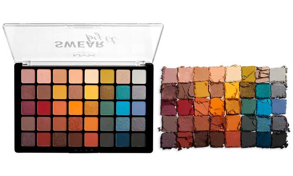
Nyx Swear By It giant eyeshadow palette: $35. 40 shades. Can you imagine that for five dollars less you could have purchased an Element palette? Yeah, neither can I. Here is a promotional pic:
Swear By It Shadow NYX palette 40 colori
Hm. I have not tried the Nyx non-neutral matte or shimmer formula. To me, this is bit intimidating, and I wish they offered this palette in halves or quarters. From a brand point of view, this is an interesting move. They are really trying to get a sense of what people will pay for, and what they won't. This mimics the Sephora Pro palettes set-up, and maybe even a little Viseart. My issue with palettes like these are the colors they choose to make shimmer. In the case of this palette, I think Nyx made smart choices and the palette is balanced. While I do think this is an interesting release, and though I am curious to see the quality of the shadows, I know I am skipping this one because I do have a lot of eyeshadow already. I would never get through all those colors. 

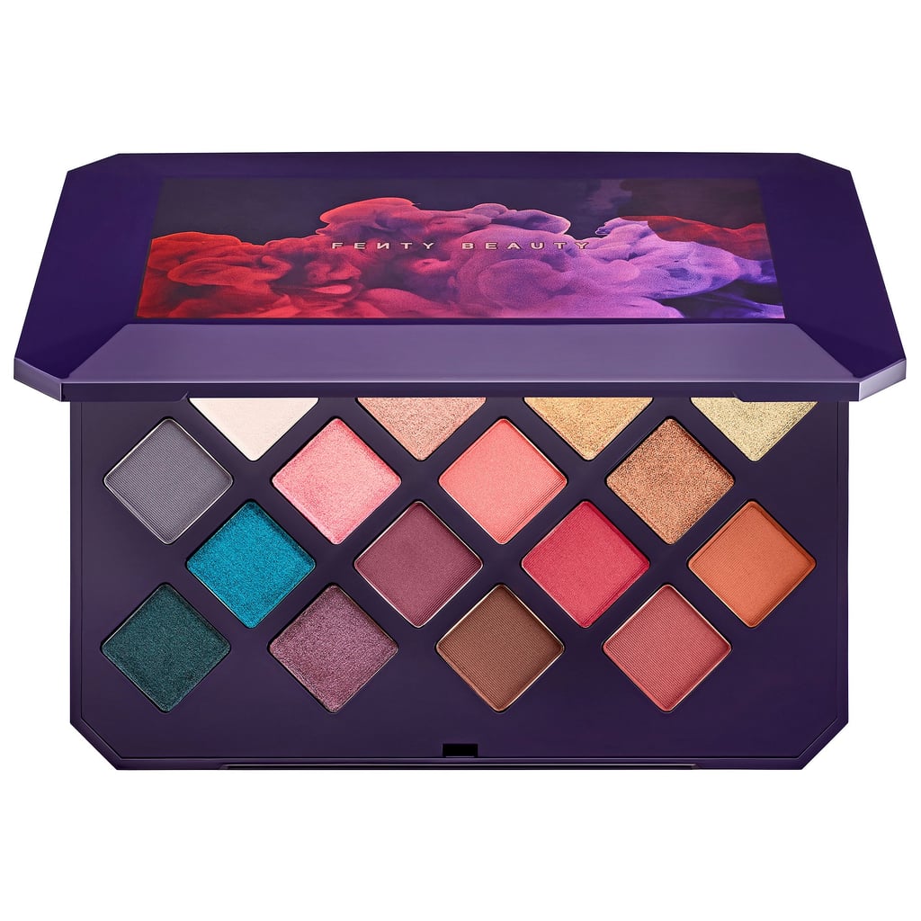
Fenty Moroccan Spice Palette:
$59 and sold out already.

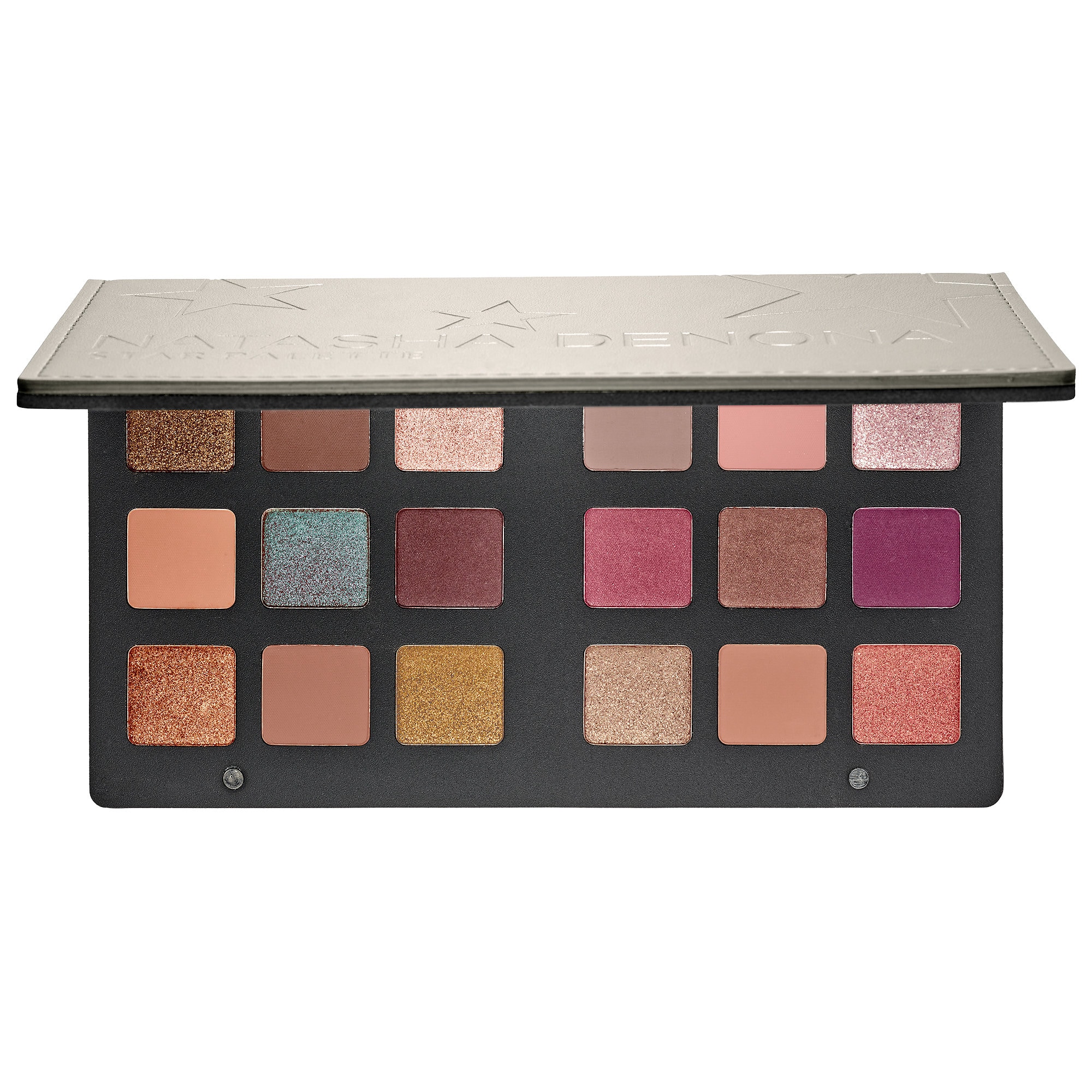
So I got a little bit of push-back on reddit for suggesting that this palette is similar to the Natasha Denona Star palette. Here me out:

Image result for fenty beauty moroccan spice sephora

Image result for natasha denona star palette
Granted, the initial images Fenty releases were VERY cool-toned, hence my associations with this palette. Still, I do see some parallels. Now, if I did not have the Modern Renaissance, or Looxi shadows coming in, or tons of other eyeshadows, I'd buy it. I think Fenty did a really cool job with colors. It is not a neutral palette. 

So, those were my thoughts! Thanks for reading! 

© *:・゚Cosmetically Inclined ・゚:*  
Blogger Templates made by pipdig