Saturday, October 7, 2017

Wet 'n Wild: Fair Trade Coffee Trio

If you don't see how reading a review of a discontinued product from 2015 is useful for you, then I totally understand. Feel free not to read.

For me, this is useful to write because I've got a weird collector/treasure hunter mentality about discontinued Wet 'n Wild products.

It started when I bought their elusive six-pan palettes for less than a dollar on Amazon.

And then came Kimberly Clark, one of my favorite YouTubers who swore  up and down that the highlighter from this trio was one of her HG highlighters.

I love Wet 'n Wild, but never paid much attention to their makeup in the past. I am shuddering to think about all I missed out on. After buying the Greed palette, and hearing about this trio, I paid another visit to Amazon, to see if there was a chance of someone selling the product.

And there was! I bought it for $5.00, and it's still on Amazon!

But was it worth it?

Let me first show you the swatches:


If I did not have so many highlighters and bronzers and blushes already, I'd be buying a backup of this on Amazon. It's special.

The formula is very soft and creamy, to the point where the blush and bronzer have a satin effect. The blush is very cool on me, which I like a lot, and the bronzer could read a little orange if I overdo it. If I use it with a light hand, it's all good.

But the highlighter? It's stunning. The creamy consistency really lends itself to a beautiful effect, and even though there is microshimmer, it's not chunky or glittery. Just finely milled sparkle.

If you can, I would snap this up immediately. It's an excellent product, and Wet 'n Wild needs to make some of this stuff permanent. I'm getting tired of hunting down discontinued gems. I even- in a moment of madness- bought the I Love Matte palette (re-released as Drinking a Glass of Shine) that was released a while ago. Like, a whiiiiile ago.  Here's hoping it's still safe to use.

Thanks for reading!

Me When I Saw the Urban Decay Holiday Palette 2017

The new Urban Decay Holiday 2017 palette:


Me:


I feel as though I was just talking about how UD has been oddly silent on what they were rolling out for Holiday 2017. And here we are.

So, yeah. I'm not buying this. Nooooooooo.

Yes, it's metallic. And I love a good shimmer. It's colorful. It's also neutral. But let's put that aside and do a good old fashioned TMO:

1.) The packaging is a disaster. I repeat: a disaster. It's basically one long tray with a mirror in the middle of two pairs of eyeshadow rows on either end. So how are you supposed to use this, or even hold it? And it looks like it comes with a lid or sleeve or something. This is so unpractical that I actually find it quite ugly to look at.

2.) Don't know what the price will be, but I promise it will be too expensive.

3.) Color selection: I recently learned a secret about shimmer eyeshadows. Let's say you have two bronze shimmer eyeshadows- one is slightly more red-toned than the other. But guess what? Does it make a bit of difference on your eye? Nope! I'm going to try and count the number of repeat pairs in this palette. And I know one has a slightly different tone than the other. My point is that it is unnecessary. If they omitted all the repeats and just went with less colors, they could have charged you less!

So, the two metallic blues, the two metallic purples, the two metallic red-tones, the three golds! It's way too much.

I myself am a gold eyeshadow junkie, but seeing this infuriates me. When I had the BH Cosmetics Foil Eyes (1), I did end up depotting them, and then I found myself gradually decluttering more and more because the repeating/close shades were frustrating me. I find this palette to be frustrating.

Even if the swatches are amazing- which I don't doubt they would be as shimmer shadows swatch very well- I wouldn't let them convince you alone. Sometimes shimmers will swatch very well, but on a small surface area such as they eyelid, they may not perform the same.

It's kind of disappointing UD went this route for the holidays- on one hand they did something different than their usual releases, but in a very boring, lackluster way.


Organization of My Blush and Highlighter Pans + Swatches of Ittse highlighter

Welcome!

Today I received in the mail an order I placed with Ipsy last week. It is an ittse palette, with two highlighter pans, all for $15.

I decided, however, to use the ittse palette for my blushes, and I am very happy with the result. All the blushes fit perfectly, and I know I will get much use out if it. The palette itself it sturdy and substantial, and has a plastic sheet to protect the mirror from the powder. I didn't think I would appreciate this, but I definitely do.

This is what the palette looks like on the outside:

It is a cool-toned gold faux leather casing.

In the palette, the first four shadows are my depotted Tarina Tarantino dollskin palette blushes. I do not regret depotting those, because the packaging was awful. The bottom two blushes from left to right are Makeup Geek Puppy Love and Pixi in Beach Rose. The Pixi blush was super easy to depot, and I am so pleased with the result. Not to give myself too much praise, but this looks like the scheme to one of those Nars holiday blush palettes. It makes me excited to use more of this.

In addition to this palette, I've got four other blushes, and one of them I am about to finish up. They are also all drugstore/budget-friendly. Overall, I feel as though my blush collection is pretty manageable.

Now, in order to place all the pans in this ittse palette, I had to take them from my medium z-palette, which originally contained blushes and highlights. As the ittse palette became my blush palette, the z-palette is now my highlighter palette. This includes the two ittse highlighters I got in the mail today.

This is what it looks like:

I'm not going to review every single one, but what I've been doing this week is mixing the two largest pans: Wet 'n Wild Precious Petals, and Mary Lou-Manizer. By itself, Precious Petals is a little too orange. 

To fill up space in this palette, I also moved my eyeshadow sample of UD Fireball to this palette, because I want to see what it would look like. I also depotted my sample of The Balm's Kuwakaribisha to place in there, because it is a highlighter but I was keeping it with my eyeshadows. 

Let's take a closer look at the ittse highlighters. I've never used an ittse face powder or eyeshadow before. 


The two on the left, from top to bottom are Run the World and Hustle and Glow. Also, the pan on the bottom right that looks white is from Vanessa's Vanity, a sparkler called 6 pm. (I'll provide a separate review for 6 pm, all I will say is that I believe this is a TRUE blush topper).

Run the World and Hustle and Glow (H & G)  are from a collaboration with a YouTuber. The full collab included four highlighters, and I personally think the ones Ipsy was selling were not the prettiest ones in the collab.

They still are pretty, though. Run the World is on the left, and  H & G is on the right:

It's not clear from the picture, but Run the World is very sparkly. I don't know if I can see myself using this. H & G, however, is gorgeous. It reminds me a little of Laura Gellar's Gilded Honey or even Champagne Pop- very metallic. I am much more partial to this one. I will provide a formal review of this stuff after I have more time to test it out.

In addition to the z-palette, I also own three highlighters, all drugstore. I do think my highlighter collection is a bit crazier than my blush collection, but I can say with certainty that I've got no repeats or dupes.

Thanks for reading!


Monday, October 2, 2017

Look of the Day: October 2 (text)

For the 0 of you reading this, I hope you don't mind that I don't provide pictures of my face. By the time I sit down at night with a cup of tea to post these things, my makeup is long gone.

I would describe my look today as "cool-toned." I'll go ahead with a description and review of the products used:

Eyes:

1. Milani Eyeshadow Primer: I still enjoy this, and it currently the only primer I use. I am interested though, in branching out to more high-coverage primers, just to see what it's like.

2.Modern Renaissance Palette: Buon Fresco in the crease, Love Letter lightly blended in. I also brought in the Blueberry Swirl shade from the Dose of Colors EyesCream Palette to diffuse the strong pink. Over the lids I used my Ardency Inn Manuka Honey Pigment in Rose Gold.

For me, the Rose Gold shade instantly makes a look special, and I am really glad that I bought it. It's one of those shades that looks great with both warm and cool complementary colors.

I have to say, I was afraid that Buon Fresco would look a little muddy on me, but I've learned that the key with this palette it to take my time. The look was clear and lasted well on the eye. In terms of eyeliner, it's the same old story with the Physician's Formula liner, but for mascara I switched it up a bit with the Starlooks Volumizing Mascara. This stuff works really well with my lashes.

Face:

1. I used the Ordinary Serum Foundation, and the Maybelline Age Rewind Concealer. The foundation is about 60% finished, but I don't know if I would repurchase. I kind of want to try the Fenty one! I also used the Too Faced Rx Primer, but I don't know if I am in love with how it wears. I don't consider my makeup to be high coverage at all, but towards the end of the day- even with setting spray- it looked a little cakey. The primer is also almost done, and I would love to try something else. Nothing with silicone, though.

2. Highlighter: I used the Milani Strobelight highlighter, which I haven't used for a while. Such a pretty and luxe highlighter, and affordable, too! Creates a nice metallic effect, and I don't have to use much.

3. Blush: To go with my eyes, I went with my purple blush, Fyrinnae's Mesmerize. I also purchased a purple blush from the Korean brand It's Skin as a replacement, but I don't have much hope- it looks chalky and grey. I am still on the look out for a replacement warm purple blush, because I really like the look of it on the face.

4. Bronzer: Same old story- Butter Bronzer!

5. Setting Spray: Urban Decay All Nighter- I use this on days when my skin feels greasier than normal, but I did not particularly feel any difference between that and the others I use.

6. Lips: Blistex Lip Serum, and Revelon Lip Butter in Fig Jam. Love Fig Jam- it's very pretty. The formula does dry my lips out, and I am wondering if I should just shell out for the much more expensive Black Honey by Clinique.

So that was it! A simple look with purple. No clue what I will feel like doing tomorrow! Sometimes I feel like I should challenge myself to using a palette, but at 5 o'clock in the morning my aim is to feel as comfortable as possible.

Sunday, October 1, 2017

TMO: (2) Holiday Palettes

Today someone on MUA reddit brought up the fact that an Urban Decay holiday palette is missing. I mean, it's only the first day of October, but it did get me thinking. Can we expect another Vice palette? Or Spectrum palette? Who knows, I wouldn't buy those.

Moving on, today's TMO invovles palettes whose promotional images have been released. We'll begin with an image from the blog ReallyRee, who is able to get a hold of these more luxury brand products to review ahead of time:
So this retails for 60 pounds, which translates to about $80.

For me, I wouldn't personally need a TMO, because for $80 I would buy a Viseart palette, if I wanted to spend that amount on eyeshadow anyway. Which I don't.

Charlotte Tilbury is an interesting concept as a brand to me. Similar to Bobbi Brown. She is a makeup artist, and yet I would not call these "Pro" products. I don't think the quality of her products are that noteworthy. What is conveyed to me through branding is that these are the products she would use on her celebrity clientele. And when you buy them, you're on par with her celebrity clientele??

Which, no, I'm not. Bad, Charlotte. Feeding into delusions of grandeur with basic neutral palettes.

And there are talented MUAs out there that simply don't need these products, and can make looks with a variety of price points.

Looking at the palette itself, we've got some metallics and mattes, organized into trios. Right off the bat, I am seeing the Naked 2 and 3, as well as Heat. I am also seeing the Carli Bybel palette.

But even if you don't have those, you've got metallic and matte neutrals, right? And even if that olive-gold shimmer seems to stand out- because it does among all of the same colors- when swatches, it's just an antique gold. No biggie.

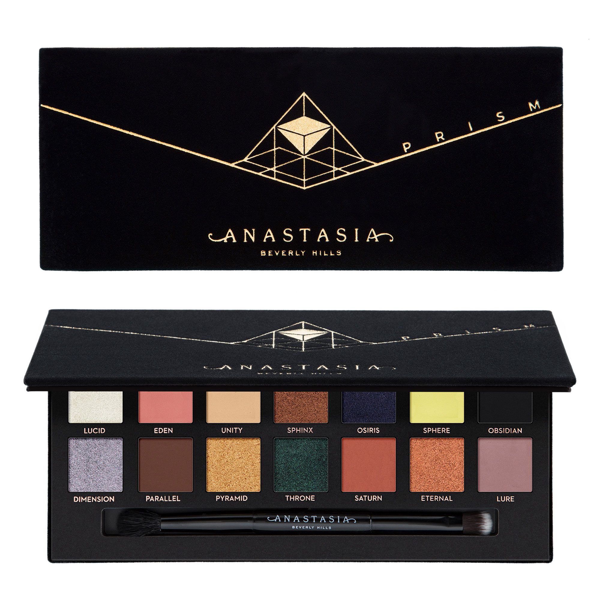
Moving on, let's TMO the ABH: Redemption Palette....er...I mean the Prism Palette.

I am not going to go into all this guff about what constitutes a prism...Instead, let's just look at it..LOOK AT IT

So, yes, people were quick to to draw comparisons to the Subculture color scheme. Now, personally, I really like this mix of colors. Most of them. And out the 14 shades, half of them are shimmer, which is quite a lot for an ABH palette.

Still, what is really putting me off is the fact that I know I would not use "Sphere," and I shudder to think how it shows up on the skin.

Furthermore, I just can't help feeling that some of these shades feel like re-promotes. Parallel, or Fudge? Lure ,or  Buon Fresco? For some reason this shade reads really red on the swatches provided, so I'm wondering again if the shadows are interacting with the skin, similar to Subculture.

Eternal and Sphinx are too similar to be useful to be, as are Saturn and Eden. I do think that ABH is trying to push people to play with color and texture, but this is reading too much like a KvD or Urban Decay Holiday palette- too "random" and challenging, if one were to really try to use all of the colors from the palette.
© *:・゚Cosmetically Inclined ・゚:*  
Blogger Templates made by pipdig