Tuesday, April 3, 2018

Spring Cleaning + Eye of the Day

I literally spent the whole day cleaning. In my cleaning adventures,  I did find some makeup items I thought I had tossed that I decided to give a second go.

These included an unopened sample of Wet 'n Wild's face primer, as well as a depotted Bliss bronzer shade, from a palette I got from TJ Maxx on clearance.

The face primer is lotion-like, but has the same paint smell as the Photo Focus foundation. I did not really see any difference with my foundation, so I would not buy a full size of the primer.

The bronzer pan, however, is a tad more exciting because I don't have many bronzers in my collection, and this one is not as orange as my others. It's a very smooth and soft powder.

In terms of my eye look today, I wanted to title this post "Soft Glam," but I didn't want people thinking I was using the palette by ABH. I wanted to use the phrase to mean a more muted glam look, using very neutral colors. I did that with the following color palette:

From top to bottom, we have the Bliss bronzer shade, the metallic shade from the Pisces section of the Zodiac palette by BH Cosmetics, Raw Sienna from MR, and the top transition color and cream satin color from WnW's Not a Basic Peach palette. 
After I primed my eyes, I set my brow bone with the cream shade from the Not a Basic Peach palette. Then I blended the transition shade liberally in my crease up to my brow bone.

With Raw Sienna, I also blended that it, using the same brush to also apply it to the lid. 

Once that was done, I took a small concealer brush with synthetic bristles to apply Too Faced Glitter Insurance on the inner half of my lid. On top of that, I added the Pisces shade. 

I then lined my lids, and used Maybelline Colossal Volume mascara, which I have been really liking lately. 

I used the bronzer shade along the perimeter of my face. 


All in all, I liked this look a lot and will probably replicate it a bunch more times. The highly reflective nature of the BH Cosmetics metallics makes even the most neutral of colors special, which I appreciate. 

Next time, though, I would not apply Raw Sienna on the lid using the blending brush, because I did not get a lot of coverage that way. I do have tons of flat shader brushes, but I was too lazy to use them. 

Anyway, hope you have a lovely day! Thanks for reading. 

Monday, April 2, 2018

Maybelline Color Sensational: Sin-a-Mon (935)

This post is serving as a tentative eulogy for the shade Sin-a-mon.

As I've written about before on this blog, out of my entire lip collection, this color is the one I use the most every day. It belongs to the same line as cult faves Touchable Taupe (940), as well as Untainted Spice (950). I own both of those as well.

Why a eulogy? Because I've nearly finished up completely my tube of Sin-a-mon. I was gifted another by my mother, though that one is also almost finished up as well. My mother gave me hers after I told her how I was convinced the stores stopped carrying it.

I messaged Maybelline for more information, but I do suspect they are phasing this shade out. I used to buy it at Walmart and Target, and they no longer have the slot for it. The only store that has the slot is Walgreens, but it was completely empty.

Furthermore, you can buy Sin-a-mon off of Amazon...for $12.99. All the other colors are a little bit over $5.00, and do not go over $7.00 Why the noticeable discrepancy?

I can feel it. It's probably discontinued.

Will I miss it? I feel it was the most used up in my collection because it went with everything. It had subtle grey undertones which I really liked. There are very few like that in the drugstore, I feel.

So, why discontinue it? For some reason, I think this shade was hard to make. Now, we are moving in to allegation territory, but I have some ideas.

Let's compare the two tubes of Sin-a-mon in my possession:

Mine is on the left. It is a couple of months older than the one on the right. Note the discoloration of the stickers, and the difference in printing of batch codes. 


Now, the swatches. On the left, is mine, and the right my mother;s.

The one on the left is definitely cooler, with a stronger grey color. The right is definitely warmer and more brown.


What do I think this means? That there was inconsistency in formulation and shade. For whatever reason. And Maybelline decided Sin-a-mon was more trouble than it was worth, and discontinued it.

I'm not sure what I am going to do. It is now up to me to find a cool grey-undertone lipstick. Thanks, Maybelline.

(If I hear back from them with information, I'll update this post.)

Sunday, April 1, 2018

Cinematically Inclined: Pacific Rim 2 (short review)

I was asked to accompany my younger brother to see the film Pacific Rim 2 today. My thoughts, including spoilers, are under the jump.


EoTD: Tints of Gold and Tangelo


Duping the Soft Glam Palette

Though I think there is something very beautiful about the Soft Clam palette, I can't deny that it is a very dupe-able palette. So I decided it would be fun to go through my collection and see what I can actually dupe!


1.) Tempera. Now, I owned Tempera in my Modern Renaissance palette. I have used up most of it, though. While there is still a teeny bit of usable powder left on the sides of the pan, I thought the best thing to do would be to use the dupe of Tempera that is in some of the new WnW palettes. There is one in the Not a Basic Peach palette that I swatched. Basically, any satin cream color will do. 

2.) Our first (there will be more) golden shade. Temptalia noted this as having an olive-tone. I myself used the shade Hype from the Tarteist Pro to Go palette, swatched below. I am not sure if that has the same precise undertones as Glistening, but do I care? No. 


3.) Orange Soda was easy for me. I have two dupes in my collection, both by Coloured Raine. I've got the single Angel Face, as well as the shade Heir in the Queen of Hearts palette. 

4.) Rose Pink: This is a berry shimmer- but more red toned/pink. I honestly do not own something like that. I have a cool-toned pink shimmer in the Eyes Cream palette, but that would not do. I ended up settling for the metallic shade from the Zodiac Palette from BH Cosmetics. It is from the Leo segment of the palette. Though it is highly metallic and lighter than Soft Glam, it does have a rose tone to it. 

5.) Sultry. The picture of the palette is a bit deceiving. It looks pink, but ABH describes this as a "chocolate brown." So I chose the metallic copper shade from the Pro to Go called Boss. It is gorgeous, and has a pink tint to it. 

6.) Bronze. I don't understand this one. This is another gold, but it is called bronze. It has a strong yellow/brown tone to it, nearly a duochrome, but swatches pretty straightforward as gold. I pretty much just shrugged on this one and used what I thought worked as an actual bronze shade (which I am not even sure what that means anymore), from the Too Faced PB & J palette: Peanut Butter Cup. 


7.) Mulberry. This is the Mulberry from the Carli Bybel palette. Unlike the ABH, it is satin, not ultra-matte. I love the formula on this one.

8.) Dusty Rose. I mean, it's pretty much Buon Fresco, right?

9.) Fairy. Another weak gold?! I am honestly shocked. I have seen countless pictures of this palette online, but it really did not occur to me how many sheer gold shades this palette contained.  I decided to use Bananas from the Too Faced PB & J palette because that is a sheer gold.

10.) Burnt Orange. I have it! It's in the MR palette.

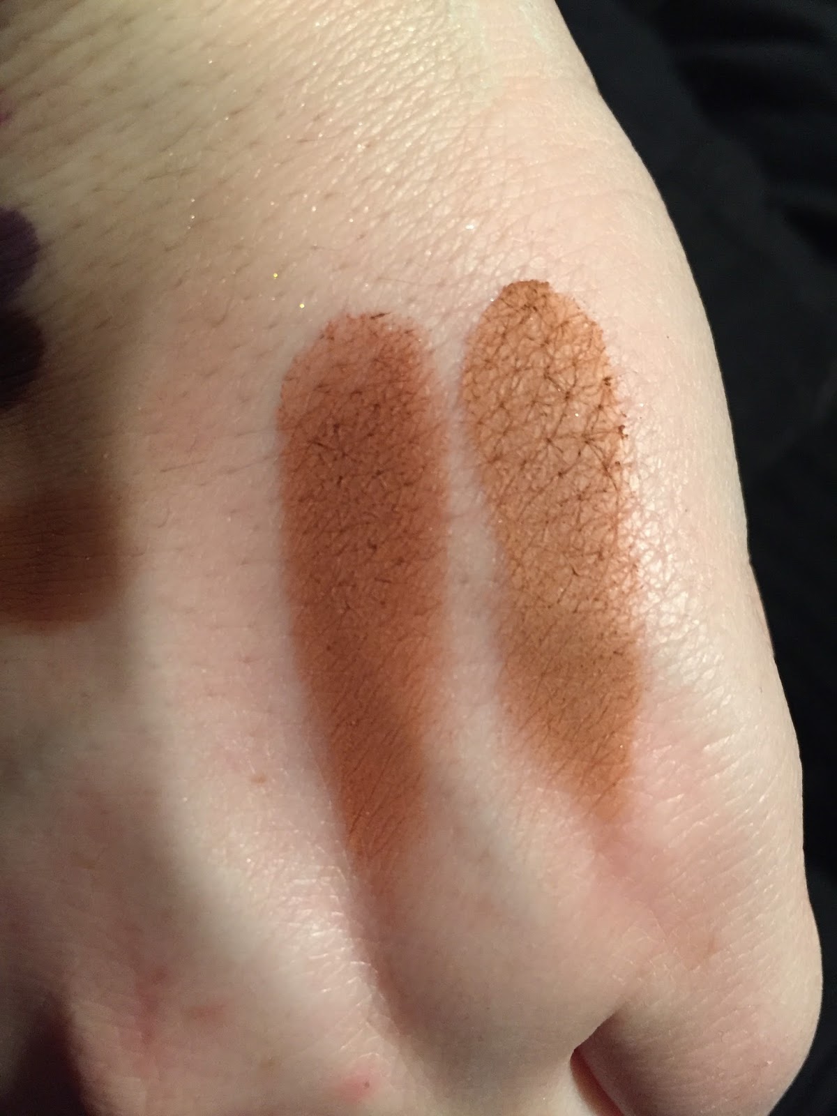
11.) Sienna. This one caused me some contention. Temptalia said a lighter dupe is from the PB & J palette, the shade "Nuts About U." I then swatched Realgar from the MR palette, thinking that could work. I ended up not liking either as dupes. The picture below contains two swatches- the left the second transition color from WnW's Not a Basic Peach palette, and the second one "Crisp" from the Tarte Pro to Go. I think the WnW comes out on top.


12.) Rustic: A neutral mid-toned brown. I used Duchess from the Queen of Hearts palette, though that may be too dark.

13.) Cyprus Umber: From the MR palette.

14.) Noir: A matte black. I have two in my collection, and one I really like. It is from the Zodiac palette, which is swatched on the right.

(l) WnW, (r) BH Cosmetics
What did I learn?

When I originally learned of this palette, I knew there were so many parallels to the Modern Renaissance. But I still thought it was a stronger palette than the Modern Renaissance. For starters, the shimmer shades in the MR were way too similar, and one had pretty weak pigmentation (Primavera). The variety of shimmers in SG APPEAR to be more diverse.

But, as a result of this project, I learned that the shimmers are still an issue in this palette. Three shimmery golds is not something I am too happy about. The only shimmer I don't actually own is that Rose one, but I could always get a single or something, if I really wanted to.

Ultimately, I can replicate the palette enough in my own collection, and there is no pressing urge to buy it. 
© *:・゚Cosmetically Inclined ・゚:*  
Blogger Templates made by pipdig