Thursday, January 31, 2019

Wet 'n Wild Color Icon Blush in Blazen Berry: Swatches and Review

I believe this a new color offering from Wet 'n Wild. When I saw it at Walgreen's the other day, I was struck by how unique it looked. Clearly, it was berry-toned, but also a brick-red color? And shimmery? I knew that I had never used anything like it before, so for $2.49, I picked it up.

Let's look at some pictures!


The formula is really nice. Though it is shimmery and soft, it is not "wet" feeling, and very easy to blend. I don't even mind the little brush.


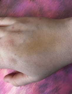
 We have a heavy finger swatch. In the picture below it is also blended out.

I was really struck at how the shimmer sheer out with the color, and how it was sheer but in a good way.


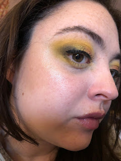
This is a really nice blush to also pair with highlighter.  In the picture below, I basically went ham and draped it all over my face, and then just applied Mac Snowflushed on top to see what would happen.

I don't hate it.

I have also been wearing this blush to work, but not in such a crazy way. It is quite easy to apply and I do feel it lasts a long time. Even though I am fair and have cool-toned skin, I think the blush works well on me. I think it also brings out the green tones in my eyes. 

I would highly recommend this blush and I think Wet 'n Wild introduced such a cool color and finish to their line. 

Thanks for reading!! 

Monday, January 28, 2019

My Small Nabla Collection and Swatches

Good evening!

I don't have much in the way of new product reviews, but I do want to talk about some eyeshadows in my collection from the Italian company, Nabla. Though shipping is a bit pricey, packages from Nabla arrive pretty quickly for me, within three days, which is really impressive.

Here is what I have in the way of eyeshadows. Prices differs, but each pan contains 2.5 g of product.


  • Lotus: A cool-toned purple-pink, matte. Perfect if you have a hankering for the vibe of the recently released CP It's My Pleasure Palette, but you don't want to get the whole palette. This matte is quite soft, but not wet feeling, and blends very easily. 7.90 euros. 
  • City Wolf: A cool-toned matte grey. Not as soft as Lotus, but also easy to work with. 6.50 euros.
  • Calypso: This is my personal version of a purple shimmer- not too cool and not too warm.  7.90 euros. 
  • Millennium: An iridescent with a super sheer, slightly grey base, and red-pink shift. This is best used as a face power for an iridescent pink shine. It doesn't get too glimmery and it does not show texture. I do not use this as an eyeshadow. 6.50 euros. 
On to the swatches!


From left to right is Millennium, Lotus, City Wolf, and Calypso. 

I also have some swatches without my newest shade, Lotus:


From top to bottom, Millennium, Calypso, and City Wolf.

 I love all of these shadows. The mattes are smooth but not too soft, and build up and blend really nicely. The shimmers aren't chunky, but very pretty.

My last item from Nabla is my newest purchase, and one that I am very happy with. I bought it on the recommendation of one of my favorite beauty bloggers, Killer Colours (aka Viola Holmgren). She had recommended the Glow Trip Highlighter in the shade Divinizer. 

Divinizer contains 6.5 g of product and cost 18 euros, or $23.00. 

Aside from the beautiful design of the product, you may ask what is so special about this powder. Well, it truly has a mirrored effect on the skin, and a cool pink shift. Of course, pictures are hard to capture. And it lasts the whole work day.


But if you are a super makeup nerd, and love the powder Snowflushed from Mac, but wish there were other ways to wear it without so much glitter, look no further. Divinzer is Snowflushed's smoother, cooler-toned sister. 

Nabla on left, Mac on right

I am quite pleased with all my Nabla products and find that I buy from them at such a sporadic pace that the high shipping fee does not really bother me. I do think Nabla's formulas and finishes are basically everything I am looking for when it comes to eye and face powders.

Have you tried anything from Nabla? Let me know!

As always, thanks for reading.

Today's Eye Look: Orange and Brown

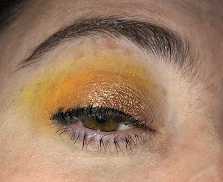
Today's eye look was the result of four shades:
  •   Dawn, from the Subculture Palette
  • New Wave, from the Subculture Palette
  • Toasted from Clionadh Cosmetics
  • Boujee, from Looxi on the lid
Basically, I love New Wave as a shade. It is the perfect "Mac 'n Cheese" yellow-orange. I do agree that the shades from the palette are trickier to blend. You can see how the brown matte on my outer corner, Toasted, is hardly blended with the orange.


On the lid is Boujee, from Looxi Cosmetics. I think this was a good choice because the warm gold matches the other colors, but this shadow has a blue shift, which complements the warm tones nicely. The shift is hard to make out on camera. 


Lastly, I was using a relatively new product. I am trying to get the hang of gel liners, because even though the brush tip eyeliners have been my HG, especially from Physicians Formula, I am getting bored with them, and getting frustrated with how easily I go through them. So I bought Mac's Black Track gel eyeliner pot. I am not sure I am using the best brush, but I do feel like I have more control with the product, so I am eager to keep using it on my eyes. I like the wear time, but I am not sure how I feel yet about the formula.

I went with a brighter, warmer look today, because I was mostly wearing pastel cool tones- blue and grey.  If I don't "plan" a look ahead of time, usually I just try to have it complement whatever I am wearing. Tomorrow I might wear a darker blue or black, so my eyes might be pink or purple. Maybe. We'll see how I feel tomorrow.

Anyway, thanks much for reading!

Wednesday, January 23, 2019

Today's Colors: PB&J and ColourpopSSSs

This is another easy look for me that I really like to do:

A couple of weeks ago I made a post about how my eyeliner looked weird. But the same thing happened to day and I realized that it's not my eyeliner at all- what that little line actually is is my eyelash curling extremely inward.

Okay, moving on.

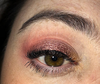
I first used the Too Faced PB & J palette. I didn't think I would like that palette as much as I do- but it's very user friendly for me. I set my browbone and crease with Extra Creamy, which I hope to pan soon, and then used Spread the Love, a pale warm peach in the crease. I then took Peanut Butter on the crease and lid and Nuts about you in the on the outer lid. I don't really use the shimmers in this palette, but the mattes make me very happy.

I then used Colourpop's ZZZ on the lid. ZZZ is a very shimmery copper with a pink shift. I then took Birthday Wish, a soft greyish-gold with a pink shift on the inner third and corner of my lid.

Very easy look!

Highlighter was Nabla Millenium, which is actually an eyeshadow. A new highlighter I purchased from Nabla just came in, so I am excited to use that tomorrow.

Blush was the Sleek coral blush palette, and it lasted a good amount of time.

My look for tomorrow? I want to go a little darker and cooler. I might pull out Norvina again, or use more Nabla products, like grey and purple. That would be cool!

Thanks for reading :)

Tuesday, January 22, 2019

Weekend Makeup Weirdness@_@

All of the looks you will see today are me just playing around and practicing with makeup.  None of the looks are great on their own, but I will still critique them and think about what I've learned from each.

Before I start, I should say that Monday was 10 degrees, and I think that even though my house is warm enough, the coldness is definitely disorienting. I've had a massive headache and sinus problems all day.

Alright, back to the program:

1. Lewk One: Yellow and Green


lololol just. what was I doing. 

So this weekend was all about getting crease colors throughout my entire crease, and not just the outer 3/4, as is the case with all my looks. Then, I blended in Looxi's Green Apple something matte, and Colourpop Team Captain on the outer corner. I used a yellow and green shimmer from the CP Good Sport Palette. 

The yellow is Clionadh's Maize, a formula which I really enjoy. I just wish I didn't put it on the lower lash line. 

The highlighter I am using is Shiro Milk-Light of Moon, a green iridescent highlighter. 

Overall, I am not going to replicate this look any time soon. I feel too much like a tropical bird.


Look #2: A Lavender look inspired by Makeup Mouse. 

I liked this look a lot more, but I didn't like how much product and blending it required. I am way too lazy. So, crease is Clionadh's Strawberry Mouse and Dose of Color's Blueberry Swirl. Lid was Give Me Glow Ride or Die, and outer corner was the dark purple from the BH Cosmetics' Zodiac Palette.

Inner corner was a highlighter- Looxi's Stripped, a pink/lavender iridescent. 

Overall, in the future I would probably due a more simple version of this look, just more toned down.


Look Three: Good and Gold

This was a really simple look using a loose pigment from Meech and Mia in Copper, and then two brown mattes from the Maybelline Lemonade palette. 

My entire brow bone looks glossy- something I rarely do- using Wet 'n Wild's loose highlighter in Written in the Stars (current favorite). 


The Maybelline mattes muddied together a bit, but I do like the warm and cool contrast of the shimmers.


Favorites?

Clionadh's Maize (though it had no business being shmeared all over the lower lash line), WnW's Written in the Stars,  and Meech and Mia's Copper.

Surprise fails?

Looxi's Stripped continues to underwhelm me, as both an inner corner highlight and highlighter on the face. I just don't get the intensity that I want and I don't know why 😣

Sunday, January 20, 2019

Skin Care Review Round-Up


I have some recent skincare-related items to talk about! Let's get into it!

1.) Lucas' Pawpaw Treatment. I bought this on Amazon for $8.00, 25 g of product. I first learned about this from Kimberly Clark, and I must say I am a fan. My hands, fingers, and even scalp get cracked during the winter, so this balm provides a nice bit of relief. I also did some research- fermented papaya has anti-microbial properties. The pawpaw ointment is made of fermented papaya suspended in petroleum jelly. It is safe to use on the face and lips as well. I have found it to be fast absorbing, and I would probably repurchase. It also has a faint smell of papaya, which is nice. 

2.) Revlon Photo Ready Candid Foundation. 0.75 fl oz, for $11.00. I am a bit miffed that they couldn't sell 1 fl oz, like everyone else. But I have been using this foundation for about two months and I really like it. It is light, but not oily, and had medium coverage. It also is in a really convenient pump bottle, which is not re-usable, unfortunately. It does not contain any SPF, which is okay, because of the fourth item. I would probably repurchase this foundation. 

3.) Wet 'n Wild Coconut Primer Water, $5.00. I have used up about two or three bottles of the regular one in the past, but have since discontinued using it because I was converted to Mac Fix+. But because Wet 'n Wild came out with a coconut-scented one, I had to try it. To make this short: no, it does not smell as good as the Mac Coconut Fix+. It has a slight note of pineapple to it, too, it is overall more sour smelling. In terms of what it does for the face, I got the same results with the original formula, which is quite good. But, I would not repurchase. 

4.) The final item was purchased because of another one of my favorite bloggers, the Anti-Haul Blog. I was in need of a new SPF product, and I recently read her favorites of 2018, to see Australian Gold Tinted Sunscreen, SPF 50. According to her, it had a non-greasy finish, and held on to foundation well. 

Well, I have to agree. I am quite fair, and the tint just blends out. And it does wear foundation well. My biggest thing with SPF products is scent- if the scent is strong, I am just not going to use it. But the Australian Gold lotion has barely any scent, just slightly like oatmeal, which I am more than okay with.

Swatch time! 


We first have two unblended swatches of the Revlon Foundation, left, and the suncreen, right. For the foundation, I am the shade 110. 


And here is everything blended out!

So that's my round-up! Except for the primer water, I am a huge fan of all these finds. Let me know your thoughts on them as well.

Thanks for reading!

Friday, January 18, 2019

My Own Purple Palette

Aka,  the purpliest purple palette that ever purpled.

And it was because of Colourpop's newest release, at the alluring price of $12.

When I saw this palette released, I was ready to buy it. But I waited a day, and paused. Even though the colors and their names are so completely right up my alley (Chick Lit, Fanfiction, and Sleeper especially), I couldn't shake the feeling that I had these colors already, and that purchasing the palette would add nothing to my collection.

So, I endeavored to make my own purple palette, inspired by My Pleasure. It's a bit expanded, and made up of singles and depotted shadows (some of which got a little banged up 😢) .

Instead of going over every single color, I will list the top ones that I think truly capture the spirit of the CP Palette.


1.) Looxi, Charmed. This is the shadow right underneath the white one. Colourpop has been doing a bit with duochromes lately, especially with blue reflects. I have a feeling that Do or Dough from the CP palette is an exact dupe of this Looxi shadow, which can also be worn as a highlighter. I also included another blue shifter shade, Glass Bull.

2.) Nabla, Calypso. This is literally at the center of my palette because it is my perfect purple shimmer shadow. Looking at the two darker shimmers in the Colourpop Palette, Bare Minimum and Chicklit, one looks too red and one looks too blue. Calypso for me is just right.

3.) No Filter, a "blue based dusty rose," from Give Me Glow. This is the largest pan in my palette. Though I think the CP palette could have benefitted from actual mid-tones of purple, rosy saturated mattes can be found, which is what I hope No Filter is replicating. I did expand upon matte options by just including more in my palette.

So, again, even though I really like what CP did, I just don't have the heart to buy it, because I know I have this palette. But, I do know CP is coming out with a series of "monochromatic" palettes, so I am exciting to see what they will do.

If you want to know what the other shadows are, please let me know! I'll also be doing some looks with this palette in the coming week, so stay tuned!

Thanks for reading.


Monday, January 14, 2019

Today's Colors and Review

I am learning that perhaps I can gauge my mood with how I do my eyeshadow. Last week I was confident, driven, focused, and I gave myself enough time to make a sparkly look.

And then we have this morning:


Is this the worst look ever? Now, of course not. My eyelashes actually were really good. But the color choices, or lack thereof, remain a mystery to me.

Here is the layout of all the eye and face color makeup products I used this morning:

I used Dawn from the Subculture palette, as my transition. I used the single Neutrogena eyeshadow, Dusty Mauve, as my lid and crease color. 

Now, I really liked Dusty Mauve. I think the name is hilarious, and the color vague, but the shadow was very soft, blendable, and stayed on my eyes all day. The picture shows some slight shimmer, but I don't know where it comes from. 

Still no idea why I didn't use an inner corner highlight. 

Moving on, I used the Sleek Cream Blush Palette in California, which also stayed on my face most of the day. By the end it wore down but today was a rather oily day.

Highlight was the Wet 'n Wild loose highlighter, a new favorite, and bronzer was the Maybelline City Bronzer, which I definitely consider too warm to be a contour. 

One more interesting purchase I'd like to show you before I go. I recently finished an eye gel from L'Oreal, but since that one was about $24.00, I knew I wanted something more affordable. So after looking around a bit, I found this:


It was $13.00 and though I have only used it a day, I really like it so far. It is fast absorbing, and it did not irritate my eyes at all. 

We'll see what mood I am in tomorrow. I keep wanting to do a silvery grey look, but at the last minute changing my mind...

Thanks for reading! 


Saturday, January 12, 2019

Three New Products from Maybelline: Reviews and Swatches


The products I will be reviewing today are: The City Bronzer in the Shade 100 (Light), the Matte Bar eyeshadow palette, and the Last Sensational Boosting Serum. 

We'll begin with the City Bronzer, which cost $7.99 for 9.25 g of product. 

Maybelline calls this a bronzer AND contour powder, so it will be interesting to see how the color performs. If it is too orange, then I would be cautious about using it as an actual contour. 

Right of the bat, you should know that the powder is scented. I would liken it to a somewhat floral baby-powder scent. It is not unpleasant, and not too strong, and it not discernible when applied to the face. 


Onto the swatches!


I do think for my skintone, the powder provides a nice bit of warmth that looks natural. It is brown-yellow toned, but not too orange.

I thought it would be interesting to compare them to my other HG bronzer, the Butter Bronzer by Physician's Formula, also in the shade light:


The Maybelline bronzer is on the left, and the Butter Bronzer is one the right. Color-wise, these two are extremely similar. The only difference is that the BB is more luminous, and applies more sheer, but both of them are incredibly easy to use. They both are very blend-able.

Overall, I would recommend the City Bronzer if you are looking for a bronzer that is more on the matte side. However, I do prefer the scent of the Butter Bronzer and do realize you get more product in the BB, albeit for a a couple of dollars more.  BB also has a better range of shades.

Both are very pretty bronzers, and I am glad to have the Maybelline City Bronzer in my collection.

The Matte Bar Eyeshadow Palette, 9.7 g for $10.00


This palette is interesting to me for a couple of reasons. For one, Maybelline hasn't been using pressed pans in their palettes for a while, but in this case, they are.

Additionally, the mattes in this palette are pretty much the matte scheme in many of the higher end palettes we've seen for a while- The Modern Renaissance, the Queen of Hearts palette, the Urban Decay Naked Heat, and the Naked Petite Heat palette.

Did I necessarily need this palette? No, of course not. I do have these mattes in many different forms, but I do love the idea of a small, all-matte palette that is affordable.

Something else interesting? The shades have names! Printed on the back, of course, so I would never remember them.


So, from left to right, we have:

  1. 1915, a peached-toned cream shade that is not showing up on my skin.
  2.  Empire, a rose-toned pink very similar to MuG's Cupcake or Coloured Raine's Princess
  3. Landmark, a berry, like Ladyship from CR
  4. Groundbreaking, a literal wash of light orange? 
  5. Hustle, an interesting salmon-toned orange
  6. Flatiron (what is that name?) a yellow-toned cream
  7. Grit, an orange-toned brown
  8. Brickhouse, a red-toned brown

9. Gridlock, a true taupe
10. Hard Edge, a blackened brown

My Thoughts:

These mattes are very tightly pressed in the pans. Do not expect loose, buttery shadows here. There is color pay-off, and they are certainly buildable, but I would not recommend setting your entire eye after you've applied primer. 

The only shades I think are a waste of time are 1915, because I don't really see any pigment, and Hard Edge, which needs to be softer and darker. Other than that, this palette is extremely easy to use, especially in terms of how it is organized and how it helps you create depth and a gradient. 

If you don't have many neutral mattes in your collection, and prefer drier formulations that you can build up, I would recommend this palette. 

And now the last one!

Lash Booster Serum, $12.00

This is going to be my shortest and most ambiguous review because products like these take time to observe, and are really very subjective. 

Long story short, my eyes are extremely sensitive, but I have not had any reactions to this product. A couple of weeks ago, my lashes- which are usually just of a medium length and thickness- were weirdly stubby, so I started being more conscious of removing all of my mascara, and then applying this serum. 

I have not felt that my lashes were as bad as they were a couple of weeks ago, and mascara has been easier to apply. 

The site says to apply it twice a day, but I've only been doing it once. Maybe I should start...

The applicator is cotton, which I like:


So applying it to my lashes is very easy, and it doesn't pull on them.  

That's all from now, for now! Thanks so much for reading!!

Friday, January 11, 2019

5 Days of Using the Norvina Palette.

I am not normally so consistent with the palettes I use. However, because the shimmers and mattes pair so well with other colors, I had a lot of fun this week. The best part was that I wasn't even intentionally trying to use the palette for the whole week, I just found myself in that frame of mind.

For reference, this is what my palette looks like:


As always, please click on the image for better resolution.

Monday:


From left to right, we have:
Looxi's Durty, BH Cosmetic's Zodiac Dark Brown Matte, ABH Volatile, ABH Dazzling, and BH Cosmetic's light brown shimmer. 

This look I was trying to go for a multi-dimensional brown shimmer look, using both warm and cool tones of brown. 

I first used Durty in the crease and up to the brow bone. Then Volatile in the crease and lid, and the dark brown matte on the outer corner. Dazzling on the center of the lid, and the brown shimmer on the inner part of the lid. 


My thoughts: This look begins my consistent use of the Norvina palette, especially Dazzling, which made THREE appearances this week. I am not sure why. I know I was wearing a blue sweater that day, and wanted a neutral elegant eye look, so I went with the shimmer in the palette that I thought was the most "refined," Dazzling.

Volatile, from the picture, could have been blended more and built up more in the crease, but maybe I ran out of time. 

Anyway, I love using the cool tones of the palette and pairing them with other warm toned shadows. 


Tuesday:

This day I used Clionadh's Strawberry Mousse, Coloured Raine Princess both in the crease. Maybe an Inglot  pink also in the crease? I can't remember!

Dazzling is on the lid, and Mac Snowflushed is in the inner corner. 


Maybe the reason I was obsessed with Dazzling this week- and I think this is true of the Norvina palette in general- is that even though the color appears neutral, it's cool tone makes it work well with other colors, where it almost changes depending on how you use it. Using matte pinks brought out the pink to this color, which I liked.


Wednesday

Today I used Volatile in the crease and on the lid, Dazzling on the lid, Colourpop's Birthday Wish on the inner lid and inner corner, and Mac Snowflushed on top of Birthday Wish.


This look is like an improved version of Monday's look, and I really liked it. I found Volatile a little easier to work with, and I wasn't so hesitant in building it up. 


Snowflushed was also a great product to use with Dazzling, because of the copper and pink dimensions to it.


Thursday

This day I decided to switch things up a bit, which may have required a bit more work and planning on my part. Instead of cool browns and rose tones, I used:


From left to right, Eccentric from the Norvina Palette, Maize from Clionadh Cosmetics, Pumpkin Spice Life from Looxi, Summer and Dreamer from the Norvina palette. 

I used Clionadh's Maize in the crease, Looxi's Pumpkin Spice Life in the crease, ABH's Norvina's Eccentric in the crease and lid, Summer (gold/bronze shimmer) on lid, and Dreamer (light gold shimmer) in inner corner. 


My liner was....not great today. I have no idea why I only realized now I made a pretty significant mistake. The above is actually my eye after work. I thought I needed to improve the look by blending more of Maize up towards my brow bone. When I did my makeup this morning, I did not blend enough upwards. 

Still, I thought this look was fun and I should improve upon it in the future. Maize is a great formula for me. I actually prefer drier more powdery formulas, as long as they adhere to the skin and build up. There are some out there (like Fantasia) that are dry and powdery and blend away to nothing. So as long as a shadow strikes that balance, I am good. 

Summer and Dreamer are quite gorgeous and it seems to be they have almost a duochromatic quality to them. 

Friday

So, rose golds came back with a vengeance today:


From left to right, we have Mac Snowflushed, Colourpop Lay Low, ABH Love, ABH Rose Gold (Norvina), and a BH Cosmetics reddish brown from the Zodiac Palette.

Don't these colors look like a happy family?

This was probably my favorite look of the week:


I used Lay Low in the crease, a warmer toned pink that blends easily. I then used Love also in the crease. 


I then used Rose Gold on the lid, Mac Snowflushed on the inner corner and inner section of my lid, and then finally used the dark matter brown on the outer lid.


I usually have such a problem blending dark mattes, but I think I am finally getting a hold of doing a decent job. The key for me is not to use a blending brush, but to rather use a packing brush to sweep the product on the outer corner.

So yeah, I would definitely wear this look again. I am super pleased with it.

Final thoughts:

Norvina is a great palette. There are some colors that I still barely use- Drama and Soul- but maybe this weekend I can complete the full week.

Thanks so much for reading!
© *:・゚Cosmetically Inclined ・゚:*  
Blogger Templates made by pipdig